LAVA

Cool Architecture Installations, Chris BosseCool Architecture Installations, Chris BosseCool Architecture Installations, Chris BosseClick to enlarge

With its two main offices in Sydney and Stuttgart, LAVA – Laboratory for Visionary Architecture – functions as a think tank generating inventive architecture that “bridges the gap between the dream and the real world.” Founded as recently as 2007 by Chris Bosse and Tobias Wallisser, LAVA has already produced an impressive body of work. Using nontraditional methodologies and advanced technology, LAVA’s structures and city planning are part of a new and cutting edge, as well as sustainable, generation of architecture. Here are just three of their projects:

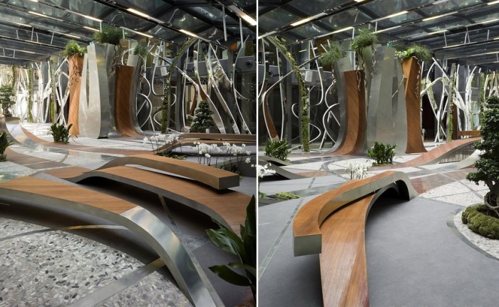
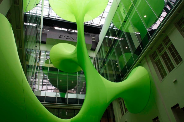
Top to bottom – The Green Void, a tensile fabric installation in the central atrium of the Sydney Customs House.
The Water Cube or National Aquatics Center in Beijing, originally designed for the 2008 Olympics has since been converted into a water park.
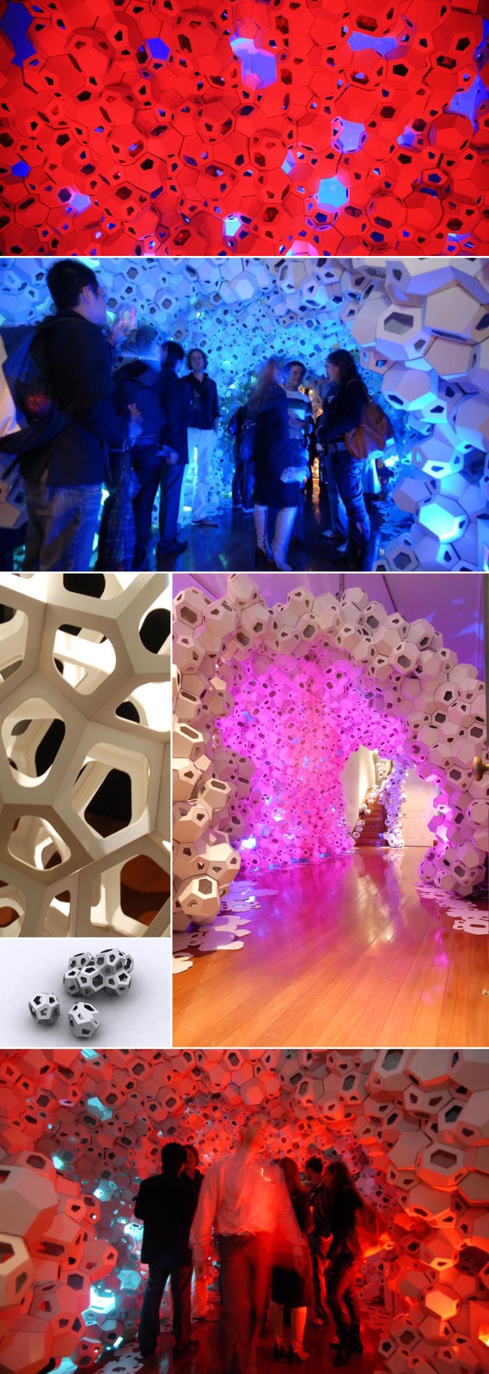
Digital Origami, an installation created in a masterclass taught by Chris Bosse at the University of Technology Sydney. Made from 3500 recycled cardboard molecules of only two different shpaes.

You can see more of LAVA’s amazing work at their website as well as on Chris Bosse’s flickr.
Moderna Museet in Malmö

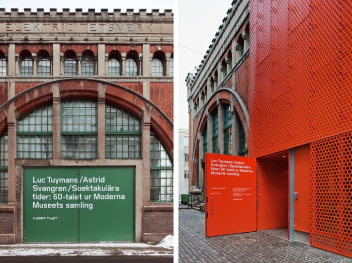
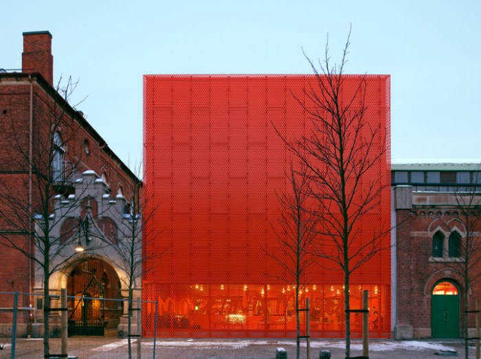
Stockholm art museum, modern architectureStockholm art museum, modern architectureModernaMuseet Malmo, stockholm art museum, architectureOne of the things that I truly enjoy, and gives me a little silly thrill, is seeing new architecture incorporated successfully with old. Coming across photos of the relatively new building for the art museum in Malmö, Sweden, Moderna Museet gave me said thrill.

Designed by Tham & Videgård Arkitekter in collaboration with Henirk Nygren Design and Stockholm Design Lab, the two latter involved in the interior design as well as branding and signage, the bright orange-y red box looks fabulous next to the older, classic brick buildings that seem to be part of the museum as well.

The handwritten logo which works beautifully large across the windows at the base of the box in the same color, is adapted from Robert Rauschenberg’s handwriting and famous signature.

via Stockholm Design Lab

Ponte City: Subotzky & Waterhouse

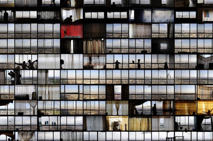
Mikhael Subotzky and Patrick Waterhouse photo light panelsMikhael Subotzky and Patrick Waterhouse photo light panelsClick images to enlarge

As Wikipedia will tell you, Ponte City is a 54-story cylindrical building, the tallest residential skyscraper in Africa, set in the Hillbrow neighborhood of Johannesburg, South Africa and built in 1975. At the time it was an extremely desirable address due to its views. Starting in the late 80s and into the 90s gang activity in and around the building caused the crime rate to soar in the tower as well as the rest of the neighborhood. Ponte City became symbolic of the crime and urban decay taking over the area.

Enter Mikhael Subotzky and Patrick Waterhouse (finally). Together they collaborated (from 2008-2010) on a series of photographic tableaux in the form of contact sheets on lightboxes, depicting the life at Ponte City titled: Ponte City. The three panels are broken down by theme: doors, windows and TVs. Though I like all three, and the individual photos are all very striking, I find the Windows series particularly interesting and beautiful. Maybe in part because it looks most like a traditional building façade in its light box—which isn’t necessarily important, since the abstraction is interesting—or maybe it’s the openness and the light that I’m drawn to, but also, individually the photos are “windows” into the tenants’ lives, where we can see a bit of the apartment along with personal decor and artifacts.

From Mikhael Subotky’s website:
Ponte has always been a place of myth, illusion and aspiration. This is what we seek to evoke in these preparatory pages. Perhaps this task is best left to the images that we have found there – both in the abandoned flats, and in the marketing material and advertising that we have collected from 1976 and 2008. When these documents are seen next to the dystopian appearance of the building and its surroundings, one begins to project an image of this city during this time. It is a place of dust and dreams, befitting the land on which it sits, which has attracted millions of migrants since gold was discovered in the 1880s.

via Goodman Gallery

Mimolimit: Czech Architects

Architecture, Office Design, Interior Design PragueRestaurant Design, Architecture, PraguePrague Architects, Restaurant and Cafe designClick to enlarge

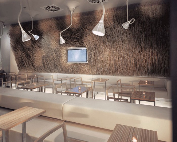
Led by architect-designer Barbora Skorpilova since 2001, Mimolimit is an architecture and interior design firm based in Prague. I really enjoyed viewing all the projects on their site. From cafés and restaurants to residential and office buildings, all their projects have a funky quality to them, combining different materials to create interesting textures and contrasts. Many of the projects have a mod look to them, but the color palettes range from bright colors to muted ones and all equally successfully. Above are but a few of Mimolimit’s cafés and commercial spaces. If you like what you see, be sure to check out their site for more.

eCLOUD

art installation, interactive artart installation, interactive artart installation, interactive artClick to enlarge

The eCloud is a digital sculpture designed by UeBersee as a permanent installation for the Norman Y. Mineta International Airport in San José, California. The thousands of small square panels of electrically switchable laminated plexiglass act as pixels which imitate the behavior, as well as the volume, of an idealized cloud. The plexiglass (or Smart Glass) has the ability to graduate opacity with the transmission of an electrical charge. The panels are opaque in their neutral state and can become transparent with the charge.

108ft long and 16ft wide, the panels are arranged to simulate a cloud suspended from the ceiling from a tensile structure. The animations that move through the eCloud are based on actual weather data via a live feed of conditions for all airports in the U.S. (see bottom photo.) You can see a video of the eCloud in action below.


(indirectly) via LovelyPackage
Photos: Spencer Lowell

Ineke Hans: CITO Tree

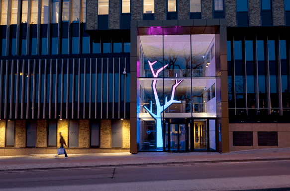
Ineke Hans, a designer and artist in the Netherlands, recently designed a tree light sculpture for the entrance of CITO’s building, a leading testing and assessment company.

The tree stands 12 meters tall and acts as a symbol for growth and the acquisition of knowledge. It changes colors throughout the day, and night, and acts as the “heart” in the center of the building. I especially like how it works in perfectly with the reflection of the trees in the glass from across the street.

Bernard Khoury

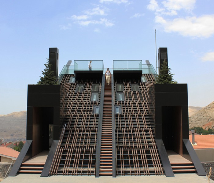
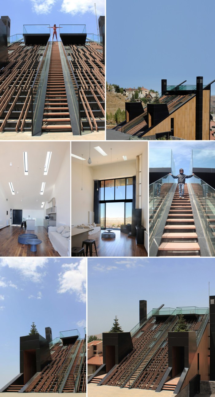
Cool residential architecture in Lebanon Bernard KhouryCool Residential Architecture LebanonBernard Khoury Plot 4328 ResidenceClick to enlarge

Built into a steep slope in Kfederbian, Lebanon, is a steep sloped double residence home designed by Bernard Khoury, a Beirut-based architect with many dynamic projects to his name. This residence, entitled Plot 4328, works very nicely with the topography that surrounds it. The central staircase on the southern façade (which also acts as the house’s roof) leads up to the pool which is surrounded by glass permitting a spectacular view. The two residences below are symmetrical and I like the way the skylights work into the staircased façade, creating texture to the surface and allowing light in to the individual apartments.

Pretty fabulous all the way around.

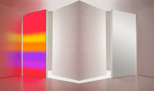
Carlotta de Bevilacqua: Truly Illuminated

LED Lamps Rothko Artemide collabcubedCarlotta de Bevilacqua Lighting Design Rothko LED LampsClick to enlarge

When it comes to design, Carlotta de Bevilacqua, along with the rest of her studio, apparently does it all: architecture; industrial; graphic; and lighting. Granted, it all stems back to the lighting, which, I might add, is quite spectacular: from the lamps and the illumination of interiors, to shops, exhibitions and beyond.

In an earlier post I had mentioned that some of Leo Villareal’s works had a Rothkoesque quality to them. Coming across Bevilacqua’s site, I discovered that she has designed a series of lamps for Artemide with a similar LED effect that are, in fact, titled Rothko and Rothko Terra! How amazing would it be to have one of these in your home?

But truly, everything on Milan-based Studio Carlotta de Bevilacqua’s site is quite beautiful. She has collaborated with Zaha Hadid on her installation Twirl for the Interni Mutant Architecture & Design exhibit (the three photos in the center) this past winter, as well as with architect Jean Nouvel on his proposed design for the New Qatar National Museum.

Bevilacqua has designed a bunch of Artemide and Euroluce showrooms, which are lovely, and several of which include the tracking of light embedded in the floor, walls and ceiling: a wonderful effect (see photos at the bottom).

Visit her site to see more lamps and projects.

Tomas Saraceno

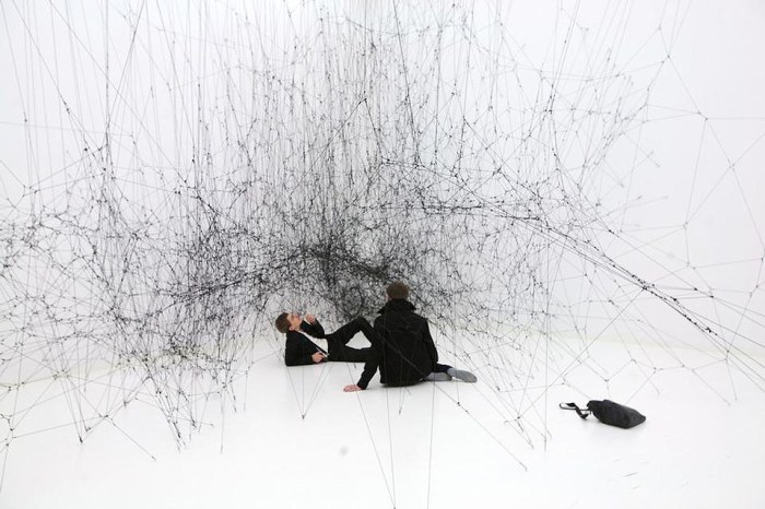
Cool Art InstallationsTomas Saraceno, an Argentinean-born artist living and working in Frankfurt, combines sculpture, science, and installation-based art to create unique spaces. Much of his work is experimenting with solutions for airborne habitation and ecological sustainability, as well as other alternatives for living.

From Andersens Contemporary Gallery website:
…For many years the natural was seen as the antithesis of the constructed, but according to Saraceno we may have to alter this view and understand that whatever is handmade is also a part of nature because we are a part of nature….Saraceno is conceiving objects, images, and installation, in order to communicate and anticipate this possibility. Imagine, living in the sky in a bubble shaped city that floats around. There are no boundaries of place nor nationality…He creates grand scale airborne balloons sometimes with their own eco-system.

Installations from top to bottom and left to right:

14 Billions (Working Title), Elastic black rope and hooks. Photo: Bonniers Konsthall.
(2nd – 4th rows): Galaxies Forming along Filaments, Like Droplets along the Strands of a Spider Web. Photos©Tanya Bonakdar
Installation View
, Walker Art Center.
Installation View
Statens Museum Kunst, Copenhagen.
Transparent Soil and the Gardens of Tomorrow

Airborne photo: don’t know source.
How to Live Together
, Sao Paolo Biennale
Installation View
, Pinksummer Gallery, Genoa.

Saraceno just showed at the arteBA 2011 fair in Buenos Aires last month, and has several upcoming solo exhibitions, including one at the Kemper Museum of Contemporary Art in St. Louis this year and another one in Tokyo in 2012.

More of Tomas Saraceno’s work can be seen here, here, and here.

via arteBA 2011

cartónLAB

cardboard exhibit design and industrial designcardboard exhibit design furniture designClick to enlarge

We have secretly been following (and admiring) the work of cartonLAB for a while now. This ongoing workshop, run by the team at Moho Architects in collaboration with Ability Graphic Design, (both in Spain) has apparently grown into a permanent subdivision of Moho’s studio. Creating everything from exhibit displays for trade shows and stores, to furniture, kids’ play objects, club dj stands, lamps and more, all out of cardboard; these guys impress. Each design somehow seems to top the last, both in beauty and complexity. In addition, many of their displays and stands are designed with multiple configuration options.

From the Moho website:
Cardboard is a material that has always been linked to artistic creativity and craftsmanship. The new design possibilities (digital cut, large print, cad, 3d modeling, etc) along with the latest patents in the production of cardboard (reboard, cardboard reinforced, flame retardant coatings, water repellent, etc) makes this material in a fantastic alternative at the time of generating new exhibition spaces, media and all types of custom cheap, lightweight and recyclable furniture. Working with contemporaneously cardboard creation process allows almost no intermediaries between the designer and the final piece through traditional interfaces (previous models) or digital.

cartonLAB’s constructions typically pack flat for easy transport, are relatively simple to assemble and, as we know, cardboard is not only economical but recyclable. The result: great, green design that won’t break the bank.

You can see more of cartonLAB’s work here, and more of Moho’s architecture work (including their beautiful entry for a dormitory building) here.

The Portrait Building

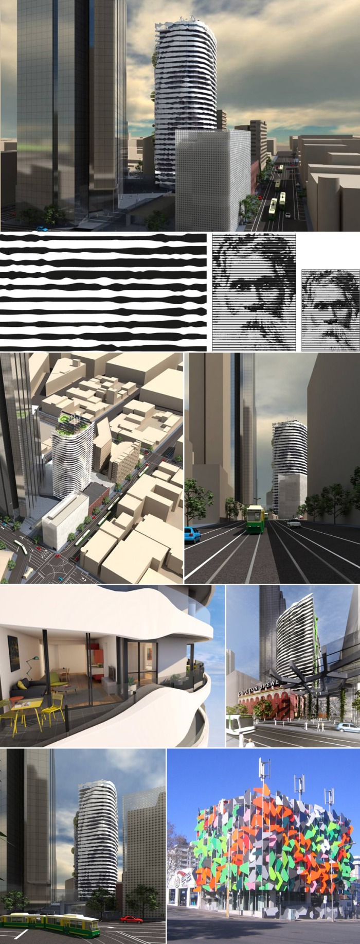
Cool Architecture Portrait Facade AustraliaCool Architecture Melbourne AustraliaClick images to enlarge

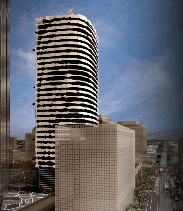
Nope, it’s not the latest Chuck Close painting. Instead, it’s the very cool Portrait Building designed by ARM architects in Melbourne, Australia and scheduled to be completed by 2014.

Part of construction group Grocon’s plan to transform the former Carlton Brewery site at the top end of Swanston Street into Melbourne’s newest urban living precinct, Portrait is a 32-story residential tower paying homage to Victoria’s indigenous heritage and first Australians. The façade features a portrait of indigenous leader, William Barak. The artwork for the Barak image was done by sculptor Peter Schipperheyn. The idea behind this, apart from the general coolness? To unite the city’s modern heritage with its ancient history.

It should be noted that Grocon completed construction on, and has since moved its offices to, yet another unique looking building, the Pixel Building (designed by Melbourne firm Studio 505), part of the same former Carlton Brewery site, and the country’s first carbon neutral office building. (See bottom right photo.) Impressively forward-thinking!

The Cube by Electrolux

Cool Restaurant Pop-Up_Architecture_EuropeCool Restaurant Pop-Up_Architecture_DesignClick to enlarge

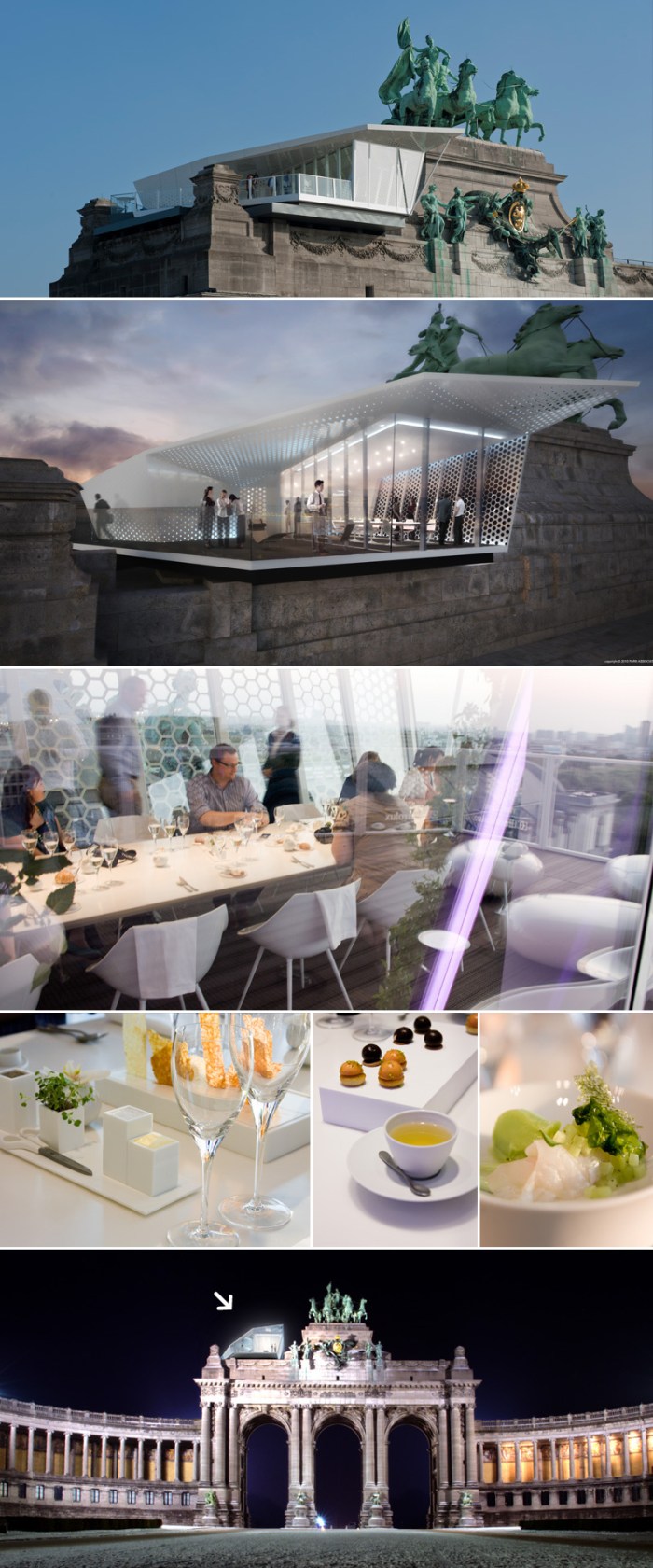
I’ve always enjoyed the combination and contrast of contemporary architecture with older, more classic structures, so coming across this pop-up restaurant — sponsored by Electrolux and designed by the Italian design firm Park Associati — was pretty exciting for me. The Cube by Electrolux will be popping up at some of Europe’s most famous landmarks from Belgium to Sweden, to Russia, Italy and Switzerland as well.

Presently, The Cube is in Brussels atop the grand Arc de Triomphe overlooking the Parc du Cinquantenaire. It will stay there through July 3, 2011 (though all reservations are sold out at this point) and then move on to Stockholm, followed by Moscow. The Cube will rest at each location for three months, making the complete tour in one year.

From the Electrolux website:
The aim is to create an experience that surprises and inspires with fantastic tastes, gastronomic hints and tips from some of the world’s greatest chefs and never-before-seen views, ultimately stimulating guests to explore their own creative boundaries next time they entertain friends or family at home.

Certainly takes Pop-ups to a whole new level!

You can book reservations here, and see more photos here and here.

Table and food photos by Photo&Coffee. All other photos from Electrolux.

Architypeture: Part II

Typography in Architecture Lowther Children's CentreTypography in Architecture Multiple ExamplesClick to enlarge
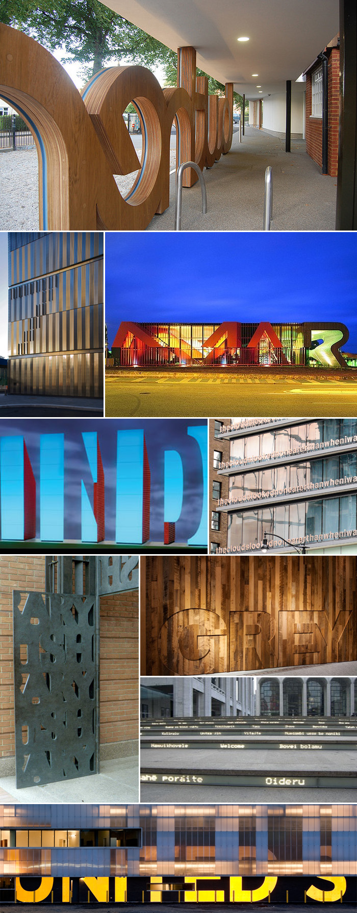
Row by row; left to right: Lowther Children’s Centre, London, Patel Taylor Architects. 7 World Trade Center, NYC, Michael Gericke, Pentagram. The Marion Cultural Centre by ARM + Phillips/Pilkington. Artwork for the Indianapolis Airport, Indiana, Joe C. Nicholson. Fairmont Pacific Rim Hotel, Vancouver, Canada, Liam Gillick; words say “Lying on top of a building, the clouds looked no nearer than when I was lying in the street.” British Library main gates, Cambridge, UK, Cardozo Kindersley Workshop. Grey Group, NYC, Paula Scher, Pentagram. Lincoln Center steps, “Welcome” in multiple languages, Diller Scofidio + Renfro. U.S.-Canada border crossing station at Massena, NY, Michael Bierut, Pentagram (has since been taken down.)

Typography in Architecture Pentagram Design

Click to enlarge
Row by row; left to right: New York Times Building Signage, NYC, Michael Bierut, Pentagram. Symphony Space, NYC, Paula Scher, Pentagram. 770 Broadway awning, Paula Scher, Pentagram. Harley Davidson Museum, Milwaukee, Wisconsin, Michael Bierut, Pentagram. Bloomberg Building, NYC, Paula Scher, Pentagram. Container Mall (proposed design) NYC, LOT-EK. APAP Open School, Korea, LOT-EK. Bohen Foundation, NYC, LOT-EK. Lignan Studio renovation, LOT-EK. PS1 Museum of Art, Queens, NY (not sure of designer.) Museum Tower, Dallas, Texas, Scott Johnson, Johnson Fain Architects, photo from williamedia’s photostream. Wales Millenium Centre, Cardiff, South Wales, Jonathan Adams, Capita Architecture, photo from iwouldstay’s photostream.

As promised, here is a second roundup of architecture and typography merged into one (see Part I). Pentagram has a large representation here, as does Lot-ek, possibly because many of their projects are in NYC and I am personally familiar with them, but it’s more likely because their websites happen to be chock-full of these beautiful projects. Lot-ek’s use of type and color on their projects feel a little like Freitag bags on steroids. I love it.

Architypeture: Part I

Architecture Typography Lentos Art MuseumClick images to enlarge
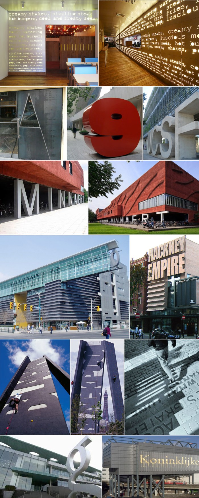
Left to right, row by row: Lentos Art Museum, Linz, Austria, Weber & Hofer Architects. Caltrans District 7 Headquarters, LA and Cooper Union, NYC, both Thom Mayne, Morphosis, typography on Cooper Union was done in collaboration with Abbott Miller, Pentagram. Parsons The New School for Design, NYC, Lyn Rice Architects; exterior awning photo: Michael Moran. Interior auditorium acoustic graphic photo: Noah Sheldon.

Architecture Typography Ali Tayar Thom Mayne Why Not Associates Chermayeff & Geismar

Click images to enlarge
Left to right, row by row: PopBurger, NYC, Ali Tayar, Parallel Design. The Alembic door, Oliver DiCicco. 9 West 57th St. sculpture, Chermayeff & Geismar. UCSF, University of California, San Francisco. Minneart Building, Utrecht University, The Netherlands, Neutelings Riedijk Architects. University of Toronto, Graduate Student Housing, Thom Mayne, Morphosis. Hackney Empire theater extension, London, Tim Ronalds Architects. Blackpool Climbing Tower, Blackpool, England, Why Not Associates with Gordon Young. Tam O’ Shanter Pub Steps in Ayr, Verse from Burns’ Whisky, Why Not Associates with Gordon Young. G Hotel, Ireland, Philip Treacy Architects. Koninklijke Bibliotheek (Library in The Hague, Netherlands), designed by Wim Quist (?).

Nothing really comes up when you google “architypeture” other than the recently scooped up domain name, but I’ve decided to use it here as the fusion of architecture and typography, especially when successfully and beautifully rendered. I don’t think there is a designated term for this, but there should be. Architypeture is possibly one of my favorite things, and I don’t do favorites lightly. This is Part 1 of two posts (the second will follow shortly) showing examples of typography wonderfully incorporated into architecture; in some cases on the exteriors of the buildings and in other cases, the interiors. All names and credits that I was able to find (mostly of the projects and architects, a few of the photographers) have been listed with their corresponding links. If someone knows any credits that have been omitted, please feel free to let me know in the comments.

(See Part II here)

Folder Chair

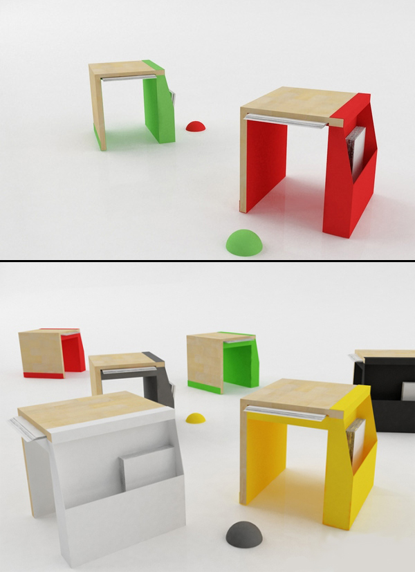
Folder Chair Vladimir ParipovicThe Folder Chair, designed by the Serbian architect Vladimir Paripovic, is made of thin steel panels and beech wood for the seat. It has a side pocket that can hold books or magazines, or anything else you’d like to put in there, and is perfect for small spaces due to its compact size. It’s actually more of a stool than a chair. Great way to brighten up a room!

Rainbow City and High Line Too (Two)

Rainbow City Friends With You High Line NYCFriends With You Rainbow City High Line AOLClick to enlarge

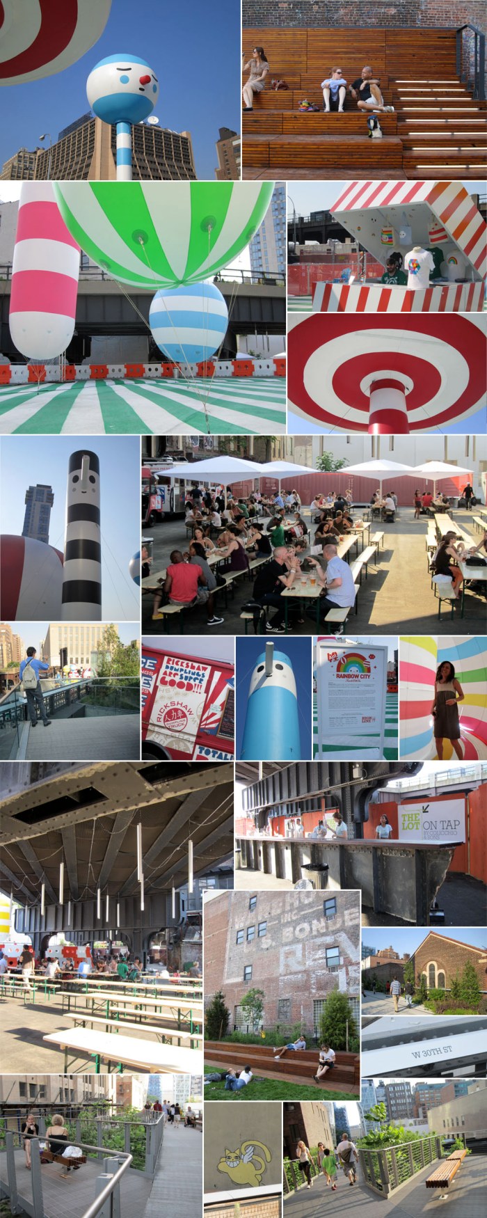
The pop-up plaza, deemed The Lot, at 30th Street and 10th Avenue is just as promised. Rainbow City, the interactive balloon installation by Friends With You is cute, fun, kid-friendly and adult-silly. It feels a little like being on a real-life Candy Land game board with a hipster twist. The food section (The Lot On Tap) with its tables nicely angled to be parallel with the High Line above it, and stylish hanging lights, food trucks, large bar and container ticket booth, is all very appealing and I can imagine will be hugely popular in the evenings and weekends.

For me, the true star, once again, is the High Line. It’s hard to believe that they could top the original section, but in some ways I think they might have. Much more seating is available and incorporated very creatively and elegantly. There’s a coziness due to the proximity to the adjacent buildings (which might get a little claustrophobic on a crowded weekend) and there are many romantic little branches, or cul-de-sacs, throughout which work very nicely. Oh, and a lawn! A decent size lawn for NYC standards.

Definitely worth a visit, or three, this summer. Rainbow City is up through July 5, 2011, and Colicchio & Sons’ The Lot On Tap will continue through the summer. Open Sundays through Wednesdays from 11am to 10pm, and till 11pm Thursdays through Saturdays.

Rolling Bridge: Heatherwick Studio

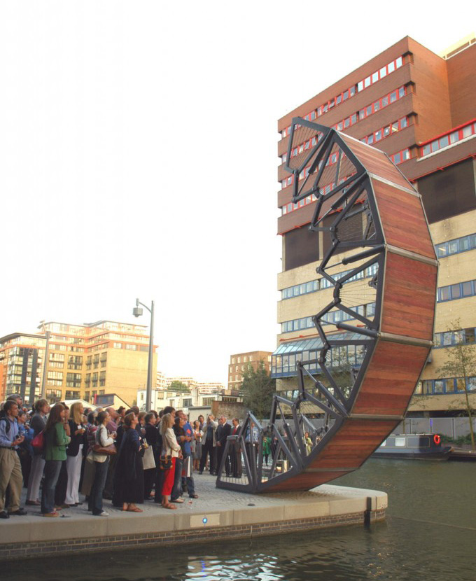
Heatherwick architects Rolling Bridge London Paddington BridgeHeatherwick Rolling Bridge Architecture Paddington BridgeHeatherwick Studio is probably best known, recently that is, for their spectacular Shanghai Expo UK Pavilion which, quite deservedly, received a lot of attention. We are also familiar with their impressive staircase at the Longchamps store in Soho, NY but, all their projects are worth checking out. The Rolling Bridge at the Paddington Basin in London is no exception.

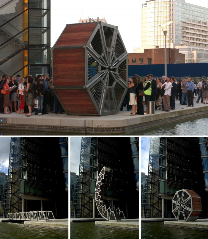
Completed in 2004, Heatherwick’s challenge was to design a pedestrian bridge to span an inlet providing an access route for pedestrians while at the same time lifting to allow access for the boats in the inlet.

From the Heatherwick website:
The aim was to make the movement the extraordinary aspect of the bridge. A common approach to designing opening bridges is to have a single rigid element that fractures and lifts out of the way. Rolling Bridge opens by slowly and smoothly curling until it transforms from a conventional, straight bridge, into a circular sculpture which sits on the bank of the canal.
The structure opens using a series of hydraulic rams integrated into the balustrade. As it curls, each of its eight segments simultaneously lifts, causing it to roll until the two ends touch and form a circle. The bridge can be stopped at any point along its journey.

You can watch a video of the bridge in action here. To see it open live, you need to be there any Friday at midday.

via our buddy Nils!