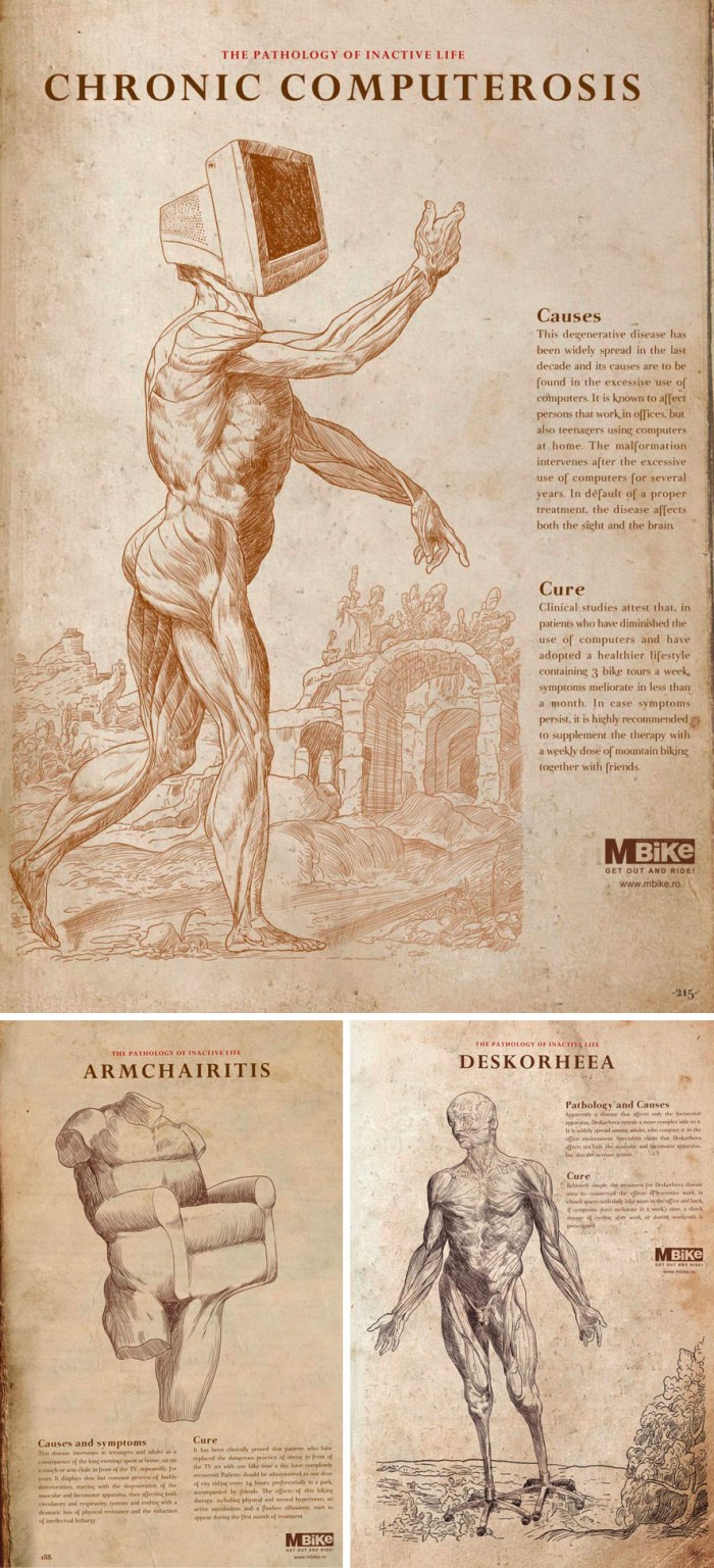
 This threesome of fictional pathology illustrations depicts the consequences of an inactive life, complete with causes and cures. Part of an ad campaign for the bicycle company MBike, designed and created by Frank, a Romanian agency.
Category Archives: Graphic Design
The Offbits
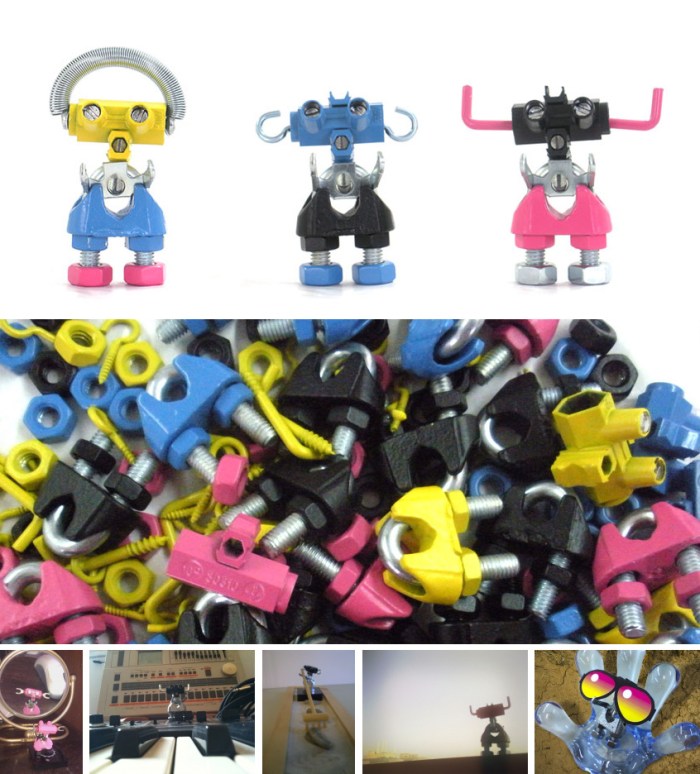 When you adopt one of artist/graphic designer Roy Barazani’s Offbits, you are not only saving an exiled, independent-thinking, malfunctioning Bitbot from the Babylonian Kingdom, but you are joining a community of Offbit adopters! The whole concept is done very well and, honestly, it’s hard to resist these little bots. The community photos made me laugh. Check it out here.
via redesign
Animal Logos
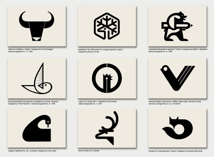 A beautiful, and interesting, set of animal-themed logos from the 1950s and 60s on Sandi Vincent’s flickr stream as well as from her posts on Aqua-Velvet. The logos were reproduced from various design publications. Sources given, where supplied.
Currency Origami: Won Park
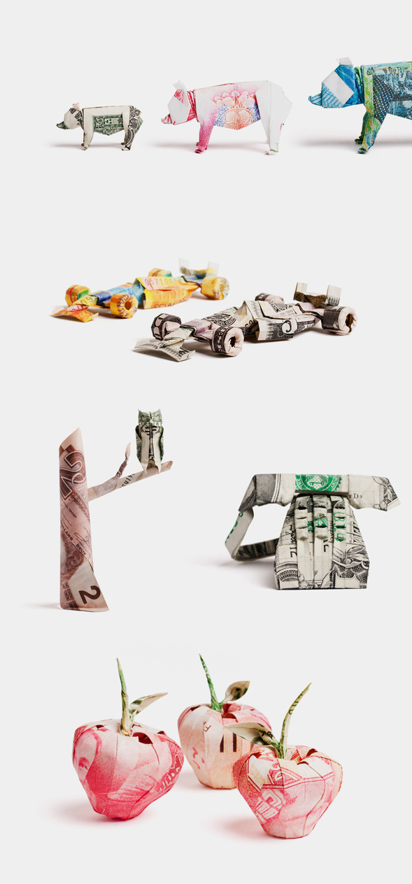 Origami expert Won Park constructed these figures from new currency as part of YIU Studio’s rebranding of Payment Systems Group.
via colossal
Ammanda Choo: Thumbprint Faces
 This humorous in-house promotional calendar postcard for Paper Stone Scissors in Melbourne, was designed by Ammanda Choo, currently a freelance designer in Singapore.
via bitique
Patternity Tights
 How fun are these, huh? From the tights to the packaging! Patternity is a London based design studio that specializes in the application of patterns. Available at their online shop.
Pantone in the Bathroom

Pantone toothbrushes and contact lens cases from Kikkerland.
White Neon
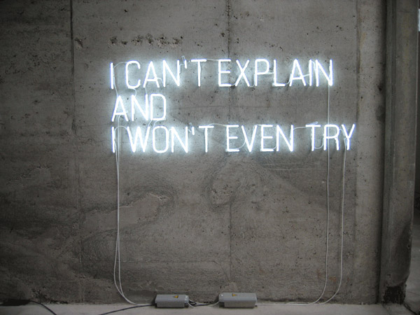 Part of Stefan Brüggemann’s Text Pieces, which are worth checking out, especially if you enjoy conceptual art. Other works that made me smile on his site include Show Titles and the Obliterated Paintings.
Czechoslovakian Book Covers
 Czech book covers and bindings from the 50s, 60s, and 70s. On 50 Watts.
via Coudal
One Day for Design: April 13th
 On April 13, 2011,
add your voice to an open, digital dialogue on design. One Day For Design brings together a global community of designers and design enthusiasts to exchange ideas, challenge viewpoints and push boundaries—collaborating in real time on the future of our profession and the organizations behind it. Spread the word. Join the conversation at onedayfordesign.org or via Twitter.
Moderators include: Alex Bogusky, Doug Bowman, Liz Danzico, Debbie Millman, Erik Spiekermann, Armin Vit, Alissa Walker and Katherine Walker.
Begins tonight at 12 midnight EST
Morse Code Wine Labels
 I know it should be more about the wine than the label, but for me it may be just as much about the label. I love these morse code labels for Henry’s Drive Wines. “The varietal of each wine is printed on the label in morse code.” Designed by Parallax Design in Australia. via Lovely Package
Jer Thorp: Data Artist in Residence
 Another one of the amazing speakers at the Geeky by Nature conference last week was Jer Thorp, a software artist, writer, and educator. He is a contributing editor for Wired UK and is currently Data Artist in Residence at the New York Times. His digital art practice explores the many-folded boundaries between science and art.
The top image is a print Thorp made based on his word frequency visualizations that he created using Processing and the NYTimes Article Search API. It is titled ‘RGB – NYT Word Frequency’ and shows usage of the words ‘red’, ‘green’, ‘blue’ in the Times between 1981 and 2011. The second image is a detail of the print. The bottom image is a screenshot of a visualization he produced based on the Guardian’s data on the Haiti Earthquake Aid by Nation. He asked how much money was being spent per citizen of these countries and converted the figures to Avatar minutes, showing how many minutes of Avatar would the aid pay for.
All of Thorp’s visualizations are beautiful as art forms as well as being incredibly useful in facilitating data interpretation. You should take a look at some of his animated visualizations here.
Open House: Droog
“Open house is a project by Droog led by Diller Scofidio + Renfro. Open house will be presented in a one-day event on Saturday, April 23rd, 2011. The event will be kicked-off with a symposium at Studio-X New York introduced and moderated by Mark Wasiuta of Columbia University, followed by a bus trip to Levittown, where visitors can view and participate in several house installations in the neighborhood, designed and executed by architects, designers and artists in collaboration with the homeowners. One of the installations will showcase concepts for future open houses, with proposals for new housing configurations and regulatory modifications.”
The event is free but there is an optional transportation fee from Studio-X to Levittown.
UPDATE: POST-VISIT FOLLOW UP HERE.
Pulp Fiction Pillows
 These would be good to prop yourself up with next time you’re eating a Royale with Cheese.
Sifteo
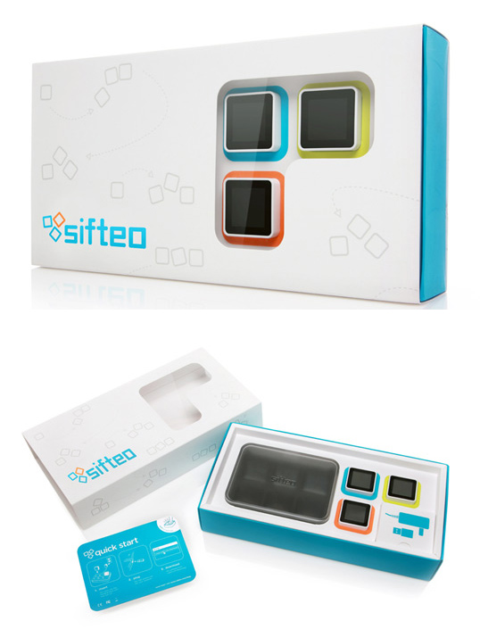 Two years ago I watched a TED Talk given by MIT Media Lab grad student David Merrill about a project he was working on called Siftables. These were tiny computer blocks that interacted with each other to make networks, play games, and music. It blew me away. Today I came across a lovely package design, by New Deal Design, for the product Sifteo which sounded remarkably similar and turns out is the company that Merrill has since founded with his partner, and co-creator, Jeevan Kalanithi. This demo explains it better than I can:
via Lovely Package
Geeky by Nature
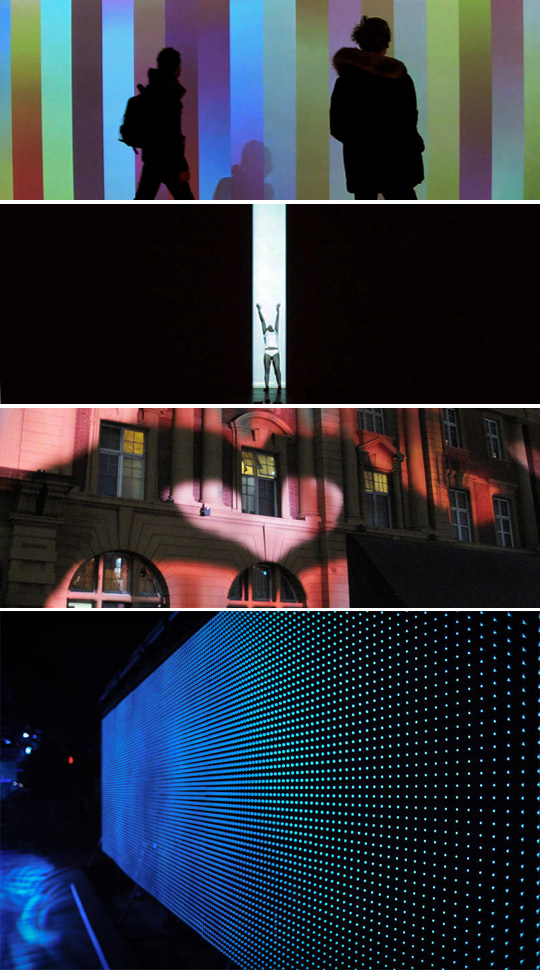 We attended the first part of Geeky by Nature yesterday here in NYC, a conference “exploring the best in art, code & design.” The day was filled with great presentations, the highlights for us being Joshua Hirsch from Big Spaceship, Hillman Curtis and his upcoming Stefan Sagmeister film, and Joshua Davis including his interactive graphics for IBM’s Watson. But, our absolute favorite talk was given by Hellicar & Lewis. Apart from being incredibly smart and talented, this team of UK interaction designers (Pete Hellicar and Joel Gethin Lewis) is witty, appealing, and immensely inspiring. The images above are stills from work on their site. I highly recommend that you look at some of their videos to get a taste of what they do. Brilliant!
Chupa Chups
 I found this advertising campaign by TBWA for Chupa Chups amusing.
via bldgwlf
Fun fact: the Chupa Chups logo was designed by Salvador Dalí in 1969.
Not Your Mother’s Hostel
 Hostels definitely didn’t look like this when I stayed in them! Golly+Bossy is a design hostel in Split, Croatia. Couldn’t find the architect, but they certainly did a beautiful job. via coolhunter
