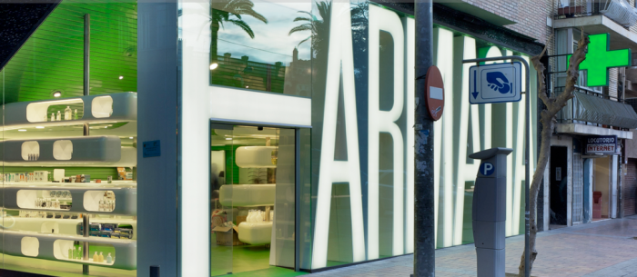
Casanueva Pharmacy (Farmacia)

Renovation, Pharmacy, Murcia, Spain, Type, Architecture, Store designRenovation, Pharmacy, Murcia, Spain, Type, Architecture, Store designRenovation, Pharmacy, Murcia, Spain, Type, Architecture, Store designClavel Architects led by Manuel Clavel Rojo, took on the renovation of the Casanueva Pharmacy in Murcia, Spain. (See before and after photos second row from top.) One of the major challenges of the project was that it had to be completed in two months and the store remained open during the first month. Because of this, 95% of the project was prefabricated.

The amazing façade (who wouldn’t want a façade made of type? And one that lights up to boot!) not only spells out the store’s identity but serves as a shading mechanism from the hot afternoon sun. The façade and all the interior furnishings were prefabricated in a workshop, and the slat cladding was also a quick-to-build solution.

I think Duane Reade with all their constant renovations would do well to pick up a pointer or two from Clavels cool redesign.
Tatsuo Miyajima: Counter Void in Tokyo

Counter Void, Installation, Tokyo, Tatsuo MiyajimaCounter Void, Installation, Tokyo, Tatsuo MiyajimaClick to enlarge.

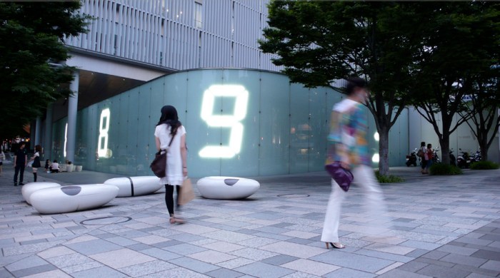
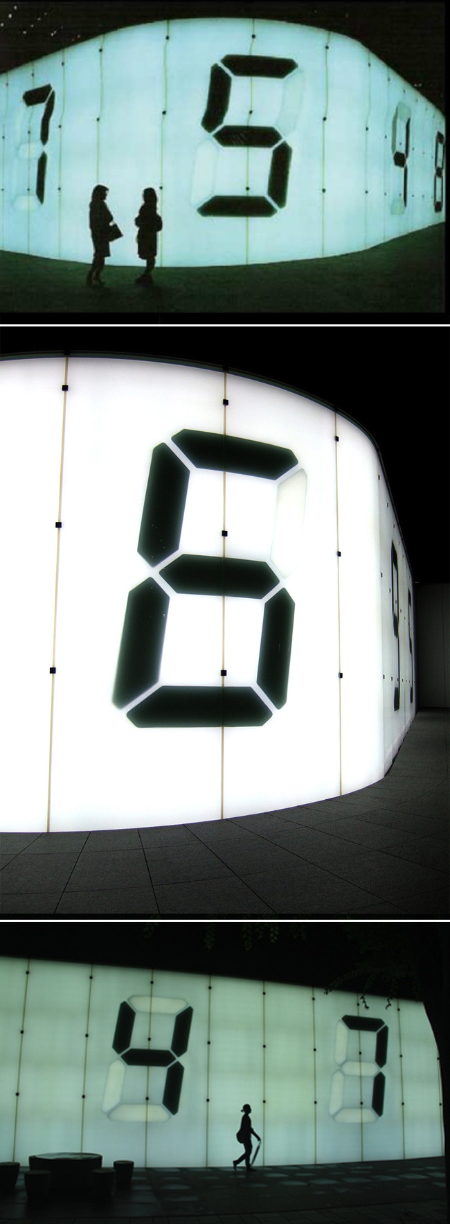
At first glance the 3-meters-plus digital wall in Roppongi Hills, Tokyo, appears to be a clock but, upon further inspection, it becomes clear that the randomness of the numbers and the speed in which they change, has little to do with time. Artist Tatsuo Miyajima created this work titled Counter Void which, instead of time, according to the artist, shows the contrast of “Life” and “Death”.

The piece displays the numbers differently in the day vs. the nighttime. During the day, the background’s neon light is turned off and the digital counters are displayed in white neon light. At night, the numbers drop out black from the white neon lit background. In both cases the digital counters keep counting from 9 to 1  with each counter counting at a different speed.

I’m pretty sure I’d enjoy seeing this live.

Photos: Local Japan Times; Kico’s flickr; Lu Yee

Graphis Packaging 3 & 4: Typography

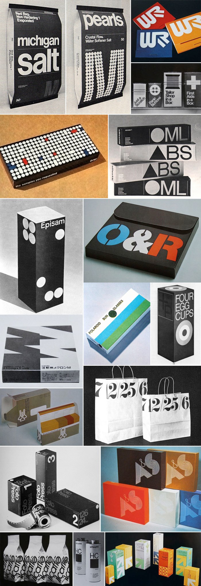
70s typography, packaging, retro design70s typography, packaging, retro design, helveticaClick to enlarge.

When I was in college, my library of choice on campus was the Fine Arts Library. I would lug my Calculus text books over there with full intention to study for my exam, but the temptation to peruse the newly discovered (for me) Graphis magazines and annuals was too huge to resist. So, you can imagine my excitement when, googling around for some typography-related material, I came across a beautiful flickr set of images from Graphis Packaging 3 and 4. It brought me right back to the Fine Arts Library and my not-so-great Calculus grade. SO much beautiful typography. I love it.

It’s interesting to note that Target introduced a new line of packaging within the last couple of years, Up & Up, that resembles the packaging in the bottom right image above, though not quite as nice.

You can see more images on crabstick’s flickr.

Giant 3D Letters for Home or Garden

Type Sculptures, Typography, Giant Letters for DecoratingType Sculptures, Typography, Giant Letters for DecoratingOne of these would be fun to have in the middle of our living room. Or maybe two or three to spell something out.

Jimmy Fiction Esq. is the man behind these giant three-dimensional letters, which are also available in numbers or symbols. Maybe a huge ampersand would be the thing to get. All letters are made of welded steel and resin or powder coated. They are sturdy enough for all-weather outdoor use as well.

These monumental type sculptures are manufactured to order and priced on an individual basis but, just to give you an idea, the ones pictured start at £700. My favorite line on Jimmy Fiction’s site? “If you want to write your beloved’s entire double-barrelled name across your garden, then well done you, you romantic and stylish fellow… and yes we can probably do you a discount.”

via typetoken

Playtype Concept Store

typography store, products with type, copenhagen, design storetypography store, products with type, copenhagen, design storeThis is one of the many reasons I think I’d really like Copenhagen. My impression from afar is that everything there is designy. I mean, a whole store dedicated to type? That’s a graphic designer’s dream come true.

Playtype is an online type foundry established by the Danish design firm e-Types. The Playtype concept store was launched in unison with the redesign of their site back in December. The store is a physical manifestation of the online shop and includes type-themed products such as t-shirts, posters, laptop covers, mugs and, of course, fonts which are loaded onto specially designed USB flash drives that resemble a credit card. The store features oversized type on the window and walls (love that!) as well as a neon sign with Playtype in large lit letters.

If you’re planning a visit to Copenhagen, it definitely looks worth checking out. But hurry because the store is scheduled to close at the end of 2011.

via Typojungle

Chaz Maviyane-Davies

Human rights, political posters, social awareness, graphic designHuman rights, political posters, social awareness, graphic designI don’t know how it’s possible, but this is the first I’ve heard of Chaz Maviyane-Davies. Thanks to an article I came across on AIGA’s website, I am no longer in the dark.

Originally from Zimbabwe (then Rhodesia), Chaz Maviyane-Davies knows what it’s like to grow up as a second-class citizen in a racist state. As soon as he was able, he left his country for Switzerland to study art and design. Going back and forth to Africa at different times in his life, Maviyane-Davies studied and worked in several countries including Japan, Malaysia and London. It was London in the 70s that he cites as responsible for “opening his eyes creatively.” “That’s when I started to identify graphic design as a nonpartisan discipline that could help to bring about change. It doesn’t only belong to capitalism or anybody. But you’ve got to be astute how you connect culturally with your audience.”

There are designers who have a gift for type and then there are those that have the gift of story-telling or message-relaying in one powerful image. In a very different style, James Victore comes to mind. Though Chaz Maviyane-Davies is clearly talented at both, he is a superstar at the latter. His are smart, sometimes disturbing, in-your-face and to-the-point images that deal with everything from social, environmental and health awareness, to politics and human rights. The type is almost superfluous.

See more here.

via AIGA

Biblio

industrial design, typography, bookends, alphabetindustrial design, typography, bookends, alphabetGraphic design student Jack Curry, currently at Cal State University, found that he needed bookends and set out to design typographic ones. Using the classic off-the-shelf black metal bookends as a guide, Jack began calculating how each letter of the alphabet could be cut out, finding open ended letters such as A, H, and K to be the easiest and closed bottoms a bit trickier. He had a test batch cut from stainless steel and powder-coated in orange, spelling out “READ”.

Read more on Jack Curry’s site.

via typetoken

OK Go + Pilobolus: All Is Not Lost

In the new video by OK Go (always a clever crowd-pleaser), “All Is Not Lost”, they teamed up with the modern dance troupe Pilobolus. There’s something for everyone: cool dance; kaleidoscopic effects; human typography…what’s not to like! If you’re a Chrome user, you can view the interactive HTML5 version here and type in your own message…which is, apparently, “way cooler.”

via Wired

Typographic Wine Labels (Mostly)

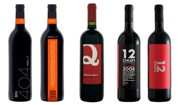
Graphic Design, Package Design, TypographyTypography, Packaging, Graphic DesignClick images to enlarge

I know it’s not wise, but I am definitely prone to choosing a wine based on its label rather than its vintage, mostly due to ignorance on the subject of fine wine, but also because as a graphic designer I am apt to go for the nicely designed label. And within the nicely designed label category, I am most likely to be lured by a nicely designed, typography-driven label.

Here is a small selection of mostly typographic wine labels that caught my eye on Lovely Package, Graphic Exchange, and, of course, FreshDirect.

Con la Tipo en la Cabeza:Type on the Brain

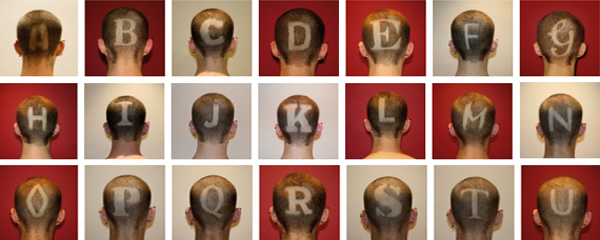
Typography, Type, Fonts, Shaved HeadTypography, Type, Shaved Head process, Alphabet, FontsCon la Tipo en la Cabeza is an ongoing project by Jesus A. Nieto (aka Cucho) a Spanish graphic designer currently based in Leeds, England. Literally, Con la Tipo en la Cabeza means With Type in the Head, but the expression probably translates more accurately (if not a perfect fit with the project) as With Type on the Brain.

Cucho inititated the project in July of 2009 as a typographic experiment to pay homage to different typefaces by initial as he discovered them entering the world of design. The only letters left to go? Y, Z and the trickier Ñ.

The typefaces:  A | Akzidenz Grotesk – B | Bauer Bodoni – C | Cooper Black – D | Din 1451 – E | Engravers – F | Futura – G | Gaseosa – H | Helvetica – I | Italian old style – J | Johnston underground – K | Kandal – L | Lucida Sans – M | Mistral – N | Neutraface – O | OCR-A – P | Palatino – Q | QuaySans – R | Rockwell – S | Stencil – T | Times New Roman – U | Univers – V | Verdana – W | Weidemann – X | Xylo

You can see the Univers ‘U’ in progress in the video below. All the letters are impressively well-rendered, considering the medium, even Mistral!

via Tago

Moderna Museet in Malmö

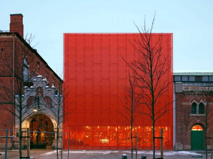
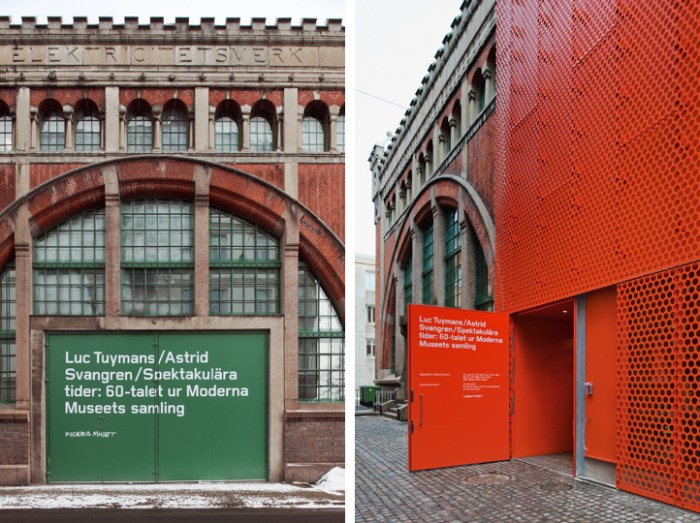
Stockholm art museum, modern architectureStockholm art museum, modern architectureModernaMuseet Malmo, stockholm art museum, architectureOne of the things that I truly enjoy, and gives me a little silly thrill, is seeing new architecture incorporated successfully with old. Coming across photos of the relatively new building for the art museum in Malmö, Sweden, Moderna Museet gave me said thrill.

Designed by Tham & Videgård Arkitekter in collaboration with Henirk Nygren Design and Stockholm Design Lab, the two latter involved in the interior design as well as branding and signage, the bright orange-y red box looks fabulous next to the older, classic brick buildings that seem to be part of the museum as well.

The handwritten logo which works beautifully large across the windows at the base of the box in the same color, is adapted from Robert Rauschenberg’s handwriting and famous signature.

via Stockholm Design Lab

Typographied Objects II

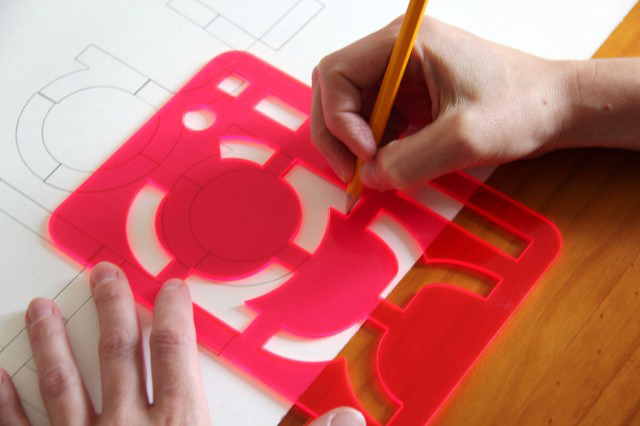
TypographyType, Letters on objects, TypographyClick to enlarge.

After the first roundup of objects that utilize typography, I’ve come across several more items, so here is a second roundup of typographied objects:

Clockwise from top image:
Jaume Plensa sculpture; Kern ring set; Architecture/Art Tie; Typography Soap; Type Sneakers; Saporiti Alphabet Bookcase; Hello Skateboard; Akzidenz Printed Fabric; WD Collections (wallpaper in 3 bottom pics); Ampersand Tee; Typography Tableware; Diego Grandi Lullaby Plate; Type Clock; Scrabble Type Pillows; Keenan Keeley Alphabet Lamp

Rose Nolan: Typographic Art

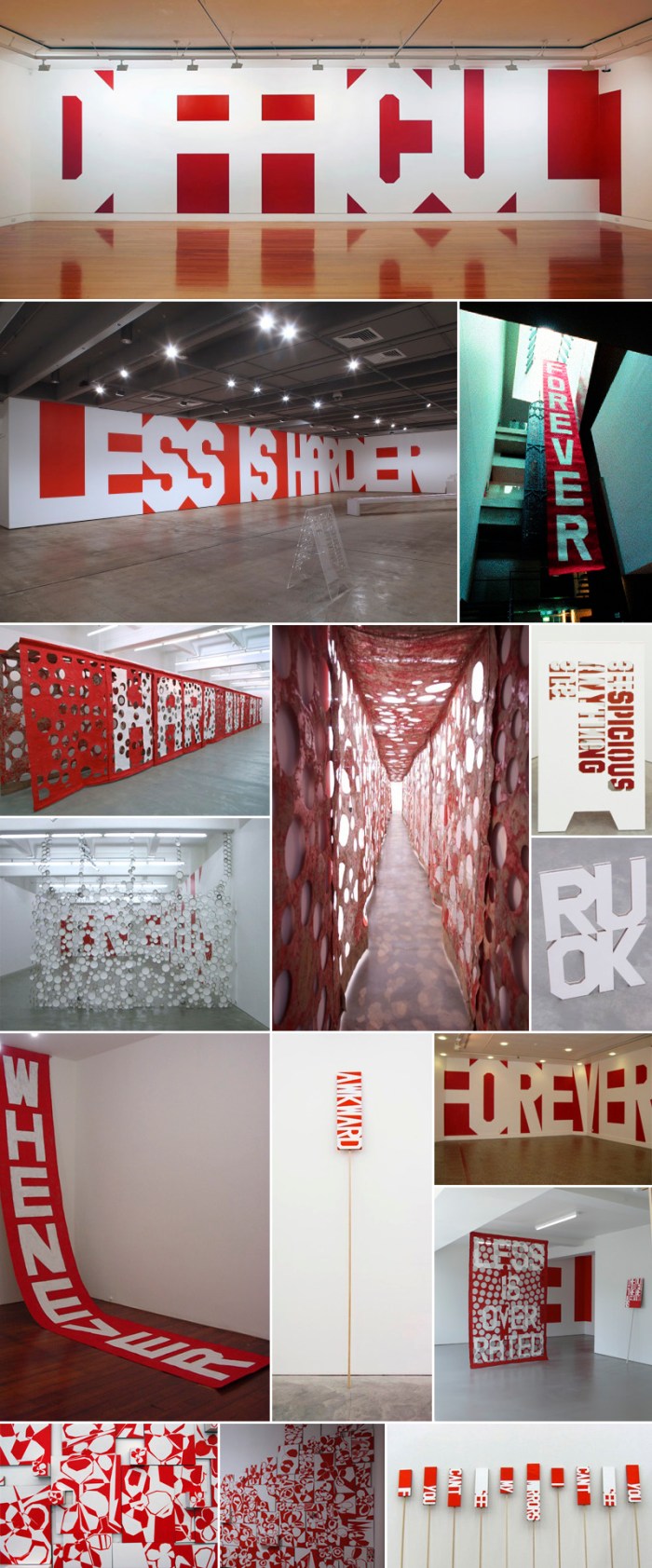
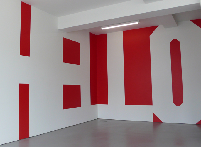
Rose Nolan collabcubed Typography Art InstallationsTypographic Art InstallationsTypographic Art InstallationsClick to enlarge

Australian artist Rose Nolan has been painting words onto walls, pennants, banners, and cardboard for 20 years. Her work is playful and oscillates between confident and self-deprecating, as well as bold and humble. Some seem to refer to herself and her reflections on what is art and what it is to be an artist.

Being a fan of type and especially large, bold type on a wall, this work is right up my alley. The red, Constructivist style only adds to its appeal, though I have to admit that the pennants and their humorous statements are also pretty great.

All photos courtesy the Anna Schwartz Gallery.

Camilo Rojas: Consumption

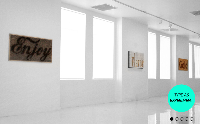
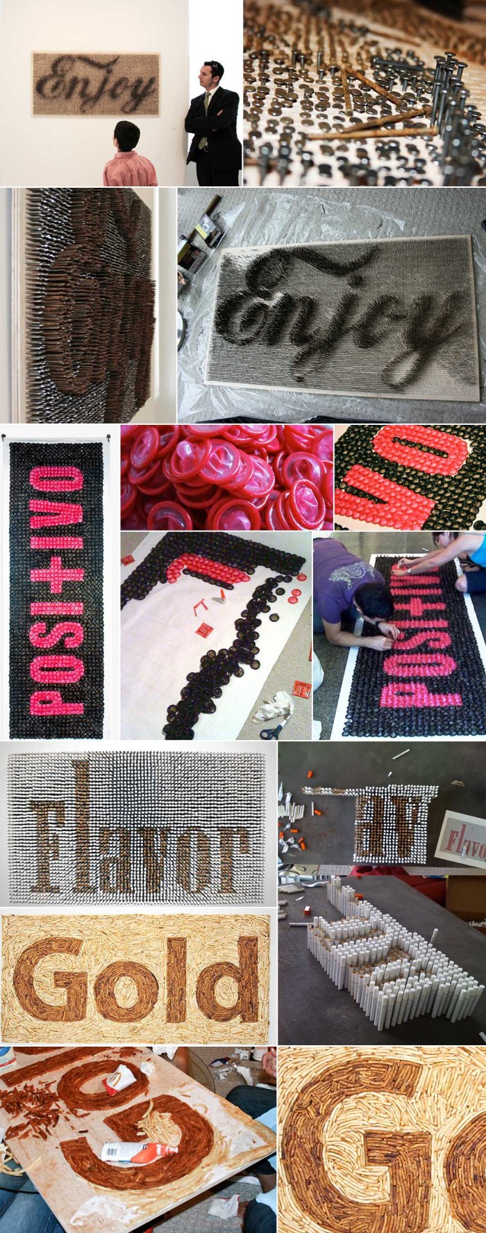
Camilo Rojas Type as Experiment CollabcubedTypography, Art made from cigarettes, fries, nailsClick to enlarge

Camilo Rojas and his Create Studio in Miami presented an installation of typographic messages using nontraditional methods in place of the more classic screen-print-on-paper style. Soda-rusted nails, condoms, cigarettes, and french fries were just some of the materials used to convey powerful statements, as well as raising awareness, about health issues such as obesity, lung cancer and STDs.

You can see the rest of them at his site.

via Quipsologies

Linotype: The Film

Linotype the FilmCalling all type lovers! I had the priviledge of hearing Doug Wilson, the director and producer of the upcoming documentary Linotype, speak at the BrandPerfect conference I attended a few days ago. He gave us a little history on the, now almost extinct, Linotype machine, as well as showed us the trailer and additional clips. Doug likes to put it this way: “The Linotype machine was basically the Twitter of the 1880s.”

From the site:
The Linotype completely transformed the communication of information similarly to how the internet is now changing communication again. Although these machines were revolutionary, technology began to supersede the Linotype and they were scrapped and melted-down by the thousands. Today, very few machines are still in existence.

Below is the trailer and you can follow screening locations and all other news on the film’s site, as well as help support the project by buying things in the shop. The film is slated for release by the end of 2011. Looks like a good one.

Black & White Graphic Posters

Graphic Design Black and White Posters Searching for specific things on Google images, time and time again I’m drawn to (and distracted from my search by) images that link back to baubauhaus.com, a website put together by two guys from Romania – Stefan Lucut and Andrei Don. Great name for a site and great content. These are just four posters from the Black and White section, but there’s so much more to see. It’s graphic designer heaven.

See it all here.