Architypeture: Part I

Architecture Typography Lentos Art MuseumClick images to enlarge
Left to right, row by row: Lentos Art Museum, Linz, Austria, Weber & Hofer Architects. Caltrans District 7 Headquarters, LA and Cooper Union, NYC, both Thom Mayne, Morphosis, typography on Cooper Union was done in collaboration with Abbott Miller, Pentagram. Parsons The New School for Design, NYC, Lyn Rice Architects; exterior awning photo: Michael Moran. Interior auditorium acoustic graphic photo: Noah Sheldon.

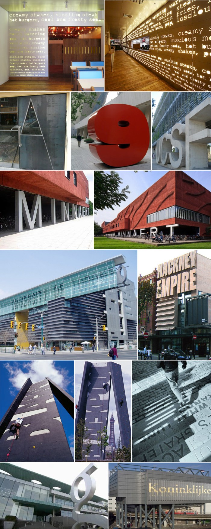
Architecture Typography Ali Tayar Thom Mayne Why Not Associates Chermayeff & Geismar

Click images to enlarge
Left to right, row by row: PopBurger, NYC, Ali Tayar, Parallel Design. The Alembic door, Oliver DiCicco. 9 West 57th St. sculpture, Chermayeff & Geismar. UCSF, University of California, San Francisco. Minneart Building, Utrecht University, The Netherlands, Neutelings Riedijk Architects. University of Toronto, Graduate Student Housing, Thom Mayne, Morphosis. Hackney Empire theater extension, London, Tim Ronalds Architects. Blackpool Climbing Tower, Blackpool, England, Why Not Associates with Gordon Young. Tam O’ Shanter Pub Steps in Ayr, Verse from Burns’ Whisky, Why Not Associates with Gordon Young. G Hotel, Ireland, Philip Treacy Architects. Koninklijke Bibliotheek (Library in The Hague, Netherlands), designed by Wim Quist (?).

Nothing really comes up when you google “architypeture” other than the recently scooped up domain name, but I’ve decided to use it here as the fusion of architecture and typography, especially when successfully and beautifully rendered. I don’t think there is a designated term for this, but there should be. Architypeture is possibly one of my favorite things, and I don’t do favorites lightly. This is Part 1 of two posts (the second will follow shortly) showing examples of typography wonderfully incorporated into architecture; in some cases on the exteriors of the buildings and in other cases, the interiors. All names and credits that I was able to find (mostly of the projects and architects, a few of the photographers) have been listed with their corresponding links. If someone knows any credits that have been omitted, please feel free to let me know in the comments.

(See Part II here)
MoMA Design Studio

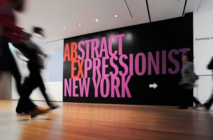
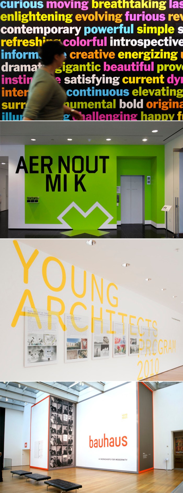
MoMA Design Studio Typography Super GraphicsMoMA Design Studio Typography GraphicsMoMA Design TypographyLiving in NYC and loving art and design makes the Museum of Modern Art (MoMA) a natural frequent destination for us. I have always appreciated the graphics in the museum but noticed in the past few years that they have become more prominent with a boldness and emphasis on typography that is hard to ignore in a good way. I have to admit to having been lured into the occasional exhibit based on the beautiful supergraphic on the wall outside, much in the way that I would pick up a book based on its beautiful cover.

The team behind the graphics is the MoMA Design Studio with Julia Hoffmann (who previously worked at Pentagram with Paula Scher) as the creative director, and whose work I’ve admired for years. Her presence along with the rest of the designers is definitely felt, from the museum’s walls to its printed materials. You should check out the studio’s site to see more of their fabulous work.

via swissmiss

Juan Astasio: 100 Smiles Project

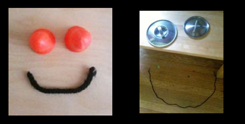
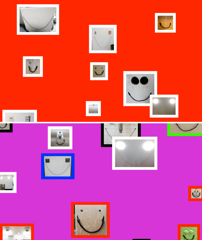
100 Smiles Project Graphic Design Student Yale100 Smiles Project Yale Graphic Design Michael Bierut ClassI saw the charming, funny, and smart Juan Astasio (who just finished his MFA in Graphic Design at Yale) speak last night at the AIGA Fresh Blood event. Many of Astasio’s projects combine a playful wit with an interesting interactive aspect. The photos above are from his 100 Days project (I believe this is a Michael Bierut assignment) called 100 Smiles. Juan made a smile a day from found objects, every day for 100 days and photographed each one. They have all been placed on a website and scroll to the song Always Look on the Bright Side of Life by Eric Idle.

The rest of his site is worth checking out as well. Some of my favorites include: Issues, a personal project showing our insensitivity towards powerfully disturbing images; One Minute of Silence Project where you can write epitaphs for things you’ve lost; and Weather Escapes.

Van Alen Books

Van Alen BookstoreClick to enlarge

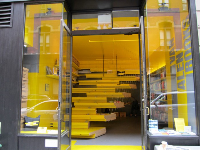
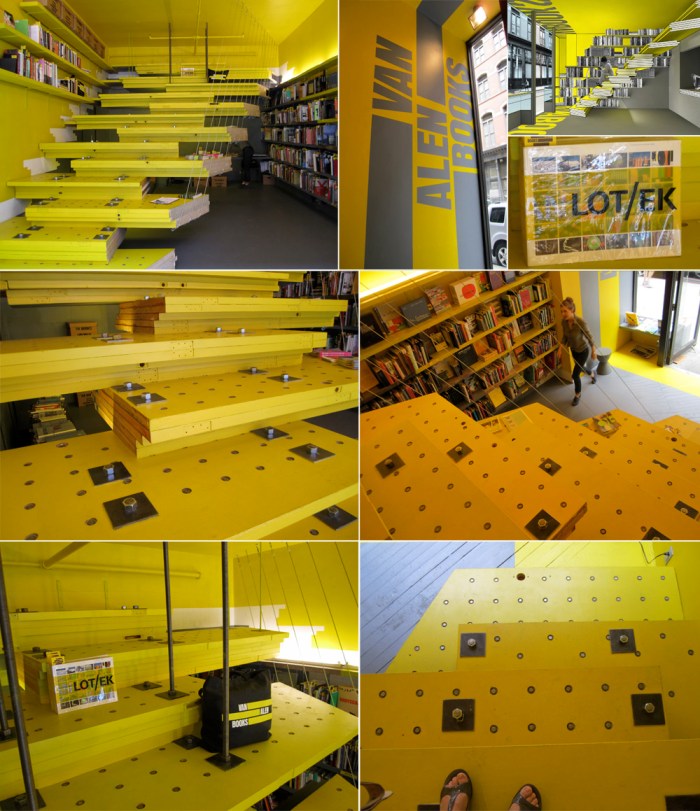
Walking over to Chelsea the other day, I happened upon this very eye-catching and unique storefront on West 22nd Street. Turns out it’s the recently opened Van Alen Books, a bookstore and public reading room devoted to architecture and design publications. Designed by the architectural firm LOT-EK (the same architects behind the design of many impressive container structures, among other projects), the small space is predominantly occupied by the dramatic steps/seats made of recycled doors (if you enlarge the photos you can see where the hinges and strike plates were) stacked and bolted together to form a triangular hanging platform which felt surprisingly sturdy when I climbed up. The delightfully welcoming and enthusiastic young woman at the store told me that there will be a lecture series starting this Wednesday and the steps will be used as seating for the audience, stadium style.

If you’re in NYC and interested in architecture or design (which is likely, if you’re reading this blog), this may be a place you’d like to visit. The lecture series schedule isn’t up on the website yet, but you can call the number on their site to find out more. Van Alen Books is located at 30 W. 22nd Street, between 5th and 6th Avenues.

SOFTlab

Click images to enlarge

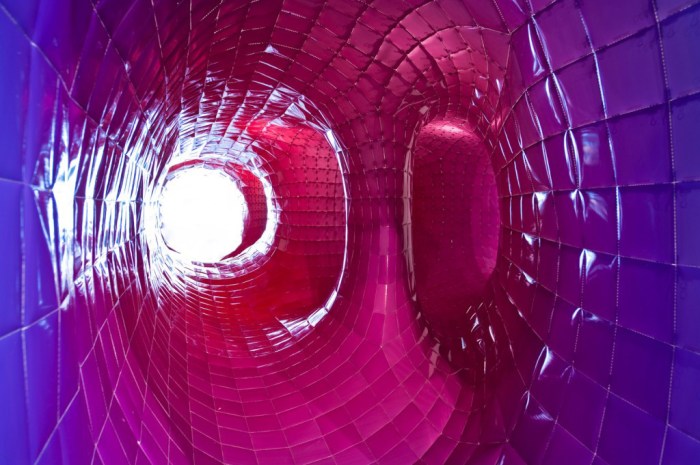
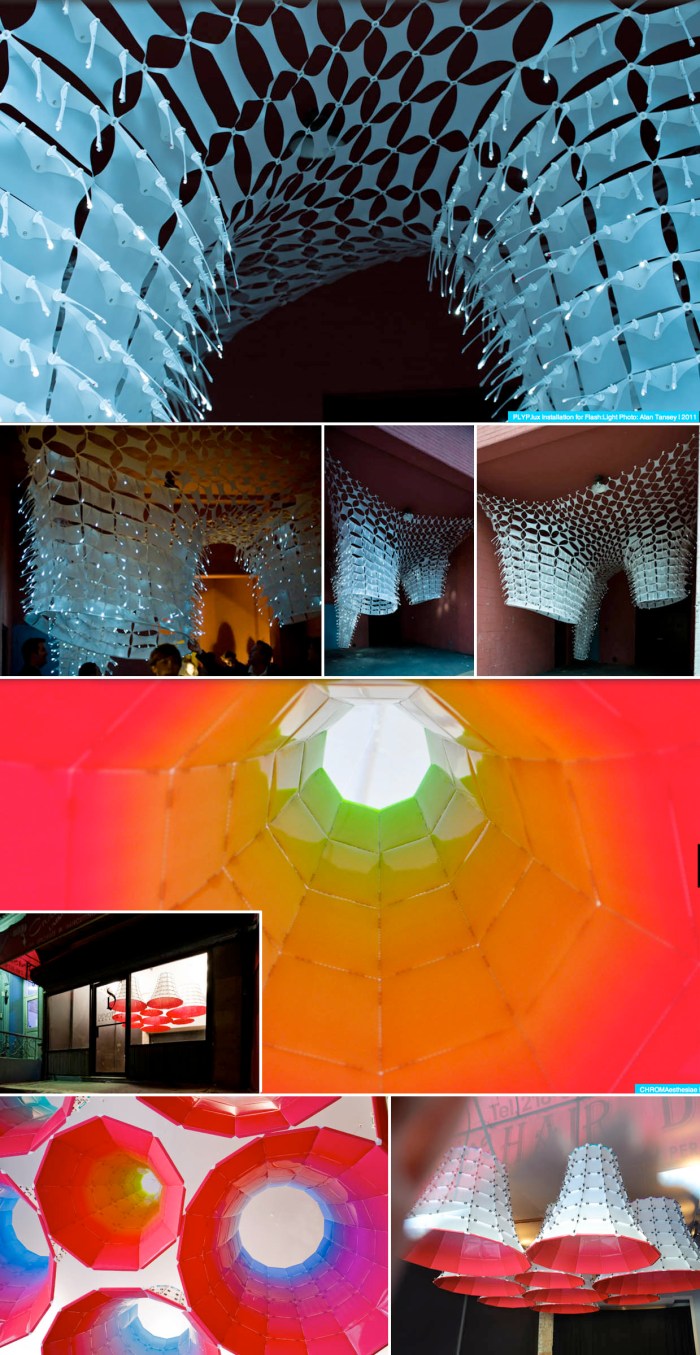
In my next life, I want to work at SOFTlab. These guys look like they have a great time doing everything they do. And what they do is everything. For them “a good idea does not discriminate between any medium or any type of project, it just works for everything.” That includes design of furniture, a website, a brand, a video, a gallery installation, a store display, and pretty much anything else that can be designed. Their approach is to make design customizable; it should allow for change, or growth, and be adaptable.

Just visiting their site is an immensely entertaining experience beginning with the computer animated video on their home page. Unknowingly, I was already familiar with (and a fan of) some of their work such as the colorful taped projection mapping of the New Museum as part of Festival of Ideas for the New City.

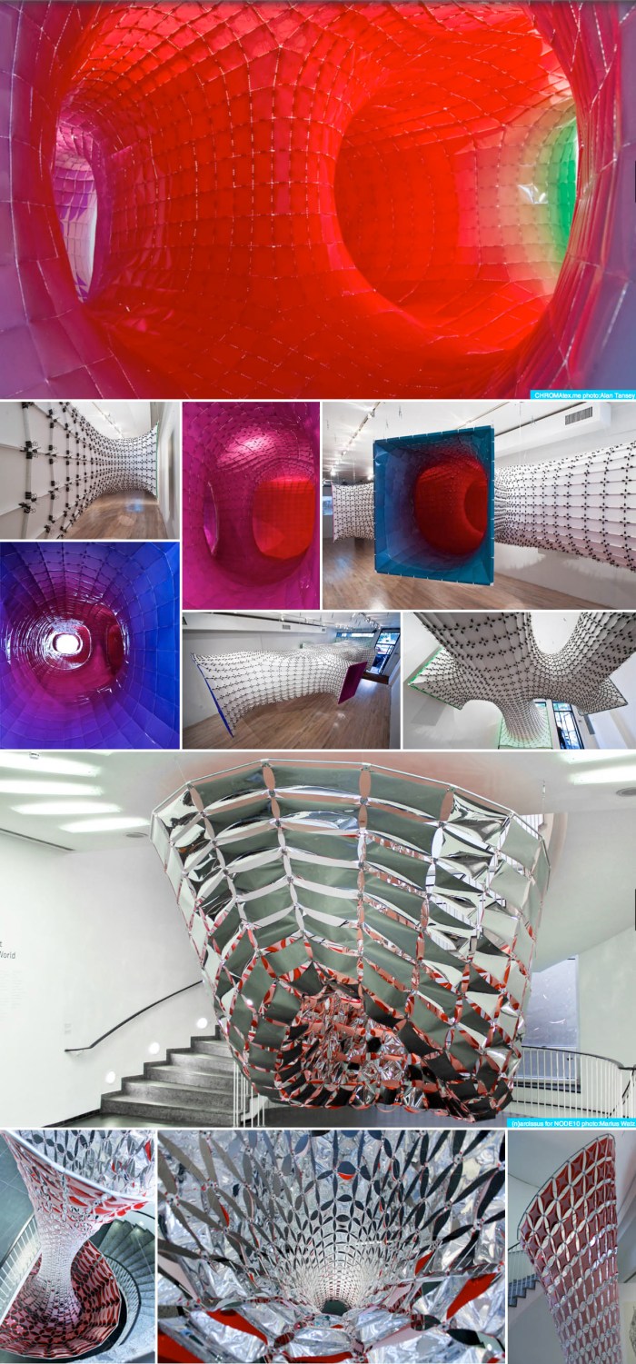
Above are just four of SOFTlab’s projects.
From top to bottom: CHROMAtex.me, a site specific installation for the bridgegallery, LES, New York. Photos: Alan Tansey
(n)arcissus, a site specific installation for NODE10 at the Frankfurter Kunsteverein in Frankfurt, Germany. Photos: Marius Watz.
POLYP.lux, a hanging installation for School Nite, part of the Festival of Ideas for the New City, NYC. Photos: Alan Tansey
CHROMAesthesiae, an installation for Devotion Gallery in Williamsburg, Brooklyn. Photos: Alan Tansey

There are plenty more interesting projects on their website.

via fourthfifthdesign

TypeClock

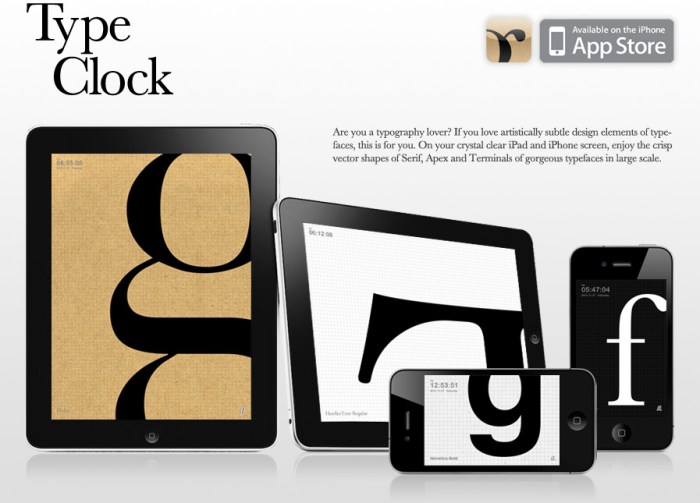
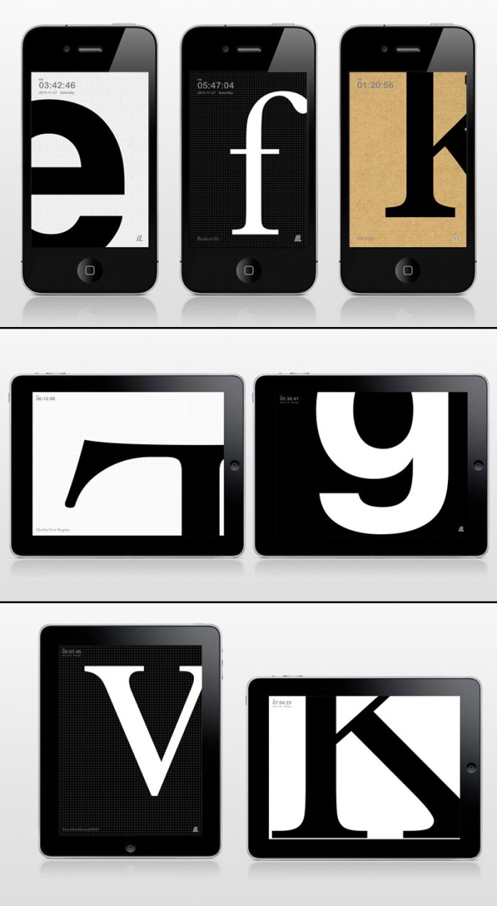
I met Dong Yoon Park on a typography tour of Staten Island last fall. Yes, strange but true. On the tour I had briefly chatted with him and he had shown me, on his iPhone, some of the things he was working on at Parsons as a grad student and teacher in their department of Design & Technology. Later, I visited his website and was really impressed with the rest of his work as well. Today I checked his site to see what he was up to and, sure enough, there waiting, was this lovely app for typography lovers! So simple and beautiful. What could be better than having a blown up letter of your choice on the screen of your phone or iPad?

From the iTunes AppStore:

Are you a typography lover? If you love artistically subtle design elements of typefaces, this is for you. On your crystal clear iPhone screen, enjoy the crisp vector shapes of Serif, Apex and Terminals of gorgeous typefaces in large scale. You can set own character set, type size and transition speed.

TypeClock can be purchased here for $0.99 and you can see more information here and a video here.

Junk Mail Art

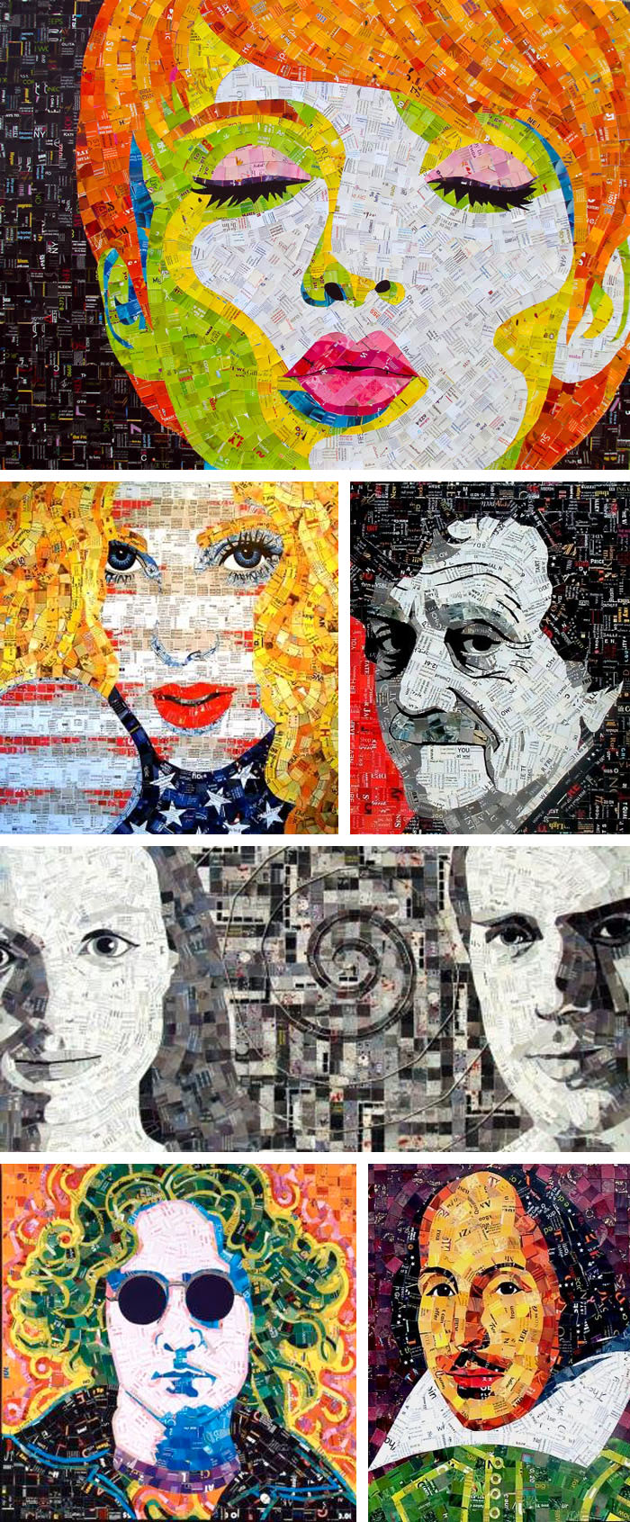
Next time you’re at the mailbox on the verge of throwing out all that junk mail, think again. Sandhi Schimmel Gold definitely does. Having studied mosaics overseas, Gold applied her knowledge to these works. By joining her disciplines of painting and mosaic with her belief in “utilizing resources that would otherwise go to waste” she has created this series of collages since 2006 which have been exhibited in shows with titles such as “Manipulated Mail” and “Recycled Art”.

Click images for more detailed view. See more at her site.

via aol news and illusion scene 360

Colored Vinyl Comeback

Colored Vinyl RecordsAfter a little googling, I discovered that colored records go back to some of the first records ever issued. In fact, the first wax records were yellow; I remember being fascinated by one that my mother owned when I was a child. Later, some 78s that were printed in multicolor swirls or splashes such as this one from 1923.

In the past ten years or so we’ve witnessed a resurgence of vinyl records, many of these seen as collectibles and possibly a good way for a small band to get visibility. Whatever the reason, I, for one, am enjoying their comeback from a design standpoint. Some of these artistically abstract colored vinyl records, from Brain Stowell’s flickr stream, are quite beautiful. More here.

via Graphic Exchange

NRM Project: New Role Models

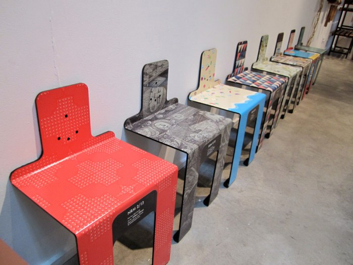
When Dan and I entered the ICFF satellite show, Model Citizens, in Chelsea last Saturday, we were greeted by a row of colorfully designed miniature seats. The NRM Project (New Role Models), of which these seats are a part of, is a movement by Mike Seto and David Kim of Click Boom Pow to “empower initiative”. The chairs have been distributed around Manhattan and Brooklyn without permission. The prints on them were donated by a variety of artists and designers including Milton Glaser and DALVA. The idea is to inspire good design as well as giving New Yorkers a place to sit, relax, and enjoy the art.

See more images of the chairs at their site.

The Heads of State: Book Covers

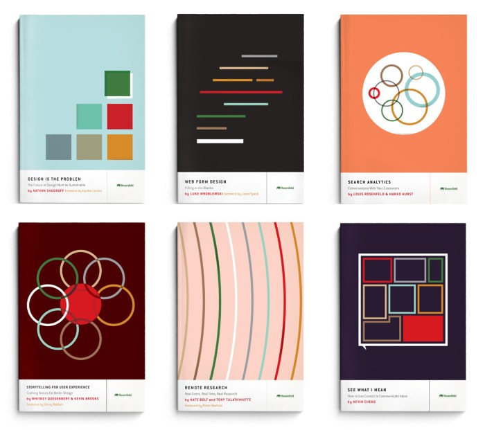
Rosenfeld Book Covers: Heads of StateA very enjoyable way to procrastinate and not get work done is to visit The Heads of State’s site. It’s incredible how much time I can spend looking at their posters. What I wasn’t aware of is that they design book covers as well. These covers for Rosenfeld Media, a publisher of user-experience design material, are just great. So simple, to the point, and graphically pleasing. They have a late 50s, early 60s aesthetic evocative of Paul Rand which I love, while feeling very much of the 21st Century as well.

Have some extra time? Check out their posters here.

Typographied Objects

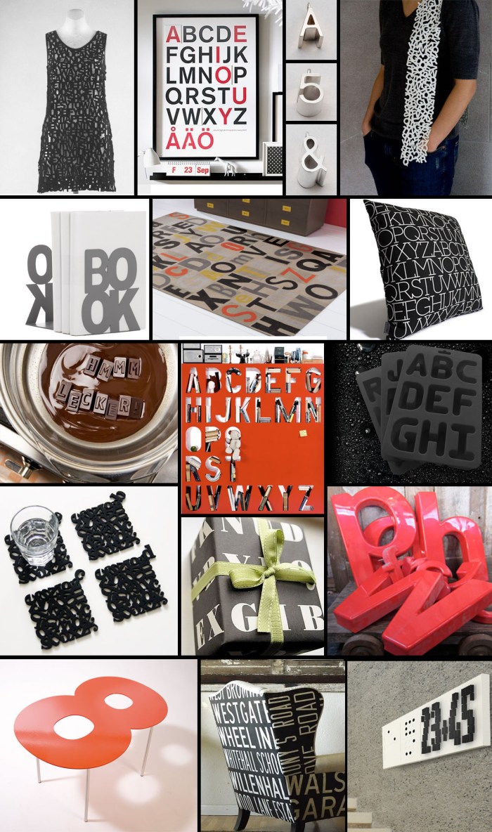
Typography ObjectsPretty much anything with nice typography is bound to catch my eye. And pretty much any object that uses typography as an integral part of its design is likely to win me over. Here are but a very few:

Clockwise from top left:
Typographic Dress at the Met
Alphabet Poster
Jacqueline Rabun Type Jewelry
Veer Character Scarf
House Industries Neutraface Pillow
Alphabet Ice Cube Trays

Red Plastic Letters from Etsy
Domino Clock
British Route Signs Chair
Fontables
Typography Coasters
Typolade Chocolates
Type Bookends
CB2 Letterpress Rug
Alphabet Bookcase
Letteroom Alphabet Eco Wrapping Paper

Cube Works

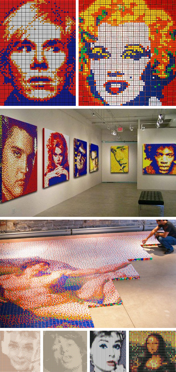
Cube Works PortraitsCube Works Studio is a Toronto-based collaboration of graphic artists who aim to repurpose common objects into complex pieces of functional art…and, obviously, they are a group of master Rubik’s Cubers to boot! Their large-scale works include images of celebrity icons as well as recreations of Pop Art pieces and classic works. Though they are most known for their Rubik’s Cube tableaux (which are created by twisting the cube to the desired configuration, not by taking them apart, in case you wondered,) Cube Works also features art created with dice (see two at bottom left) and spools of thread (see two at bottom right.)

via Illusion