Nils and Sven Völker: Captured

art installation, inflating foil, colored lights, collabcubedart installation, inflating foil, colored lights, collabcubedClick to enlarge.

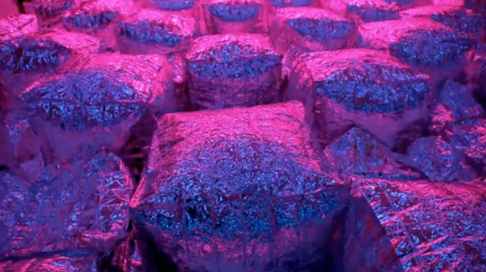
If you’ve ever popped some Jiffy Pop on the stove, it’s likely that that experience will come to mind while viewing Nils and Sven Völker’s recent installation, Captured: An Homage to Light and Air presented at MADE Space in Berlin.

The German brothers – Sven a graphic designer and Nils a machine artist (see our previous post) – collaborated by combining four walls with 304 framed graphic pages surrounding a field of 252 inflatable silver cushion-like air bags. The bags were programmed by Nils Völker to create sequences according to chapters of his brother’s “books on wall”. The inflating and deflating of the bags, along with the colored lighting system, create a very dramatic and intensified effect.

You can watch it in action below.

Christian DuCharme: Coffee Lamps

Chris DuCharme, cool lamps, coffee cups, filters, spoons, collabcubedChris DuCharme, cool lamps, coffee cups, filters, spoons, collabcubedClick to enlarge

A couple of days ago, on a nice stroll up from Canal Street, a friend and I spotted an interesting structure in the window of the very cute Lafayette Espresso Bar + Market. Going in to explore further, and have a tea while at it, turns out the large sea urchin-like object was a lamp made from 300 of the classic “It’s Our Pleasure to Serve You” coffee cups, cut into slim triangles. The artist/designer behind the lamp? The multi-talented Christian DuCharme.  Previously a set designer and window display artist, the Swiss designer from Zurich now works as an interior and accessories designer. And, well, he also makes lamps. Very cool ones at that.

The top four images are the 300 Cups Lamp, presently on display at the previously mentioned espresso bar in NYC. The lamp that follows is made from plastic coffee spoons, and the two photos below that are another lamp made from coffee filters. Amazing!

Two of Christian DuCharme’s beautiful bags are at the bottom of the photos. If you’re interested in purchasing Christian’s lamps or bags you can get in touch chrisducharme1@me.com.

Photos courtesy of Christian DuCharme.

Adidas Laces Signage: Turbocharged Type

Laces office building, Herzogenaurach, Germany, Typography, collabcubedLaces office building, Herzogenaurach, Germany, Typography, collabcubedLaces office building, Herzogenaurach, Germany, Typography, collabcubedLaces office building, Herzogenaurach, Germany, Typography, collabcubedClick to enlarge

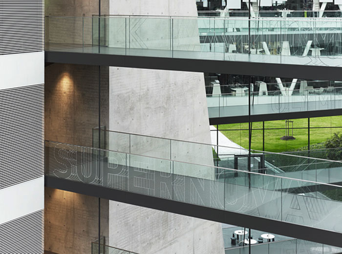
The new Adidas Laces R&D building at the corporation’s headquarters in Herzogenaurach, Germany, is Kada Wittfeld Architektur’s latest project. In addition to the innovative communicative architectural ‘laces’ theme with criss-crossing connecting walkways — a metaphor for the Adidas sports shoe as well as the networked communications of the corporation — the ‘turbocharged’ typographic signage system by Büro Uebele leaps across walls, doors, and handrailings throughout the center. Words identify places as well as becoming colored surfaces and sculptures.

From the press release:
The building forms a loop. Suspended walkways cross the atrium space, “lacing” the building’s structure together like the laces of a sports shoe. The walkways connect individual departments within the building complex, making for greater proximity and preventing the disruptive effect of people walking through offices. The signage system supports this concept, providing directions at hubs and intersections. The names of the meeting areas are displayed on the glass balustrades, creating a subtly mobile effect as visitors look across the atrium, helping them find their way. The corporate typeface, a variation on FF DIN, is dynamically varied here. The outlines of letters and arrows are shifted vertically and repeated rhythmically, creating a dynamic, sporty effect. The shimmering characters – for all the world as if frozen in time-lapse photography – are combined in varying patterns, offering the viewer a varied and distinctive echo on the “laces” theme.

Truly spectacular inside and out.

Photos: Werner Huthmacher & Christian Richters

via e-architect and typetoken

Bring to Light/Nuit Blanche 2011: Follow-up

Bring to Light Festival, nuit blanche, greenpoint, marcos zotes-lopez, eye, collabcubedBring to Light Festival, nuit blanche, greenpoint, marcos zotes-lopez, eye, collabcubedBring to Light Festival, nuit blanche, greenpoint, video, art installations, collabcubedClick to enlarge.

Last night, a night bookended by heavy rain showers here in NYC, fortunately offered a 2- to 3-hour precipitation-free window. Just enough time to ferry on over to Greenpoint and catch the Bring to Light Festival.

Though the ferry was quite empty, I was happy to see that the crowds obviously made it over by other means of transportation. It was one of those really nice NYC events, where everyone seemed so happy in sharing such a fun and unique experience. The brick and corrugated metal façades of the industrial warehouses on the Brooklyn waterfront made for the perfect backdrop and canvases for the various video projections and colorful light installations. There were over 50 works displayed, so naturally I can’t go over all of them here, and some I am not sure of the names or artists, but some of the highlights are pictured above starting with, possibly my favorite, a very Buñuelesque image:

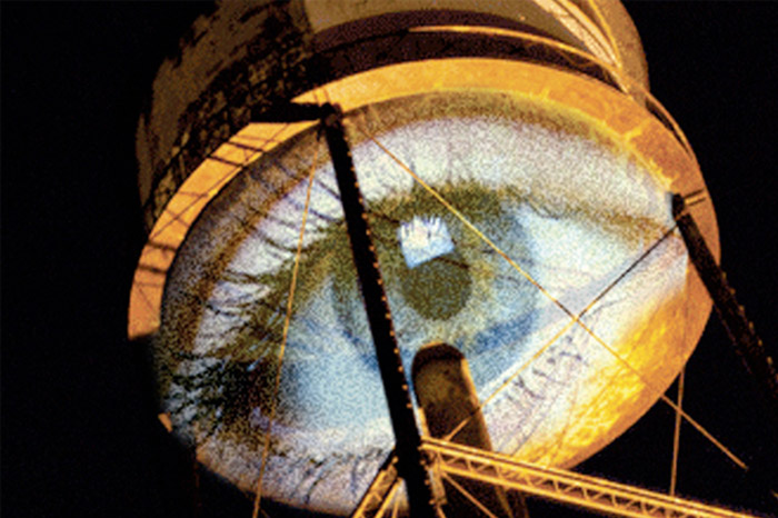
Marcus Zotes-Lopez’s CCTV/Creative Control TV; a projection of an eye on the bottom of a water tower looking over the crowds.
Devan Simunovich & Olek, Suffolk Deluxe Electric Bicycle.
Not sure of this but possibly Colin Snapp, Sylvania.
Jason Peters, Structural Light.
BOB, Columbia Architecture Students, inflatable structure (left and right pics, outside and in).
Glowing pedestrians walking around in self-made light costumes.
Not sure about the colored bulbs.
Camilled Scherrer, In the Woods, interactive projection converting people’s shadows into creatures.
Chakaia Booker, Shadows, silhouettes on installation.
Others include a bench with light emanating from the slats and a person lying down within (à la Vito Acconci): projections of hands morphing into latex gloves; a glowing lung-like object that breathed; and Raphaele Shirley’s Light Cloud on a Bender, a glowing mist sculpture.

It was all very bright, colorful, and animated. You can watch the short video clips below for a better sense of the atmosphere. Next year, I’ll at least hang a glow stick around my neck before heading over.

Top photo courtesy the artist, Marcus Zotes-Lopez. Second photo from Alix’s flickr. All other photos taken by collabcubed.

Centro Cultural Oscar Niemeyer

Oscar Niemeyer, Asturias, Aviles, Spain, Architecture, collabcubedOscar Niemeyer, Asturias, Aviles, Spain, Architecture, collabcubedClick on images to enlarge.

Brazilian architect Oscar Niemeyer is probably best known for his public office buildings in Brasilia, as well as the UN Building in NYC. A pioneer in using reinforced concrete for aesthetic purposes, emphasizing curves and contrasting volumes with empty spaces, Niemeyer donated the design for the Oscar Niemeyer International Cultural Center in Asturias, Spain in gratitude for having been awarded the Prince of Asturias Award of Art in 1989. The center opened this past spring, clearly thrilling photographers for the opportunity to take some beautiful shots.

Photos courtesy of Centro Niemeyer, Avilés, Spain, by Oscar Niemeyer, Photography by © Inigo Bujedo Aguirre, © David Busto Méndez, and enemigo_80’s flickr.

via e-architect

Andrei Molodkin: Transformer No. V579

Light sculpture, Light installation, Lumen, London, Art Sensus, collabcubedLight sculpture, Light installation, Lumen, London, Art Sensus, collabcubedLight sculpture, Light installation, Lumen, London, Art Sensus, collabcubedClick to enlarge

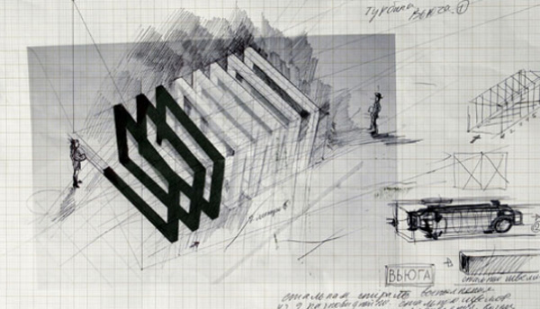
Oh how I wish I were in London to see this!  Russian artist Andrei Molodkin has created a site-specific installation titled Transformer No. V579. The exhibit consists of three galleries: the first, a monumental corridor of transparent acrylic tubes filled with light and oil; the second gallery, shows a video with details of the installation’s construction; and the last, is a ‘laboratory’ of drawings and photographs that outline the project’s development.

Visitors are encouraged to interact and walk through the six cubed modules and corridors. The effect of the bleeding oil and its glowing white light counterpart is reminiscent of blood coursing through the human body.

From the gallery’s site:
While the oil and light represent simple dichotomies of life and death, purity and greed, the dissimilar substances unite to highlight the interchangeability of these labels. Oil is both a natural substance of an ancient earth and yet the fuel of urban, technological and unnatural power. It is Molodkin’s intention that visitors will directly experience an unlikely physiological affinity to this substance and will find themselves « true revolutionaries » upon exiting the installation, « capable of achieving a variety of mutually exclusive goals »

Hard not to be reminded of my last trip to London and one my favorite light exhibits ever.

Transformer No. V579 will be on view at Art Sensus in London through December 17, 2011.

via ArtSensus and Frame

Stéphane Malka: Urban Study Installations

Malka Architecture, installations, art, BoomBox, Fury, Ame-lotMalka Architecture, installations, art, BoomBox, Fury, Ame-lotMalka Architecture, installations, art, BoomBox, Fury, Ame-lotThis is where the line between art and architecture blurs. French architect Stéphane Malka started as a graffiti artist in his younger life. Through that experience Malka discovered the city and its untapped potential. He has a strong taste for ‘soft’ resistance and lives in continuous quest for abandoned spaces that offer the possibility for “creating new urban vitality.”

Consequently, Stephane Malka has amassed an impressive body of work, from installations and other completed projects, to elaborate studies and proposals for urban projects, to impressive competition entries. The similar theme throughout his work includes reuse and reappropriation of materials; recycling the existing without additional processing.

Above are his most recent projects.

From top to bottom: Boombox Space Invader, Moscow; Boombox-luz, Barcelona (with light projections); Ame-Lot On the Blind Walls, Paris (a study on housing and avoidance of deconstruction but rather superimposing interventions onto built buildings.);  The Temple of Fury for NYC, a study for an installation made of Reebok Fury Insta-Pumps. A criticism of today’s excessive consumption and desire over need.

via archdaily

X-TU Architects: Social Housing in Paris

X-tu architects, social housing, Paris, modern architecture, collabcubedX-tu architects, social housing, Paris, modern architecture, collabcubedClick to enlarge.

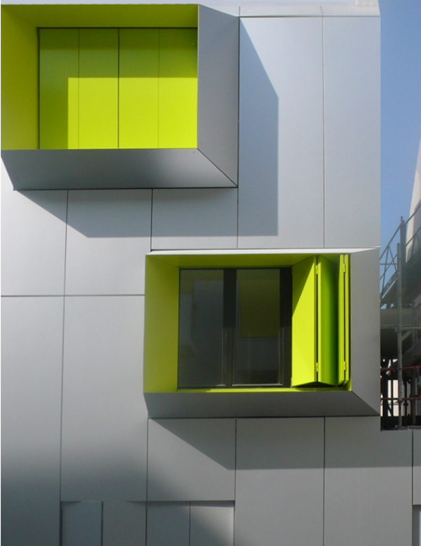
French architects X-TU have designed a building for social housing on rue Marcadet in Paris. The modern structure is clad in a soft gray aluminum skin, with (seemingly) randomly placed boxed extrusions lined in bright green that frame the windows. In addition to the windows that project off the façade, there are smaller ones that lie flat within the aluminum. The result is a contemporary, bright building with coordinating bright green interiors in the mailroom and entrance staircase, as well as in the tiled bathrooms. And, of course, the bright green folding shutters, both within the exterior boxes and lying flat against the building’s skin.

The building is thermally insulated as per the new regulations and has solar panels placed on the roof, so clearly X-TU architects have taken sustainability into consideration…thus adding even a little more ‘green’ to the project.

via miesarch

IBM THINK Exhibit at Lincoln Center

IBM Think, interactive screen, digital wall, IBM100, data visualization, collabcubedIBM Think, interactive screen, digital wall, IBM100, data visualization, collabcubedIBM Think Exhibit Lincoln centerClick to enlarge.

Today, my dad and I went to explore the new IBM THINK Exhibit at Lincoln Center here in NYC. We were greeted at the entrance by the very familiar (my father is a retired longtime IBMer) ‘THINK’ logo, still looking fresh today in the same slab serif type that I remember from the 1960s.

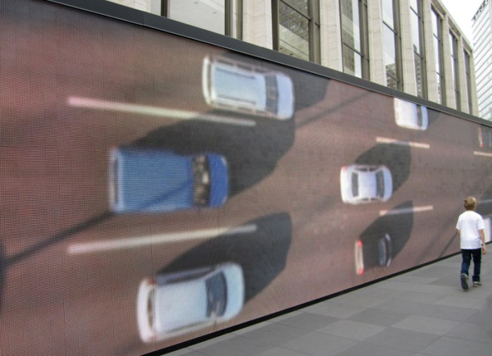
The exhibit is in celebration of IBM’s 100th anniversary and illustrates – via multimedia – the possibilities that science and information technology offer to ‘make the world work better.’ Beginning with its 123-foot digital visualization wall which streams real-time data from the surrounding Lincoln Center area with respect to traffic, air quality and water consumption, to its interior 12 minute immersive film, which then converts to multi-panel interactive walls mostly displaying the changes in science, technology and comparisons in the way we display information in the past and today.

It’s all beautifully executed. The Data Wall, in particular, is mesmerizing. Designed by the transmedia studio Mirada (started by director Guillermo Del Toro) in conjunction with a team of mostly faculty and graduates of the UCLA Department of Design Media Arts who designed the software, it’s a perfect example of art and science merging; animated infographics at their best. Also quite lovely, are the print exhibition graphics throughout the exhibit that are clearly a nod to the great Paul Rand.

The IBM THINK Exhibit is on the inclined Jaffe Drive at Lincoln Center through October 23, 2011. It’s hard to miss the spectacular digital wall from Broadway.

Kane Cali: Glass Ripples

glass sculpture, rippled layered glass, malta design weekglass sculpture, rippled layered glass, malta design weekglass sculpture, rippled layered glass, malta design weekClick to enlarge.

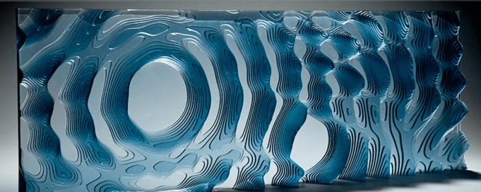
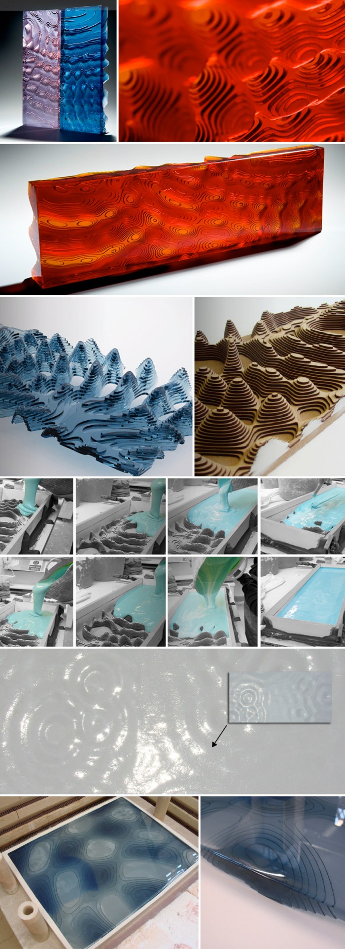
British artist Kane Cali has always been fascinated by nature, especially through the eyes of science. He embraces all that new technologies have to offer and creates with them as well as with more traditional methods. His most recent work utilizes 3d modeling and glass. Whether the effect of colliding droplets or ripples in milk, Cali translates these into impressive glass sculptural landscapes in rich color tones, some translucent and some opaque.

Check out his glass Dot Portraits as well.

via malta design week

Keith Sonnier: Light Installations + Sculptures

Light sculptures, installations, lumen, architecture, collabcubedLight sculptures, installations, lumen, architecture, collabcubedLight sculptures, installations, lumen, architecture, collabcubedClick to enlarge.

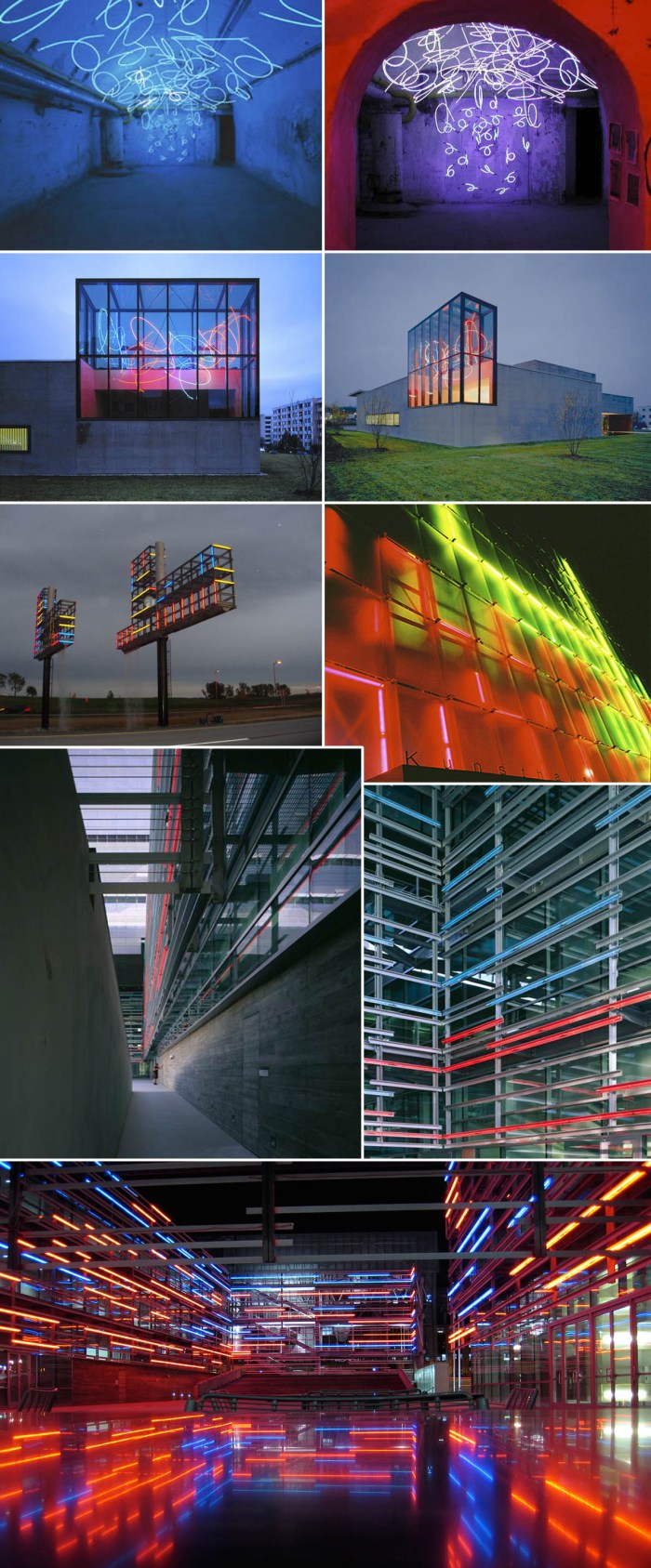
Originally from Louisiana, Keith Sonnier has been working with fluorescent light bulbs and neon since the late 1960s. He has many series of light sculptures with different names such as ‘Ba-O-Ba’,  ‘Sel’, ‘Blatt’ and ‘Chandelier’ each with its own distinctive style and twist. Some more minimalist and geometric, while others busier and loopy.

In addition to his extensive sculptural work, Sonnier has created many installations over the years in public spaces including working with architects such as Morphosis on the Caltrans headquarters building in Los Angeles, an installation in the Lever House, and others in various airports.

Quite the body of beautiful work.

Photos courtesy of Keith Sonnier, Mary Boone GalleryNational Gallery of Australia and the Ace Gallery. All of which are sites where you can see more of Sonnier’s work.

Chrome Hotel in Kolkatta, India

cool hotel design, kolkatta, india, mod, hospitality design, collabcubedcool hotel design, kolkatta, india, mod, hospitality design, collabcubedcool hotel design, kolkatta, india, mod, hospitality design, collabcubedClick to enlarge

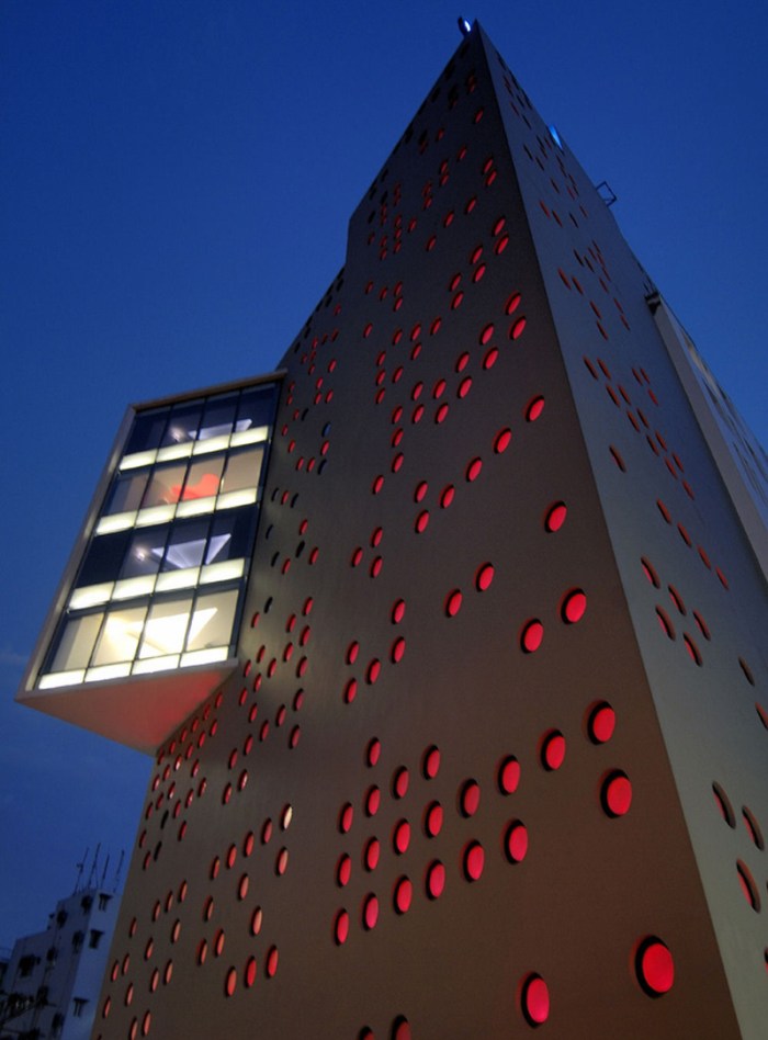
Continuing with Sanjay Puri Architects (I told you I liked their work), the Chrome Hotel in Kolkatta, India looks like a hotel I’d enjoy checking out if I were to be in Kolkatta one day. The circular cutout windows in the skin are arranged in a graphic pattern and are deliberately created in an opaque glass to allow the interior public spaces to have an ambiance of their own, allowing only the light to come through and not the view. In addition, the windows are shaded by concrete fins that surround them which offers privacy as well as acting as a heat barrier, reducing the amount of air conditioning necessary to cool the hotel by a quarter.
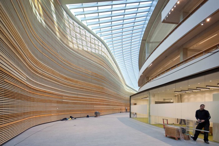
The hotel was designed so that each space has its own distinct identity: the sculpted free flowing entrance lobby, the abstract design of the restaurant, a variety of room designs and the fluid shape of the bar offer the guest a series of experiences. Personally, they had me at polka-dotted façade.

Triose: Sanjay Puri Architects

contemporary architecture, India, retail design, collabcubedmodern architecture, lonavala, india, collabcubedSanjay Puri Architects in India were recently shortlisted for the LEAF Awards 2011 on their Triose building in Lonavala, India.

This dramatically angled, folded concrete skin structure houses a few retail shops, a food court, two restaurants, a large bar and an entertainment gaming area. The building is comprised of three volumes that jut out from the core circulation section that interconnects them. There are several trapezoidal windows, including the large balcony area that cantilevers out offering an impressive view from one of the restaurants housed in that section. In fact, the sculptural quality of the building integrates the external surroundings seamlessly with its interiors throughout the edifice.

It’s well worth checking out the rest of Sanjay Puri’s work. Very interesting architecture that pushes boundaries. You can visit their site here.

via e-architect

Michelangelo Pistoletto: Serpentine Gallery

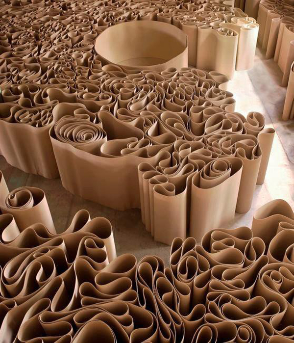
Installation, Mirror of Judgement, London, Contemporary ArtInstallation, Serpentine Gallery, London, Contemporary ArtInstallation, collabcubed, Contemporary Art, cardboard mazeA leading figure in conceptual art, Italian artist Michelangelo Pistoletto has combined several elements from previous works to create the site-specific installation The Mirror of Judgment at the Serpentine Gallery in London. In the labyrinth of corrugated cardboard one comes upon sculptures/objects that include a Trumpet of Judgement, a Buddha, and a prayer kneeler, to name a few. Pistoletto says the gallery is like a temple – in a spiritual sense, not religious – where we come up against the mirror and are meant to judge ourselves.

From the gallery’s website:
Pistoletto’s exhibition will draw visitors through the galleries, leading them via a winding maze to hidden installations and sculptures. Responding to the architecture of the Serpentine galleries and using an economy of materials, the exhibition will manipulate visitors’ perceptions of space, making them an integral part of the work itself.

The exhibit runs through Saturday, September 17th, so if you’re in London, rush on over and check it out!

via Serpentine Gallery

Photos courtesy of: Serpentine Gallery, Galleria Continua; Politicus; Sebastiano Pellion; Bertrand Huet; and Oak Taylor-Smith. ©2011 Michelangelo Pistoletto

BP Refinery in Rotterdam

Group A Architects, Rotterdam, Refinery, Atrium, contemporary architectureGroup A Architects, Rotterdam, Refinery, Atrium, contemporary architecturecollabcubed, Rotterdam, Refinery, Atrium, contemporary architectureClick to enlarge.

It may not be PC to feature an oil refinery, especially BP’s with its recent history, but we’re here to talk about design and this is a rather stunning structure. Designed by Dutch architects Group A in Rotterdam, this 10,500 square meter building takes into consideration sustainability and safety in addition to aesthetics.

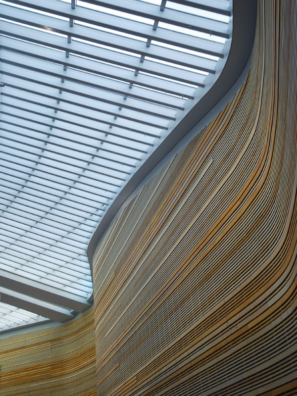
The beautiful and dramatic curved glass atrium wasn’t without its challenges. To keep the costs down, rectangular glass panels were used in as few different sizes as possible. By using the geometric primitive of the cone the architects were able to bend and twist the roof while the panels remained normal rectangles within a structure of tapered aluminum and steel profiles.

The building is hidden in an artificial dune which adds to the dramatic look as well as helping to meet safety requirements.

From the Group A:
On the north side the building is hidden in a new artificial dune, while it appears to be ‘crawling’ out of the dune on the south side. By embedding the building in the landscape, safety measures against the explosion hazard posed by the refineries are being met with. The head office is a dynamic expression of the connection between landscape and building mass.
The dune is also actively and dynamically part of the interior. A large atrium is situated between the offices and the dune. The efficient and flexible offices can be connected to each other, and open up towards the atrium, creating a dynamic and interactive environment.

The expansive timber clad wall enhances the presence of the dune landscape on the interior of the office. The varying wood tones echo the qualities of rock and sand formations. At the same time, the curved front facade emerges from the artificial dune, while the grassy hill hides the building from the road.

via The Archhive

Just Fold It by Kutarq

room dividers, partition, architectural, pleated, contemporary designroom dividers, partition, architectural, pleated, contemporary designKutarq, a multidisciplinary firm led by Jordi López Aguiló in Valencia, Spain, has just come out with an interesting design for a room divider. “Just Fold It” is flexible, easy to assemble and disassemble, and the individual models fold compactly making them convenient to store or transport. The length of the screen can be adjusted by adding or subtracting the number of modules. Perforations on the surface increase stability by counteracting wind resistance in addition to varying the porosity which creates a nice visual effect that varies depending on the angle and distance from which it is viewed.

Be sure to check out the rest of Kutarqs products and projects on their site.