Jenny Holzer: I Stay

Jenny Holzer typographic LED installation in Sydney, Australia, May 2014, I StayJenny Holzer typographic LED installation in Sydney, Australia, May 2014, I StayJenny Holzer typographic LED installation in Sydney, Australia, May 2014, I Stay
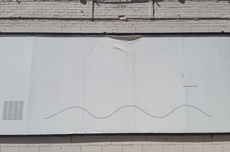
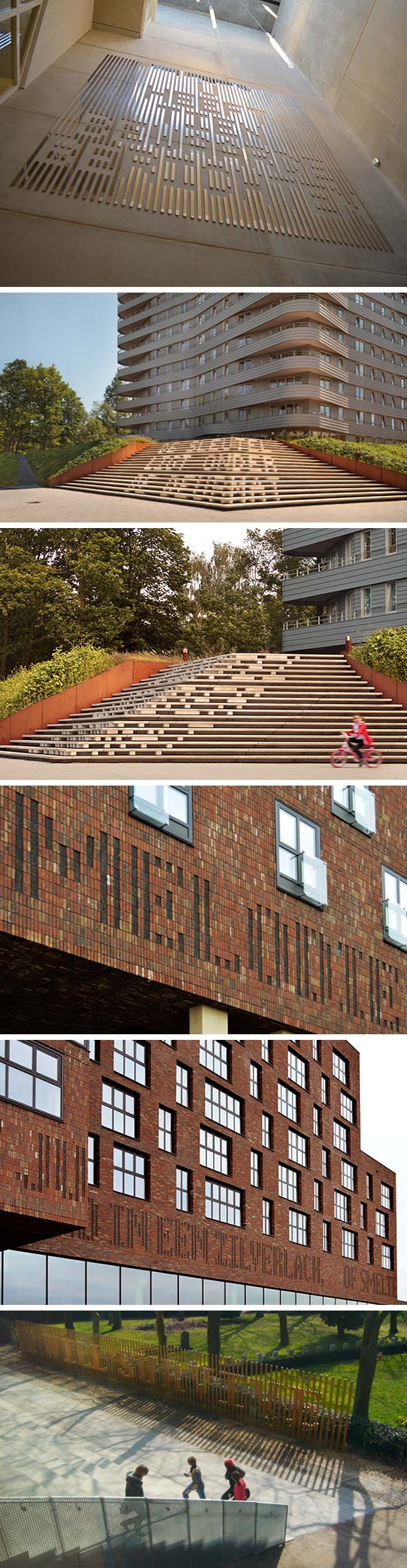
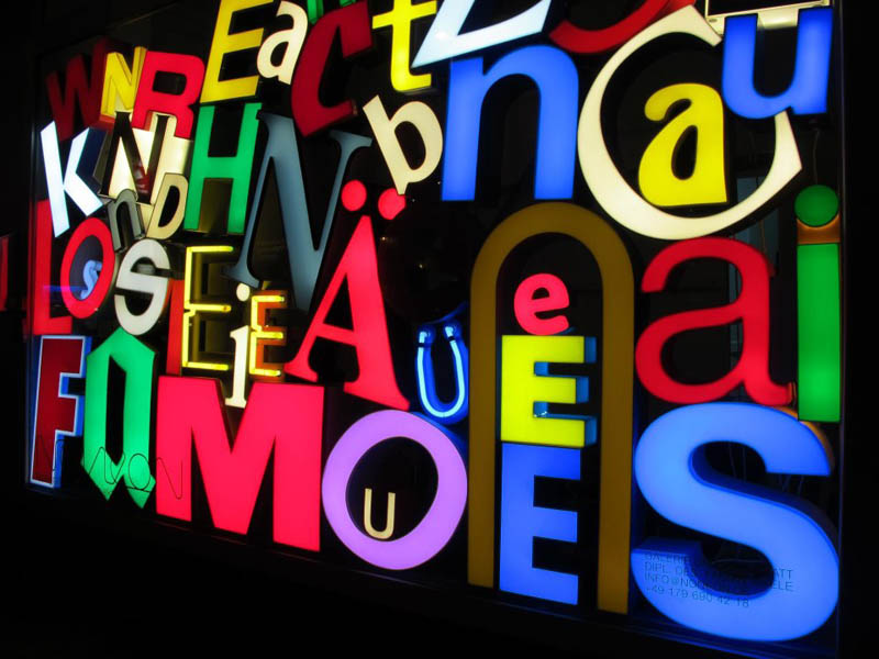
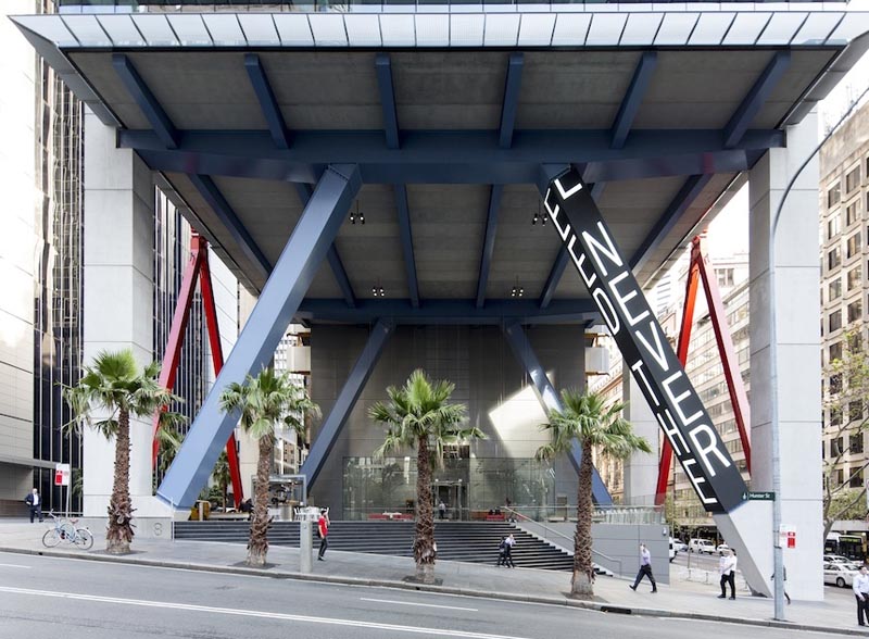
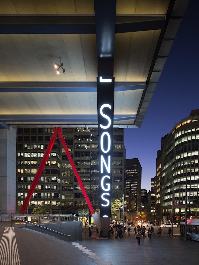
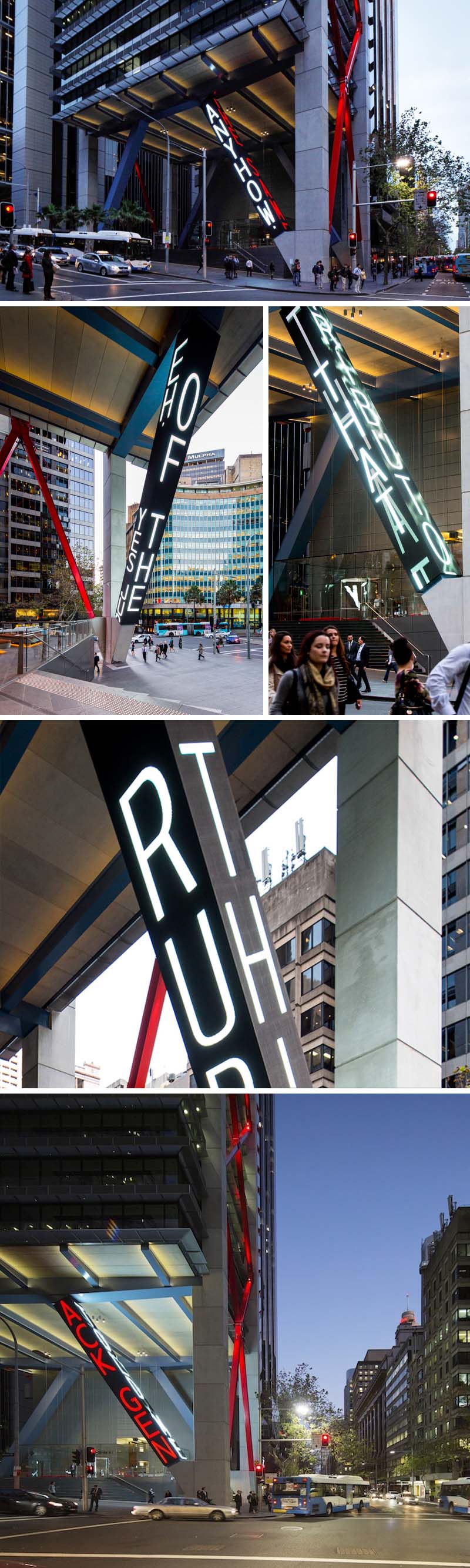
New York based artist Jenny Holzer (previously here) recently unveiled her newest typographic LED installation in Sydney. I Stay (Ngaya ngalawa), as the permanent site-specific installation is titled, takes over all four sides of one of the 19-meter steel columns beneath 8 Chifley Square. Globally recognized for a body of work that is responsive to history and place through language that speaks to the community, Holzer has chosen texts by numerous Indigenous authors. They span the past century and represent a broad range of sources. Some are poems, some are songs, and some much longer texts. This site-specific work enlivens what was essentially a concrete wind-tunnel, providing a human, emotional, and political focus to the corporate building and neighborhood through the use of blue, green & red diodes vertically streaming its words.

Photos: Brett Boardman


Holzer, who is globally recognised for a body of work that is responsive to history and place with language that speaks to the community – See more at: http://www.illumni.co/landmark-artwork-sydney-jenny-holzer-unveiled-8-chifley/#sthash.dUR2HG0n.dpuf

Concrete Poetry: Karl Holmqvist

Concrete Poetry, Visual Poetry by Karl Holmqvist, West Village, Gavin Brown's Enterprise, murals, street art, typographic street artConcrete Poetry, Visual Poetry by Karl Holmqvist, West Village, Gavin Brown's Enterprise, murals, street art, typographic street artConcrete Poetry, Visual Poetry by Karl Holmqvist, West Village, Gavin Brown's Enterprise, murals, street art, typographic street artThe past few weeks I’ve spent quite a bit of time in the West Village and occasionally found myself on streets I hadn’t visited in a while. One of these was Leroy Street over by Washington where I came across three typographic murals, or, more accurately, concrete poetry, on the exterior of Gavin Brown’s Enterprise Gallery. It’s hard to explain the happy feeling playful or stylish or clever typography instills in me. That might be because it’s not really logical, it’s just an emotion. It goes as far back as my childhood when the IBM logo or the Design Research logo (and store in general) had a similar effect on me. Even the subway graffiti, not the black tags all over the interior of the cars that created a gloomy feel, but the occasional spectacular tag on the outside of a train car, large, colorful, and with dimension, would inspire me to run home and title my French homework “FRENCH” in block letters or bubble type, much to the dismay of my teacher who probably could have done without the header altogether but, at a minimum, I’m sure would have preferred it read “FRANCAIS”.

Anyway, back to the Concrete Poetry. Defined as “poetry in which the typographical arrangement of words is as important in conveying the intended effect as the conventional elements of the poem, such as meaning of words, rhythm, rhyme and so on,” another term for it is Visual Poetry. After a little research I discovered that these street pieces were created by Swedish artist Karl Holmqvist who is known for his text-based works, poetry, and readings. I don’t claim to know what these mean, but I enjoyed them and the surprise of turning a corner and seeing them there. Make of them what you will.

BoaMistura: Pensar/Sentir (Think/Feel)

Boa Mistura, University of Isthmus, Panama City, Typographic Mural with students, Think/Feel, Pensar/Sentir, anamorphosis, typography, street artBoa Mistura, University of Isthmus, Panama City, Typographic Mural with students, Think/Feel, Pensar/Sentir, anamorphosis, typography, street artBoa Mistura, University of Isthmus, Panama City, Typographic Mural with students, Think/Feel, Pensar/Sentir, anamorphosis, typography, street artA recent project at the University of Isthmus in Panama City by one of my favorite Spanish art collectives, Boa Mistura (previously), engaged the architecture and industrial design students. Invited to give a two-week workshop, the artists worked with the students to create a design using their signature anamorphic style which was then executed by the students. Seeing the university as a Ciudad del Saber (City of Knowledge) they created a type mural on the side of one of the campus buildings that reads pensar (think) from one angle, and sentir (feel) from another; two key elements in obtaining knowledge.

All images courtesy of BoaMistura

Shurong Diao: Hair Alphabet

Hair Alphabet by Shurong Diao, Type made with hair, Chinese calligraphy style, typographyHair Alphabet by Shurong Diao, Type made with hair, Chinese calligraphy style, typographyHair Alphabet by Shurong Diao, Type made with hair, Chinese calligraphy style, typographySchool of Visual Arts design student Shurong Diao decided to link Chinese calligraphy to the Roman alphabet by substituting black ink on rice paper with long black hair…and when I say “long” I mean crazy-long (photoshopped long?) hair. Every letter of the alphabet has been created and there are even a few words thrown in. Maybe not the most practical typeface, but kind of fun.

via étapes

Martijn Sandberg: Image Messages

type messages hidden in architecture by Martijn Sandberg, Typography, Architecture, Cooltype messages hidden in architecture by Martijn Sandberg, Typography, Architecture, Cooltype messages hidden in architecture by Martijn Sandberg, Typography, Architecture, CoolDutch visual artist Martijn Sandberg creates Image Messages in public spaces as well as in paintings and sculpture. He explores the tension between text and image, legibility and illegibility, public and private domain. In his site-specific public artworks throughout The Netherlands, Sandberg plays with the material bearing the image which in turn camouflages the message from certain angles, and exposes it from others. “Image is message is image.” Whether created using bricks on a building facade, tiles on a floor surface, concrete staircases, or a wooden fence, there’s a trickiness to all of Sandberg’s work that both challenges and amuses the viewer. And as if that weren’t enough, the messages themselves are often chuckle-worthy, such as in the third photo down in what looks to be brass strips: “U Heeft Tien Bewaarde Berichten” which translates as “You Have Ten Saved Messages.”

via filemag

Motoko Ishii: Visual Music

Motoko Ishii, typography, music as typography, visual music, School of Visual Arts, Radio Head lyricsMotoko Ishii, typography, music as typography, visual music, School of Visual Arts, Radio Head lyricsMotoko Ishii, typography, music as typography, visual music, School of Visual Arts, Radio Head lyricsSVA design student Motoko Ishii used what looks like cassette tape or reel-to-reel audio tape to create a visual interpretation of Radiohead’s song Last Flowers. The project was done for Olga Mezhibovskaya’s typography class at the School of Visual Arts, and this particular assignment, titled Visual Music, invites students to select a piece of music of their choice and express it with the tools of typography. Nice assignment and beautifully executed, down to the serifs, by Motoko.

via graphis

Cornea Ti: FH Mainz

Cornea Ti, Luminale 2014, FH Mainz, Light, sound and type installation, cool artCornea Ti, Luminale 2014, FH Mainz, Light, sound and type installation, cool artCornea Ti, Luminale 2014, FH Mainz, Light, sound and type installation, cool artThe Frankfurt based Luminale 2014  — one of the world’s largest and most renowned light festivals — concluded this past weekend. As per usual, there were many impressive installations this year including Cornea Ti, a collaboration between Interior Architecture students from the School of Design Mainz and Ensemble Modern Frankfurt. Consisting of three connected containers that formed a sort of interactive stage, visitors would step through the amorphous tunnels triggering the many integrated LEDs hidden within the walls of the structure with their movements. In addition to the movement, sound caused the light to change, illuminating letterforms that would transform and morph into anagrams, only visible from the perspective of the audience. I haven’t been able to make out any words myself in the video below, but I sure do like the effect.

via luminapolis

Corsage/Boutonniere Redux: Daniela Gilsanz

Corsage and Boutonniere by Daniela Gilsanz, fun alternative to the classic for prom or other events, jewelry, accessories for prom, fun gift itemCorsage and Boutonniere by Daniela Gilsanz, fun alternative to the classic for prom or other events, jewelry, accessories for prom, fun gift itemSpring is fast approaching (like, tomorrow…yay!) and along with the lovely season come school proms, weddings, and other formal occasions where the purchase of a corsage or boutonniere may be warranted. If you’d like to deviate from the classic floral variety, we’ve got Daniela’s clever Corsage/Boutonniere bracelet/pin combos right here. Be the talk of your event and the envy of every type-crazed participant (surely there’s at least a couple in any crowd) when you and your date show up donning these fun pieces. Limited supply so order soon…

Michael Goodward: Sculptural Humor

Michael Goodward, humorous sculptural objects, Me compass, typography, contemporary artMichael Goodward, humorous sculptural objects, Hair brush made with hair,, contemporary artMichael Goodward, humorous sculptural objects, contemporary artSwitzerland-based, British artist, Michael Goodward makes art “with a serious smile and a wry mind.” His humorous sculptures and installations are eclectic and a manifestation of the curious way he occupies his time with anything that is remotely connected with the nature of being and man’s perception of the world within and around him. Themes such as death, religion, and existence are represented through the artist’s view. And if the works themselves don’t make you break into a smile automatically, some of the titles sure will: the Me compass which is also referred to as sartresample 1; the curiously literal hairbrush is titled Something or Other; the pie at the bottom is Humble Pie; and the S/M arty-pants with their nails penetrating areas that might want to avoid nails, definitely should evoke a chuckle, if maybe one combined with a wince.

via saatchi

Shelley Jackson: Snow Story

Shelley Jackson writes words in the snow to create a story on instagram, typography in snow, nycShelley Jackson writes words in the snow to create a story on instagram, typography in snow, nycShelley Jackson writes words in the snow to create a story on instagram, typography in snow, nycIt’s been, and continues to be, a long and relentlessly snowy winter here in NYC this year, but Brooklyn-based author/illustrator Shelley Jackson is making the best of it. With admirable handwriting, Jackson has set out to writing a story in the snow—one word at a time—photographing each one and posting them to her instagram. Reading from oldest photo to newest, you can follow the ongoing story, waiting with bated breath for the next words to appear. Photos, it seems, are posted in relatively large batches roughly once a week, so maybe you can get a sentence or two in at a time. Story aside, the photos themselves are lovely, with great composition and a splash of color here and there. This is not the first time Shelley Jackson has taken to story-telling a word at a time; SKIN, a story published in tattoos on the skin of 2,095(!) volunteers is a previous project.

You can follow SNOW (in reverse order) over here, “weather permitting”, but from the looks of things outside, that shouldn’t be an issue…this could end up being a multi-volume story.

via gothamist via the awl

NONEON: Fabian Thiele

Noneon, recycled sign letters converted into lights by Fabian Thiele. FrankfurtNoneon, recycled sign letters converted into lights by Fabian Thiele. FrankfurtNoneon, recycled sign letters converted into lights by Fabian Thiele. FrankfurtI certainly know where I’ll be headed if I find myself in Frankfurt. NONEON is a small shop/gallery run by designer Fabian Thiele who has been collecting letters from old signs and fixing them up, making them into lights, all, apparently, affordable to boot. Just seeing these piles of illuminated type makes me happy. The shop is only open on Fridays and Saturdays so, if this appeals to you next time in Frankfurt, make sure to plan accordingly. Recycling at its best.

via luminapolis

Blaqk: Greg Papagrigoriou & Simek

Blaqk Greg Papagrigoriou and Simek Athens street art, typography, calligraphy, black and whiteBlaqk Greg Papagrigoriou and Simek Athens street art, typography, calligraphy, black and whiteBlaqk Greg Papagrigoriou and Simek Athens street art, typography, calligraphy, black and whiteBlaqk is a collaboration between Athens-based design duo Greg Papagrigoriou and Chris Tzaferos who goes by Simek. Their street art mixes geometric forms with typographic letterforms—much of which is calligraphy. Whether black on white or white on black, on gallery walls, building façades, or abandon lots, their graphic style definitely pops. You can see much more of their work on their site.

via IdN

Audra Hubbell: Letters at Large

Letters at Large by Audra Hubbell, Large projections of letters with cool effects against architecture. Photographs. TypographyLetters at Large by Audra Hubbell, Large projections of letters with cool effects against architecture. Photographs. TypographyLetters at Large by Audra Hubbell, Large projections of letters with cool effects against architecture. Photographs. TypographyClick to enlarge

I love everything about Chicago-based designer Audra Hubbell‘s project Letters at Large. For starters, it’s type. Large type at that. Then the combination with architecture and the effect of each on the other is pretty fabulous. Somewhat reminiscent of Jenny Holzer’s Projections, but here it’s all about the one letter as opposed to text. Hubbell unleashes full-scale typography in public spaces as a visual research project exploring the interaction between projected large scale letterforms and the urban Chicago surroundings. Wouldn’t it be great if the poster set were available for purchase.

via behance

Mégaphone: Moment Factory

interactive led type facade, Montreal, Megaphone by Moment Factory, typographyinteractive led type facade, Montreal, Megaphone by Moment Factory, typographyinteractive led type facade, Montreal, Megaphone by Moment Factory, typographyClick to enlarge

This past fall, up until last month, Mégaphone, an interactive installation, occupied the Promenade des Artistes, in the heart of Quartier des Spectacles in Montreal with the intention of reappropriating public space. The installation, designed by Moment Factory, invited visitors to gather and explore the fun side to public speaking. Using a megaphone participants could speak out, their words transformed in real time into images projected onto the façade of the University of Quebec in Montreal (UQAM), leaving their visual “footprint” on the urban landscape. Inspired by the city’s early 20th-century history of popular assemblies as well as the 19th-century British tradition of the Speaker’s Corner, the installation gives everyone a chance to speak out and air their concerns. Visual effects of waves, scribbles, and distortions were generated by voice recognition software designed by the Computer Research Institute of Montreal. Certainly a crowd pleaser for all ages as seen in the video below:

via eg

Moving Icon: Kalhöfer-Korschildgen

Moving Icon Pop-Up Pavilion in Westphalia, Germany by Kalhöfer-Korschildgen. Pavilion communicates HistoryMoving Icon Pop-Up Pavilion in Westphalia, Germany by Kalhöfer-Korschildgen. Pavilion communicates HistoryMoving Icon Pop-Up Pavilion in Westphalia, Germany by Kalhöfer-Korschildgen. Pavilion communicates HistoryClick to enlarge

Moving Icon is a mobile pop-up pavilion designed by Cologne-based Kalhöfer-Korschildgen that travels around the Westphalian region of Germany providing its visitors with information on local architectural history. The compact house-like mini-museum attaches to the back of a car and, with the click of a remote control, literally ‘pops’ open transforming into a lovely illuminated pavilion. The exhibit includes both analogue and digital displays and incorporates typography into its structure and signage in a clever and designy manner. The display is interactive and can be customized for any location.

Photos by Jörg Hempel

Hot Tea: Banksy Tribute & More

Hot Tea Yarn-bombing Banksy Tribute, East 4th St, NYC, BanksyNYC, street art, typographyHot Tea Yarn-bombing Banksy Tribute, East 4th St, NYC, BanksyNYC, street art, typographyHot Tea Yarn-bombing Banksy Tribute, East 4th St, NYC, BanksyNYC, street art, typographyClick to enlarge

Minneapolis-based street artist—and NYC frequenter—HOT TEA is known for his yarn-bombing typography, usually found on—but not limited to—chain link fences & telephone poles. Most often the words HOT TEA are geometrically spelled out, seemingly interlocked in three dimensions. I’ve run into several of his pieces over the past couple of years around NYC, one in Soho, another Nolita, and DUMBO as well. A couple of weeks ago, shortly after Banksy finished his month-long scavenger-hunt-like show Better Out Than In around the city, I came across a tribute to the reknowned street artist by, I assume, HOT TEA, though this speculation is based soley on style. The piece, which was on East 4th Street, was gone in less than 24 hours replaced with a real estate sign by the owners of the empty lot where the work stood. I’ve looked around to see if this Banksy tribute appeared anywhere online, including HOT TEA’s flickr, but so far nothing. Earlier in the fall, HOT TEA created his largest site specific piece to date with over 1600 knots and 800 pieces of yarn installed on the Williamsburg Bridge walkway. You can see the installation in the video below:

Top two photos: collabcubed. All others courtesy Hot Tea’s flickr.

Gooyesh Language Institute: Ali Karbaschi

Gooyesh Language Institute, Contemporary Iranian Architecture, Typographic exterior facade and gates, Ali Karbaschi architect, Cool building exterior with alphabet cutoutsGooyesh Language Institute, Contemporary Iranian Architecture, Typographic exterior facade and gates, Ali Karbaschi architect, Cool building exterior with alphabet cutoutsGooyesh Language Institute, Contemporary Iranian Architecture, Typographic exterior facade and gates, Ali Karbaschi architect, Cool building exterior with alphabet cutoutsClick to enlarge

I definitely get a kick out of seeing typography integrated into architecture (hence the multiple Architypeture posts) and this building in Isfahan, Iran is no exception. Designed by architect Ali Karbaschi, the Gooyesh Language Institute’s curtain wall is clad with almost a crossword-y look of, ironically (or not so ironically, being a language institute), Latin letters on all sides as well as cut out of its steel entrance gates. As far as I can tell, the letters are purely decorative and don’t spell anything out, but I wasn’t able to find any information on the project, other than its location, architect, and that it was built a little over a year ago. Looking closely, it would appear that in some areas the oreder of the letters in the rectangular panels adhere to the alphabet, but then suddenly a ‘W’ appears sandwiched between an ‘E’ and a ‘G’, so there goes that theory. In any case, it looks particularly attractive lit up at night, wouldn’t you say?

via Contemporary Architecture of Iran