Claire Fontaine: Matchstick Art

matchstick art, burned, Consumption commentary, French contemporary art, collabcubedmatchstick art, burned, Consumption commentary, French contemporary art, collabcubedmatchstick art, burned, Consumption commentary, French contemporary art, collabcubedClaire Fontaine is a Paris-based collective artist who lifted her name from a popular school notebook brand. Her work often looks like other people’s work and she defines it as ‘readymade art’. Working in several mediums including neon, video, sculpture and painting as well as text, Fontaine’s works comment on the “political impotence and the crisis of singularity that seem to define contemporary art today.”

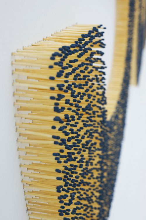
In the two recent works above, Fontaine used matchsticks both new and burnt on the word Consumption and on the Map of France: Burnt or Unburnt.

Images courtesy Helena Papadopoulos Gallery and Air de Paris.

via arte al dia

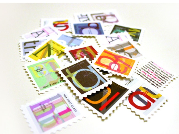
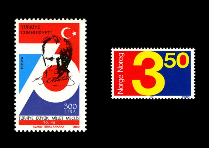
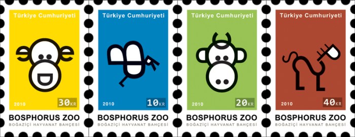
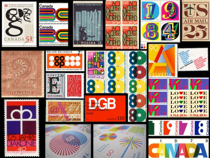
Typographic Stamps

typography, stamps, postage stamps, mail, letters and number designtypography, stamps, postage stamps, mail, letters and number designtypography, stamps, postage stamps, mail, animals made of typetypography, stamps, postage stamps, mail, letters and number designClick to enlarge

I’ve been collecting typographic stamps online for a couple of months; just filing them whenever I came across one. Unfortunately, I didn’t always make a note of where I found them, so my apologies for not crediting all sources. Some of the sources, however, include:

Jung Min for the stamps at the top of the post, Onur Aydin for the Turkish type animal stamps (third set of photos down), Karen Horton’s flickr, Abduzeedo, Gavin Potenza, and Timbre Serrones. Also, the French Postal Service, Dutch Postal Service and Canadian, though I can’t find the correct links.

Hello Wood Festival 2011: Ebéd

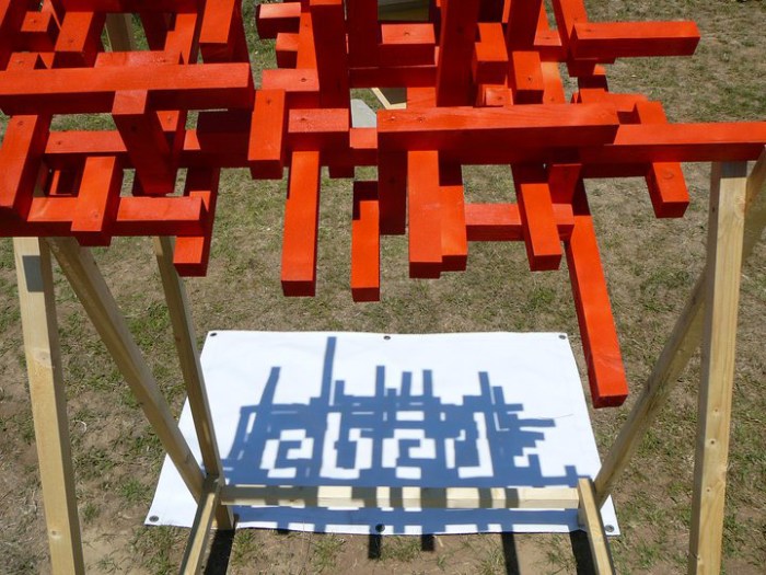
Wood Festival, Budapest, typography, type, lunch, shadowWood Festival, Budapest, typography, type, lunch, shadowWood Festival, Budapest, typography, type, lunch, shadow, sculptureWhat appears to be an abstract wood sculpture made up of a cluster of two-by-fours painted red, is exactly that for 23 hours out of the day. The sculpture, created as part of the Hello Wood Festival in Budapest this past July, was one of the three “typography team” projects (there were architecture teams and film teams too) made by students from Hungarian Universities. Titled Ebéd (‘lunch’ in Hungarian), this structure was designed to form the word ‘ebéd’ in a pixelated font, using the rays of the sun to highlight it in the negative space of the shadow precisely at 1pm: lunchtime! The rest of the day the sculpture showed a random system of shadows. Very clever, I’d say.

The team was led by graphic artist Áron Jancsó, with team members, Krisztina Bogó, Péter Magda, and Gabriella Karácsonyi.

Photos courtesy Hello Wood’s facebook page.

Some Guy: Works on Paper

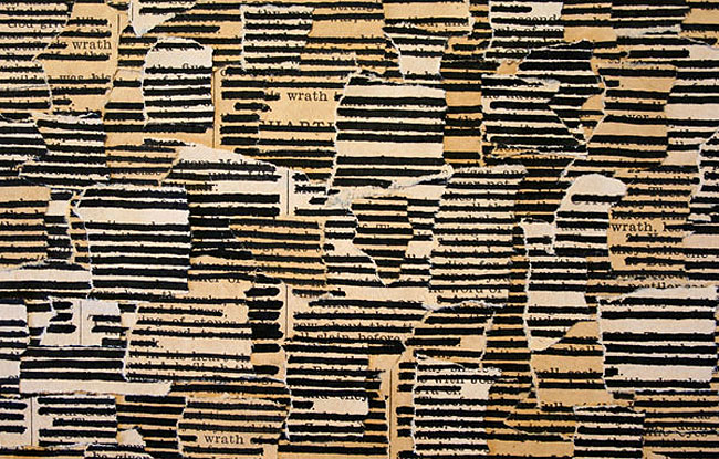
book text collages, redacted text, someguy, Brian Singerbook text collages, redacted text, someguy, Brian Singerbook text collages, redacted text, someguy, Brian SingerSan Francisco artist Brian Singer, who goes by Some Guy, explores the printed word using books and their pages with whiteout or ink in his Works on Paper.

From the artist’s statement:
I’m exploring the printed word as a visual representation of information, attempting to uncover new meaning in what is slowly becoming an outdated form. Crossing out the entirety of a written text while exposing only selected words changes the perception of the original message. Revealing word frequency adds another layer and opens new paths to understanding.

Reminiscent of Jenny Holzer’s Redaction Paintings, Some Guy is actually doing the opposite by focusing, in some cases, on words that might be offensive or censored in well known texts. I like everything about these, from the concept to the texture  (as well as the typographic aspect), if a bit obsessive in nature.

From top to bottom:
Knowledge 172, Wrath 198 and detail; 9 Unicorns and detail; 212 Slaves and detail; The Catcher in the Rye and detail; Love, Evil see video below.

Also interesting are Some Guy’s mixed-media pieces, made from flyers stapled to telephone poles that have been weathered and rusted and reassembled into collages including his Bullseye Triptych commissioned by Target.

You can watch the short version video of Love, Evil — the full video is 30 minutes long — the King James Version of the Bible with all words crossed out except ‘Love’ and ‘Evil’.

Some of Some Guy’s Works on Paper can be seen as part of the Transmit exhibit at den contemporary in Los Angeles through December 23, 2011.

Typography in Providence

typography, type, rug, Brown University, Pembroke Hall, collabcubedtypography, type, rug, Brown University, Pembroke Hall, collabcubedtypography, type, Brown University, RISD, Rhode Island School Design, collabcubedClick to enlarge

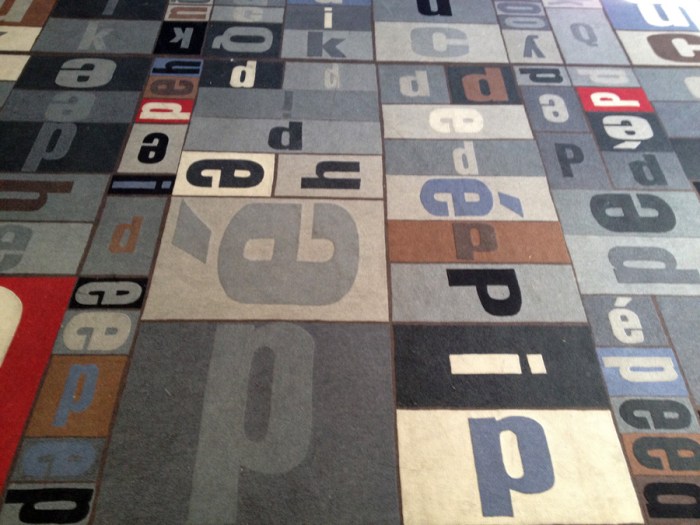
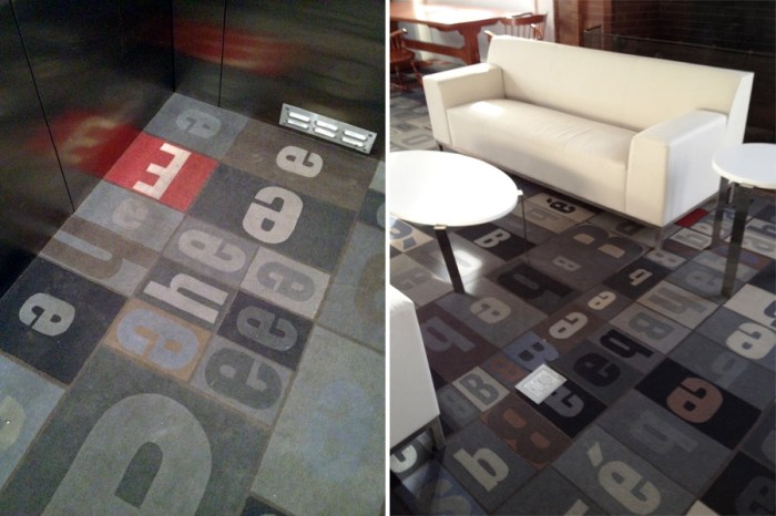
Providence, Rhode Island holds a special place in our hearts being that two out of the three of us are currently living there the majority of the year. Not surprisingly, the importance placed in design on both campuses where Em and Dan attend, is evident from Brown’s new Granoff Arts Center designed by Diller Scofidio + Renfro, to the RISD Museum of Art designed by Jose Rafael Moneo. What are nice as well, are the little surprise design elements you suddenly come upon on both of these adjacent schools. Typography, one of our favorites for example, is nicely incorporated and used decoratively on both campuses. Strolling around on a recent visit we spotted some of these. I wasn’t able to find information on all of the designs, but have included what I did obtain.

From top to bottom:
Typography carpet in Pembroke Hall, Brown;  Decorative type panels on the sides of the bleacher seating area and behind the librarian desk at Rhode Island School of Design (RISD) Library, designed by Office dA; Portfolio Café at RISD; Sciences Library floor numbers at Brown, designed by Warner Burns Toan & Lunde Architects.
All photos by Emma/Collabcubed except two grand hall shots of RISD Library courtesy Office dA.

Micheline Branding by Anagrama

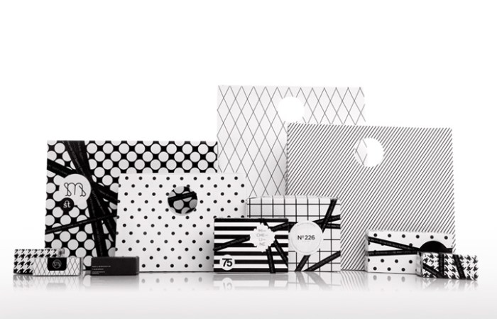
interior design, branding, print shop, Mexico, typographyinterior design, branding, print shop, Mexico, typography, packaginginterior design, branding, print shop, Mexico, typographyMexican design firm Anagrama, specializing in identity and brand consulting, rebranded the boutique print shop Micheline, from their logo and packaging to the interior of their shop. In order to express uniqueness, elegance and modernity and keep the flavor of the mid 70s when Micheline was founded, Anagrama played up the 1975 year typographically in the decor as well as through the furniture and lighting selections. The color palette was kept neutral to contrast with the bright colors of the card catalogues and papers. Nicely done!

via retail design blog

The Tidy Street Project

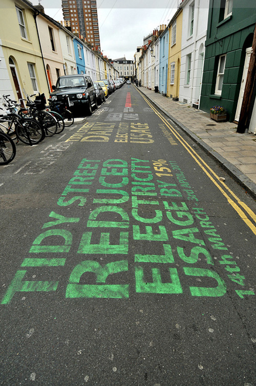
Energy consumption, info graphic, street art, Urbanized the filmEnergy consumption, info graphic, street art, Urbanized the filmClick to enlarge

I went to see the new documentary Urbanized—the third film in Gary Hustwit’s trilogy starting with Helvetica and followed by Objectified—which looks at city planning issues and stresses the importance of intelligent urban design for the immediate future when 75% of the population is estimated to inhabit cities by 2050. It’s a great film and I highly recommend it. There’s a lot more that could be said about the film, but instead I wanted to share a project that was featured and relates more to art, design, and typography: The Tidy Street Project.

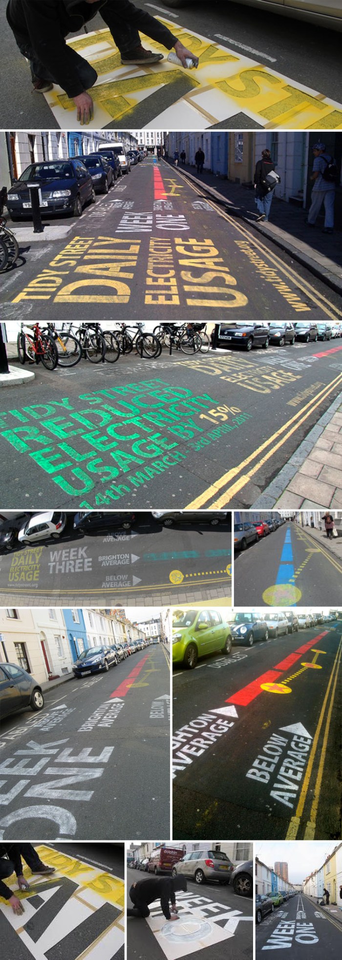
During March and April 2011, participating households on Tidy Street, in Brighton, UK, recorded their electricity consumption. Each day the participants’ electricity usage over the previous 24 hours was marked; and each week participants could choose to add another comparison line that showed how their electricity consumption compared to another region in the UK or even a different country. The residents, in collaboration with the local graffiti artist Snub, produced an engaging street infographic that stimulated the street and passersby to reflect on their electricity use. In Urbanized, several of the participants are interviewed as well as the project creator, Jon Bird from Open University. It was interesting to see the enthusiasm in the project and how the tenants were made aware of which appliances used the most electricity as well as a general awareness on how to lower their consumption, resulting in a 15% usage reduction.

Definitely a fun way to get people involved and interested.

The Tidy Street Project is part of CHANGE, an EPSRC funded research collaboration between The Open University, Goldsmiths, Sussex University and Nottingham University.

Photos courtesy of The Tidy Street Project, Sare, thelastretort’s flickr, Kevan’s flickr, and boxman’s flickr.

J. Mayer H.: Rapport

Berlin, J. Mayer H. Installation, Berlinishe Galerie, collabcubedBerlin, J. Mayer H. Installation, Berlinishe Galerie, collabcubedClick to enlarge

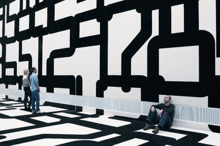
The German architectural firm J. MAYER H., founded by Juergen Mayer H., has designed an installation for the Berlinische Galerie titled Rapport: Experiments with Spatial Structure. Data security patterns have been printed in an unimaginably large point size on carpeting which adorns both the floor and walls of the museum’s 10-meter high entrance hall. The large, somewhat abstract shapes created by the oversized numbers, results in a flickering impression and transforms the rigid white cube into a playful scenario negating its strict geometry.

The word “Rapport” has multiple interpretations and is meant to be ambiguous.

From the architects:
As a specialist German-language term from textile manufacturing, it refers to the serial pattern of the installation. On the other hand, in the military field the term “Rapport” means a “dispatch”, while in psychology it describes a human relationship in which those involved convey something to the others. In this sense it also refers to the starting material of the installation: data security patterns, which are used, for example, on the inside of envelopes. In this case, they stand for confidential communication between two parties.

The installation will be up through April 9, 2012 at the Berlinische Galerie, in Berlin, of course.

via city vision

Alfabeto Graffiti: Graffiti Alphabet

graffiti alphabet, type, street art, art book, collabcubedgraffiti alphabet, type, street art, art book, collabcubedalfabeto graffiti, street art, typography, alphabetClick to enlarge

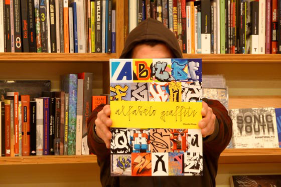
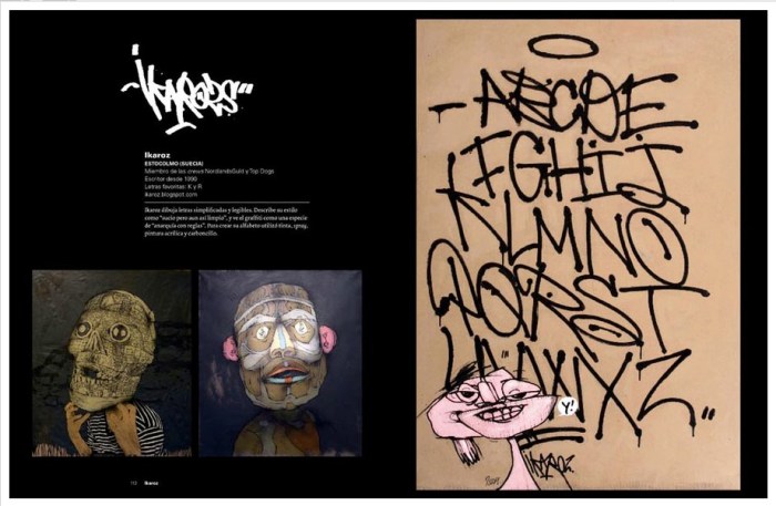
Attention type lovers and street art aficionados: this may be just the book for you. Claudia Walde, author of Alfabeto Graffiti, spent over two years collecting alphabets by 154 street artists from 30 countries. The brief given to each artist was to “design all 26 letters of the Latin alphabet within the limits of a single page of the book.” The result: Alfabeto Graffiti.
Though I haven’t seen the actual book, the spreads on the publisher’s page look like the perfect combination of street art photos and fun (complementing) typography.

via Editoral Gustavo Gil and available here. 319 pages with text in Spanish.

Scott Campbell: Cut Currency

Currency art, tattoo art, skulls, dollarsCurrency art, tattoo art, skulls, dollarsCurrency art, tattoo art, skulls, dollarsClick to enlarge

Originally from New Orleans, but now living and working in New York, Scott Campbell studies and chronicles working-class iconography commonly found in tattoo culture. His work highlights the irony within much of that imagery.

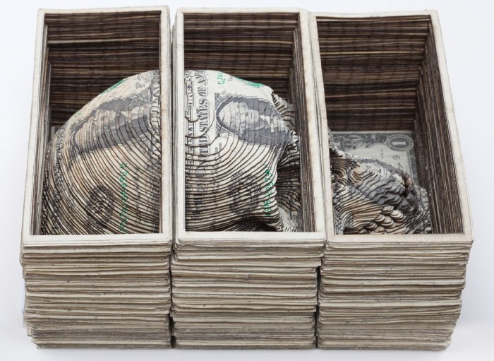
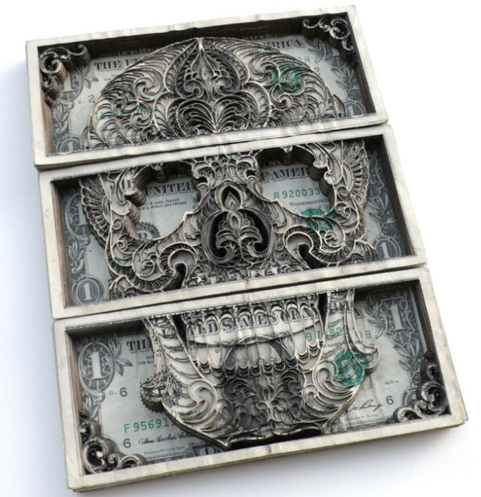
In Campbell’s cut currency works, he sources uncut sheets of dollars directly from the U.S. Mint and creates intricate sculpture-like pieces with a sunken relief effect by laser cutting the stacks of bills.

You can see more of Scott Campbell’s work on his site as well as schedule an appointment for a tattoo.

Thanks Rachael!

Tsang Kin-Wah: The Seven Seals

Dynamic projected type installations, Mori Art MuseumDynamic projected type installations, Mori Art MuseumClick to enlarge

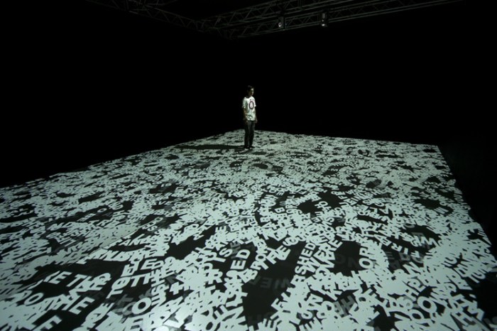
Oh yes, this is right up my alley. Hong Kong based artist Tsang Kin-Wah incorporates text and type to create dynamic installations. From painted floral-like wall patterns that upon closer inspection are made up of letters and Chinese characters, to his ongoing video installation series titled The Seven Seals, Kin-Wah envelops the viewer in type. The texts formed by that type pose questions on existence drawing from biblical, political and philosophical writings, in many cases meant to provoke a range of feelings from the spectator reminding us of issues like war, terrorism, revolution, death, murder, suicide, self-denial, etc.

Presently the latest installation in The Seven Seals, The Fifth Seal – HE Shall Deliver You Up To Be Afflicted And Killed As HE Was, is being shown at the Mori Art Museum in Tokyo through January 15, 2012.

via Mori Art Museum

m_lab: Espluga + Associates

interior design, naming, packaging, retail design, espluga+associates, collabcubedinterior design, naming, packaging, retail design, espluga+associates, collabcubedinterior design, naming, packaging, retail design, branding, collabcubedThe Spanish design firm Espluga + Associates, based in Barcelona, is one of those companies that does it all: graphic design, branding, advertising, naming, and, as they say on their website, lots of other things that end in ‘ing’.

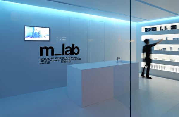
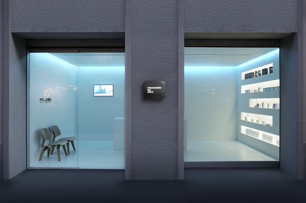
One of their recent projects involved several of these capabilities rolled into one. m_lab, Mesoestetic’s ( a company/laboratory specializing in the development of products for the treatment and care of skin) first lab store in Europe, includes interior design, naming, visual id, and packaging by Espluga + Associates. The white, minimalist design with its recessed blue-tinted lighting along with the Helvetica-driven signage and packaging creates the perfect cool and sterile lab-like feel. Nice!

You can see more of Espluga + Associates work here.

And stay tuned for our next post on a completely different project by this talented studio.

Typographied Objects III

typography objects, letterforms, type on sheets, type on clothes, type jewelry, collabcubedtypography objects, letterforms, type on sheets, type on clothes, type jewelry, collabcubedClick to enlarge

Our latest roundup of objects with type. See our previous posts Typographied Objects and Typographied Objects II for more.

From left to right, top to bottom:
Typeshelf by Thirtyfive Creative Works; Punctuation Journals; Lucky Letters Umbrella; Letter Lamp; Eivor Ord Duvet cover and pillow cases; READ book shelf; Ampersand Jewelry; Caleido Digit Radiator; Profiltek Vetro Shower Door; Blah Blah Throw; Alphabet Stockings; Welcome Letter Concept Chair; Even Little Number Plates; Calvin Klein Briefs; Number Placemats; Numbers Runner

The Comedy Carpet in Blackpool

Typography, England, installation, art, sculpture, letterforms, why not associatesTypography, Blackpool, England, Why Not Associates, comedy tributeTypography, England, installation, art, sculpture, letterforms, why not associatesClick to enlarge

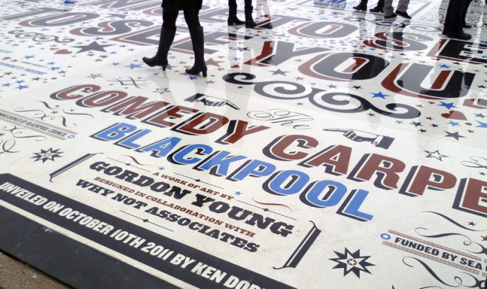
The Comedy Carpet in Blackpool – a seaside resort town in the Northwest of England – is a typographic celebration of comedy in a grand way. The 2,200 sq. meter installation contains over 160,000 granite letters embedded into concrete, making it virtually impossible not to tip toe through the type.

A super-sized homage to those who have made the nation laugh, as well as to wood type, the amazing sculpture, that will also act as a stage, was designed by Gordon Young with typography by Why Not Associates (both previously mentioned in Architypeture I) and inspired by old theater posters and playbills. The jokes span a full range including one-liners, catchphrases, gags and sketches, with something for everyone’s sense of humor…or not.

via typetoken

Adidas Laces Signage: Turbocharged Type

Laces office building, Herzogenaurach, Germany, Typography, collabcubedLaces office building, Herzogenaurach, Germany, Typography, collabcubedLaces office building, Herzogenaurach, Germany, Typography, collabcubedLaces office building, Herzogenaurach, Germany, Typography, collabcubedClick to enlarge

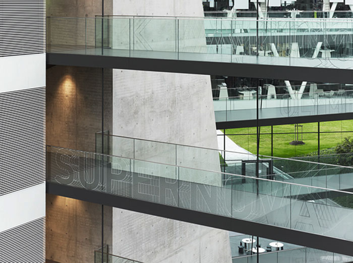
The new Adidas Laces R&D building at the corporation’s headquarters in Herzogenaurach, Germany, is Kada Wittfeld Architektur’s latest project. In addition to the innovative communicative architectural ‘laces’ theme with criss-crossing connecting walkways — a metaphor for the Adidas sports shoe as well as the networked communications of the corporation — the ‘turbocharged’ typographic signage system by Büro Uebele leaps across walls, doors, and handrailings throughout the center. Words identify places as well as becoming colored surfaces and sculptures.

From the press release:
The building forms a loop. Suspended walkways cross the atrium space, “lacing” the building’s structure together like the laces of a sports shoe. The walkways connect individual departments within the building complex, making for greater proximity and preventing the disruptive effect of people walking through offices. The signage system supports this concept, providing directions at hubs and intersections. The names of the meeting areas are displayed on the glass balustrades, creating a subtly mobile effect as visitors look across the atrium, helping them find their way. The corporate typeface, a variation on FF DIN, is dynamically varied here. The outlines of letters and arrows are shifted vertically and repeated rhythmically, creating a dynamic, sporty effect. The shimmering characters – for all the world as if frozen in time-lapse photography – are combined in varying patterns, offering the viewer a varied and distinctive echo on the “laces” theme.

Truly spectacular inside and out.

Photos: Werner Huthmacher & Christian Richters

via e-architect and typetoken

Odoardo Fioravanti: Industrial Design A-Z

Industrial design, furniture, Italy, Fogfurniture design, industrial design, italyfurniture design, industrial design, Italy, Malta design weekClick to enlarge

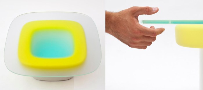
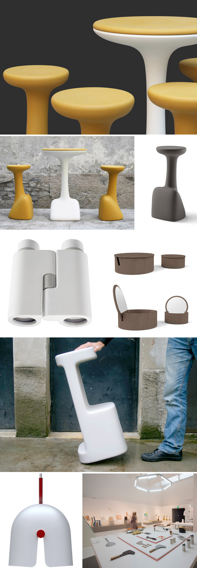
I wasn’t familiar with Odoardo Fioravanti’s work, but it was quite a nice discovery. This incredibly prolific Italian designer started working as an industrial designer as recently as 2003 and already has an impressive array of work and projects for a roster of companies that most designers could only dream of working with. Adding to that, Fioravanti designs everything! From kitchenware to toys, to furniture and telescopes, all the way to colorful roof tiles.

You can take a look for yourself here.

via malta design week

Emily Floyd: Type as Art

Contemporary Art, Type, Australian, Anna Schwartz GalleryContemporary Art, Type, Australian, Anna Schwartz GalleryAs a designer and lover of type, I really enjoy when art and type are combined — I pretty much enjoy when type is combined with anything. So it’s not surprising that I enjoyed coming across Australian artist Emily Floyd’s work. Drawing inspiration from the text-based Conceptual Art of the 60s, Floyd thinks it’s important to find new ways of working with language. In her art, she likes to combine different texts and fragments of different narratives and have the viewer experience them. Themes in her work include politics, ecology, philosophy and fiction.

You can see more of Emily Floyd’s installations on the Anna Schwartz Gallery site.