Architypeture: Part II

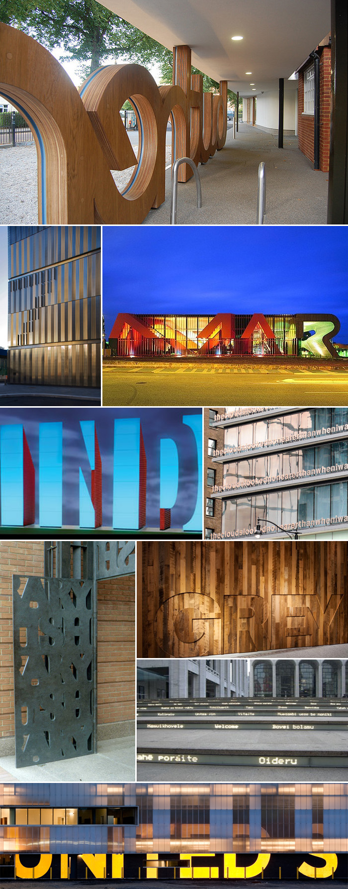
Typography in Architecture Lowther Children's CentreTypography in Architecture Multiple ExamplesClick to enlarge
Row by row; left to right: Lowther Children’s Centre, London, Patel Taylor Architects. 7 World Trade Center, NYC, Michael Gericke, Pentagram. The Marion Cultural Centre by ARM + Phillips/Pilkington. Artwork for the Indianapolis Airport, Indiana, Joe C. Nicholson. Fairmont Pacific Rim Hotel, Vancouver, Canada, Liam Gillick; words say “Lying on top of a building, the clouds looked no nearer than when I was lying in the street.” British Library main gates, Cambridge, UK, Cardozo Kindersley Workshop. Grey Group, NYC, Paula Scher, Pentagram. Lincoln Center steps, “Welcome” in multiple languages, Diller Scofidio + Renfro. U.S.-Canada border crossing station at Massena, NY, Michael Bierut, Pentagram (has since been taken down.)

Typography in Architecture Pentagram Design

Click to enlarge
Row by row; left to right: New York Times Building Signage, NYC, Michael Bierut, Pentagram. Symphony Space, NYC, Paula Scher, Pentagram. 770 Broadway awning, Paula Scher, Pentagram. Harley Davidson Museum, Milwaukee, Wisconsin, Michael Bierut, Pentagram. Bloomberg Building, NYC, Paula Scher, Pentagram. Container Mall (proposed design) NYC, LOT-EK. APAP Open School, Korea, LOT-EK. Bohen Foundation, NYC, LOT-EK. Lignan Studio renovation, LOT-EK. PS1 Museum of Art, Queens, NY (not sure of designer.) Museum Tower, Dallas, Texas, Scott Johnson, Johnson Fain Architects, photo from williamedia’s photostream. Wales Millenium Centre, Cardiff, South Wales, Jonathan Adams, Capita Architecture, photo from iwouldstay’s photostream.

As promised, here is a second roundup of architecture and typography merged into one (see Part I). Pentagram has a large representation here, as does Lot-ek, possibly because many of their projects are in NYC and I am personally familiar with them, but it’s more likely because their websites happen to be chock-full of these beautiful projects. Lot-ek’s use of type and color on their projects feel a little like Freitag bags on steroids. I love it.

Architypeture: Part I

Architecture Typography Lentos Art MuseumClick images to enlarge
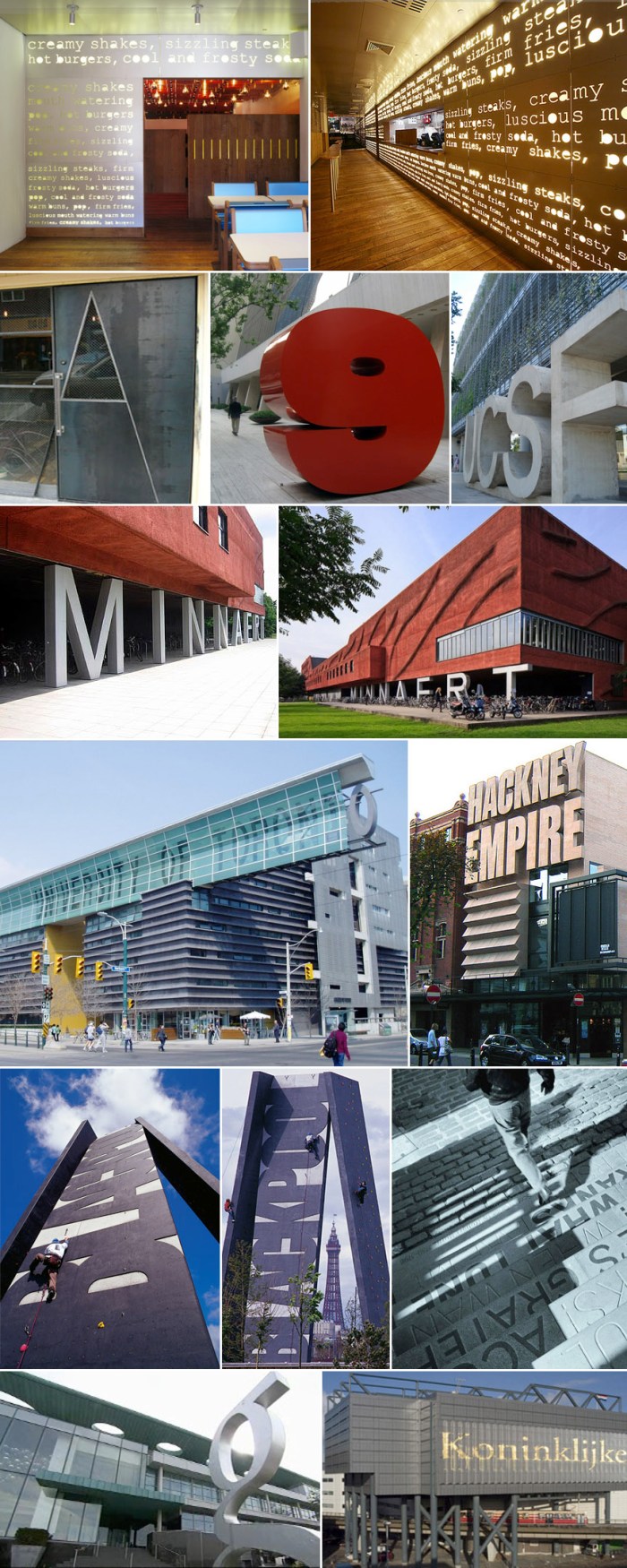
Left to right, row by row: Lentos Art Museum, Linz, Austria, Weber & Hofer Architects. Caltrans District 7 Headquarters, LA and Cooper Union, NYC, both Thom Mayne, Morphosis, typography on Cooper Union was done in collaboration with Abbott Miller, Pentagram. Parsons The New School for Design, NYC, Lyn Rice Architects; exterior awning photo: Michael Moran. Interior auditorium acoustic graphic photo: Noah Sheldon.

Architecture Typography Ali Tayar Thom Mayne Why Not Associates Chermayeff & Geismar

Click images to enlarge
Left to right, row by row: PopBurger, NYC, Ali Tayar, Parallel Design. The Alembic door, Oliver DiCicco. 9 West 57th St. sculpture, Chermayeff & Geismar. UCSF, University of California, San Francisco. Minneart Building, Utrecht University, The Netherlands, Neutelings Riedijk Architects. University of Toronto, Graduate Student Housing, Thom Mayne, Morphosis. Hackney Empire theater extension, London, Tim Ronalds Architects. Blackpool Climbing Tower, Blackpool, England, Why Not Associates with Gordon Young. Tam O’ Shanter Pub Steps in Ayr, Verse from Burns’ Whisky, Why Not Associates with Gordon Young. G Hotel, Ireland, Philip Treacy Architects. Koninklijke Bibliotheek (Library in The Hague, Netherlands), designed by Wim Quist (?).

Nothing really comes up when you google “architypeture” other than the recently scooped up domain name, but I’ve decided to use it here as the fusion of architecture and typography, especially when successfully and beautifully rendered. I don’t think there is a designated term for this, but there should be. Architypeture is possibly one of my favorite things, and I don’t do favorites lightly. This is Part 1 of two posts (the second will follow shortly) showing examples of typography wonderfully incorporated into architecture; in some cases on the exteriors of the buildings and in other cases, the interiors. All names and credits that I was able to find (mostly of the projects and architects, a few of the photographers) have been listed with their corresponding links. If someone knows any credits that have been omitted, please feel free to let me know in the comments.

(See Part II here)

MoMA Design Studio

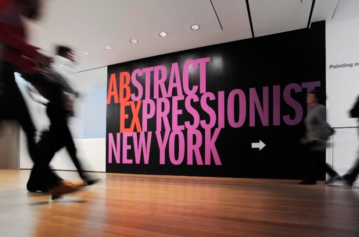
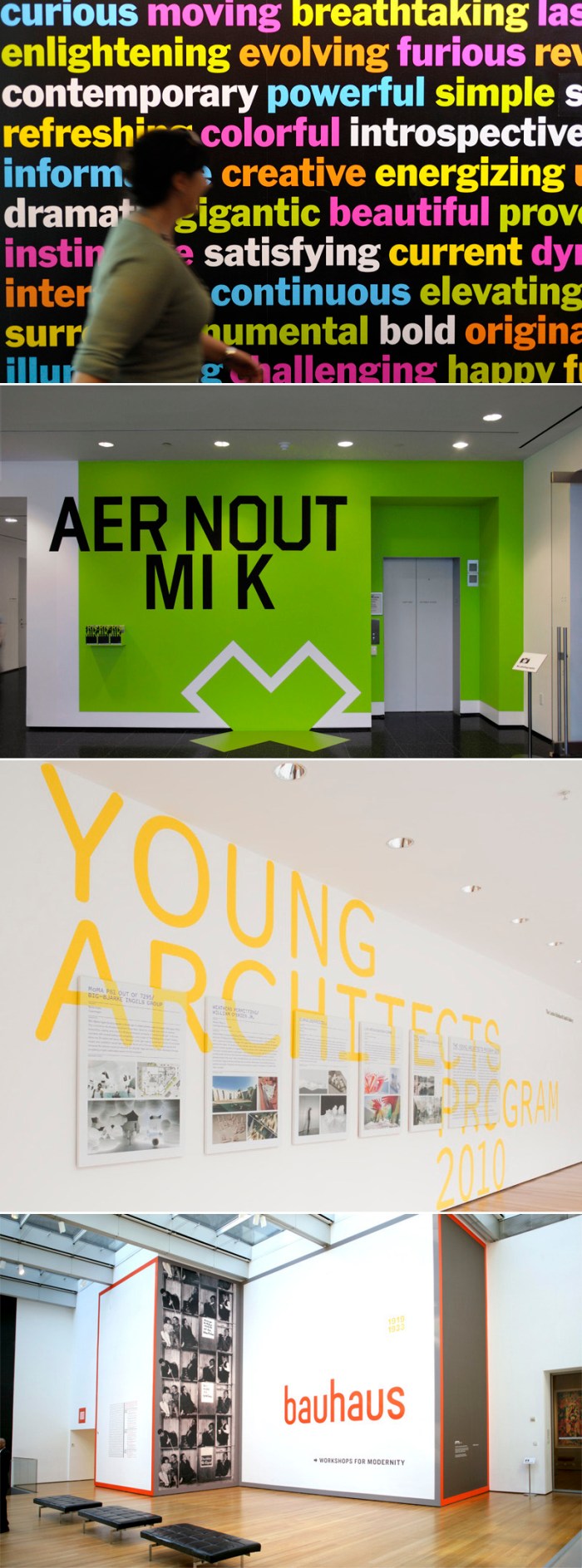
MoMA Design Studio Typography Super GraphicsMoMA Design Studio Typography GraphicsMoMA Design TypographyLiving in NYC and loving art and design makes the Museum of Modern Art (MoMA) a natural frequent destination for us. I have always appreciated the graphics in the museum but noticed in the past few years that they have become more prominent with a boldness and emphasis on typography that is hard to ignore in a good way. I have to admit to having been lured into the occasional exhibit based on the beautiful supergraphic on the wall outside, much in the way that I would pick up a book based on its beautiful cover.

The team behind the graphics is the MoMA Design Studio with Julia Hoffmann (who previously worked at Pentagram with Paula Scher) as the creative director, and whose work I’ve admired for years. Her presence along with the rest of the designers is definitely felt, from the museum’s walls to its printed materials. You should check out the studio’s site to see more of their fabulous work.

via swissmiss

TypeClock

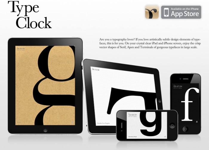
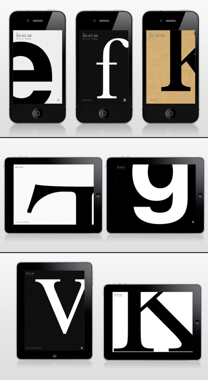
I met Dong Yoon Park on a typography tour of Staten Island last fall. Yes, strange but true. On the tour I had briefly chatted with him and he had shown me, on his iPhone, some of the things he was working on at Parsons as a grad student and teacher in their department of Design & Technology. Later, I visited his website and was really impressed with the rest of his work as well. Today I checked his site to see what he was up to and, sure enough, there waiting, was this lovely app for typography lovers! So simple and beautiful. What could be better than having a blown up letter of your choice on the screen of your phone or iPad?

From the iTunes AppStore:

Are you a typography lover? If you love artistically subtle design elements of typefaces, this is for you. On your crystal clear iPhone screen, enjoy the crisp vector shapes of Serif, Apex and Terminals of gorgeous typefaces in large scale. You can set own character set, type size and transition speed.

TypeClock can be purchased here for $0.99 and you can see more information here and a video here.

Typographied Objects

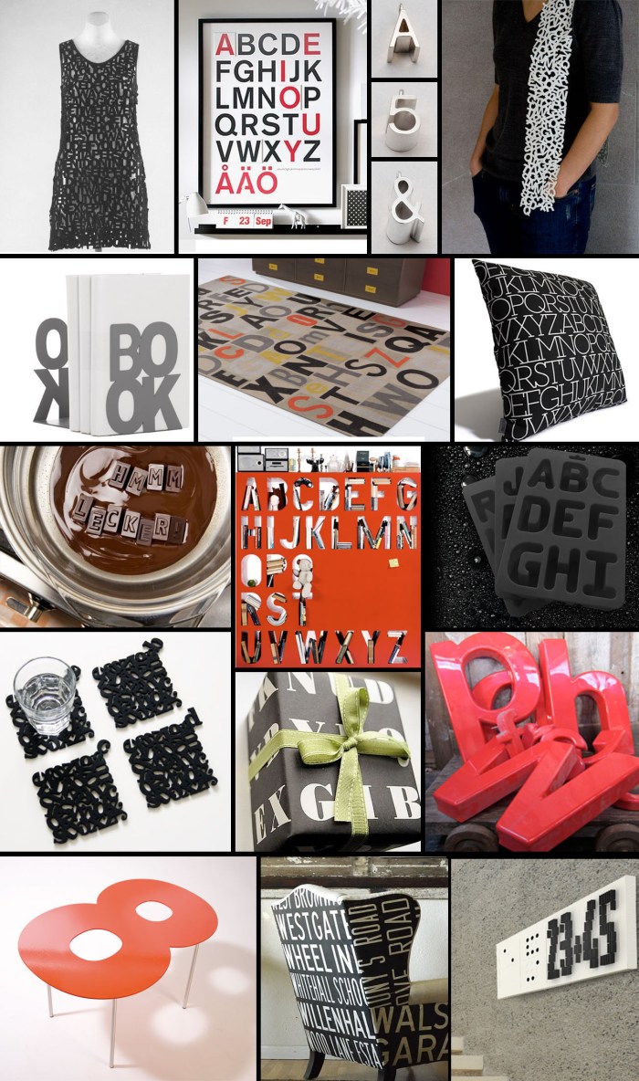
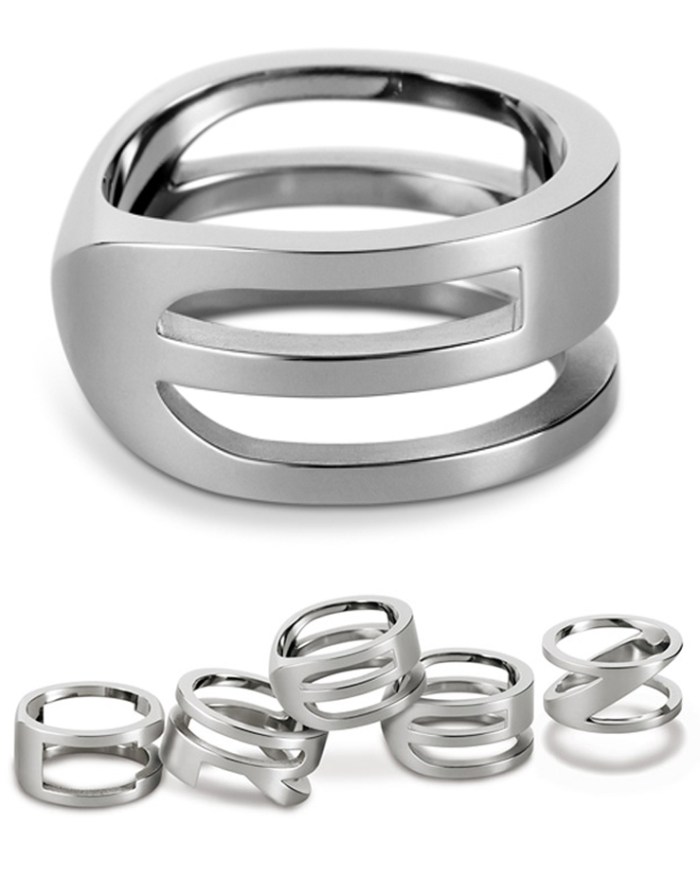
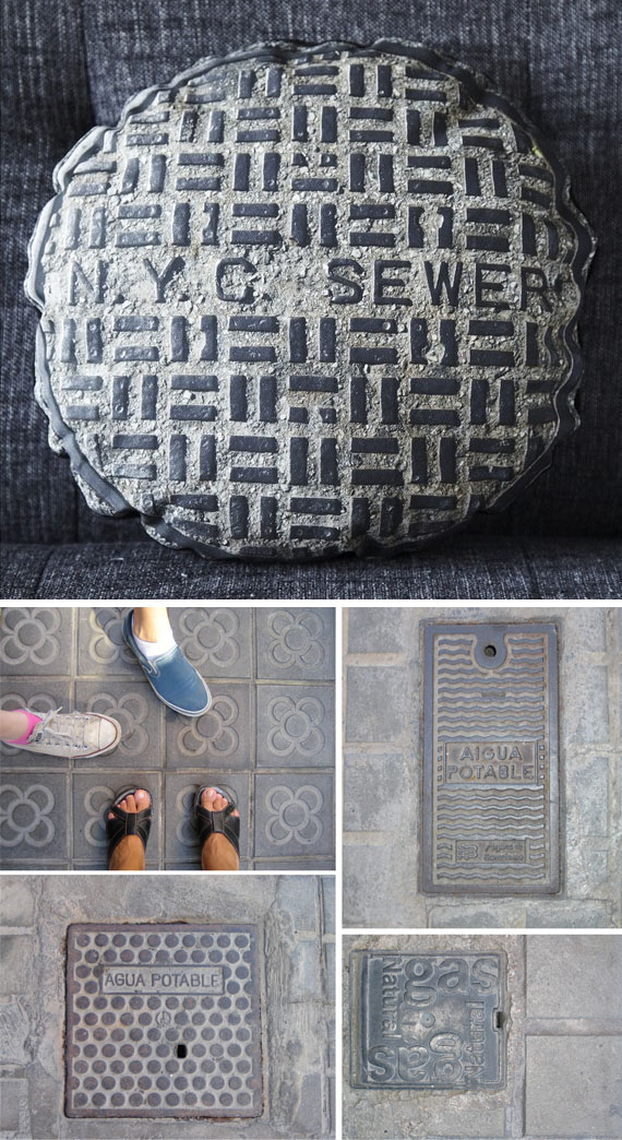
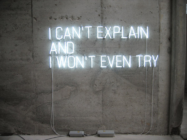
Typography ObjectsPretty much anything with nice typography is bound to catch my eye. And pretty much any object that uses typography as an integral part of its design is likely to win me over. Here are but a very few:

Clockwise from top left:
Typographic Dress at the Met
Alphabet Poster
Jacqueline Rabun Type Jewelry
Veer Character Scarf
House Industries Neutraface Pillow
Alphabet Ice Cube Trays

Red Plastic Letters from Etsy
Domino Clock
British Route Signs Chair
Fontables
Typography Coasters
Typolade Chocolates
Type Bookends
CB2 Letterpress Rug
Alphabet Bookcase
Letteroom Alphabet Eco Wrapping Paper

Pablo Lehmann

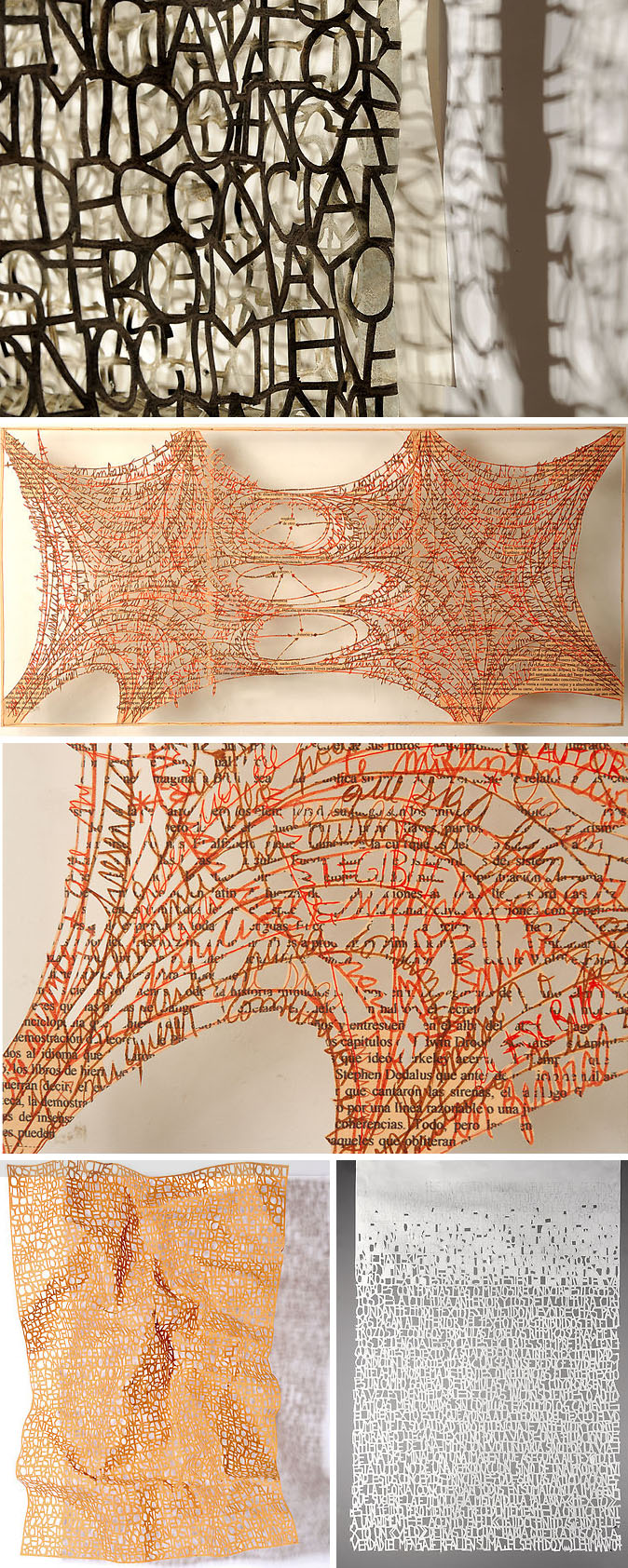
Argentinean artist Pablo Lehmann lives and works in Buenos Aires. His paper cutouts, of type and shapes cut out from large sheets of paper or cloth, are extremely intricate and impressive. In many cases he uses multiple sheets/layers to create 3D installations that seem to also play with their shadows. Lovely.

via Colossal

One Day for Design: April 13th

One Day for DesignOn April 13, 2011,
 add your voice to an open, digital dialogue on design. One Day For Design brings together a global community of designers and design enthusiasts to exchange ideas, challenge viewpoints and push boundaries—collaborating in real time on the future of our profession and the organizations behind it. Spread the word. Join the conversation at onedayfordesign.org or via Twitter.

Moderators include: Alex Bogusky, Doug Bowman, Liz Danzico, Debbie Millman, Erik Spiekermann, Armin Vit, Alissa Walker and Katherine Walker.

Begins tonight at 12 midnight EST

Bordbar

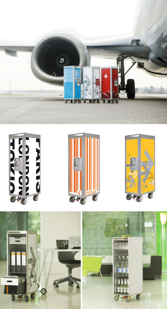
Bordbar recycled airplane trolleysBordbar, based in Cologne, processes used airplane trolleys and transforms them into high quality designer objects for private use. Bordbar trolleys are available in a variety of patterns and colors, with interior elements varying from office file cabinet, to shoe closet, to minibar, as well as the ability to implement personal requests.   via architonic

Cecil Touchon: Visual Poetry

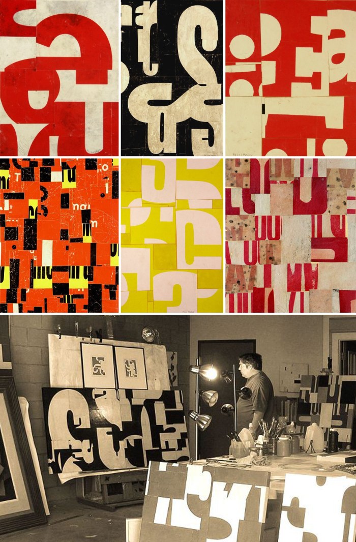
Cecil Touchon Visual Poetry CollagesI really like this series of collages by Cecil Touchon titled “Visual Poetry”. Cutting up the type into abstract shapes creates a lovely effect, but then I’m a fan of collage and type in general, so the mixing of the two is win win.

Here, pieces of letters—once recognizable symbols—cease to exist as words and begin to communicate only as formal elements of design. They become part of the visual medium, which celebrates the true essence of the artwork”.   via trendland

Character

Character_Recycled LettersOkay, how cool would it be to have one of these at home? Answer: very.

Character saves fascia signs from demolition. We choose the most stylish letters and turn them into individual and unique design objects. We replace the old neon tubes with LEDs, add a transformer, install a power cord and give them a new life cycle.

via Beautiful Life