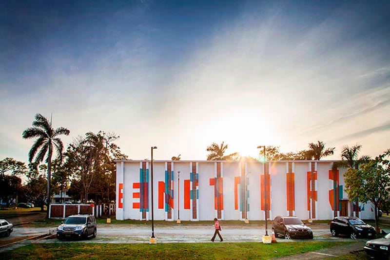
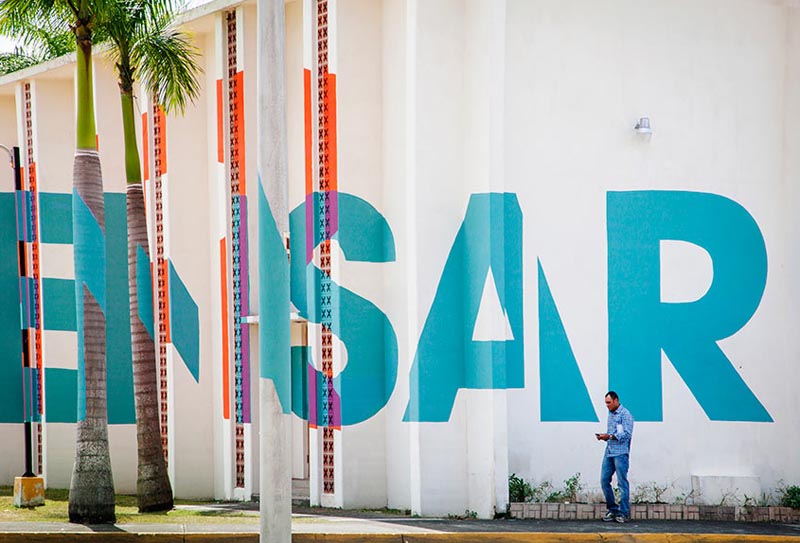
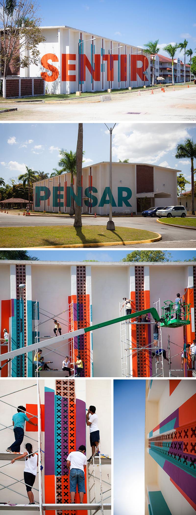
 A recent project at the University of Isthmus in Panama City by one of my favorite Spanish art collectives, Boa Mistura (previously), engaged the architecture and industrial design students. Invited to give a two-week workshop, the artists worked with the students to create a design using their signature anamorphic style which was then executed by the students. Seeing the university as a Ciudad del Saber (City of Knowledge) they created a type mural on the side of one of the campus buildings that reads pensar (think) from one angle, and sentir (feel) from another; two key elements in obtaining knowledge.
Patrick Dougherty: Stickwork
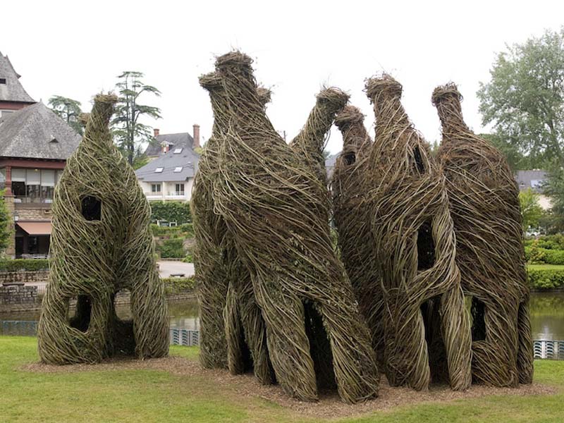
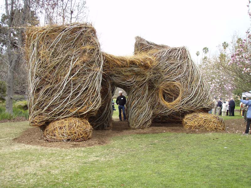
 Based in North Carolina, Patrick Dougherty has become noted for his amazing work with saplings and sticks which he uses to create fantastical, quasi-architectural structures that seem to evoke another time, place, or fantasy realm altogether. Individual sapling branches and sticks are woven together in windswept fashion, fitting in as if part of the natural landscape. Combining his carpentry skills with his love of nature, the artist began to learn more about primitive techniques of building and to experiment with tree saplings as construction material. These works have evolved into largescale environmental pieces, requiring saplings and twigs by the truckload. Almost seems like a Hobbit should be peering out the door of some of these.
You can see Dougherty at work in the trailer for the film Bending Sticks, below, which documents his stickwork.
via Nashville Arts
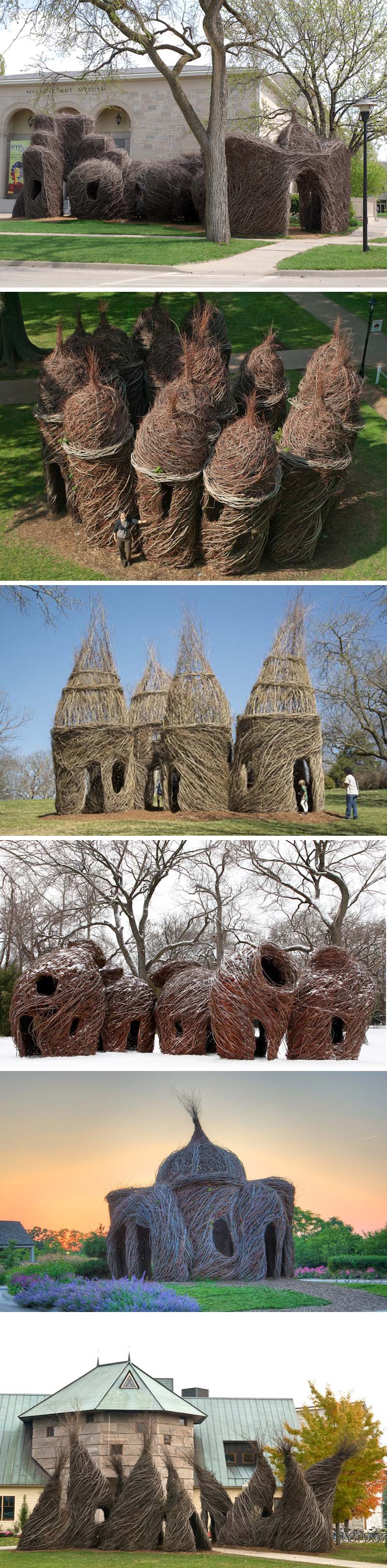
Miguel Chevalier: Magic Carpets 2014

 French transmedia artist Miguel Chevalier presented Magic Carpets 2014 in Morocco at the beginning of the month. The spectacular lighting installation turned the massive floor of the Sacré Coeur church in Casablanca into a joyful interactive experience. From a sea of vibrantly colored spirals to pixels that gave way to cellular-inspired patterns, the contemporary animated projections moved along nicely complemented by Michel Redolfi’s music. See it in action in the video below. I could see this working very nicely at our own Park Avenue Armory here in NYC…hint, hint.
via designboom
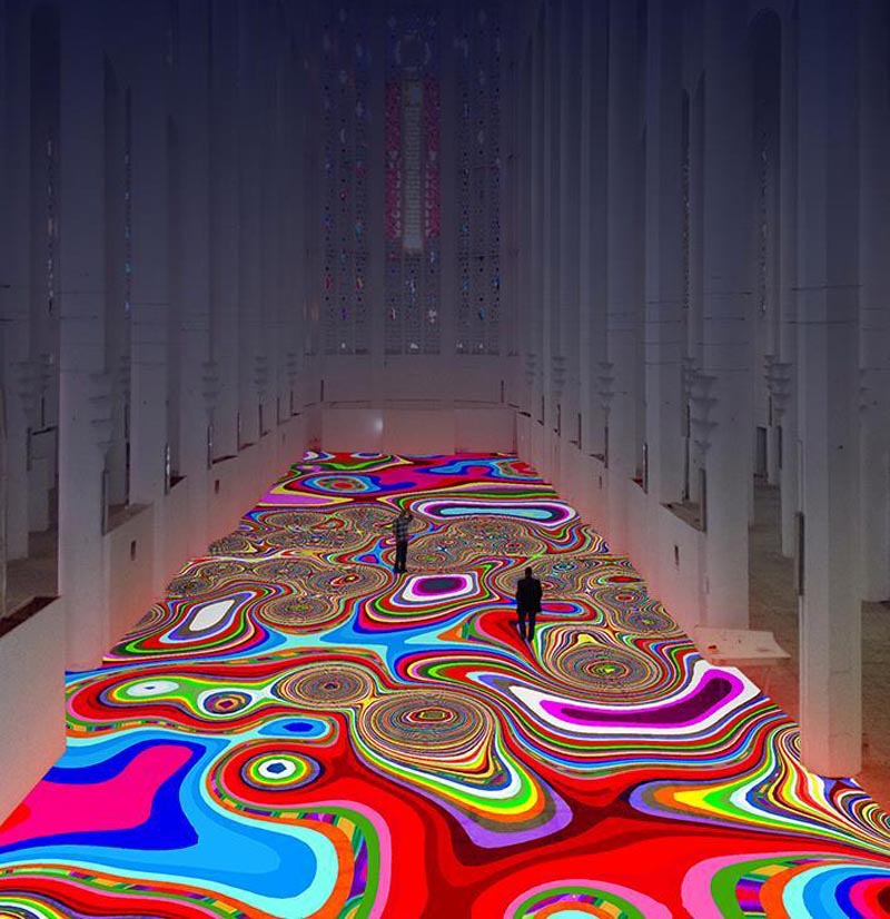
Shurong Diao: Hair Alphabet


 School of Visual Arts design student Shurong Diao decided to link Chinese calligraphy to the Roman alphabet by substituting black ink on rice paper with long black hair…and when I say “long” I mean crazy-long (photoshopped long?) hair. Every letter of the alphabet has been created and there are even a few words thrown in. Maybe not the most practical typeface, but kind of fun.
via étapes
Fra.Biancoshock: Ephemeral Experiences
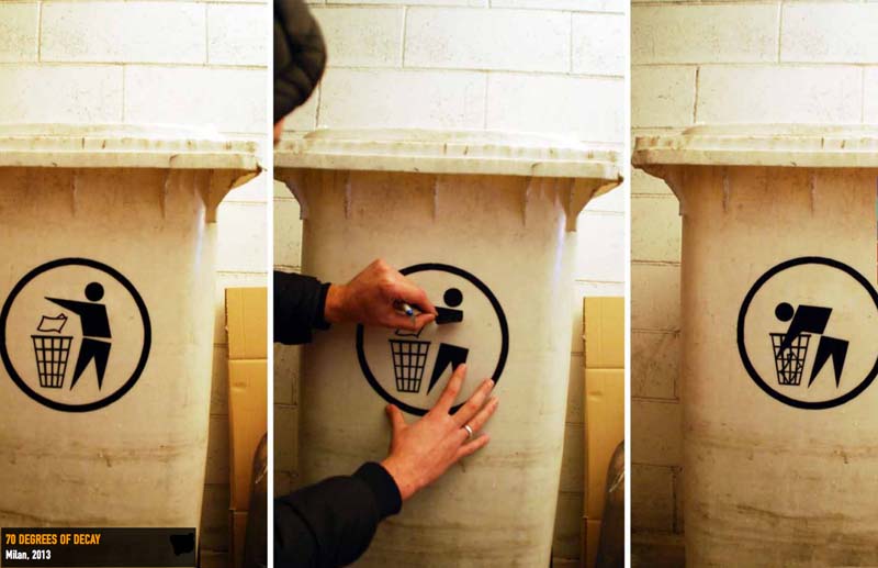

 Milan-born and based street artist Fra.Biancoshock created his own artistic avant-garde which he labeled “Ephemeralism”. A combination of classic conceptual and performance art, Epheralism is a movement in which work is produced to exist briefly in space but limitlessly in time. Fra.Biancoshock’s works have been realized in Italy, Spain, Croatia, Hungary, Czech Republic, Malaysia and Singapore. I’ve kept the titles since in many cases they really add to the work. You can see more of his work here.
Henk van Rensbergen: Abandoned Places
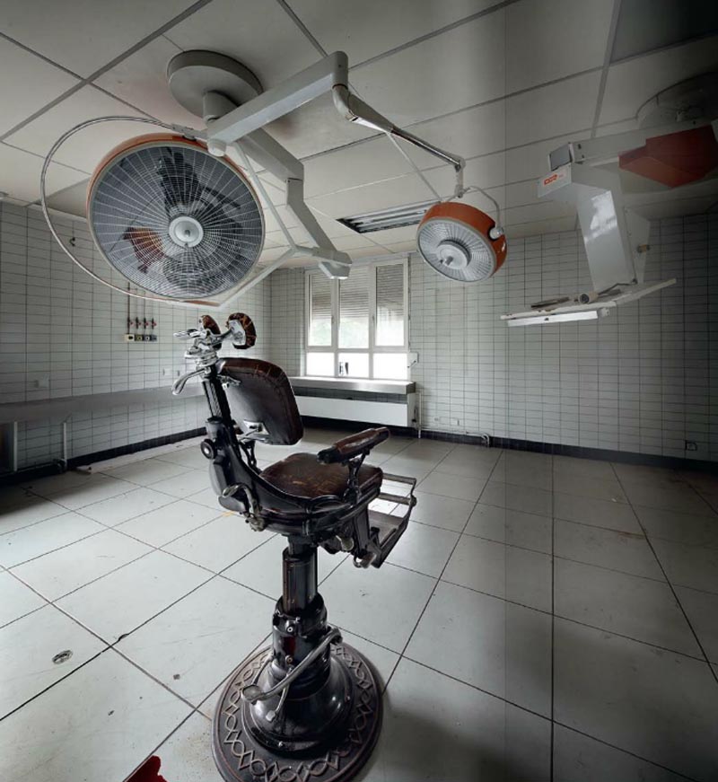

 Believe it or not, Belgium-born Henk van Rensbergen is an airline pilot; a job which takes him to many locations around the world. But it is the urge to explore eerie abandoned sites which he’s possessed since childhood, that has led him to take this stunning series of photographs (and books) titled Abandoned Places. Van Rensbergen captures the ghost-like atmosphere that exists within these spaces, whether they be homes, offices, amusement parks or hair salons. The presence of those who once inhabited these locations is almost palpable. The stories (or the stories we decide to create in our minds) are there to be told via his amazing images. These few are just the tip of the iceberg. You can see so many more over here. I think it’s safe to say, flying might be Mr. Rensbergen’s official profession, but photography is clearly his passion.
via umbrella
Martijn Sandberg: Image Messages
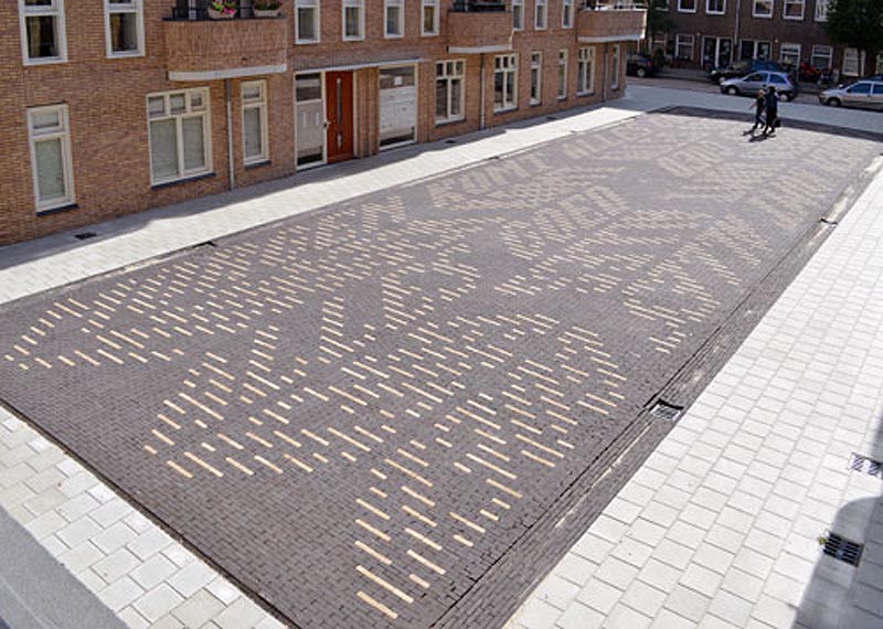
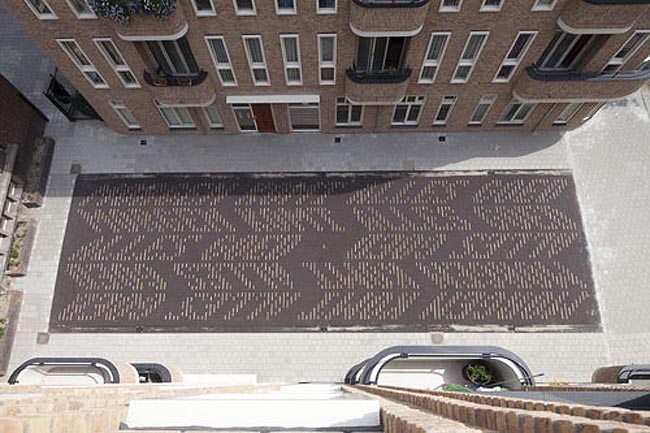
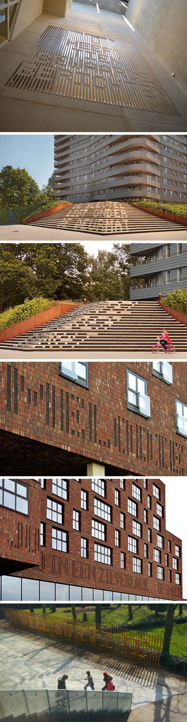 Dutch visual artist Martijn Sandberg creates Image Messages in public spaces as well as in paintings and sculpture. He explores the tension between text and image, legibility and illegibility, public and private domain. In his site-specific public artworks throughout The Netherlands, Sandberg plays with the material bearing the image which in turn camouflages the message from certain angles, and exposes it from others. “Image is message is image.” Whether created using bricks on a building facade, tiles on a floor surface, concrete staircases, or a wooden fence, there’s a trickiness to all of Sandberg’s work that both challenges and amuses the viewer. And as if that weren’t enough, the messages themselves are often chuckle-worthy, such as in the third photo down in what looks to be brass strips: “U Heeft Tien Bewaarde Berichten” which translates as “You Have Ten Saved Messages.”
via filemag
Harvezt: Album Covers from the Other Side

 Click to enlarge

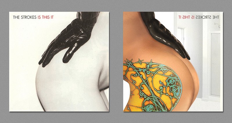
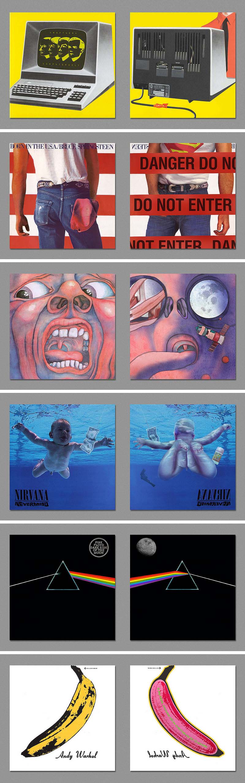
Flickr user Harvezt has cleverly ventured to the other side. The other side of iconic album covers, that is. Harvezt has created a gallery of album covers as seen from behind. From a British bobby directing Abbey Road traffic, to the other leg and cheek on the Strokes’ Is This It, on to Kraftwerk, Springsteen, Nirvana and more, the funny and well-executed idea often surprises, but even the less surprising cases readily evokes a smile. You can see the rest of the set here.
via @timothyogoodman
Lauryn Bertolo: What’s The Date?
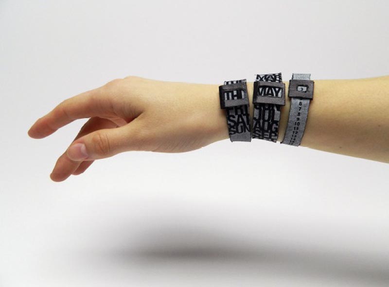
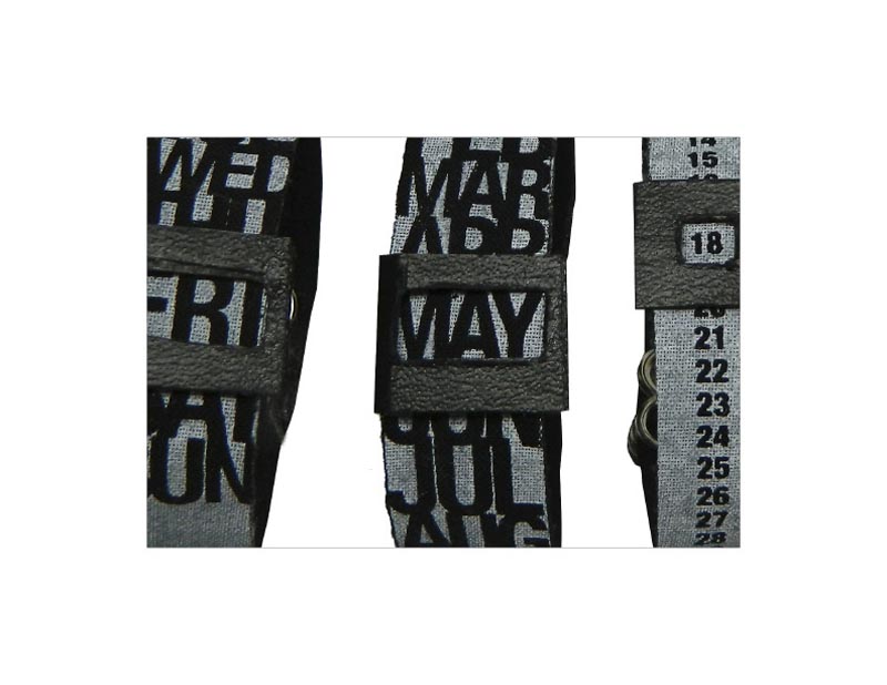
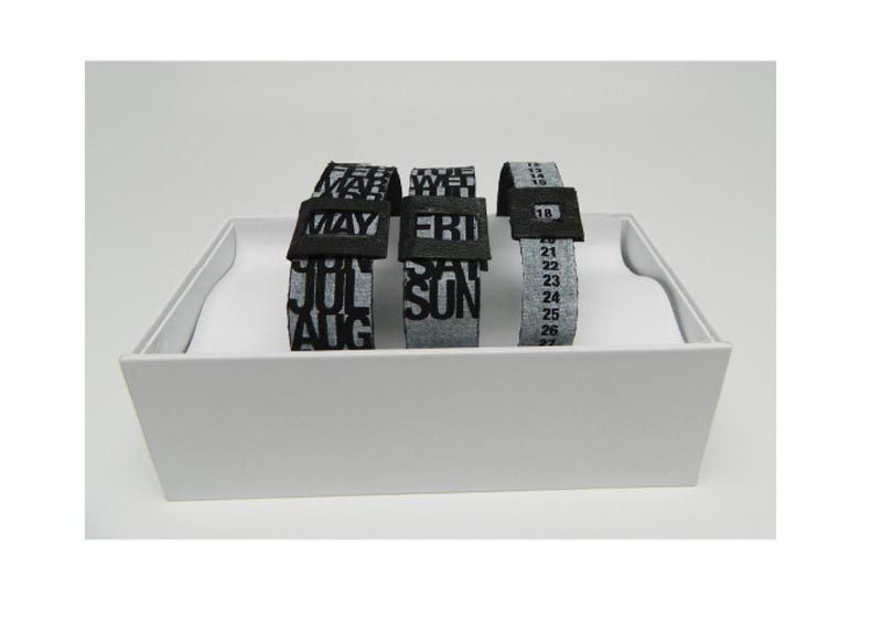 These are fun. Illinois-based graphic designer Lauryn Bertolo designed a wearable calendar. What’s the Date, as the 3-piece bracelet is called, is screen printed on fabric in bold type and adjusts to every day of the year. I have a feeling it’s a prototype, but I bet there’s a market out there.
Motoko Ishii: Visual Music
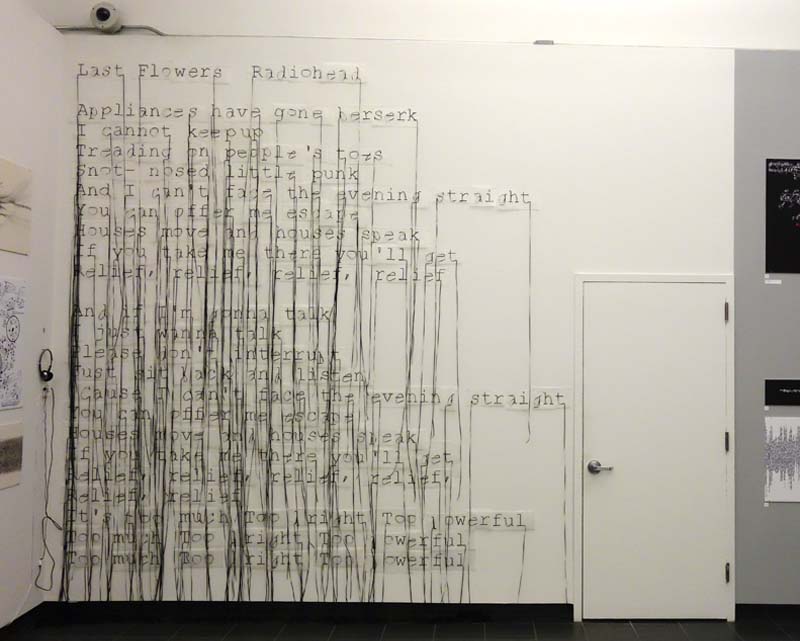
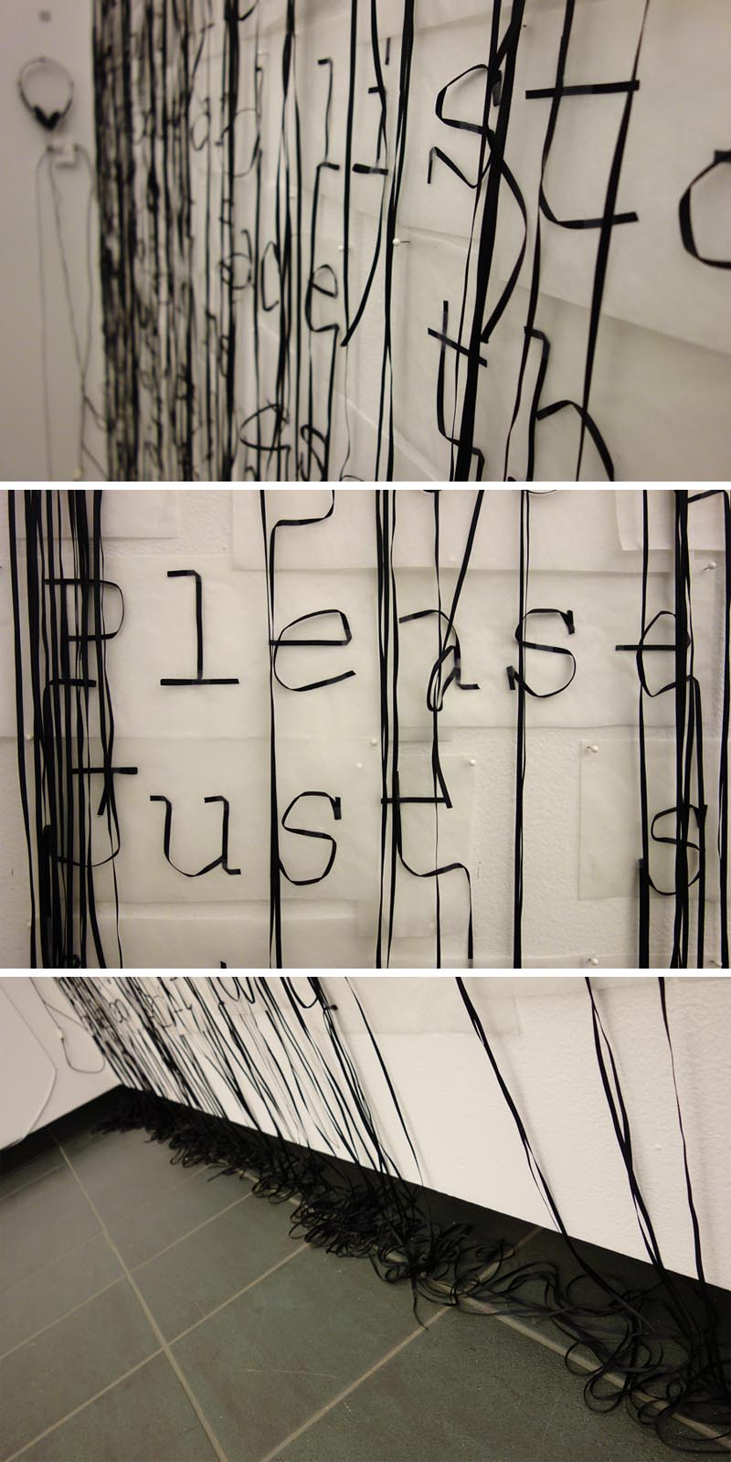 SVA design student Motoko Ishii used what looks like cassette tape or reel-to-reel audio tape to create a visual interpretation of Radiohead’s song Last Flowers. The project was done for Olga Mezhibovskaya’s typography class at the School of Visual Arts, and this particular assignment, titled Visual Music, invites students to select a piece of music of their choice and express it with the tools of typography. Nice assignment and beautifully executed, down to the serifs, by Motoko.
via graphis
Cornea Ti: FH Mainz


 The Frankfurt based Luminale 2014 — one of the world’s largest and most renowned light festivals — concluded this past weekend. As per usual, there were many impressive installations this year including Cornea Ti, a collaboration between Interior Architecture students from the School of Design Mainz and Ensemble Modern Frankfurt. Consisting of three connected containers that formed a sort of interactive stage, visitors would step through the amorphous tunnels triggering the many integrated LEDs hidden within the walls of the structure with their movements. In addition to the movement, sound caused the light to change, illuminating letterforms that would transform and morph into anagrams, only visible from the perspective of the audience. I haven’t been able to make out any words myself in the video below, but I sure do like the effect.
via luminapolis
The Big Egg Hunt NYC

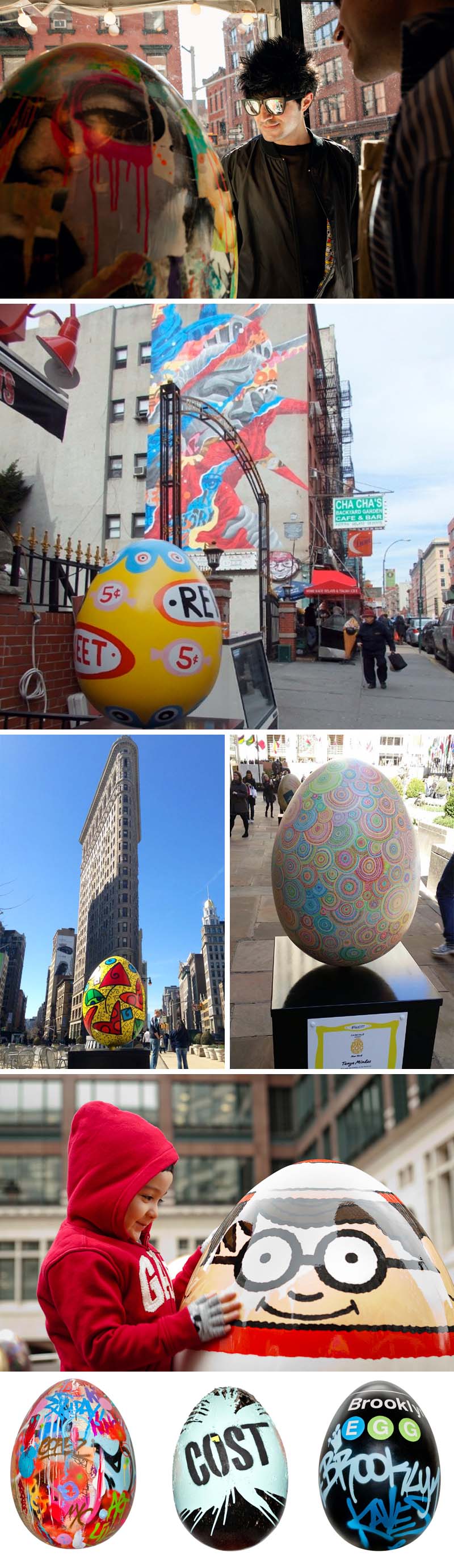 Reminiscent of the summer of 2000 when The Cow Parade hit the streets of NYC—we were huge fans, having set out on the mission to find all the cows and photograph ourselves with our favorites, pre-social media era, just for our own pleasure…imagine that!— this April the city has kicked off The Big Egg Hunt NY with close to 300 eggs “hidden” around town that Fabergé commissioned artists, designers, and architects to paint, or create their own, all in the name of charity. The participants are an impressive bunch, from artists such as Jeff Koons and Julian Schnabel, to architects Zaha Hadid and Morphosis, to graphic designer Debbie Millman, fashion designers including Cynthia Rowley and Diane Von Furstenberg, and, of course, street artists: Dain, Cost, Faust and plenty more. Unlike the cows at the beginning of the century, the eggs can be tracked via smartphone app that will notify a person if they’re near an egg and will place it on a map once it’s been discovered (and checked in) by ten people. It seems many of the street art eggs are located downtown, other eggs are exhibited in Grand Central, Rockefeller Center and Columbus Circle (there are a whole bunch more photos here.) But those are just a few eggsamples… there are lots more to find all across the boroughs, so get cracking! Well, you know what I mean. You have until April 17th. After that they’ll be exhibited at Rockefeller Center through the 25th and then auctioned off. Anyone can bid via the website and there are also more affordable mini versions available in the site’s shop.
Photos courtesy of The Big Egg Hunt NY & facebook page; danap07’s instagram; and complex.
Bodyscapes: Carl Warner

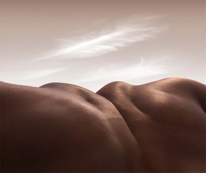
 After years of great success in advertising in the 80s and 90s, British photographer Carl Warner suddenly found his work less in demand and not as fulfilling creatively. Searching for something to rekindle his interest in photography as well as put some new energy into his flagging business, Warner started creating Foodscapes having found inspiration in the produce section of his supermarket. After going viral, these foodscapes opened the door to new clients and a burst of work. From the foodscapes, Warner then departed to a series of other scapes including these Bodyscapes. Maybe a tad disturbing, these contorted and manipulated bodies certainly do make some fantastic landscapes. And the titles fit perfectly. A few examples: The Cave of Abdo-men; Cut Throat Valley; and Headless Horizon, just to name a few. You can see more of these Bodyscapes and the rest of Carl Warner’s work over here.
via behance
Edgeland House: Bercy Chen Studio

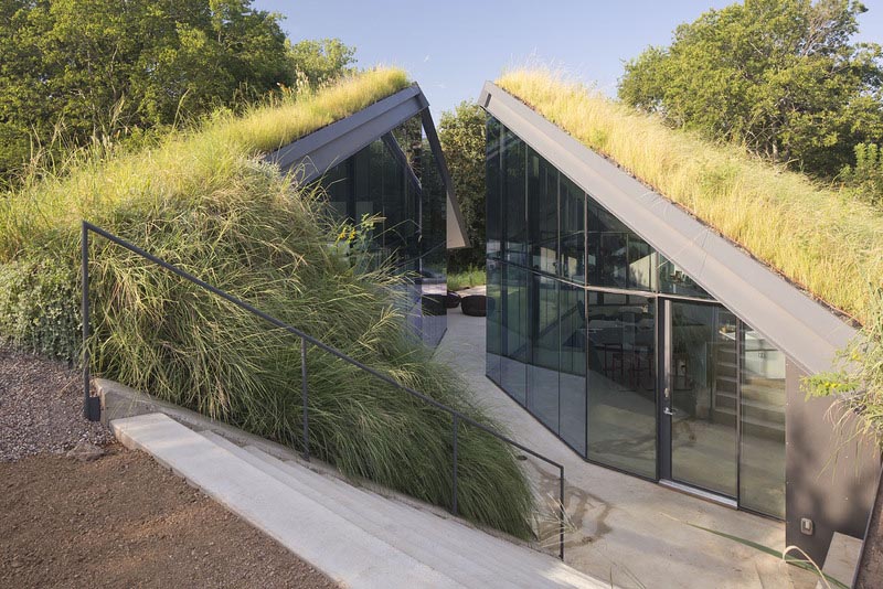
 If you were to pass by the Edgeland House in Austin, Texas, you may just think you’re seeing a small hill that has somehow split apart, or you may just miss it altogether. The cleverly hidden house designed by Bercy Chen Studio, is a contemporary re-interpretation of an old Native American Pit House. The Pit House was typically sunken, taking advantage of the earth’s mass to maintain a comfortable temperature throughout the year; cooler in the summer and warmer in the winter. In addition to providing maximum energy efficiency, the project also converted a property that had long been used as a dumping ground for construction crews into a showcase for the wild nature found in the very land itself. The result is a sculptural piece, hidden from the road with dramatic glass clad polygons stretching out back, allowing illumination of the entire house, with privacy and, of course, sustainability in mind.
Photos courtesy of the architects.
via Texas Architects
Hense: Murals and Paintings
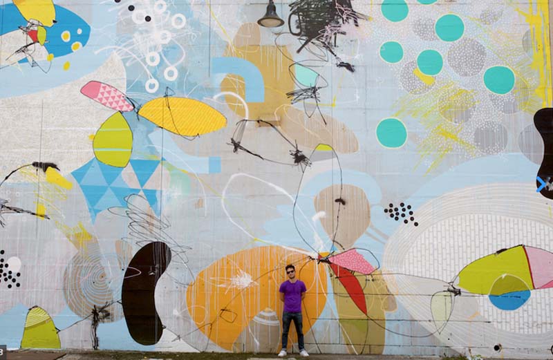

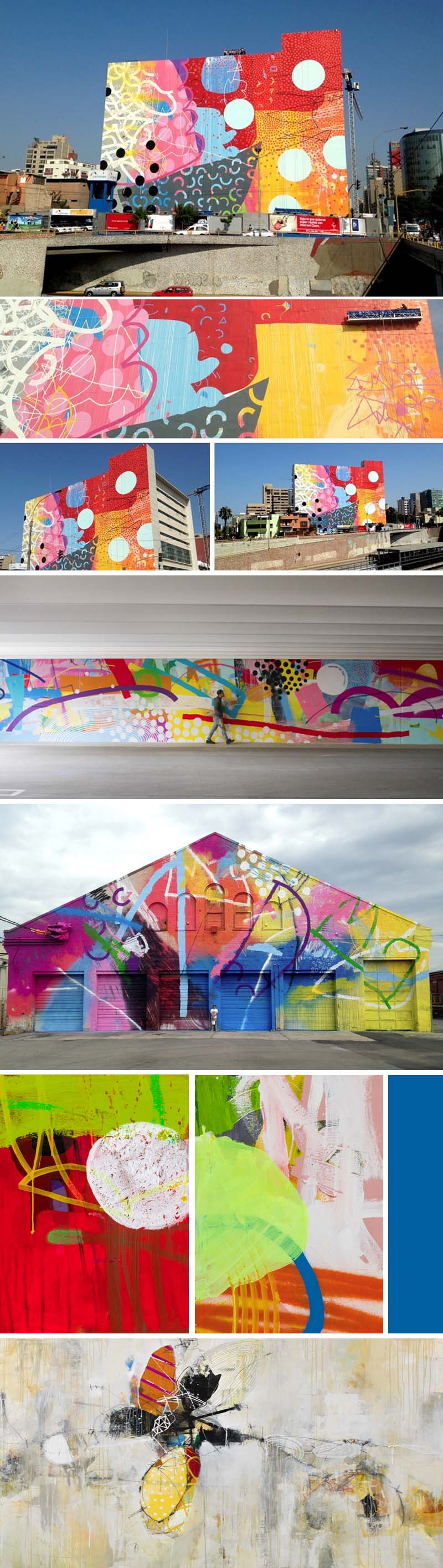 Recently, I ran across more of Hense’s (previously here) beautiful exterior murals. Originally recognized as a graffiti artist, Hense (aka Alex Brewer) moved into granted and commissioned public art, mostly in his native town of Atlanta but, more recently in other cities as well, from Detroit to Richmond, Chicago to Lima, Peru. These spectacularly colorful and cheerful abstract murals could brighten the gloomiest of neighborhoods or the most abandoned of buildings. I love them all. But, even if you don’t have a wall or building to cover, the good news is he paints canvases too. You can see more of Hense’s exteriors here and paintings over here.
Hypertube: PKMN & Taller de Casqueria
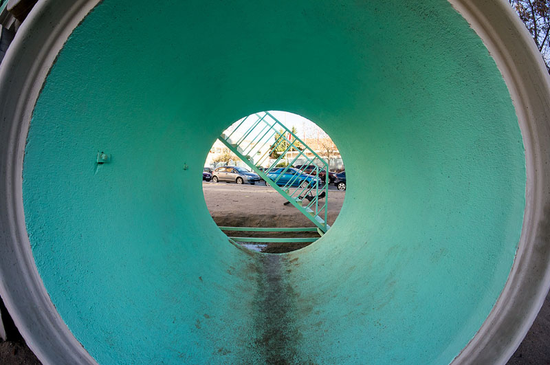
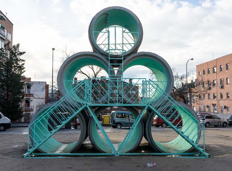
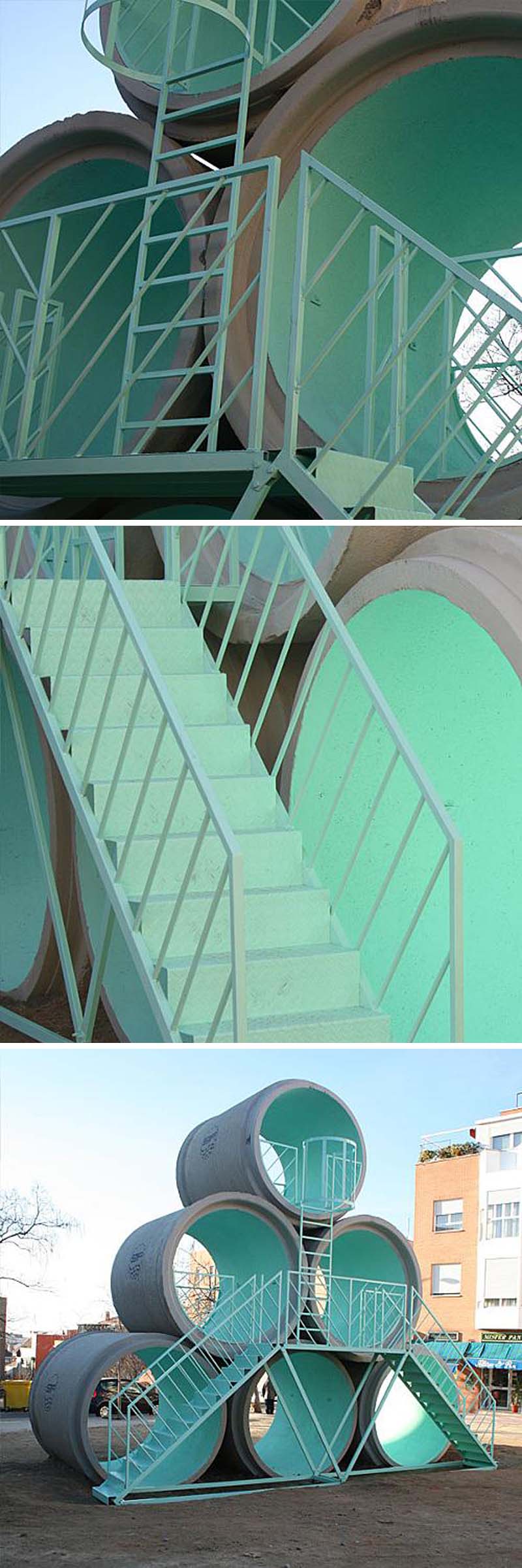 Earlier this year, Madrid launched an innovative project that seeks to “redecorate” lower income neighborhoods of the city with contemporary art interventions, both in the form of sculpture/structure as well as murals. Starting in Tetouan, the initiative to improve the urban landscape has been quite successful and is continuing on into other neighborhoods: first Usera, then Villaverde in the southside of the capital. One such project is Hypertube, a collaboration between PKMN Architects and Taller de Casqueria. The playful looking structure is made up of six precast reinforced concrete tubes two meters in diameter and two and a half meters in length. These dimensions make it possible for anyone to stand inside, from child to adult. Its objective: a “gathering place for neighbors and passers-by.”
Photos: r2hox’s flickr; marta nimeva; & intermdiae
via abc via lagaleriademagdelena
Alyse Emdur: Prison Landscapes
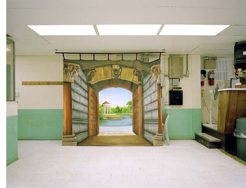
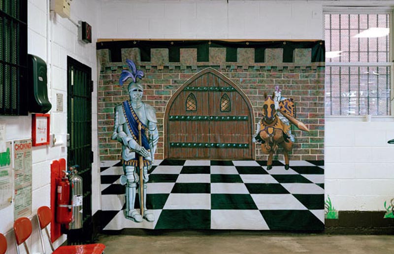
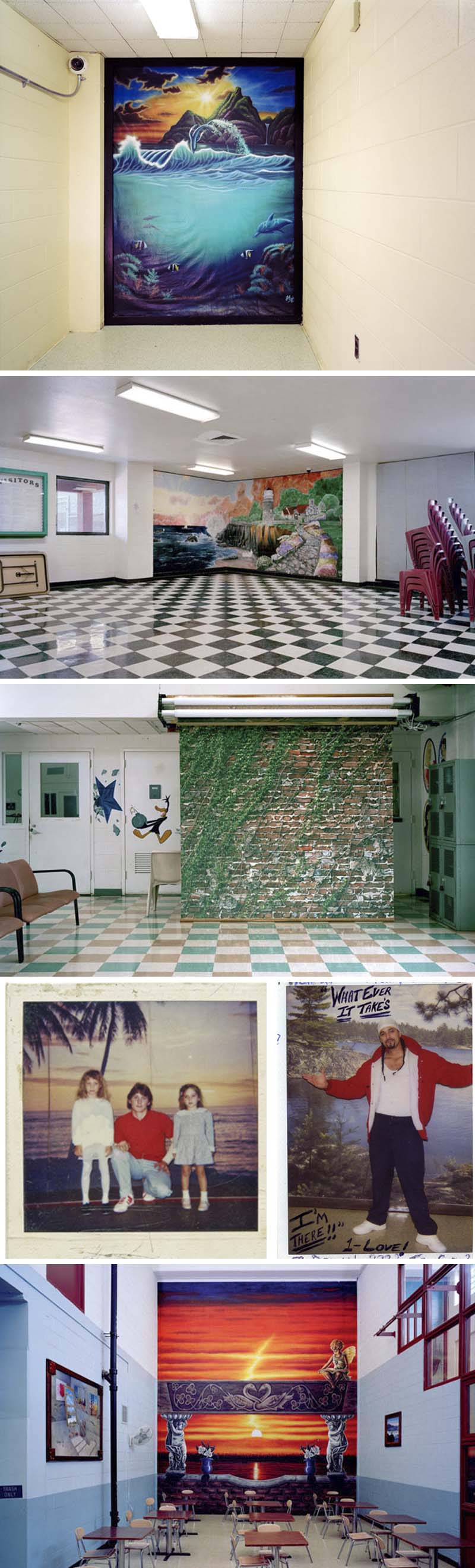 Dan and I went to The Last Brucennial this past weekend and in the midst of the fun chaos that is the show, we spotted some work that really stood out for us. Among these were two large photos by Alyse Emdur which elicited several emotions at once: confusion; laughter; and sadness. And that was before I even googled the artist to find out more about these! We assumed the artist had placed the bizarre murals in these depressing office spaces/institutions, but as it turns out, they all truly exist in this manner. Prison Landscapes as the series, as well as book, is called, is a collection of photographs of prison waiting rooms, that typically have backdrops—often painted by the inmates themselves—which are used as portrait set-ups for the inmates and their visitors to pose in front of for photos. These idealized landscapes offer a brief escape…a chance to pretend that they are somewhere else. Emdur invited hundreds of prisoners to send in their photos for inclusion in her book Prison Landscapes which was initially inspired by a photograph she found in 2005 of herself at age five, posing in front of a tropical beach scene while visiting her brother in prison. Poignant and at the same time a little unintentionally humorous.
r1: Yield
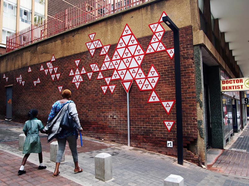
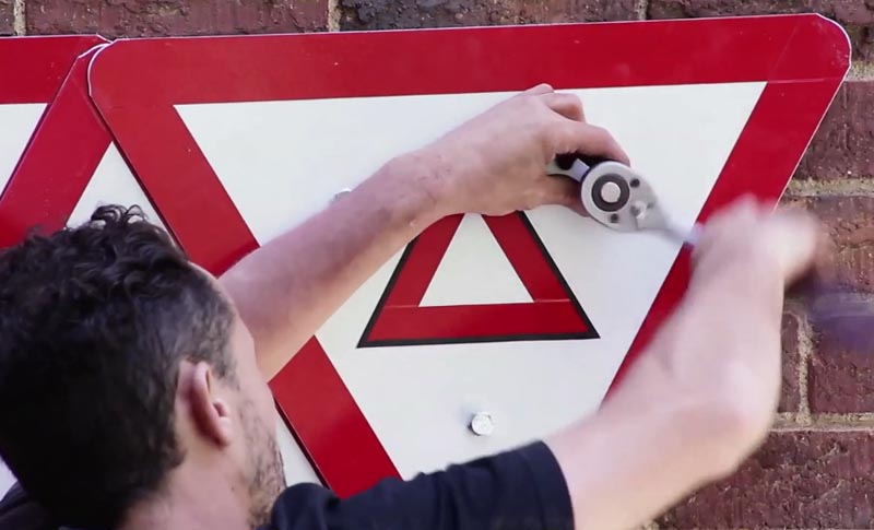
 South African street artist r1 sees the street as an open canvas and thus uses it accordingly, creating urban interventions and sculpture mostly using found materials, reappropriating them into the cityscape. His latest work is titled Yield, based on the commonly seen street sign. Starting by setting a street pole into the sidewalk, r1 continued with 100 yield signs, fitting them in a design on the wall behind it. Commissioned by the City of Johannesburg as part of its upgrade program, the intent being to encourage its citizens to engage more actively with the city’s life and creative activities. The significance of the yield sign is found in the word’s two meanings: to “give way, concede” to others, as well as “to produce.” As r1 states:
“This tension between being productive and giving way exist in every city, and bustling Johannesburg is a good example of it. This piece illustrates that these two seemingly opposite forces are in fact symbiotic; both embodied in the symbol of the yield sign.”
You can see a video of the installation below, and much more of r1’s interesting work here.
