Arthur Collani Chair

Click to enlarge

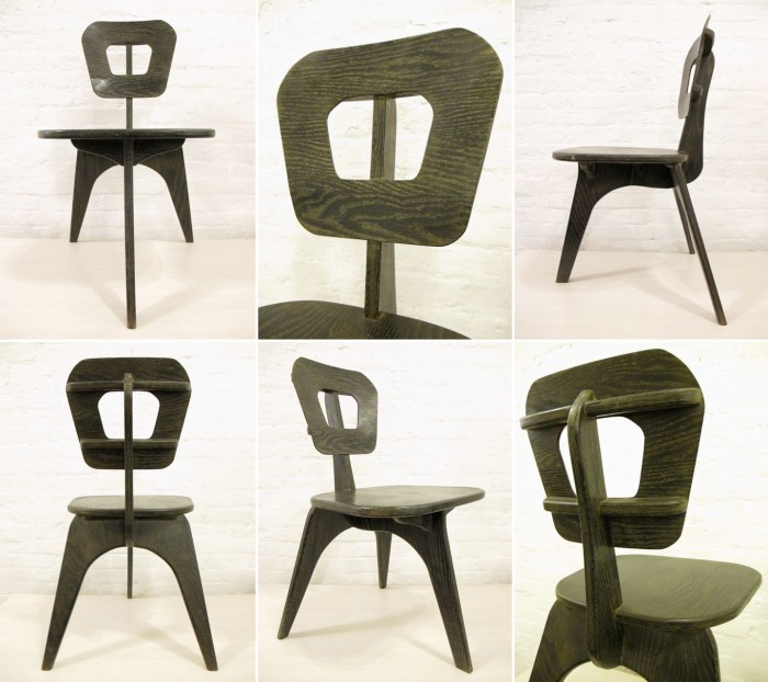
I’m not sure how I ended up finding this Collani Chair from the 1950s, but I really love it. Apparently these were a do-it-yourself design by Arthur Collani published in the January 1952 edition of Home Craftsman magazine. It’s definitely not sleek, but it’s got so much character and, having grown up with different three-legged chairs, I have an appreciation for them.

Available at MondoCane.

Rainbow City at the High Line

U P D A T E : See our post-visit post here for the latest on Rainbow City.

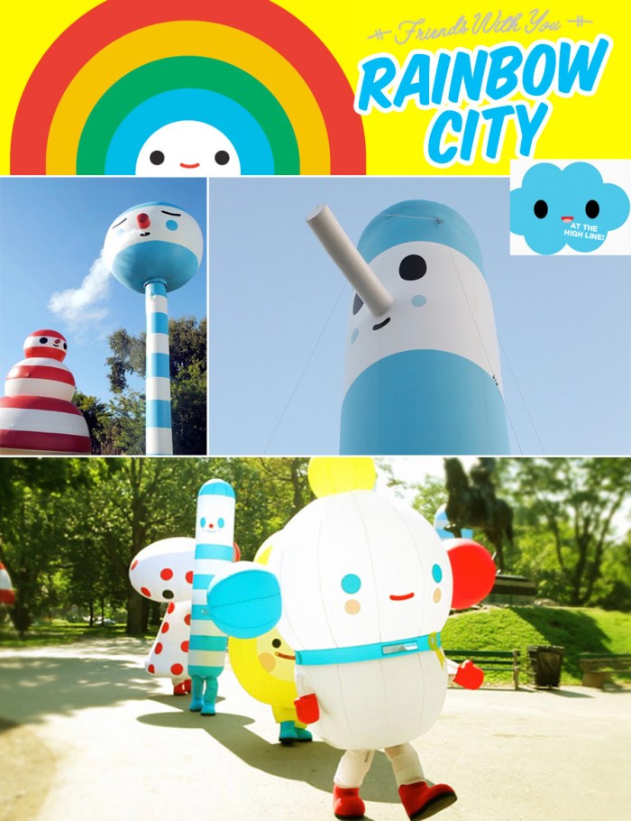
This looks like fun! Em just read about this upcoming event on the Friends With You  site (you may be familiar with their collaborations with KidRobot, among other things.) In celebration of the opening of the second section of the High Line, FriendsWithYou (sponsored by AOL) will be showcasing their forty piece installation Rainbow City.

FriendsWithYou presents a vibrant collection of mutable, air-filled sculptures. Inaugurating in the art district of Chelsea during the month of June, this will be FWY’s first large-scale installation in New York City. This happy city is made up of intensely colored balloon pieces, encouraging visitors to be active and explore the giant 16,000 square foot playground. Built for adults and children alike, the installation allows for interaction with each art object, making the experience unforgettable.

According to the article in the New York Times, the installation is part of a “pop-up plaza” at 30th Street and Tenth Avenue. There will be a 350-seat bar run by Colicchio & Sons, as well as a variety of fashionable food trucks offering a range of edibles from lobster rolls to ice cream.

The installation and festivities open on Wednesday, June 8th, 2011 and run through July 5th. Worth checking out for sure.

SOFTlab

Click images to enlarge

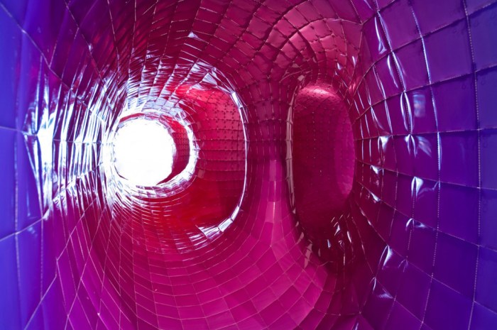
In my next life, I want to work at SOFTlab. These guys look like they have a great time doing everything they do. And what they do is everything. For them “a good idea does not discriminate between any medium or any type of project, it just works for everything.” That includes design of furniture, a website, a brand, a video, a gallery installation, a store display, and pretty much anything else that can be designed. Their approach is to make design customizable; it should allow for change, or growth, and be adaptable.

Just visiting their site is an immensely entertaining experience beginning with the computer animated video on their home page. Unknowingly, I was already familiar with (and a fan of) some of their work such as the colorful taped projection mapping of the New Museum as part of Festival of Ideas for the New City.

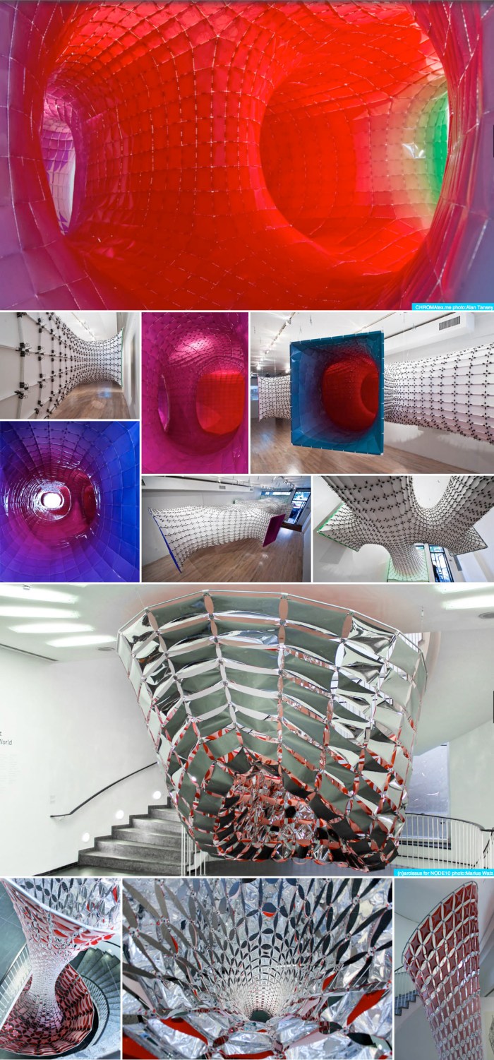
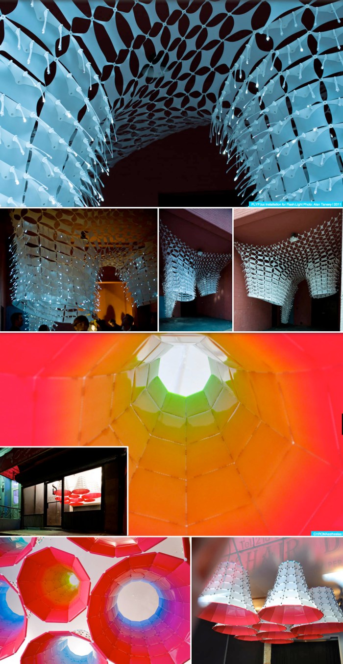
Above are just four of SOFTlab’s projects.
From top to bottom: CHROMAtex.me, a site specific installation for the bridgegallery, LES, New York. Photos: Alan Tansey
(n)arcissus, a site specific installation for NODE10 at the Frankfurter Kunsteverein in Frankfurt, Germany. Photos: Marius Watz.
POLYP.lux, a hanging installation for School Nite, part of the Festival of Ideas for the New City, NYC. Photos: Alan Tansey
CHROMAesthesiae, an installation for Devotion Gallery in Williamsburg, Brooklyn. Photos: Alan Tansey

There are plenty more interesting projects on their website.

via fourthfifthdesign

TOMA

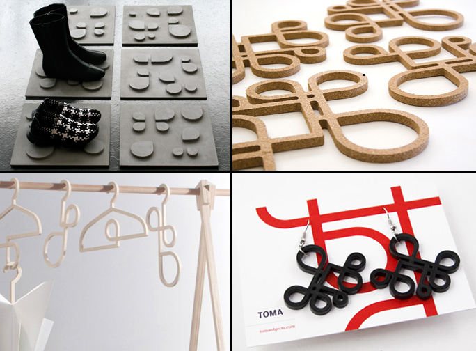
The Montreal company TOMA “takes hold of daily living with a dash of humor and a hint of cunning” in their approach to designing their household objects, as well as adhering to a green philosophy. I find their InsideOut series especially appealing. Shown above, clockwise from top left corner:

Concrete Bootwear tiles, footwear mats made of concrete and fiberglass.
Cork Trivets, also available in wood.
Earrings, laser cut from black acrylic, also available in red or transparent colors.
Accessory hangers, for keeping belts, scarves, and umbrellas in the same place.

See the rest of TOMA’s products here.

Port Authority Bus Terminal Goes Graphic

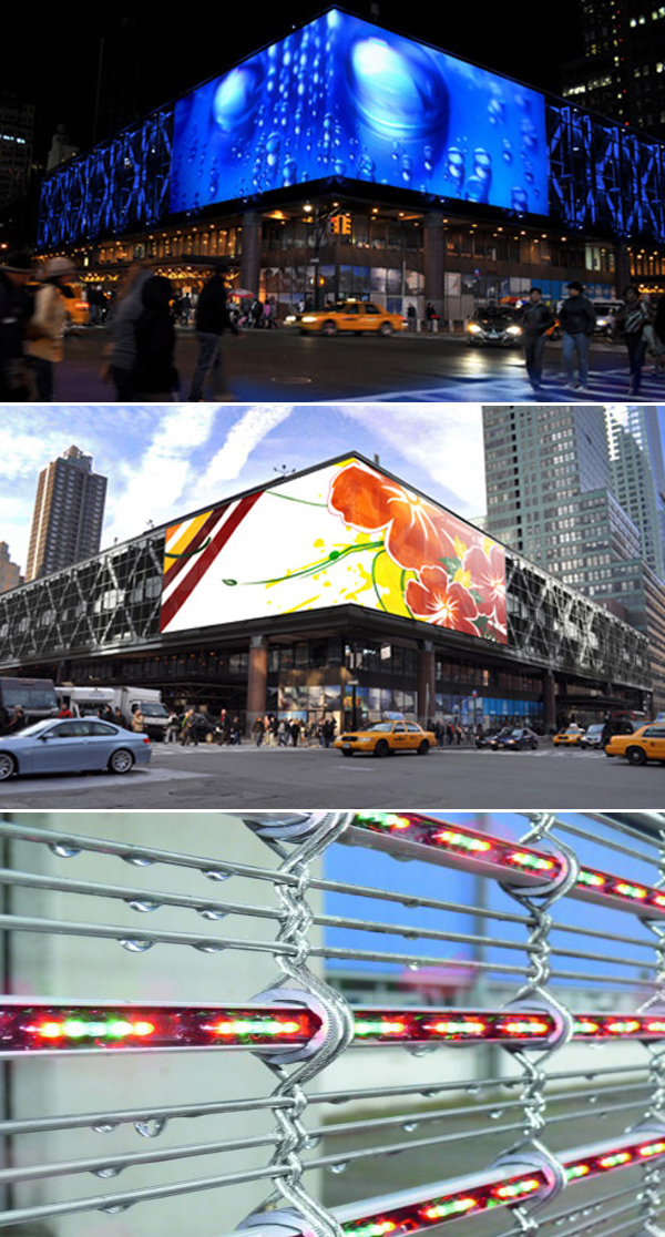
Come the end of this month, the Port Authority Bus Terminal here in NYC will be covered with a 6,000 sq.ft. LED-embedded mesh which, from the interior is transparent, but from the exterior provides a fabric for high-resolution graphics wrapping around the corner façade. The MediaMesh appears opaque during the day (see rendering above).

Hopefully the façade will be used as a medium for art though, unfortunately, unlike the renderings, it’s likely that advertising will be displayed instead. It would be great to be wrong.

via notcot, via Architect’s Newspaper

Paperclip Potpourri

Click to enlarge

Here is a roundup of paperclip-inspired objects as well as a few that are actually made of paperclips.

Clockwise from the top left corner:
The Paperclip Lamp (3 images); Paperclip radiators; Koziol Clip Pen & Pencil Tray; Paperclip Fruit Bowl; Paperclip Money Clip; Paperclip t-shirt; Paperclip Coat Hooks; Paperclip Hanger; Paperclip Typography; Paperclip Necklace; Paperclip Note Cards; Paperclip Radiator/Towel Rack

Leo Villareal

Click on images to enlarge

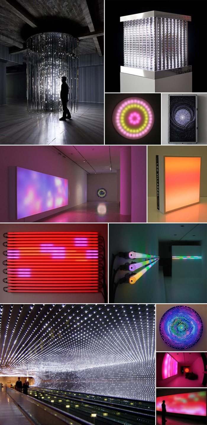
After seeing some of Leo Villareal’s work online, I went over to the Gering & Lopez gallery the other day to see his current show called Volume. The solo exhibit is mainly comprised of the pieces in the top two images: Cylinder and Cube. Cylinder takes up a whole room and is quite impressive, measuring 12ft tall and 9ft in diameter. Made up of white LEDs and mirror finished stainless steel, it’s like your own, personal (I was the only one in the gallery at the time) fireworks show contained within a cylinder. I realized later that he was also the man behind the sparkler-like windows at BAM two or three years ago that were very intriguing at the time.

As much as I liked the few works in the gallery, I would love to see one of his larger shows such as the one at the San Jose Museum of Art which, (based on the photos), looks like it included beautiful colored light panels that are the sort of pieces I imagine Rothko would have created had he had LEDs to play with. Really lovely work and probably even more so in person with the changes in lighting and movement; the complete experience.

Another big project (possibly one of his largest) is Multiverse (bottom left image) at the National Gallery of Art, in Washington DC, through the Concourse walkway. You can see a video here.

All photos are from Gering & López’s site, as well as Leo Villareal’s and Conner Contemporary Art.

The exhibit Volume is up at Gering & Lopez through June 25, 2011.
Origami Madness

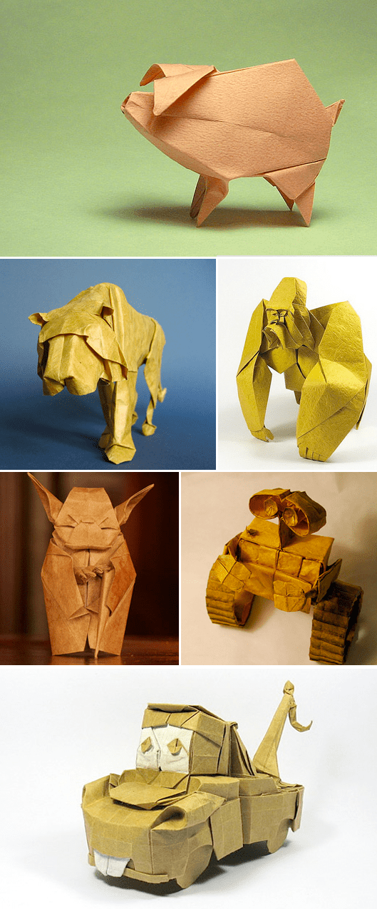
An impressive collection of origami from different sources has been put together by Pavol Janovicek on Cruzine.

From top to bottom and left to right:
Blue Bar Pigeon by Seth Friedman (for Em)
Piggy by Roman Diaz
Onitsuka Tiger by Sopho Mabona; Gorilla by Black Scorpion
May the Autofocus be With You by straightfromthecask; Wall-E by Brian Chan
Tow Mater by Black Scorpion

See many more here.

Gabriele Basílico: Contact 1984

Click to enlarge

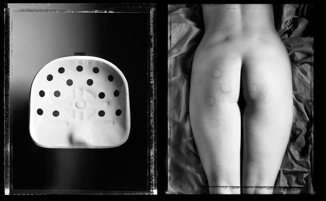
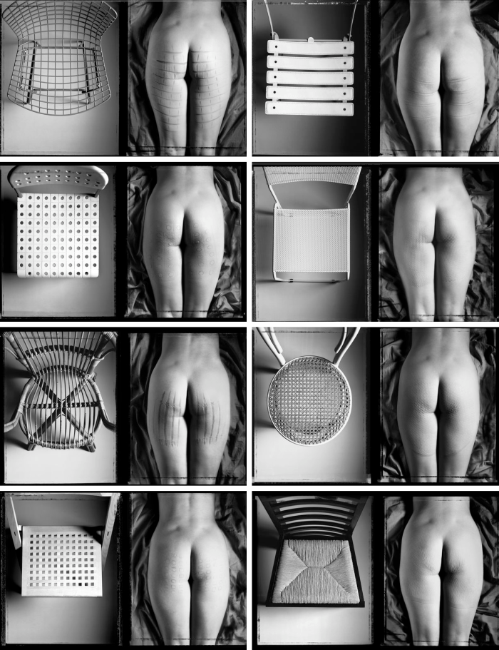
When I came upon the wall of these large blown-up images at the Armory Show here in NYC a couple of months back, it filled me with a silly happiness. Who hasn’t, as a child, wearing shorts in the summer, been fascinated by the different bumps or ridges left on their thighs after getting up from an extended sitting? I certainly was. So, a sort of nostalgia and instant smile overcame me when I observed these photos by Gabriele Basílico, an Italian photographer who according to his gallery’s web site, first shot these photos in 1979. He had been asked to participate in an exhibit entitled “Freedom limits/the object: faced interpretations” and thought to take an ironic approach that invited free interpretation. From the artist:

The opportunity to participate in such cultural and artistic event helped me to take aside the beauty and formality of the still life photographies and to conceived a project more symbolic, ironic and freedom to interpreted the matter.
Thinking through the images about the relationship between the object-chair and the human body it came to my mind the funny and grotesque image that the hard summer chairs left in the naked bodies of the swimmers. It is a real negative “by contact”. A provisional relief tattoo which is printed on the body aesthetically developing the original surface of the contact.

I had neglected to take down Basílico’s name when I saw this at the Armory and had since been looking for it online, so I was especially happy the other day when I happened upon it via La Lettre de la photographie.

Tablemoods

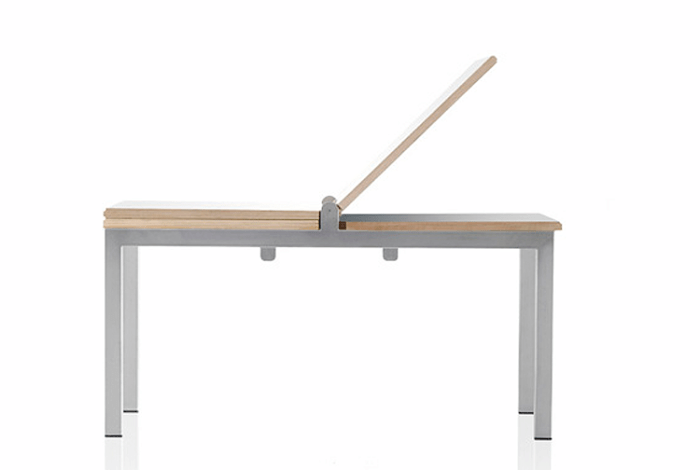
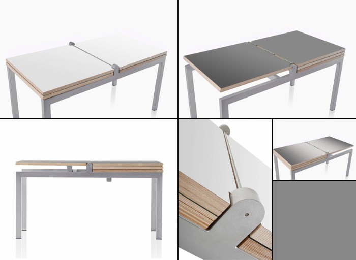
In addition to designing the Ringset ONE, the trio of young designers at Bloomming, in the Netherlands, design furniture and wall partitions. This Tablemoods table can be easily flipped to reveal a white or gray tabletop surface, depending on your mood, or I guess, that of the table’s. Made of stainless steel and birch plywood.

Ringset ONE

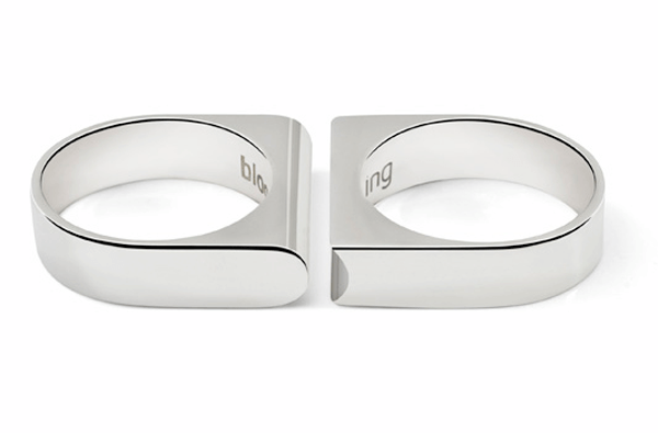
Ringset ONEI’m really not much of a ring person (it’s a small-hands-stubby-fingers thing), in fact Daniela is the big ring-wearer of the family. But, if I were to wear rings this Ringset ONE by the Dutch design studio, Bloomming, would be my style. I like the simple, elegant lines, as well as the interlocking aspect which, for a friendship/wedding ring, is not only clever but meaningful. They come in polished or brushed; silver, gold, or white gold.

Available here.

Adrián Navarro

(Click images to enlarge)

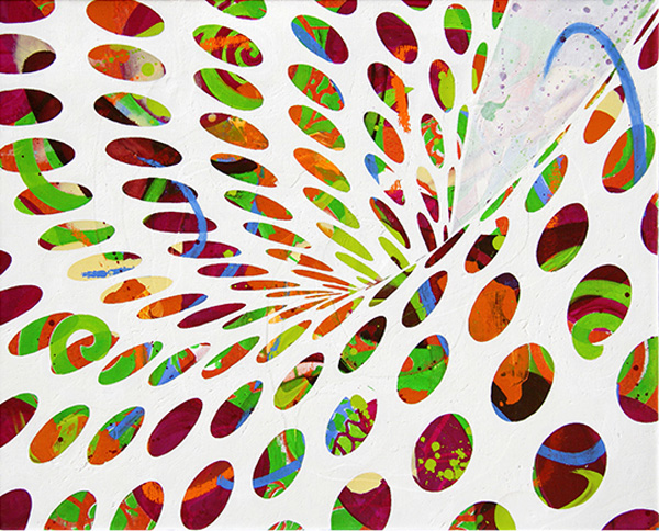
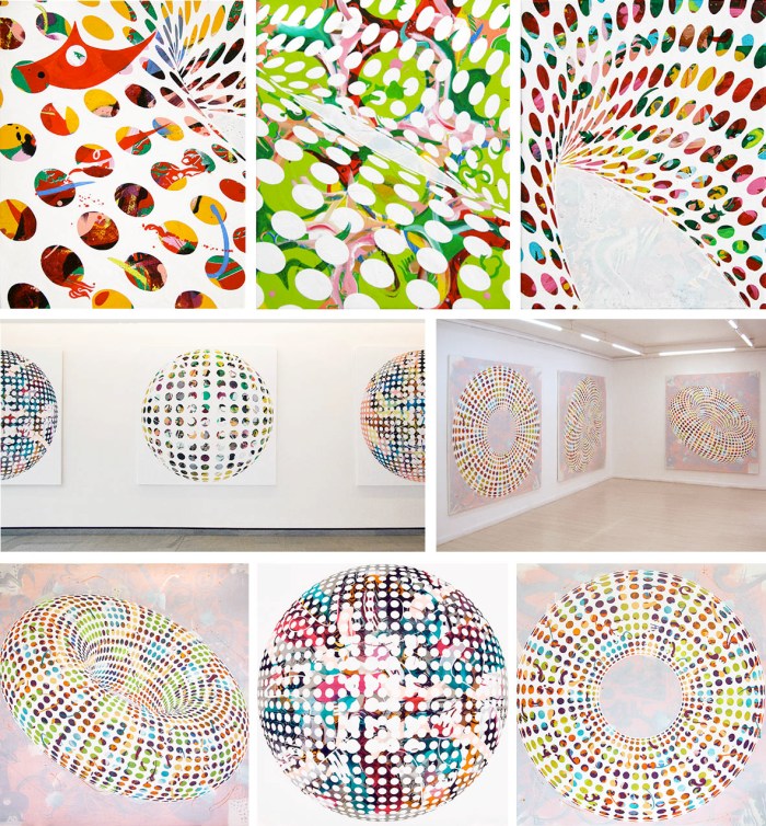
Nice work from Adrián Navarro, presently based in London. His Fragment Series paintings (up top) seem to be his most recent, followed by the Ring Series, and then the Sphere Series.

His paintings describe implosions of colour trapped inside virtual volumes that float weightlessly in the pictorial space.  Navarro´s work explores the paradox between the physical confinement and the expansive freedom inherent to the organic painting, and by extension to the human being.

I’d love to see these live.

TypeClock

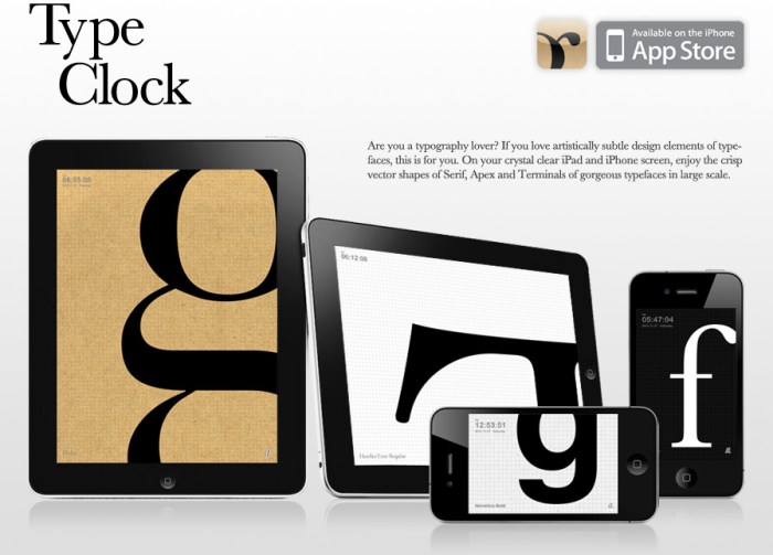
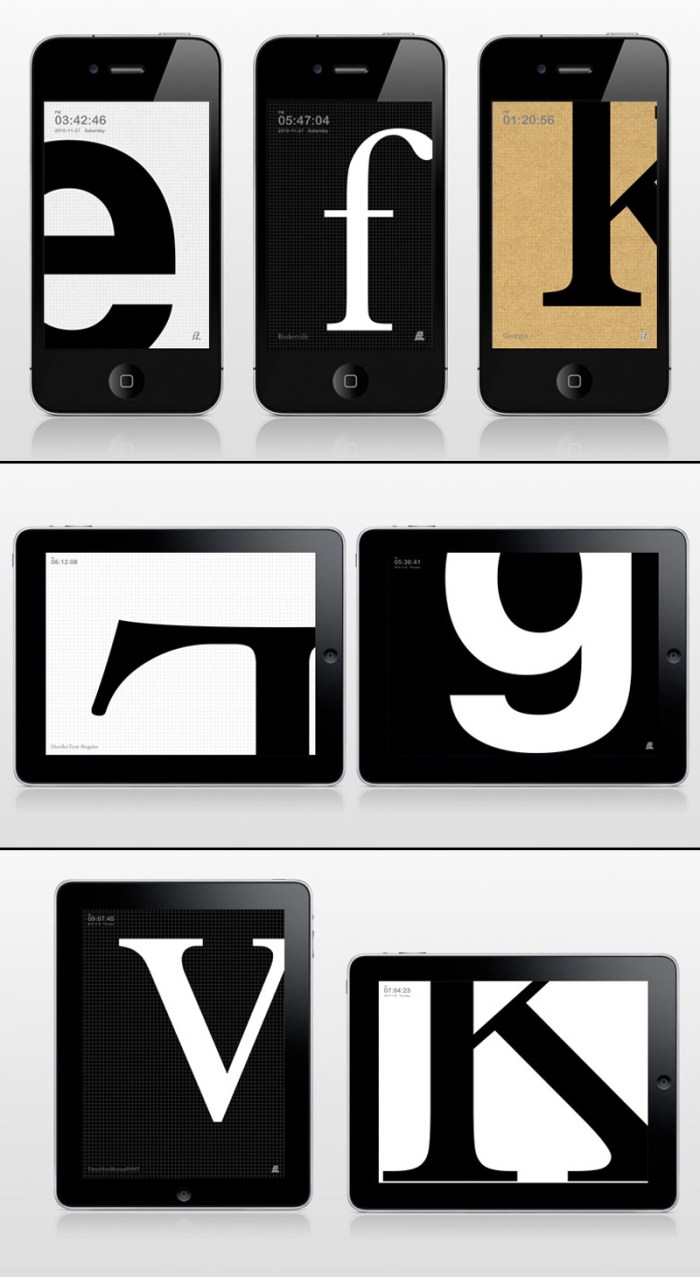
I met Dong Yoon Park on a typography tour of Staten Island last fall. Yes, strange but true. On the tour I had briefly chatted with him and he had shown me, on his iPhone, some of the things he was working on at Parsons as a grad student and teacher in their department of Design & Technology. Later, I visited his website and was really impressed with the rest of his work as well. Today I checked his site to see what he was up to and, sure enough, there waiting, was this lovely app for typography lovers! So simple and beautiful. What could be better than having a blown up letter of your choice on the screen of your phone or iPad?

From the iTunes AppStore:

Are you a typography lover? If you love artistically subtle design elements of typefaces, this is for you. On your crystal clear iPhone screen, enjoy the crisp vector shapes of Serif, Apex and Terminals of gorgeous typefaces in large scale. You can set own character set, type size and transition speed.

TypeClock can be purchased here for $0.99 and you can see more information here and a video here.