Empty Sky: Jersey City 9/11 Memorial

911 Memorial, New Jersey, Names, Frederic Schwartz Architects, Sculpture, landscape architecture911 Memorial, New Jersey, Names, Frederic Schwartz Architects, Sculpture, landscape architecture911 Memorial, New Jersey, Names, Frederic Schwartz Architects, Sculpture, landscape architecture9/11 New Jersey Memorial, Frederic Schwartz architects, collabcubed, monizaClick to enlarge

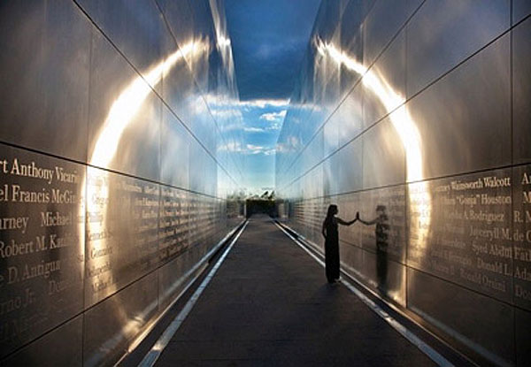
Though I haven’t yet visited the 9/11 Memorial down at the World Trade Center, it has been so thoroughly documented that I am not only aware of its existence, but also have a reasonably good idea of what to expect when I do finally go in person. The same cannot be said of the New Jersey memorial, Empty Sky, on the other side of the Hudson River, honoring the 744 victims from New Jersey who lost their lives at the Twin Towers on September 11th, 2001. That is until now, that I’ve come across its existence.

This simple yet striking memorial, designed by Frederic Schwartz Architects, consists of twin cement and stainless steel walls, 12 feet apart, 30 feet high and 210 feet long, that reflect the changing light of day creating a halo effect at dusk and dawn as the sun hits the parallel walls. The corridor created by these two walls dramatically draws the eye to the vacant (empty) space where the towers once stood. Working with graphic designer Alexander Isley, it was decided to engrave the names of the victims in ITC Bodoni 12 in a larger size than is usual in memorials, using a cap height of 3.6 inches, spacing the names out so that none of them are broken, and allowing for the families of the victims to easily create rubbings of their names, if they so choose. Other consultants on the project include Ove Arup & Partners Structural Engineers and Arnold Associates as the landscape architects.

The project was unveiled this past September. I’ll have to pay a visit to this memorial in addition to the inverted fountains downtown.

Photos and images courtesy of the architects; Ari Burling Photography; David Sundberg/Esto; and Moniza’s flickr

via sedg
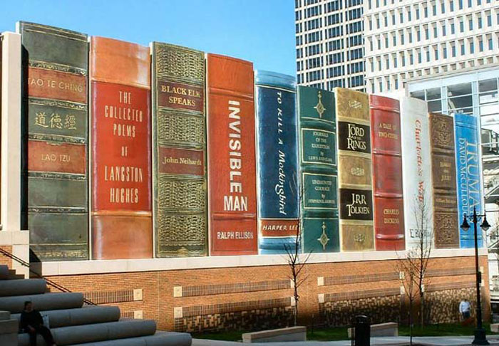
Kansas City Public Library Parking Garage
Books as architecture, book spines, clever library design, clever parking garage design, cdfm2 architects, 360 architectsBooks as architecture, book spines, clever library design, clever parking garage design, cdfm2 architects, 360 architectsBooks as architecture, book spines, clever library design, clever parking garage design, cdfm2 architects, 360 architectsClick to enlarge

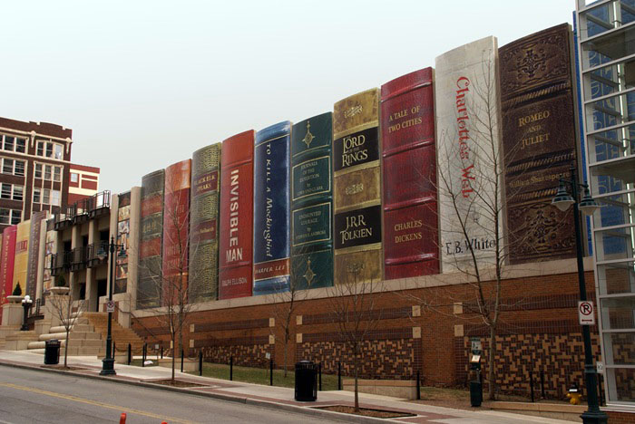
Though the Kansas City Library Parking Garage in Kansas City, Missouri was completed in 2004, I had never seen it before. Designed by cdfm2 architects (now apparently 360 Architects), the book spines measure approximately 9 meters by 3 meters and are made of signboard mylar. The shelf showcases 22 titles reflecting a wide variety of reading interests suggested by Kansas City readers and then selected by The Kansas City Public Library Board of Trustees. Clever.

Photos: Jonathan Moreau, Hanneorla, Worldslargestthings, and Jonathan Kemper.

via visiondivision

Plastique Fantastique: Fantastic Plastic

temporary architecture, fantastic bubbles in urban spaces, marco canevacci, inflatable structures, temporary exhibit spacestemporary architecture, fantastic bubbles in urban spaces, marco canevacci, inflatable structures, temporary exhibit spacestemporary architecture, fantastic bubbles in urban spaces, marco canevacci, inflatable structures, temporary exhibit spacesClick to enlarge

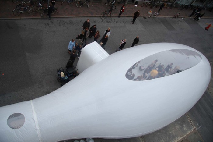
Based in Berlin, Plastique Fantastique is self-described as a studio for temporary architecture. Since 1999 this team of designers, artists, and engineers – headed by architect and founder Marco Canevacci – has been creating fantastic plastic bubbles in urban spaces for art exhibits, trade shows and festivals.

From their website:
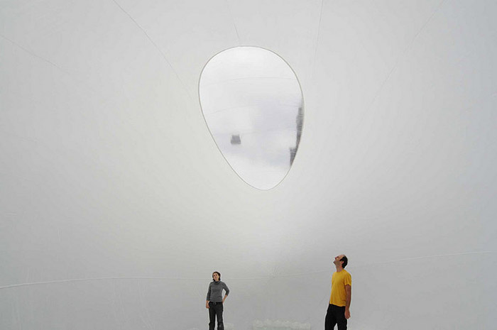
Plastique Fantastique’s synthetic structures affect the surrounding space like a soap bubble does: it is a foreigner which occupies and mutates usual relations and points of view. By mixing the landscape, it gives birth to a new hybrid environment that allows an osmotic passage between private and public space. The installations crop the subject from its context by beaming it into a new realm of space. Whether people interact with the bubble simply by seeing it, or walking around the exterior, or actually moving through the interior, the structure is a medium to experience the same physical setting in a temporary extraordinary situation. Plastique Fantastique creates light and fluid structures that can lay on the street, skirt a wall, infiltrate under a bridge, squeeze in a yard, float on a lake, invade an apartment and generate an “urban premiere”.

Very fun and cool. If you like these you might also enjoy the work of Lang/Baumann, Architects of Air, and Olga Diego.

via cityvision

Adriano Zumbo Pâtissier

Zumbo Patisserie, Retail Design, Sydney, Fun Bakery design, The Star, Luchetti Krelle Design, collabcubedZumbo Patisserie, Retail Design, Sydney, Fun Bakery design, The Star, Luchetti Krelle Design, collabcubedZumbo Patisserie, Retail Design, Sydney, Fun Bakery design, The Star, Luchetti Krelle Design, collabcubedClick to enlarge

This is a fun design for a bakery! Adriano Zumbo, who has four locations in Australia, creates desserts that are unique in concept and execution, and so it would seem that designers Luchetti Krelle (Stuart Krelle and Rachel Luchetti) set out to design a space unique in concept and execution as well for Zumbo’s latest location at the Star Casino in Pyrmont. Full of humor from the windmill boots in the window to the dessert conveyer belt and the “In Case of Emergency Break Glass” cases of French Macarons, the space is sure to lure in any passersby.

Photos by Murray Fredericks and Adriano Zumbo’s website.

CollabCubed at 1

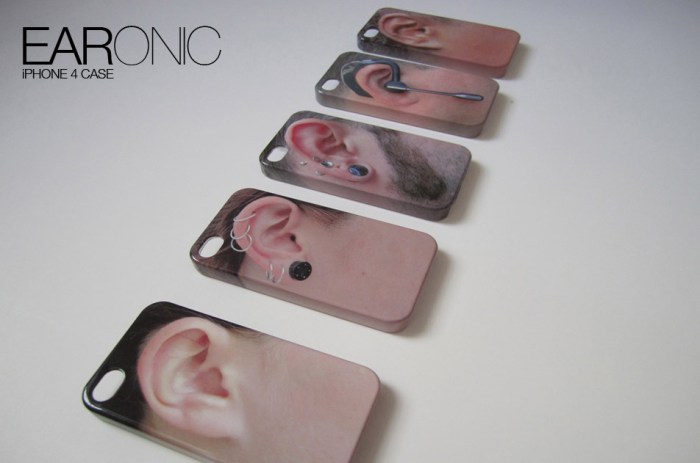
Last week marked our one year anniversary as a blog and, though not an especially remarkable feat in this sea of blogs, it seems like a good time to say of few words and acknowledge some people. It’s been a fun year for us and surprising how this blog, as well as a few related side projects, have been major topics of conversation between the three of us even at a semi-long distance. We’ve had fun trying to come up with somewhat unique content and it’s been really satisfying, and sometimes a little thrilling, to have many of the blogs and sites that we admire pick up some of our posts. Notcot and Rugenius (aka Jean and Justine) over at notcot.org have picked up many of our submissions and have been instrumental in giving us exposure. You can see our collabcubed posts on their pages here. Christopher Jobson at the amazing Colossal has had many kind words for us and been very supportive, as well as picking up several of our posts during the year and kindly linking back to us…this is where the little thrills came in. Same goes for the wonderful thisisnthappiness. And a big thanks to holycool and the always generous swissmiss for being the first ones to post our EARonic phone cases causing them to go viral with buyers cropping up all over the globe and eventually leading to a deal with Fred and Friends who will be distributing a variation on Daniela’s initial concept starting next month but, have no fear, we continue to sell our own EARonic models at our shop.

We’ve got other exciting projects in the works for this year, starting with being selected to exhibit our EARonics and some other designs at the Designboom Mart at the ICFF 2012 in New York this May, which has us super excited, but we’ll talk more about that later.

In the meantime we’ve added a bunch of photos and links to our facebook page – we’ll be adding more in the next few days – making it easier to look at some older posts, so maybe you’d like to ‘like us’ there if you haven’t already, and of course there’s also twitter, or subscribe to our RSS feed or emails.

Below are a few of our most popular posts this past year (in case you missed them the first time around); click on the photo to go to the post. Most importantly, thanks to all of you for following our blog and making it fun for us to keep posting.

Sang Sik Hong Plastic Straw Sculptures

Nicole Dextras Ice Typography

The Portrait Building by ARM Architects

Matchheads by David Mach

Blackfield by Zadok Ben David

The Transfinite: Ryoji Ikeda

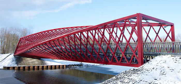
The Twist Bridge

Ana Soler: Causa-Efecto

EARonic iPhone Cases by Daniela Gilsanz

Slade Architecture: Virgin Clubhouse and…

Virgin Atlantic, new JFK Clubhouse, Airline Lounge, Slade Architecture, collabcubedVirgin Atlantic, new JFK Clubhouse, Airline Lounge, Slade Architecture, collabcubedVirgin Atlantic, new JFK Clubhouse, Airline Lounge, Slade Architecture, collabcubedClick to enlarge

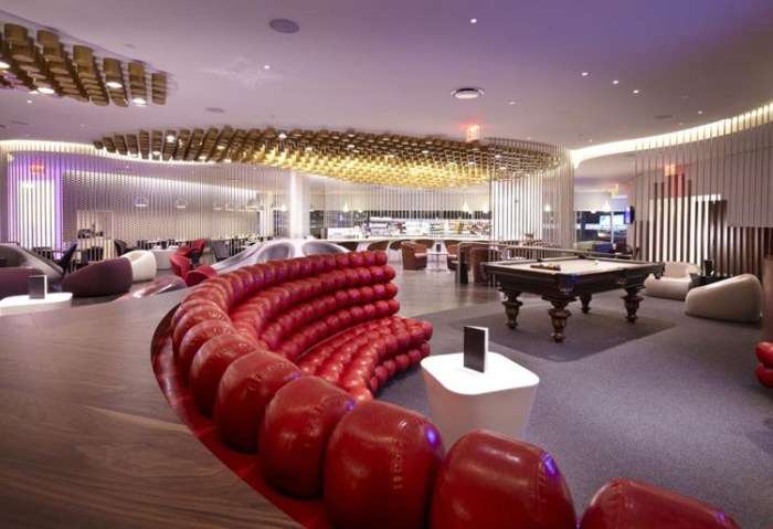
Virgin Atlantic’s new JFK Clubhouse – designed by our good friends James and Hayes Slade of Slade Architecture – opened yesterday at JFK International Airport here in NYC. The 10,000 square foot lounge includes a beautiful curvy bar, cool seating such as the also curved, oversized, custom-made flame red ball sofa, and a large maple wood and burgundy billiards table in the ‘Entertainment Zone’. Bumble and Bumble has opened their first US airport salon and spa as part of the Clubhouse, as well.

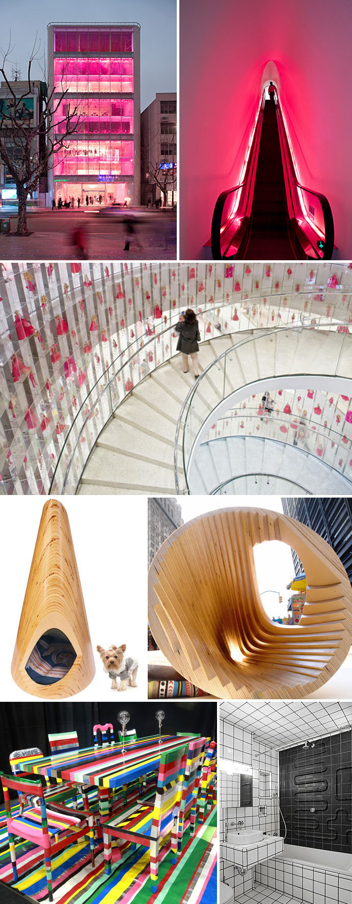
Slade Architecture have a slew of great projects under their belt (many of them award winning) and an impressive range to boot; from residential to commercial, educational to cultural…plus furniture and product design, to boot! Below are some of our recent favorites, but you should really visit their website to see much more.

James Slade, Hayes Slade, Cool Barbie Flagship Store, Pup Tent, Diffa Installation, Bathroom design

Top three photos: Barbie Flagship Store in Shanghai; second from bottom: Pup Tent; bottom left: Diffa Installation (discarded furniture covered in duct tape); bottom right: East 67th Street Bathroom.
All photos courtesy Slade Architecture

via Virgin Atlantic’s facebook page

Slinky Springs Bridge: Tobias Rehberger

Slinky Bridge, New Bridge over Rhine_Herne Canal, Germany, in style of Slinky toy, collabcubedSlinky Bridge, New Bridge over Rhine_Herne Canal, Germany, in style of Slinky toy, collabcubedSlinky Bridge, New Bridge over Rhine_Herne Canal, Germany, in style of Slinky toy, collabcubedSlinky Bridge, New Bridge over Rhine_Herne Canal, Germany, in style of Slinky toy, collabcubedClick to enlarge

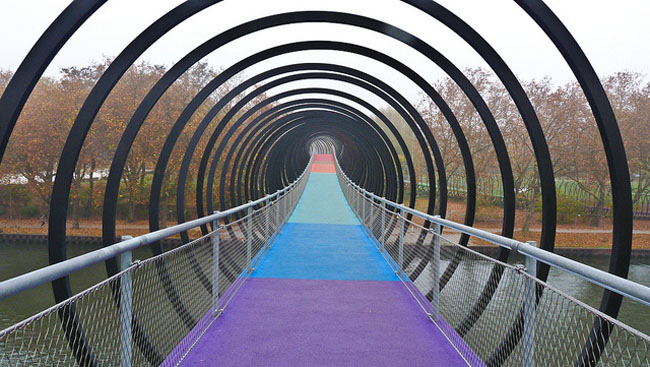
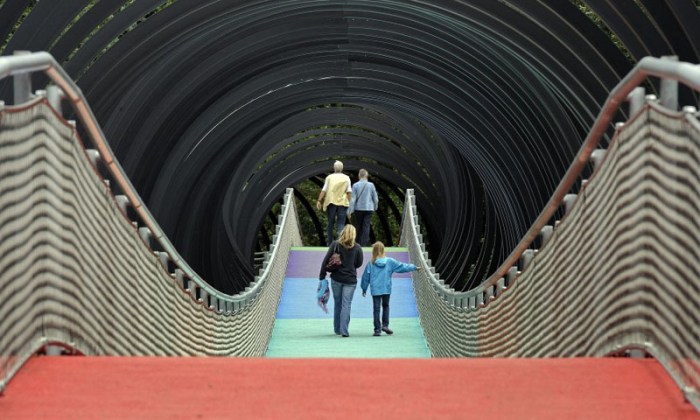
The Slinky Springs Bridge in Oberhausen, Germany, was completed this past summer. Designed by artist Tobias Rehberger, the inspiration for the bridge came from the iconic Slinky toy and the catchy phrase “Slinky Springs to Fame” which seems to be the way the bridge is referred to. Rehberger was able to recreate the light, wild and irregular quality of the toy in his vibrating spiraling bridge that almost looks thrown across the Rhine-Herne Canal. This was no easy feat, if I understand correctly from the not-always-easy-to-decipher google-translated German sites that I read. Apparently, the execution of artist Rehberger’s, (self-admittedly clueless about bridge design) vision was successfully accomplished through the collaboration with structural engineers Schlaich Bergermann and Partner. A bit of description from their website on the 406-meter-long bridge with 496 coils:

Following the design of the artist Tobias Rehberger, a colorful ribbon wrapped in a light, swinging spiral connects the two existing parks. The lightness of this design is due to the minimalist structural design of the stress ribbon bridge. Two steel ribbons made of high strength steel connect to the inclined supports across the canal. The resulting tension force is transferred into strong abutments through the outer vertical tension rods. The walkway consists of pre-cast concrete plates, bolted to the stress ribbon, to which the railing and spiral are attached. The springy synthetic pavement of the walkway as well as the colorful rhythmization of the concrete and coating amplifies the dynamic experience of the bridge.

The colorful pavement pathway was carefully selected by Rehberger who had very specific ideas on its look. Then the bottom of the bridge was made to exactly match the colors on top in a separate material. It’s great how the nighttime illumination really accentuates the colorfulness.

Seems to me that bouncing across the incredibly cool and unique Slinky Bridge could be a lot of fun, if maybe a little unsettling as well.

If you like this bridge then you’ll probably enjoy the Tiger & Turtle Walkable Rollercoaster and the Twist Bridge as well.

Photos: Dirk Jungholt’s flickr, Roman Mensing, Jens Stachowitz, and AP.

Dimitris Polychroniadis: Church Slogan Art

Humorous Church sign slogan inspired contemporary sculpture, Dmitris Polychroniadis, collabcubedHumorous Church sign slogan inspired contemporary sculpture, Dmitris Polychroniadis, collabcubedHumorous Church sign slogan inspired contemporary sculpture, Dmitris Polychroniadis, collabcubedClick to enlarge

Architect and set designer Dmitris Polychroniadis from Athens has recently completed a series of humorous sculptures inspired by church sign slogans and relevant to the struggles that his country (as well as much of the world) is presently experiencing. The series is titled The Miracle of Fluo Colours.

From Polychroniadis:
Religion often serves as an emotional ‘lender of last resort’ in times of crisis. The idea for this series of maquette sculptures, comes from Christian church signs and billboards in the US. By stripping these religious quotes away from their physical and emotive context, the ‘message’ becomes more absolute, almost surreal. To emphasize this further, the text size has been exagerated in scale (compared to the figurines) and colour. The project is somewhat ‘street’ influenced by large scale advertising and slogan graffiti. The title of the series generates a contrast: The notion of God-sent miracles as an integral part of religious faith, against the marvels of man-made, modern age, industrial technology and it’s products such as fluoerscent materials and colours.

You might enjoy some of Polychroniadis’ architecture work as well. I especially like his use of type in his restaurant and store designs.

Photos: Michalis Dalanikas & Dimitris Polychroniadis

Hirshhorn Bubble: Diller Scofidio + Renfro

Temporary inflatable exhibit, peformance space, Hirshhorn Museum, Diller Scofidio and RenfroTemporary inflatable exhibit, peformance space, Hirshhorn Museum, Diller Scofidio and RenfroTemporary inflatable exhibit, peformance space, Hirshhorn Museum, Diller Scofidio and RenfroClick to enlarge

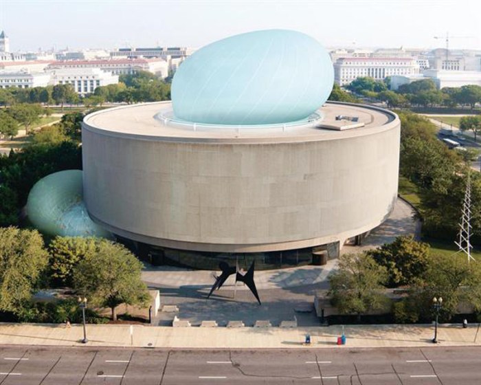
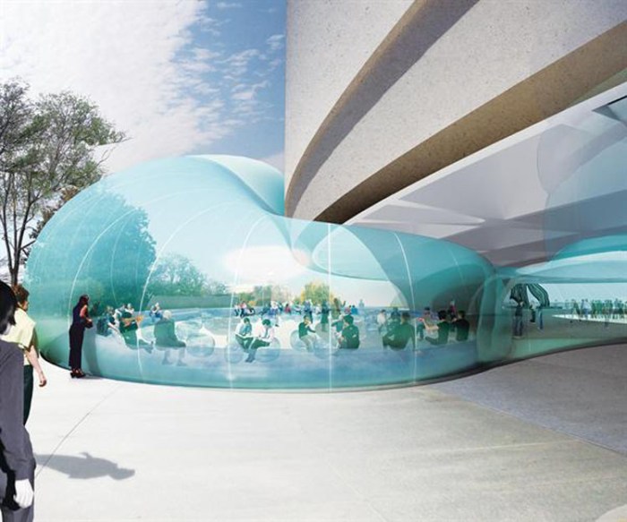
This is such a clever and fun idea! Diller Scofidio + Renfro (fast becoming one of my favorite architects after the High Line, Alice Tully Hall and all the renovations at Lincoln Center, as well as the ICA in Boston, just to name a few…) have designed an inflatable temporary event space for the cylindrical courtyard of the Hirshhorn Museum in Washington, D.C. The thin translucent membrane of the pneumatic structure is meant to be squeezed into the void of Gordon Bunshaft‘s donut-shaped building, and ooze out  the top as well as beneath the mass. The contrast of the soft and hard structures is great, and by roofing over the courtyard the museum gains 14,000 sq. feet of sheltered space in the spring and fall that will accommodate up to a 1000-person audience for performing arts events, films, lectures or even art installations.

The project was initially scheduled to open in Fall 2012, but due to lack of sufficient funding, the project may be delayed slightly. Hope not too long…

Images all courtesy of Diller Scofidio + Renfro.

via Architect Magazine

Espacio Cultural El Tanque: The Tank

The Tank, Cultural Space in Santa Cruz de Tenerife, Oil tank converted to performance, exhibit spaceThe Tank, Cultural Space, Oil tank converted to performance, exhibit space, Canary IslandsThe Tank, Cultural Space in Santa Cruz de Tenerife, Oil tank converted to performance, exhibit spaceClick to enlarge

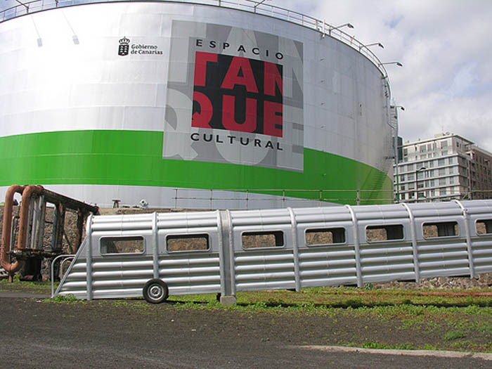
Though they are celebrating their fifteenth anniversary this year, Espacio Cultural El Tanque de Santa Cruz de Tenerife, in the Canary Islands, is news to me and, judging from my googling, might be news to many. Menis Arquitectos transformed the old oil tank, the last of its type in the formerly industrial landscape, into an ever-changing cultural space used to display art installations as well as a performance venue for concerts. 50 meters in diameter and 20 meters in height, the tank has a temple-like quality. An old train car is used as the entrance ramp adding to the drama of the space. That, combined with the impressive installations and lighting of the space make it a cool-looking destination for anyone heading to Tenerife.

Photos: Colin Kirby, omarnahas’s flickr, encarneviva’s flickr, georgepompidou’s flickr,  Hisao Suzuki, and Teresa Arozena

Superkilen and The Red Square in Copenhagen

Park, playground, copenhagen, colorful park, Red Square, multicultural, bike pathPark, playground, copenhagen, colorful park, Red Square, multicultural,Park, playground, copenhagen, colorful park, Red Square, multicultural, bike pathClick to enlarge

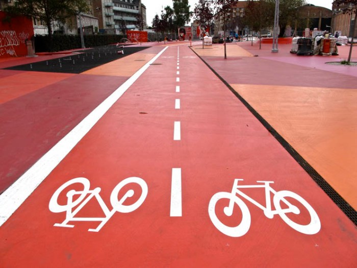
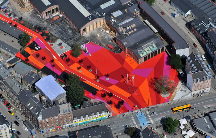
Superkilen, a multicultural section of Copenhagen in the northwest part of the city has recently finished its new Red Square; a park and playground that is actually painted all shades of red. To reflect the many cultures in the community, the park is furnished with elements such as benches, trees, signage, and other furnishings all imported from 57 different countries.

Designed by Superflex, BIG (Bjarke Ingels Group) and TOPOTEK1, the urban park occupies a long stretch containing a green and a black area in addition to the red zone. Each section facilitates different activities.

Very cool and fun.

Photos courtesy of the architects, classiccopenhagen’s flickr, and Drumstik1’s flickr

via a+t magazine

Lauren Smith: Doubt and Confusion

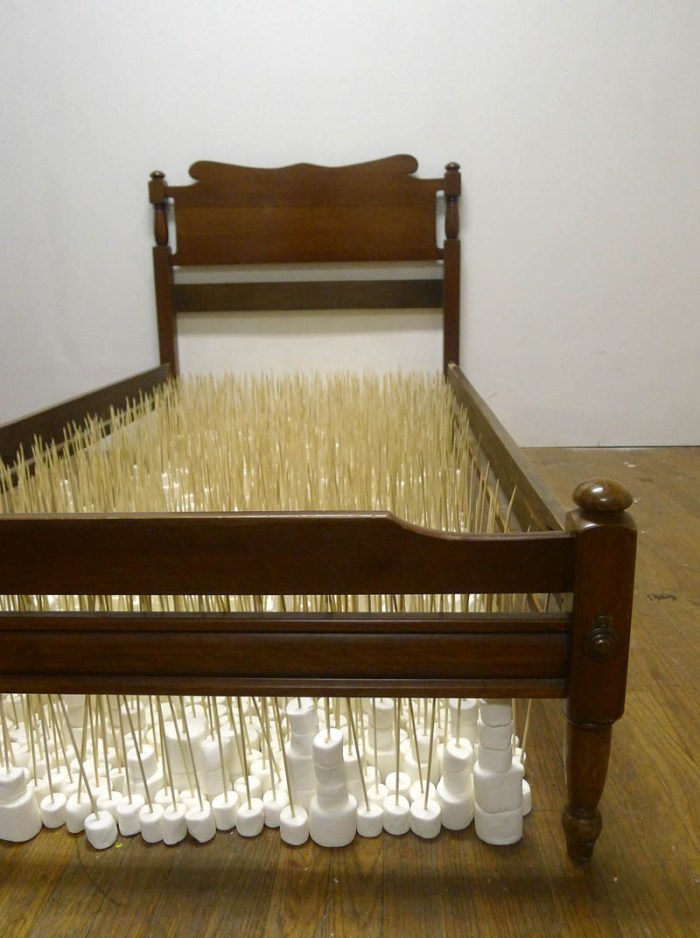
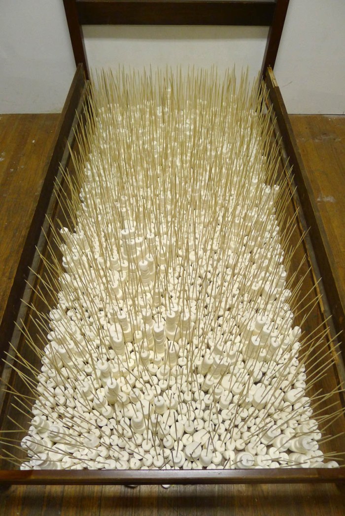
contemporary art, installation, bed frame, marshmallows, humor, confusion, collabcubedcontemporary art, installation, bed frame, marshmallows, humor, confusion, collabcubedcontemporary art, installation, bed frame, marshmallows, humor, confusion, collabcubedClick to enlarge

New Jersey based artist Lauren Smith is a 2D/3D mixed media artist whose work is influenced by three years experience in historic preservation architecture. As Smith stated in an interview:

I try to create environments that make the viewer feel a sense of doubt and/or a moment of confusion.

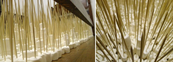
Here, in two very different types of works, one an installation the other drawings, she does just that. Above, her installation titled Under the Bed is made with a wooden bed frame enclosing a ‘mattress’ of skewered marshmallows. Maybe not a lot of doubt here, but definitely some confusion.

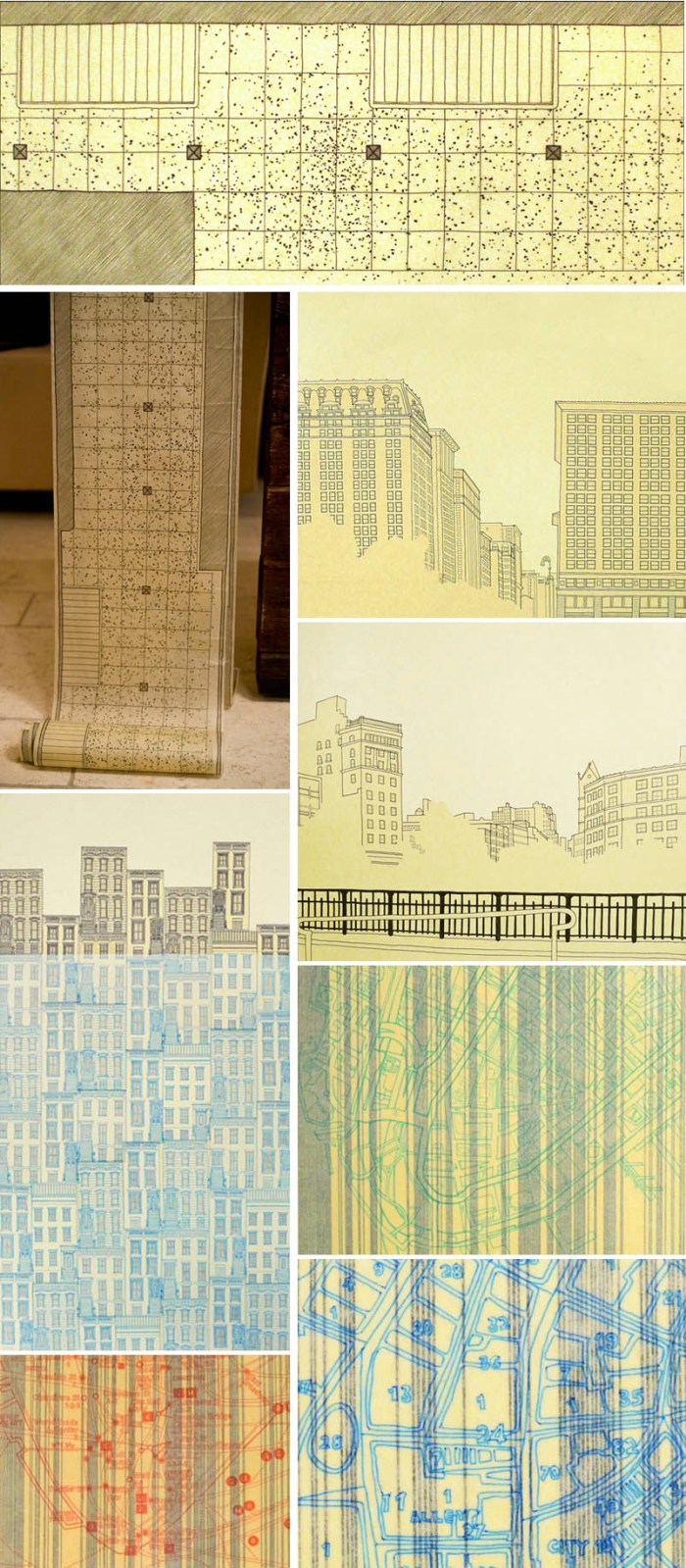
Below, her ink drawings on typical architect canary-yellow tracing paper are part of a series titled NYC: An Honest Lie.

Typically, people associate architectural drawings with the documentation of truth and precise representation. My work challenges this association by using the vernacular of architectural drawings to create “lies” about buildings. I will slightly misrepresent buildings by either idealizing them and/or intentionally distorting them. I aim to provoke the audience to question not only the validity of what they are seeing, but also their own perspectives towards their external environment.

In addition, Smith uses varnish to mount the tracing paper drawings onto canvas, adding to the ‘lie’ by disguising them as paintings. I love all of this work. It’s smart, full of humor, plus, I’ve always found those canary-yellow rolls of tracing paper an odd choice for architects – the color, the curling aspect from being rolled – so the choice of that material alone makes me chuckle. If you look closely at the first two images below (one a detail, the other an installation view) the drawing is a detailed diagram titled 14th St./6th Ave Subway Gum Conditions Survey. Many of the other drawings are of buildings around Union Square, right here in NYC, so maybe my familiarity with the neighborhood adds to the appeal as well.

NYC, Drawings, Union Square, Architectural style drawings, contemporary art

via 1Op Collective

Shay Frisch Peri: Energy Fields

Light sculptures, energy fields, electrical adaptors, Israeli contemporary art, Haunch of VenisonLight sculptures, energy fields, electrical adaptors, Shay Frisch Peri art, Haunch of VenisonLight sculptures, energy fields, electrical adaptors, Shay Frisch Peri art, Haunch of VenisonClick to enlarge

Shay Frisch Peri is an Israeli artist and industrial designer living and working in Rome. Creating an almost weave-like look with the repetition of electrical adaptors and light indicators, Frisch Peri’s light sculptures are like energy fields. The one that Daniela and I saw this past weekend in Chelsea (Campo 4012 N – the circular one with ‘N’ signifying the color black) had a wonderful glow to it as we walked into the gallery. Frisch Peri takes into consideration each individual space and the appropriate proportion of light required.

This piece, as well as Campo 1 N (the individual component used to create the larger work) will be at Haunch of Venison in Chelsea through March 3, 2012. You can see more of Shay Frisch Peri’s work here and here.

Three NYC Architectural Tidbits

Three different projects here in NYC have recently come to my attention, so rather than do three separate posts, I’ve decided to group them together in one. You can click on most of the images to see them larger.

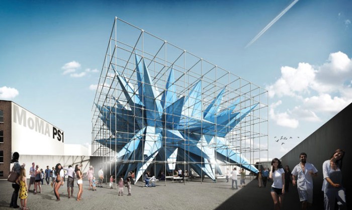
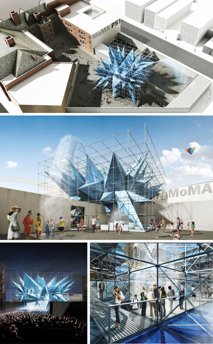
PS1, New York City, Warm Up 2012, Wendy, HWKN architects, cool structure, Young Architects MoMAPS1, New York City, Warm Up 2012, Wendy, HWKN architects, cool structure, Young Architects MoMAFirst up, The Museum of Modern Art and MoMA PS1 have announced this year’s winner of the Young Architects Program. HWKN (HollwichKushner) will construct their entry for the annual outdoor summer installation in PS1’s courtyard in Queens this summer. The winning proposal, titled Wendy, will consist of a large scaffold containing an oversized blue nylon starburst-like structure that will clean the air while offering shade, wind, rain and music. Looks like quite a departure from the past couple of years in that it looks more self-contained. I’m really looking forward to seeing it built in June.

Images courtesy HWKN
via archdaily

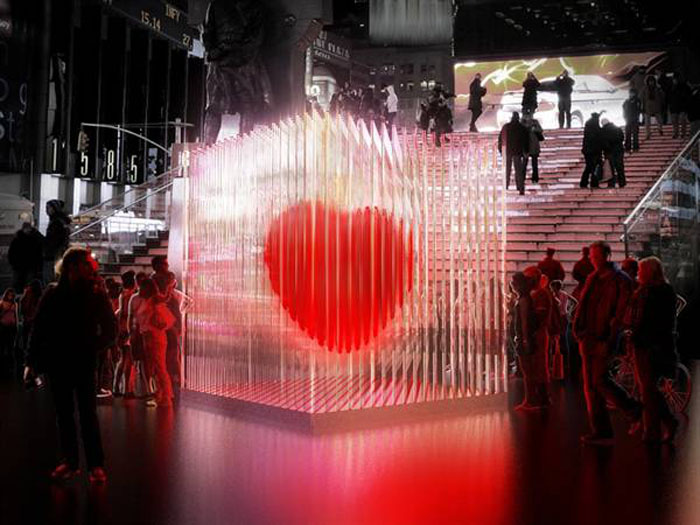
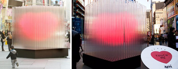
Times Square, BIG Heart, Bjarke Ingels Group, Art Installation, cool, Light installationTimes Square, BIG Heart, Bjarke Ingels Group, Art Installation, cool, Light installationNext, right now through February 29, 2012, there’s a 10-foot-tall BIG ❤ NYC sculpture/light installation in Times Square designed by BIG (Bjarke Ingels Group) Architects in honor of Valentine’s Day. The public art installation is located in Duffy Square at the foot of the TKTS steps/seats. Consisting of 400 transparent acrylic tubes (lit by LEDs) that form a cube around a suspended red heart whose beat and color intensity directly correlate to how many people touch the “Touch Me” heart pad on a circular stand close by.

Flatcut fabricated the rods, Silman Associates were the structural engineers and Zumtobel provided LED technology.

You might also want to check out BIG’s winning entry for Wave Pier in St. Petersburg which looks spectacular!

Photos courtesy Times Square Alliance

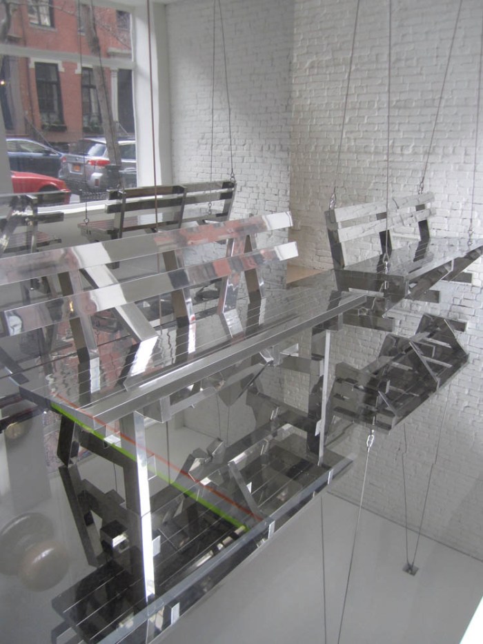
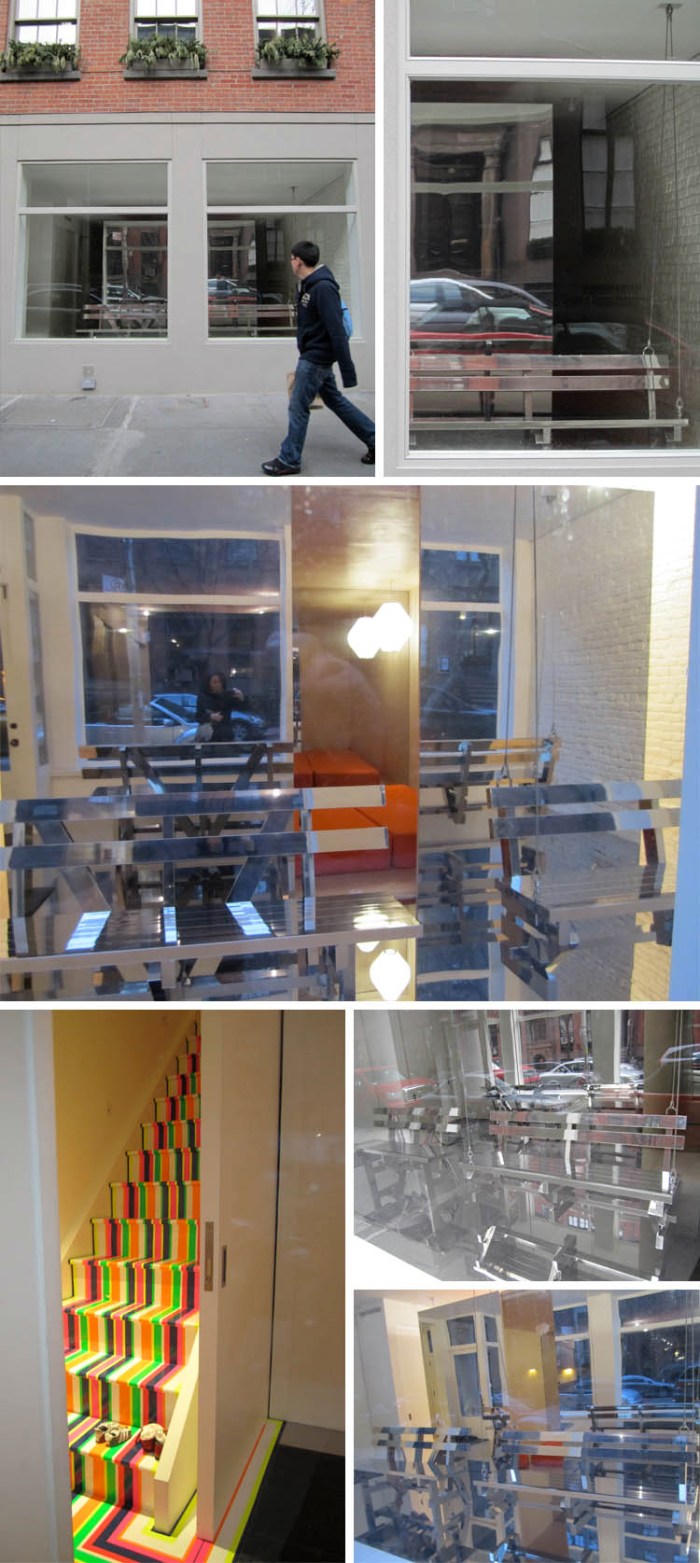
Solomonoff Architects, Greenwich village townhouse, cool playroom, mirrored benches, collabcubedSolomonoff Architects, Greenwich village townhouse, cool playroom, mirrored benches, collabcubedLastly, this Greenwich Village townhouse has had us puzzled for the past couple of months on our daily walks past it. In the storefront of what used to be a hair salon now sit two mirrored benches; one a swing the other static. I imagined some sort of new age church or meeting house with funky pews, or some sort of cool, minimalist art gallery, but a few weeks ago I finally had the opportunity to ask a neighbor as she entered her building if she knew what the mirrored benches were all about. Turns out that it’s a private home and the mirrored room (floor, ceiling, walls as well as bench/swing) are all part of the playroom/guest room. This is not your childhood playroom. I’ve been sort of stalking the place (not really, but I do pass by often on my way to and from home) and was able to catch a glimpse of the open guest room, (with its orange mattresses), as well as the super-cool multicolor striped stairs that lead up to the rest of the house. The architects behind the project are Solomonoff Architecture Studio and professional photos of the entire project are due out in an undisclosed architecture periodical shortly, which should look a lot better than these (the reflective space is especially difficult to photograph.) I’m curious to see what the rest of the house looks like…

Photos: collabcubed

Evergreen: Typographic Garden

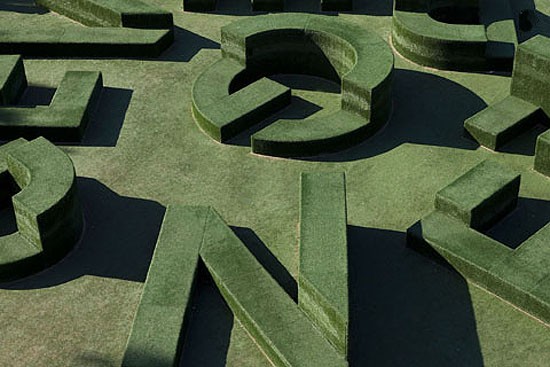
art installation, typography garden, School outdoor structure in Oldenzaal, The Netherlandsart installation, typography garden, School outdoor structure in Oldenzaal, The Netherlandsart installation, typography garden, Twents Carmel College outdoor seating structure in Oldenzaal, The NetherlandsVollaersWart is a Dutch design studio that focuses on the intersection of architecture with public and visual communication, thus creating many projects for exhibitions and festivals as well as sculptures and public art.

Evergreen is a permanent typographic sculptural installation that was designed for the new Twents Carmel College de Thij—a high school in Oldenzaal—to be used primarily as student seating and as a meeting place in a park-like setting. The large, multi-level letters spell out the word ‘Evergreen’ and are grouped in a way that makes the space resemble a labyrinth. The structure is covered with artificial turf and its circular shape echoes the shape of the school building itself.

Photos courtesy of VollaertsWart; TCC de Thij; and Kunst en Bedrijf

Escalator Photos

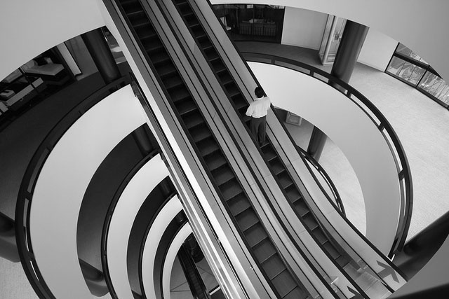
photography, escalators, cool images, stairs, escalator photos, flickrphotography, escalators, cool images, stairs, escalator photos, flickrphotography, escalators, cool images, stairs, escalator photos, flickrRecently, I’ve come across several interesting photos of escalators and after doing a search found a whole group on flickr. It was hard to select just a few photos (who knew there could be so many great shots of escalators?), but I went for a variety of angles and styles.

All names are linked to their source. From top to bottom and left to right:
Oliver Huizinga
Julie Daniels
The Relevant Authorities
Quaisi
John Fullard
Jill Fehrenbacher for Inhabitat
Siraphornbooks
Alexandre Moreau
b_juhasz

Tiger & Turtle – Magic Mountain

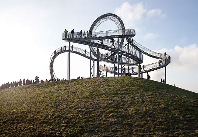
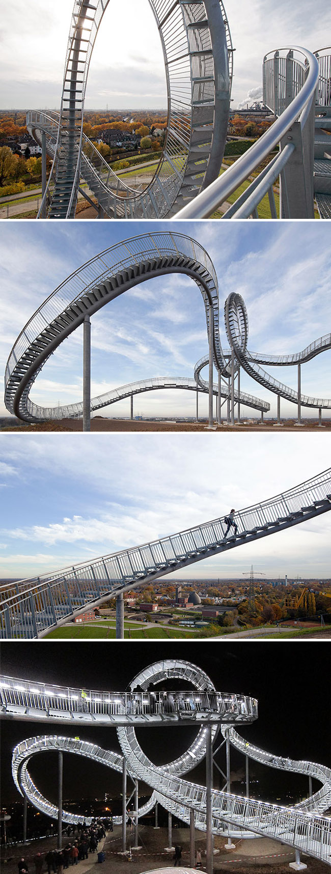
walkable rollercoaster, interactive sculpture, Heike Mutter, Ulrich Genth, Duisberg, Germanywalkable rollercoaster, interactive sculpture, Heike Mutter, Ulrich Genth, Duisberg, Germanywalkable rollercoaster, interactive sculpture, Heike Mutter, Ulrich Genth, Duisberg, GermanyThis seems to have made the rounds a couple of months back, but I hadn’t seen it till now. Tiger and Turtle – Magic Mountain is a site-specific, large-scale, walkable rollercoaster designed by Heike Mutter and Ulrich Genth positioned at the highest peak of the Heinrich-Hildebrand-Höhe in Duisburg, Germany. Visitors are invited to walk up the zinc-plated steel sculpture, which soars to 21 meters at its highest point, and, add to that the height of the artificial mountain that it sits upon, and a person gets a view of the Rhine from 45 meters above the landscape. Unfortunately, for the more adventurous types, you can’t actually climb on the center loop past a certain point.

Mutter and Genthe collaborated with Arnold Walz who did the parametric 3-D planning and stairway system, as well as Prof. Micahel Staffa who did the planning of structural framework, and architects Sonja Becker and Rudiger Karzel of bk2a architecture.

The interactive sculpture is lit up by LEDs under the handrails at night, making it accessible in the dark as well. My kind of rollercoaster.

Photos by Thomas Mayer

via radiolab

Eka Sharashidze: Wall People

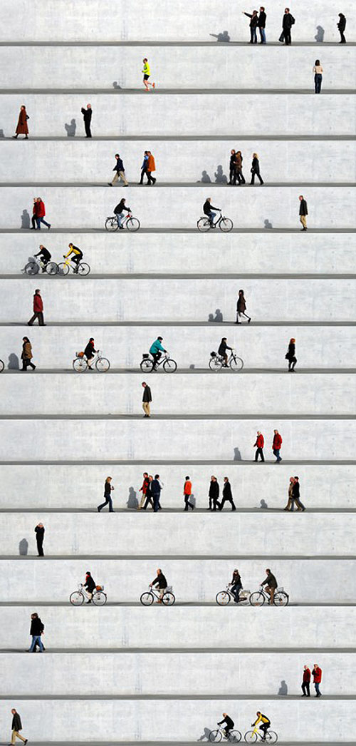
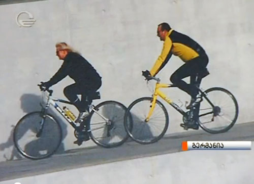
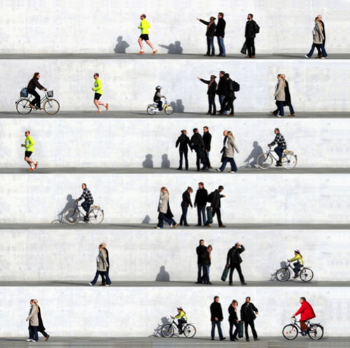
Photo collages, panels, alu dibond, Wall People by Eka SharashidzePhoto collages, panels, alu dibond, Wall People by Eka SharashidzePhoto collages, panels, alu dibond, Wall People by Eka SharashidzePhoto collages, panels, alu dibond, Wall People by Eka SharashidzeArchitectural photo collage by Eka SharashidzeOriginally from Georgia, but now living and working in Berlin, Eka Sharashidze creates photo collages. Her series Wall People caught my eye. In these images, the panels almost look like paintings, (though that may not be the case in person) but, if I understand correctly (my Georgian and German are a bit rusty, as in I don’t speak either at all), Eka sets up her camera facing a big white wall and shoots the passersby collecting photographs of people going about their everyday business, from walking to biking, to standing and pointing. She then proceeds to take these images, often repeating many of them, (which makes for an interesting effect), other times placing the images sequentially illustrating the progression of time, and, finally, printing them onto aluminum panels. Sharashidze has some nice architectural photo collages as well.

via artreview