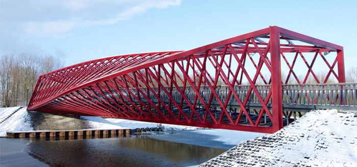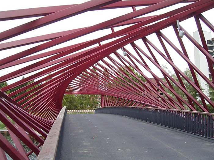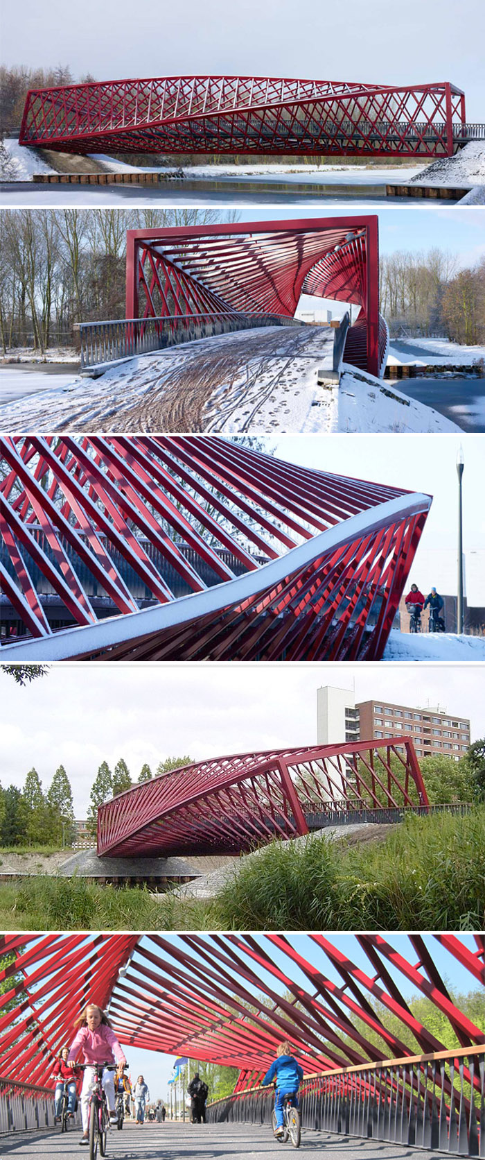
The Twist Bridge: West 8 Architects

De Twist Brug, Vlaardingse Vaart, Netherlands, 8 West Architects, ABTDe Twist Brug, Vlaardingse Vaart, Netherlands, 8 West Architects, ABTDe Twist Brug, Vlaardingse Vaart, Netherlands, 8 West Architects, ABTSpanning roughly 42 meters, this bicycle and pedestrian bridge called ‘The Twist’ bridge for its contorted and sculptural lines, connects the Holy-Zuid district and the Broekpolder over Vlaardingse Vaart in The Netherlands. Designed by West 8 Architects with structural engineers ABT, the bright red bridge makes for a lovely and striking surprise in the natural green setting.
And if you like this bridge you might also enjoy West 8’s three previous red undulating Bridges Borneo-Sporenburg.

Photos © Jeroen Musch

The Joe & Rika Mansueto Library

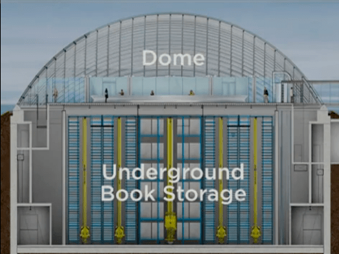
Joe and Rika Mansueto, University of Chicago Library, Helmut JahnHelmut Jahn, University of Chicago Library, robot, collabcubedHelmut Jahn, University of Chicago Library, robot, collabcubedMansueto Library Diagram LayoutClick to enlarge

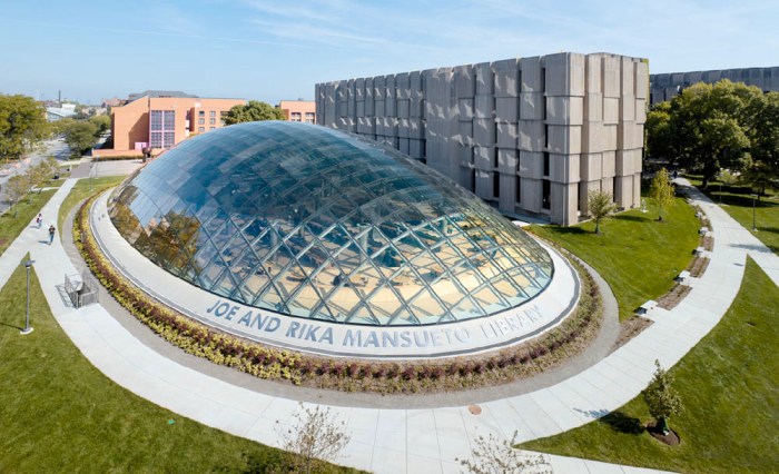
Just when you think books are on their way out, the University of Chicago builds a new library that can hold 3.5 million volumes and deliver your requested book within minutes. The Joe and Rika Mansueto Library, named after the couple who donated $25 million to the university, was designed by architect Helmut Jahn and completed last May. Both the top and bottom of the library are quite spectacular. The domed, 700-glass-panel reading room measuring around 8,000 square feet, pops up from the lawn, while underground, extending 50 feet deep, is a hi-tech automated storage and retrieval system that uses five mechanized robotic cranes, in conjunction with bar codes on the books, to retrieve any title quickly from the 24,000 metal bins used to store the books in optimal preservation conditions.

It’s all very impressive and the structural volumes, from the 120 foot x 240 foot clear span dome on top to the nearly 1,000,000 cubic feet of subterranean storage space, are challenges that were successfully tackled and executed by Halvorson and Partners Structural Engineers.

Photos courtesy Murphy/Jahn Architects and the University of Chicago.

Thanks to tipster Elaine!

Maggie’s Centre Nottingham: CZWG

Maggie's Nottingham, CZWG, Paul Smith, Architecture, collabcubedMaggie's Nottingham, CZWG, Paul Smith, Architecture, collabcubedMaggie's Nottingham, CZWG, Paul Smith, Architecture, collabcubedClick to enlarge

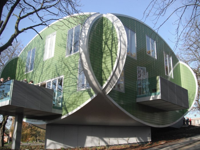
The new Maggie’s Cancer Caring Center in Nottingham, England, was designed by Piers Gough, Partner CZWG Architects with interiors by Paul Smith. Comprised of four interlocking ovals and elevated above the ground to give a floating sensation, the distinctive building is clad in green glazed ceramic tile.

The building is situated on a sloping wooded area, not typical of hospitals, near the main entrance to Nottingham City Hospital. The balconies extend out from the kitchen and sitting room providing pretty and peaceful views of the surrounding landscape. The Paul Smith interiors are colorful, open, and bright, from the blue and green tiled bathrooms to the upholstery on the chairs. An uplifting atmosphere for sure.

Photos: Martine Hamilton Knight; Ercol’s flickr and Living Projects

via e-architect

Typography in Providence

typography, type, rug, Brown University, Pembroke Hall, collabcubedtypography, type, rug, Brown University, Pembroke Hall, collabcubedtypography, type, Brown University, RISD, Rhode Island School Design, collabcubedClick to enlarge

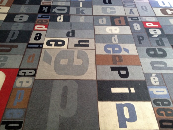
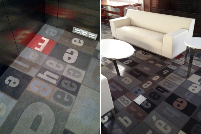
Providence, Rhode Island holds a special place in our hearts being that two out of the three of us are currently living there the majority of the year. Not surprisingly, the importance placed in design on both campuses where Em and Dan attend, is evident from Brown’s new Granoff Arts Center designed by Diller Scofidio + Renfro, to the RISD Museum of Art designed by Jose Rafael Moneo. What are nice as well, are the little surprise design elements you suddenly come upon on both of these adjacent schools. Typography, one of our favorites for example, is nicely incorporated and used decoratively on both campuses. Strolling around on a recent visit we spotted some of these. I wasn’t able to find information on all of the designs, but have included what I did obtain.

From top to bottom:
Typography carpet in Pembroke Hall, Brown;  Decorative type panels on the sides of the bleacher seating area and behind the librarian desk at Rhode Island School of Design (RISD) Library, designed by Office dA; Portfolio Café at RISD; Sciences Library floor numbers at Brown, designed by Warner Burns Toan & Lunde Architects.
All photos by Emma/Collabcubed except two grand hall shots of RISD Library courtesy Office dA.

Micheline Branding by Anagrama

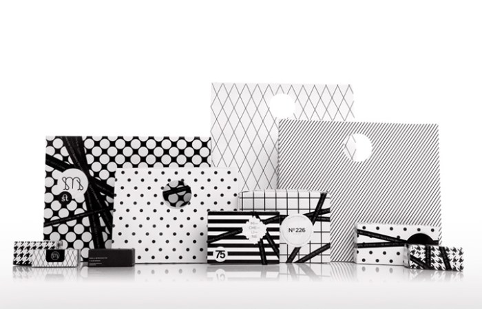
interior design, branding, print shop, Mexico, typographyinterior design, branding, print shop, Mexico, typography, packaginginterior design, branding, print shop, Mexico, typographyMexican design firm Anagrama, specializing in identity and brand consulting, rebranded the boutique print shop Micheline, from their logo and packaging to the interior of their shop. In order to express uniqueness, elegance and modernity and keep the flavor of the mid 70s when Micheline was founded, Anagrama played up the 1975 year typographically in the decor as well as through the furniture and lighting selections. The color palette was kept neutral to contrast with the bright colors of the card catalogues and papers. Nicely done!

via retail design blog

CHIP House: Energy Efficient Prefab

solar power, sustainable housing, energy efficient, Sci-Arc, CaltechSustainability, Sci-Arc, Caltech, Solar Decathlon, prefab houseClick to enlarge

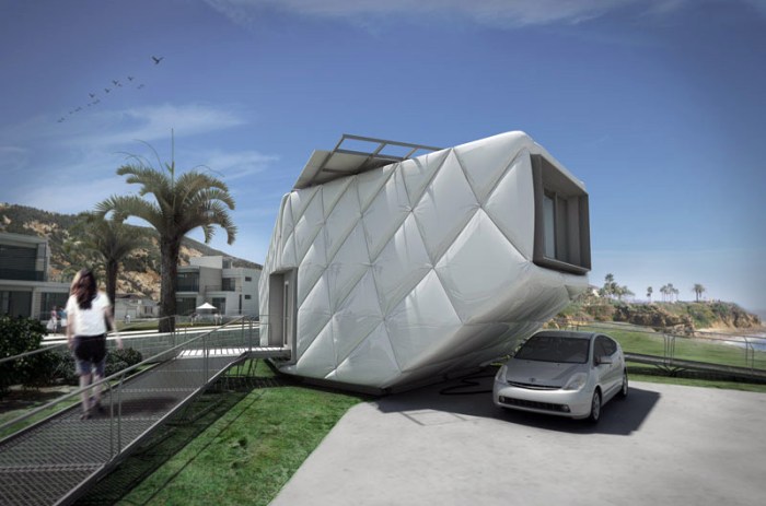
With its insulation on the outside, CHIP (Compacted Hyper-Insulated Prototype) seems to have been a big draw at this year’s Solar Decathlon in Washington DC. Designed by a team of over one hundred Sci-Arc and Caltech students, CHIP is a prefab, net-zero solar-powered house designed to challenge every architectural and engineering preconception regarding the net-zero-energy home. The house includes a full kitchen and bath, as well as an elevated platform as the sleeping area which also provides a nice view of the rest of the house, from above, and a view out the large window. Because the insulation is on the outside—which is apparently an inexpensive and effective way to blanket the house and keep it warm—the interior has its framing exposed and allows for many built-ins and furniture storage.

The puffy, energy-efficient house will be on display at the Sci-Arc Library in Washington DC through December 16, 2011, if you’d like to see it in person. For the rest of us, there’s the video below:

Photos: CHIP, Plataforma Arquitectura, CHIP2011 flickr

via Plataforma Arquitectura

Peter Kogler: Spatial Illusion

light projection art, installation, dirimart, graphic patternslight projection art, installation, dirimart, graphic patternslight projection mapping, cool installation art, graphic patternsClick to enlarge

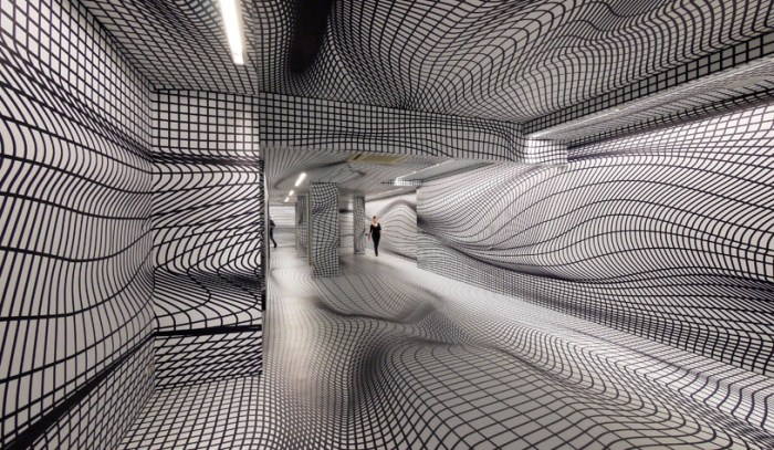
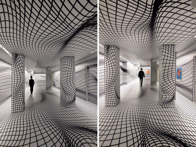
Clearly, one doesn’t necessarily need Upside Down Goggles or a Psycho Tank à la Carsten Höller to experience a trippy effect through art. Austrian artist Peter Kogler has been playing with spatial illusion since the 1980s.

Interested in film architecture and influenced by movies from the 1920s such as The Cabinet of Dr. Caligari and Metropolis where the architecture plays a central role generating emotion from the viewer, Kogler began working with the “illusionism of space”. Initially working with small models made from cardboard, his work evolved into projections of large-scale graphic images onto walls, trying to absorb or change the actual architecture.

Personally, the rats are a tad too freaky, but the rest of it really appeals to me.

Below is a short video of one of Peter Kogler’s video installations in action.

via Dirimart

J. Mayer H.: Rapport

Berlin, J. Mayer H. Installation, Berlinishe Galerie, collabcubedBerlin, J. Mayer H. Installation, Berlinishe Galerie, collabcubedClick to enlarge

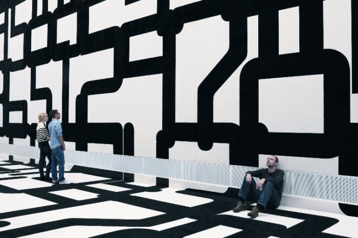
The German architectural firm J. MAYER H., founded by Juergen Mayer H., has designed an installation for the Berlinische Galerie titled Rapport: Experiments with Spatial Structure. Data security patterns have been printed in an unimaginably large point size on carpeting which adorns both the floor and walls of the museum’s 10-meter high entrance hall. The large, somewhat abstract shapes created by the oversized numbers, results in a flickering impression and transforms the rigid white cube into a playful scenario negating its strict geometry.

The word “Rapport” has multiple interpretations and is meant to be ambiguous.

From the architects:
As a specialist German-language term from textile manufacturing, it refers to the serial pattern of the installation. On the other hand, in the military field the term “Rapport” means a “dispatch”, while in psychology it describes a human relationship in which those involved convey something to the others. In this sense it also refers to the starting material of the installation: data security patterns, which are used, for example, on the inside of envelopes. In this case, they stand for confidential communication between two parties.

The installation will be up through April 9, 2012 at the Berlinische Galerie, in Berlin, of course.

via city vision

Bar Code Shopping Center Building

humorous architecture, russia, Bar code building, collabcubedhumorous architecture, russia, Bar code building, collabcubedClick to enlarge

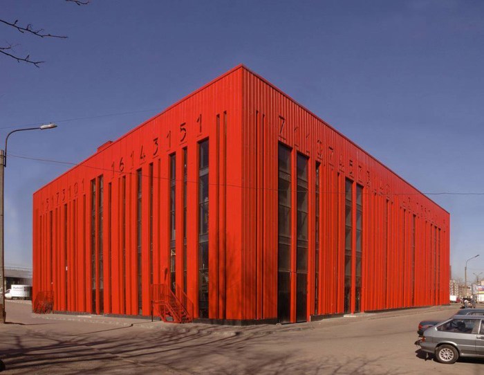
First we find a bar code sculpture and now a building! Not just a building but, more accurately and appropriately, a shopping center. The architects behind the building are the Russian firm Vitruvius and Sons. The Bar Code building or Shtrikh Code, which houses shops and offices, is located on the bank of the Neva River in St. Petersburg. Its bright red façades are hard to miss among the mostly gray landscape. Though completed in 2008, the building was recently entered in the Wan Awards 2011 under the ‘color’ category.

More Espluga + Associates: Clonography

architectural images, photographs, photoshopped, cloned images, designarchitectural images, photographs, photoshopped, cloned images, designarchitectural images, photographs, photoshopped, cloned images, designClick to enlarge

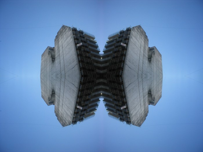
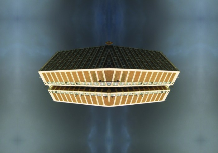
Also from Espluga + Associates, the Barcelona based graphic design and communications firm (see previous post), an experimental side project that started by chance while doing research for a client: Clonography.

From their site:
Clonography is, at least for us, something beautiful, aesthetically and complex looking but simple at the same time. This duality between complexity and simplicity, between reality and fiction, is what makes it appealing. Clonography is somewhere between photography,  graphic design, architecture and the  cognitive perception theories. Clonography make us react in front of a strange object  despite being familiar at the same time. It contains known shapes and objects disposed in a different way. The virtual image that we are looking at is made of real parts. And is this moment of doubt what attract us.

Many more images have been developed since that first accidental one, resulting in a compilation of images using photographs from Amsterdam, Barcelona, Benidorm, Buenos Aires, Helsinki, Honningsvag, London, Moscow and Tallinn.

A new website is in the works and coming soon.

All images courtesy of Espluga + Associates.

m_lab: Espluga + Associates

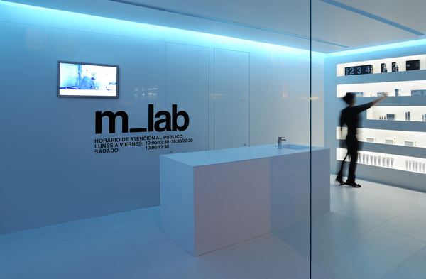
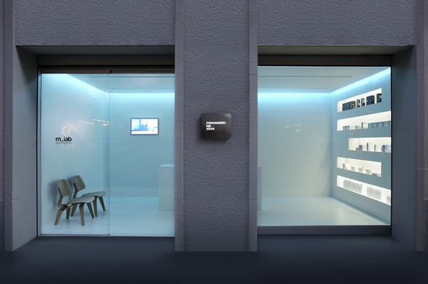
interior design, naming, packaging, retail design, espluga+associates, collabcubedinterior design, naming, packaging, retail design, espluga+associates, collabcubedinterior design, naming, packaging, retail design, branding, collabcubedThe Spanish design firm Espluga + Associates, based in Barcelona, is one of those companies that does it all: graphic design, branding, advertising, naming, and, as they say on their website, lots of other things that end in ‘ing’.

One of their recent projects involved several of these capabilities rolled into one. m_lab, Mesoestetic’s ( a company/laboratory specializing in the development of products for the treatment and care of skin) first lab store in Europe, includes interior design, naming, visual id, and packaging by Espluga + Associates. The white, minimalist design with its recessed blue-tinted lighting along with the Helvetica-driven signage and packaging creates the perfect cool and sterile lab-like feel. Nice!

You can see more of Espluga + Associates work here.

And stay tuned for our next post on a completely different project by this talented studio.

Youth Factory: Selgas Cano Architects

Mérida, Youth Center, skateboarding, rock climbing, Spain, contemporary architectureMérida, Youth Center, skateboarding, rock climbing, Spain, contemporary architectureMérida, Youth Center, skateboarding, rock climbing, Spain, contemporary architectureMérida, Youth Center, skateboarding, rock climbing, Spain, contemporary architectureClick to enlarge

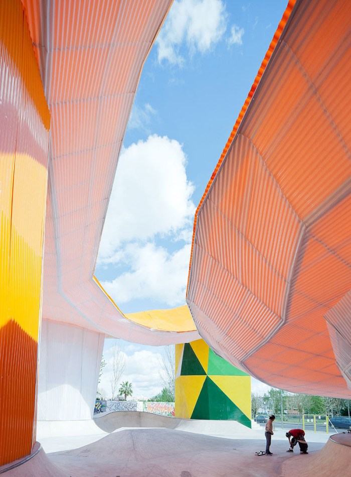
SelgasCano Architects’ design for the new Youth Factory (Factoría Joven) in Mérida, Spain is all about welcoming and protecting. The colorful youth center is very open with its, possibly, most notable feature being a huge orange, organically shaped canopy that protects from rain and the strong hot rays of the sun, typical of Mérida. The architects refer to this prominent aspect as a plastic ‘cloud’.

With a curvaceous skate park that can be used for skateboarding, rollerblading, or cycling, a large climbing wall, an open amphitheater encouraging shows, as well as music and dancing, what teenager would stay away? The open and inviting structure, meant to welcome all, is supported by the oval pods that house the activity rooms as well as the offices.

I’d say the whole edifice screams fun.

via the archhive and architectural review

The Comedy Carpet in Blackpool

Typography, England, installation, art, sculpture, letterforms, why not associatesTypography, Blackpool, England, Why Not Associates, comedy tributeTypography, England, installation, art, sculpture, letterforms, why not associatesClick to enlarge

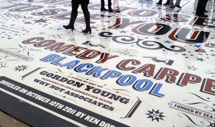
The Comedy Carpet in Blackpool – a seaside resort town in the Northwest of England – is a typographic celebration of comedy in a grand way. The 2,200 sq. meter installation contains over 160,000 granite letters embedded into concrete, making it virtually impossible not to tip toe through the type.

A super-sized homage to those who have made the nation laugh, as well as to wood type, the amazing sculpture, that will also act as a stage, was designed by Gordon Young with typography by Why Not Associates (both previously mentioned in Architypeture I) and inspired by old theater posters and playbills. The jokes span a full range including one-liners, catchphrases, gags and sketches, with something for everyone’s sense of humor…or not.

via typetoken

London 2012 Shooting Venue: Woolwich

Magma Architecture, 2012 Olympics, Royal Artillery Barracks, collabcubedMagma Architecture, 2012 Olympics, Royal Artillery Barracks, collabcubed

Magma Architecture, 2012 Olympics, Royal Artillery Barracks, collabcubed

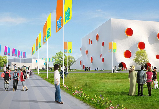
Architect’s rendering

I’m not one to understand the appeal of shooting, as a sport or otherwise, but the design of the new London 2012 Shooting Venue at the Woolwich Royal Artillery Barracks definitely piqued my interest. Designed by German studio Magma Architecture, the three enclosures are clad in a fun and colorful 18,000 sq m phthalate-free pvc membrane. The bright colored openings contrast nicely against the white in addition to providing tension, ventilation and light.

The exteriors are just about completed, with the installation of seating and back-of-house facilities to come shortly. The venue will be dismantled immediately after the Games.

All images courtesy of the ODA.

via World Architecture

Jaume Secondary School: Ramón Esteve

Colorful architecture, Spain, Ramon Esteve, School DesignColorful architecture, Spain, Ramon Esteve, School DesignColorful architecture, Spain, Ramon Esteve, School DesignColorful architecture, Spain, Ramon Esteve, School DesignClick to enlarge

When I started middle school, one of the things I was most excited about were the rows of colorful lockers that alternated between yellow, red and orange. I mean, the concept of just having a locker was pretty exciting too, but the bright colors that lined the walls were part of the appeal.

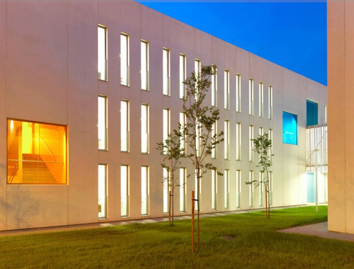
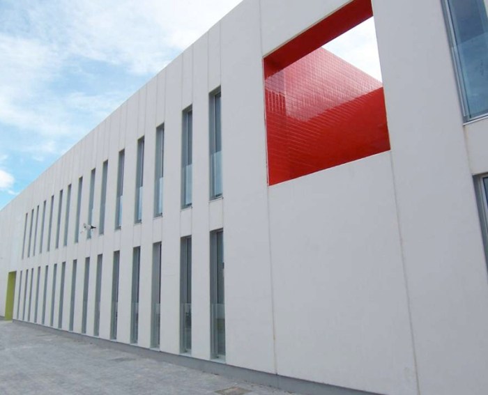
The Jaume Secondary School in Ontinyent, Valencia, Spain takes the color concept way beyond. Designed ever-so-smartly by Ramón Esteve Architects (Estudio de Arquitectura), what could have been a rather straightforward high school is lively and welcoming by contrasting the white, prefabricated concrete panels of the exterior with colored glass and tiles, as well as paint. That combined with the use of light, both natural and artificial, enhance the building scheme and bring relief, brightness and dynamism to the interiors and exteriors.

All four buildings that complete the complex, creating outdoor spaces including the sports ground, garden and parking, enclosing them with the architecture and working harmoniously. The solid volumes are ventilated and lighted through the cut-out openings with different color tiles in each.

Definitely a school I would have enjoyed attending, based on the look anyway.

Photos by Xavi Mollá, courtesy of Ramón Esteve and The Archhive.

via the archhive

Anekit Bhagwat: The Drum House

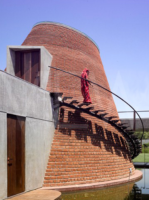
Drum House, Ahmedebad, India, Anekit Bhagwat, Bricks, collabcubedDrum House, Ahmedebad, India, Anekit Bhagwat, Bricks, collabcubedThe House with Drum or Drum House designed by Anekit Prabhakar B. Bhagwat is a weekend residence on the outskirts of Ahmedebad in Gujurat, India. Composed of three main sections – the drum, the veranda and the stockade – each space was sited with respect to the larger landscape of the project. Brick was used innovatively, with specially made extra flat styles and different sizes, to create the ‘vault’ that is the main living area. The veranda includes a glass dining pavilion at one end that faces the gardens and the stockade houses two rooms and a pool at the back. Other facilities include a projection room, a shaded deck, a water tank with lilies, and an India garden with an elevated trampoline. Definitely lots to keep a person busy for the weekend.

Photos ©Edmund Sumner via View and Prabhakar B. Bhagwat

Magic Carpet: Sarah Crowley & David Brooks

Magic Carpet Brick Installation in Dockland's Australia by Sarah CrowleyMagic Carpet Brick Installation in Dockland's Australia by Sarah Crowley, David BrooksClick to enlarge

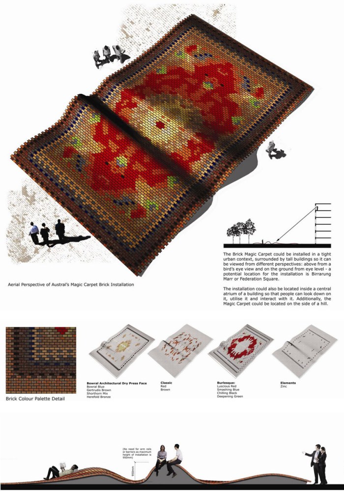
Australian architect Sarah Crowley, whose jewelry we posted about previously, joined forces with David Brooks on their winning entry for Austral Bricks Architectural Ideas Competition. The design challenge was to “design an experiential element for an urban space that reflects the future of brick.” Crowley and Brooks’ solution: a magic carpet installation made of bricks.

The Magic Carpet forms an undulating terrain providing ergonomic curves that serve as seating and lounging spaces, at the same time showcasing the extensive color range and texture of clay brick products.

Currently, it looks like the Magic Carpet will become a reality in the Docklands, Melbourne, Australia. Fun idea!

Adidas Laces Signage: Turbocharged Type

Laces office building, Herzogenaurach, Germany, Typography, collabcubedLaces office building, Herzogenaurach, Germany, Typography, collabcubedLaces office building, Herzogenaurach, Germany, Typography, collabcubedLaces office building, Herzogenaurach, Germany, Typography, collabcubedClick to enlarge

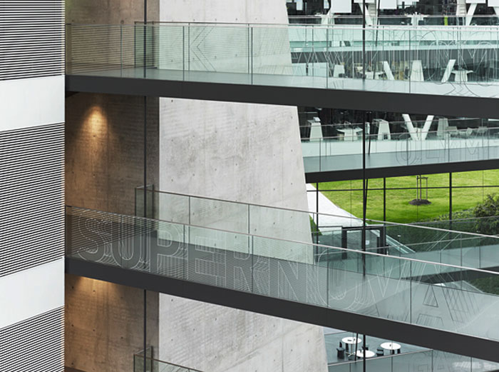
The new Adidas Laces R&D building at the corporation’s headquarters in Herzogenaurach, Germany, is Kada Wittfeld Architektur’s latest project. In addition to the innovative communicative architectural ‘laces’ theme with criss-crossing connecting walkways — a metaphor for the Adidas sports shoe as well as the networked communications of the corporation — the ‘turbocharged’ typographic signage system by Büro Uebele leaps across walls, doors, and handrailings throughout the center. Words identify places as well as becoming colored surfaces and sculptures.

From the press release:
The building forms a loop. Suspended walkways cross the atrium space, “lacing” the building’s structure together like the laces of a sports shoe. The walkways connect individual departments within the building complex, making for greater proximity and preventing the disruptive effect of people walking through offices. The signage system supports this concept, providing directions at hubs and intersections. The names of the meeting areas are displayed on the glass balustrades, creating a subtly mobile effect as visitors look across the atrium, helping them find their way. The corporate typeface, a variation on FF DIN, is dynamically varied here. The outlines of letters and arrows are shifted vertically and repeated rhythmically, creating a dynamic, sporty effect. The shimmering characters – for all the world as if frozen in time-lapse photography – are combined in varying patterns, offering the viewer a varied and distinctive echo on the “laces” theme.

Truly spectacular inside and out.

Photos: Werner Huthmacher & Christian Richters

via e-architect and typetoken