m_lab: Espluga + Associates

interior design, naming, packaging, retail design, espluga+associates, collabcubedinterior design, naming, packaging, retail design, espluga+associates, collabcubedinterior design, naming, packaging, retail design, branding, collabcubedThe Spanish design firm Espluga + Associates, based in Barcelona, is one of those companies that does it all: graphic design, branding, advertising, naming, and, as they say on their website, lots of other things that end in ‘ing’.

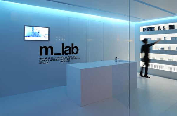
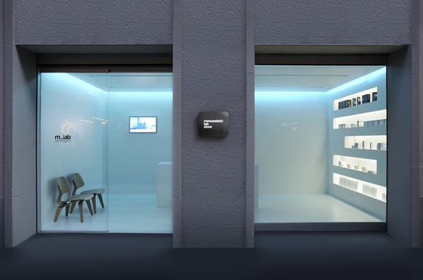
One of their recent projects involved several of these capabilities rolled into one. m_lab, Mesoestetic’s ( a company/laboratory specializing in the development of products for the treatment and care of skin) first lab store in Europe, includes interior design, naming, visual id, and packaging by Espluga + Associates. The white, minimalist design with its recessed blue-tinted lighting along with the Helvetica-driven signage and packaging creates the perfect cool and sterile lab-like feel. Nice!

You can see more of Espluga + Associates work here.

And stay tuned for our next post on a completely different project by this talented studio.
Mark Wagner: Currency Collages

art, collage, currency, dollar bill, art and economy, paper art, moneyart, collage, currency, dollar bill, art and economy, paper art, moneyart, collage, currency, dollar bill, art and economy, paper art, moneyClick to enlarge for detail

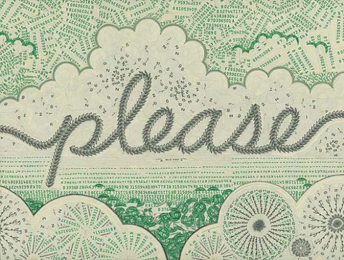
My friend Eric introduced me to Mark Wagner’s currency collages a few years ago in Chelsea. It seems to me that today’s economic climate is a perfect time to share them. These collages, made exclusively with the U.S. Dollar, speak to the cultural, social and political roles that money plays in our society.

Mark Wagner, originally from the Midwest, is a Brooklyn based artist who writes and makes books in addition to his collages. His statement on his currency collages is as follows:

The one dollar bill is the most ubiquitous piece of paper in America. Collage asks the question: what might be done to make it something else? It is a ripe material: intaglio printed on sturdy linen stock, covered in decorative filigree, and steeped in symbolism and concept. Blade and glue transform it-reproducing the effects of tapestries, paints, engravings, mosaics, and computers-striving for something bizarre, beautiful, or unbelievable… the foreign in the familiar.

The detail on these collages is amazing. The second and third collages above also show zoomed-in sections to appreciate even the tiniest image.

All images courtesy of Mark Wagner and Pavel Zoubok Gallery.

Typographied Objects III

typography objects, letterforms, type on sheets, type on clothes, type jewelry, collabcubedtypography objects, letterforms, type on sheets, type on clothes, type jewelry, collabcubedClick to enlarge

Our latest roundup of objects with type. See our previous posts Typographied Objects and Typographied Objects II for more.

From left to right, top to bottom:
Typeshelf by Thirtyfive Creative Works; Punctuation Journals; Lucky Letters Umbrella; Letter Lamp; Eivor Ord Duvet cover and pillow cases; READ book shelf; Ampersand Jewelry; Caleido Digit Radiator; Profiltek Vetro Shower Door; Blah Blah Throw; Alphabet Stockings; Welcome Letter Concept Chair; Even Little Number Plates; Calvin Klein Briefs; Number Placemats; Numbers Runner

The Comedy Carpet in Blackpool

Typography, England, installation, art, sculpture, letterforms, why not associatesTypography, Blackpool, England, Why Not Associates, comedy tributeTypography, England, installation, art, sculpture, letterforms, why not associatesClick to enlarge

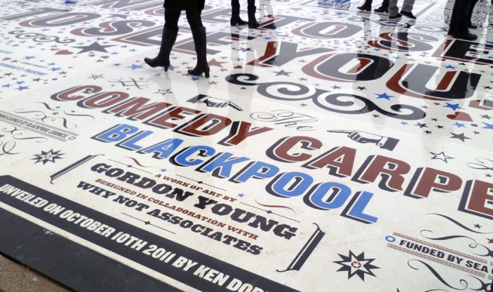
The Comedy Carpet in Blackpool – a seaside resort town in the Northwest of England – is a typographic celebration of comedy in a grand way. The 2,200 sq. meter installation contains over 160,000 granite letters embedded into concrete, making it virtually impossible not to tip toe through the type.

A super-sized homage to those who have made the nation laugh, as well as to wood type, the amazing sculpture, that will also act as a stage, was designed by Gordon Young with typography by Why Not Associates (both previously mentioned in Architypeture I) and inspired by old theater posters and playbills. The jokes span a full range including one-liners, catchphrases, gags and sketches, with something for everyone’s sense of humor…or not.

via typetoken

Liam Gillick: Type, Color & Light …Trifecta!

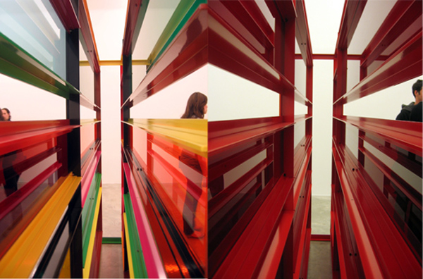
color art installation, contemporary art, typographycolor art installation, contemporary art, typographyYes siree, three of my favorite elements all combined by one artist: Liam Gillick. The British artist is based both in London and New York. He has published a number of texts that function in parallel to his artwork, and the artwork itself often incorporates typography. In addition to Gillick‘s installations, he has collaborated with architects on the façades and interiors of many buildings including the Fairmont Pacific Rim Hotel in Vancouver, Canada (see our Architypeture II post) and the Marsham Street Home Office in London.

Gillick’s installations are at once minimalist, conceptual and ironic. They are often seen as abstract representations of the various social projects that he participates in. Definitely would love to see one of these in person.

via artnet

Aaron De La Cruz

Aaron de la cruz street art, graffiti, LA street art, Honolulu, collabcubedAaron de la cruz street art, graffiti, LA street art, Honolulu, collabcubedAaron de la cruz street art, graffiti, LA street art, Honolulu, collabcubedClick to enlarge

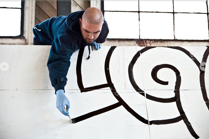
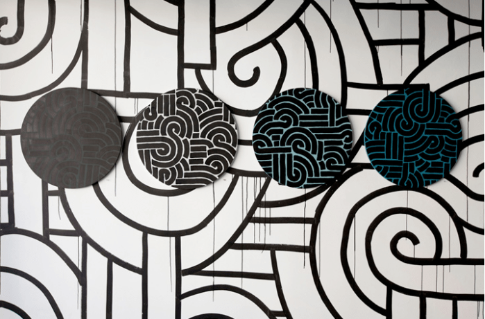
Illustrator, street artist, graffiti artist, designer Aaron De La Cruz started drawing on everything, including the walls of his bedroom, from a very young age. Much of his street art appears in California, from L.A. to San Francisco. His work, “though minimal and direct at first, tends to overcome barriers of separation and freely steps in and out of the realms of design, graffiti, and illustration.”

Next Saturday, October 15th, 2011, De La Cruz will be showing past, present, and future work at his exhibit Long Walk Home at Loft in Space in Honolulu. Included in the exhibit will be a room created to look like his childhood bedroom… the one where he drew on the walls.
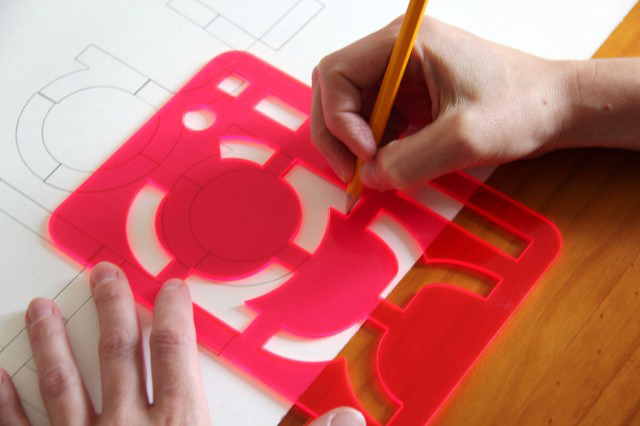
via Arktip

Nils and Sven Völker: Captured

art installation, inflating foil, colored lights, collabcubedart installation, inflating foil, colored lights, collabcubedClick to enlarge.

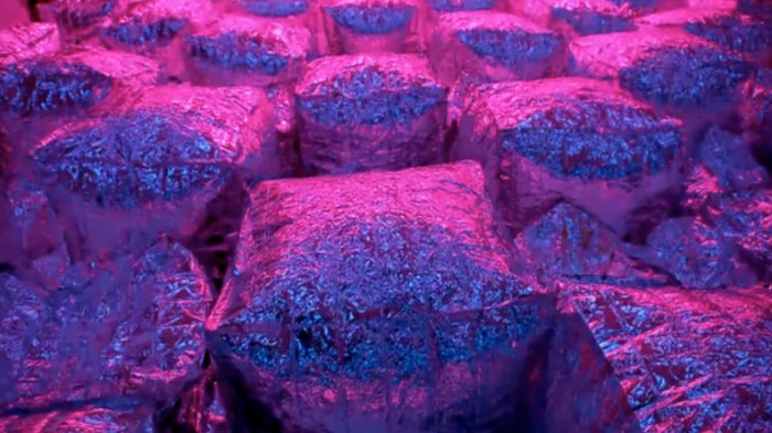
If you’ve ever popped some Jiffy Pop on the stove, it’s likely that that experience will come to mind while viewing Nils and Sven Völker’s recent installation, Captured: An Homage to Light and Air presented at MADE Space in Berlin.

The German brothers – Sven a graphic designer and Nils a machine artist (see our previous post) – collaborated by combining four walls with 304 framed graphic pages surrounding a field of 252 inflatable silver cushion-like air bags. The bags were programmed by Nils Völker to create sequences according to chapters of his brother’s “books on wall”. The inflating and deflating of the bags, along with the colored lighting system, create a very dramatic and intensified effect.

You can watch it in action below.

Adidas Laces Signage: Turbocharged Type

Laces office building, Herzogenaurach, Germany, Typography, collabcubedLaces office building, Herzogenaurach, Germany, Typography, collabcubedLaces office building, Herzogenaurach, Germany, Typography, collabcubedLaces office building, Herzogenaurach, Germany, Typography, collabcubedClick to enlarge

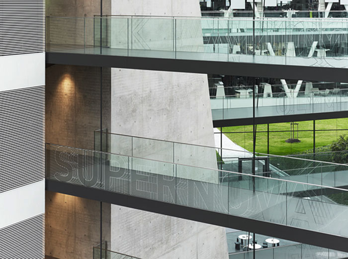
The new Adidas Laces R&D building at the corporation’s headquarters in Herzogenaurach, Germany, is Kada Wittfeld Architektur’s latest project. In addition to the innovative communicative architectural ‘laces’ theme with criss-crossing connecting walkways — a metaphor for the Adidas sports shoe as well as the networked communications of the corporation — the ‘turbocharged’ typographic signage system by Büro Uebele leaps across walls, doors, and handrailings throughout the center. Words identify places as well as becoming colored surfaces and sculptures.

From the press release:
The building forms a loop. Suspended walkways cross the atrium space, “lacing” the building’s structure together like the laces of a sports shoe. The walkways connect individual departments within the building complex, making for greater proximity and preventing the disruptive effect of people walking through offices. The signage system supports this concept, providing directions at hubs and intersections. The names of the meeting areas are displayed on the glass balustrades, creating a subtly mobile effect as visitors look across the atrium, helping them find their way. The corporate typeface, a variation on FF DIN, is dynamically varied here. The outlines of letters and arrows are shifted vertically and repeated rhythmically, creating a dynamic, sporty effect. The shimmering characters – for all the world as if frozen in time-lapse photography – are combined in varying patterns, offering the viewer a varied and distinctive echo on the “laces” theme.

Truly spectacular inside and out.

Photos: Werner Huthmacher & Christian Richters

via e-architect and typetoken

IBM THINK Exhibit at Lincoln Center

IBM Think, interactive screen, digital wall, IBM100, data visualization, collabcubedIBM Think, interactive screen, digital wall, IBM100, data visualization, collabcubedIBM Think Exhibit Lincoln centerClick to enlarge.

Today, my dad and I went to explore the new IBM THINK Exhibit at Lincoln Center here in NYC. We were greeted at the entrance by the very familiar (my father is a retired longtime IBMer) ‘THINK’ logo, still looking fresh today in the same slab serif type that I remember from the 1960s.

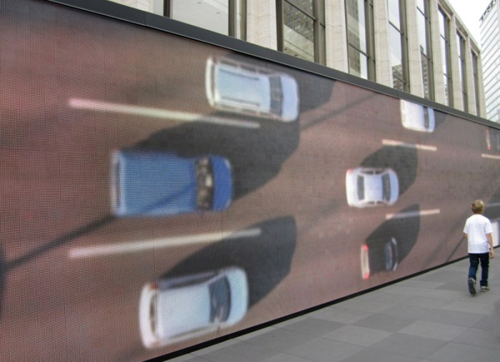
The exhibit is in celebration of IBM’s 100th anniversary and illustrates – via multimedia – the possibilities that science and information technology offer to ‘make the world work better.’ Beginning with its 123-foot digital visualization wall which streams real-time data from the surrounding Lincoln Center area with respect to traffic, air quality and water consumption, to its interior 12 minute immersive film, which then converts to multi-panel interactive walls mostly displaying the changes in science, technology and comparisons in the way we display information in the past and today.

It’s all beautifully executed. The Data Wall, in particular, is mesmerizing. Designed by the transmedia studio Mirada (started by director Guillermo Del Toro) in conjunction with a team of mostly faculty and graduates of the UCLA Department of Design Media Arts who designed the software, it’s a perfect example of art and science merging; animated infographics at their best. Also quite lovely, are the print exhibition graphics throughout the exhibit that are clearly a nod to the great Paul Rand.

The IBM THINK Exhibit is on the inclined Jaffe Drive at Lincoln Center through October 23, 2011. It’s hard to miss the spectacular digital wall from Broadway.

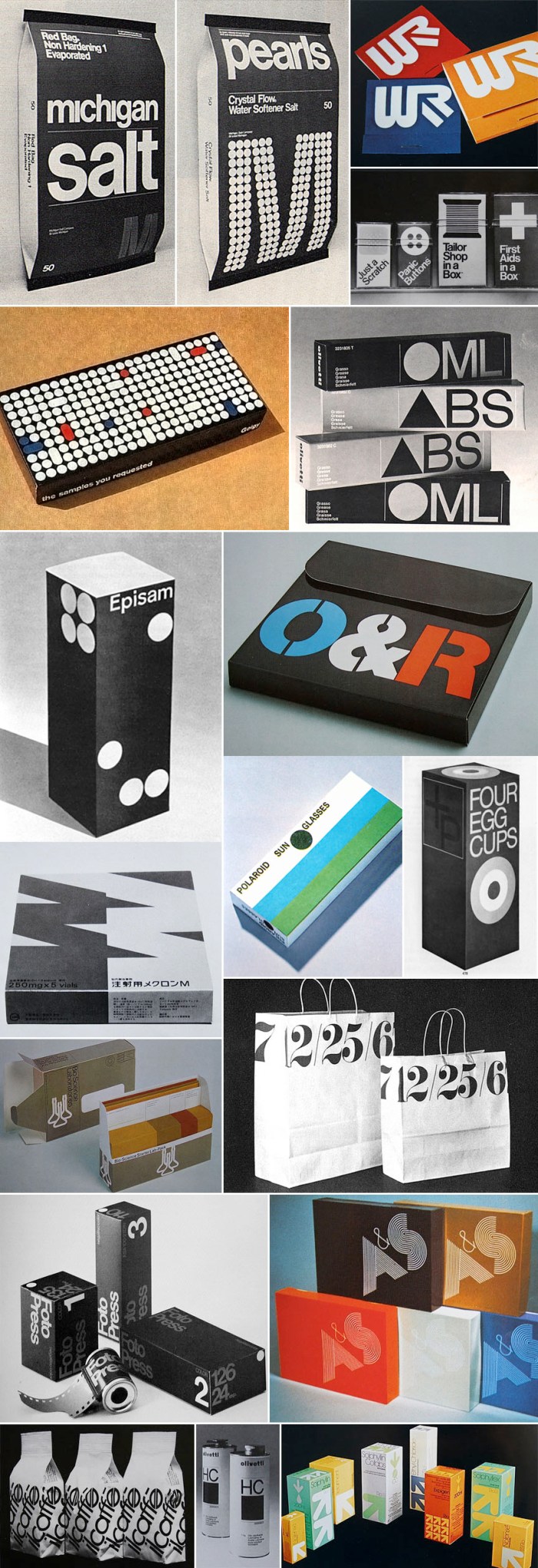
Graphis Packaging 3 & 4: Typography

70s typography, packaging, retro design70s typography, packaging, retro design, helveticaClick to enlarge.

When I was in college, my library of choice on campus was the Fine Arts Library. I would lug my Calculus text books over there with full intention to study for my exam, but the temptation to peruse the newly discovered (for me) Graphis magazines and annuals was too huge to resist. So, you can imagine my excitement when, googling around for some typography-related material, I came across a beautiful flickr set of images from Graphis Packaging 3 and 4. It brought me right back to the Fine Arts Library and my not-so-great Calculus grade. SO much beautiful typography. I love it.

It’s interesting to note that Target introduced a new line of packaging within the last couple of years, Up & Up, that resembles the packaging in the bottom right image above, though not quite as nice.

You can see more images on crabstick’s flickr.

Giant 3D Letters for Home or Garden

Type Sculptures, Typography, Giant Letters for DecoratingType Sculptures, Typography, Giant Letters for DecoratingOne of these would be fun to have in the middle of our living room. Or maybe two or three to spell something out.

Jimmy Fiction Esq. is the man behind these giant three-dimensional letters, which are also available in numbers or symbols. Maybe a huge ampersand would be the thing to get. All letters are made of welded steel and resin or powder coated. They are sturdy enough for all-weather outdoor use as well.

These monumental type sculptures are manufactured to order and priced on an individual basis but, just to give you an idea, the ones pictured start at £700. My favorite line on Jimmy Fiction’s site? “If you want to write your beloved’s entire double-barrelled name across your garden, then well done you, you romantic and stylish fellow… and yes we can probably do you a discount.”

via typetoken

Playtype Concept Store

typography store, products with type, copenhagen, design storetypography store, products with type, copenhagen, design storeThis is one of the many reasons I think I’d really like Copenhagen. My impression from afar is that everything there is designy. I mean, a whole store dedicated to type? That’s a graphic designer’s dream come true.

Playtype is an online type foundry established by the Danish design firm e-Types. The Playtype concept store was launched in unison with the redesign of their site back in December. The store is a physical manifestation of the online shop and includes type-themed products such as t-shirts, posters, laptop covers, mugs and, of course, fonts which are loaded onto specially designed USB flash drives that resemble a credit card. The store features oversized type on the window and walls (love that!) as well as a neon sign with Playtype in large lit letters.

If you’re planning a visit to Copenhagen, it definitely looks worth checking out. But hurry because the store is scheduled to close at the end of 2011.

via Typojungle

Chaz Maviyane-Davies

Human rights, political posters, social awareness, graphic designHuman rights, political posters, social awareness, graphic designI don’t know how it’s possible, but this is the first I’ve heard of Chaz Maviyane-Davies. Thanks to an article I came across on AIGA’s website, I am no longer in the dark.

Originally from Zimbabwe (then Rhodesia), Chaz Maviyane-Davies knows what it’s like to grow up as a second-class citizen in a racist state. As soon as he was able, he left his country for Switzerland to study art and design. Going back and forth to Africa at different times in his life, Maviyane-Davies studied and worked in several countries including Japan, Malaysia and London. It was London in the 70s that he cites as responsible for “opening his eyes creatively.” “That’s when I started to identify graphic design as a nonpartisan discipline that could help to bring about change. It doesn’t only belong to capitalism or anybody. But you’ve got to be astute how you connect culturally with your audience.”

There are designers who have a gift for type and then there are those that have the gift of story-telling or message-relaying in one powerful image. In a very different style, James Victore comes to mind. Though Chaz Maviyane-Davies is clearly talented at both, he is a superstar at the latter. His are smart, sometimes disturbing, in-your-face and to-the-point images that deal with everything from social, environmental and health awareness, to politics and human rights. The type is almost superfluous.

See more here.

via AIGA

Tec: Buenos Aires Street Art

Fase, graffiti, Argentinean Street ArtFase, graffiti, Argentinean Street ArtClick to enlarge

Tec started painting the streets of Buenos Aires in the 1990s. Known for his image of a fish cut in half as his tag, Tec was interested more in drawing iconic images that were bright in color instead of letter-based graffiti. He is a founding member of the art/design/music collective FASE and, along with DOMA art collective, were the force behind the graphic design influenced form of street art of bright colors and positive nature that largely defined street art in Buenos Aires in the years following the economic crash of 2001.

Tec continues to paint on urban walls.

You can see more of his work at his site and on his flickr photostream.

via graffitimundo