Biblio

industrial design, typography, bookends, alphabetindustrial design, typography, bookends, alphabetGraphic design student Jack Curry, currently at Cal State University, found that he needed bookends and set out to design typographic ones. Using the classic off-the-shelf black metal bookends as a guide, Jack began calculating how each letter of the alphabet could be cut out, finding open ended letters such as A, H, and K to be the easiest and closed bottoms a bit trickier. He had a test batch cut from stainless steel and powder-coated in orange, spelling out “READ”.

Read more on Jack Curry’s site.

via typetoken

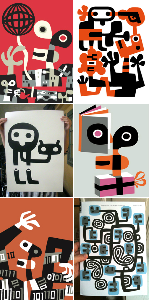
Lasse Skarbovik: Illustrations and Prints

illustration, art, design, Swedish prints

graphic design, contemporary illustration, prints
In the past few years I have downloaded several of Lasse Skarbovik’s illustrations as wallpapers for my iPhone from Poolga’s website without registering his name. Coming across his larger work, I recognized it immediately. I love it. From the book illustrations to the wall murals.

You can see lots more of Swedish illustrator Lasse Skarbovik’s work on his site.

via Lancia Trendvisions

Typographic Wine Labels (Mostly)

Graphic Design, Package Design, TypographyTypography, Packaging, Graphic DesignClick images to enlarge

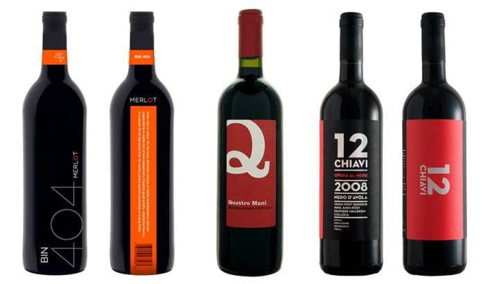
I know it’s not wise, but I am definitely prone to choosing a wine based on its label rather than its vintage, mostly due to ignorance on the subject of fine wine, but also because as a graphic designer I am apt to go for the nicely designed label. And within the nicely designed label category, I am most likely to be lured by a nicely designed, typography-driven label.

Here is a small selection of mostly typographic wine labels that caught my eye on Lovely Package, Graphic Exchange, and, of course, FreshDirect.

Con la Tipo en la Cabeza:Type on the Brain

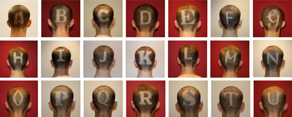
Typography, Type, Fonts, Shaved HeadTypography, Type, Shaved Head process, Alphabet, FontsCon la Tipo en la Cabeza is an ongoing project by Jesus A. Nieto (aka Cucho) a Spanish graphic designer currently based in Leeds, England. Literally, Con la Tipo en la Cabeza means With Type in the Head, but the expression probably translates more accurately (if not a perfect fit with the project) as With Type on the Brain.

Cucho inititated the project in July of 2009 as a typographic experiment to pay homage to different typefaces by initial as he discovered them entering the world of design. The only letters left to go? Y, Z and the trickier Ñ.

The typefaces:  A | Akzidenz Grotesk – B | Bauer Bodoni – C | Cooper Black – D | Din 1451 – E | Engravers – F | Futura – G | Gaseosa – H | Helvetica – I | Italian old style – J | Johnston underground – K | Kandal – L | Lucida Sans – M | Mistral – N | Neutraface – O | OCR-A – P | Palatino – Q | QuaySans – R | Rockwell – S | Stencil – T | Times New Roman – U | Univers – V | Verdana – W | Weidemann – X | Xylo

You can see the Univers ‘U’ in progress in the video below. All the letters are impressively well-rendered, considering the medium, even Mistral!

via Tago

Moderna Museet in Malmö

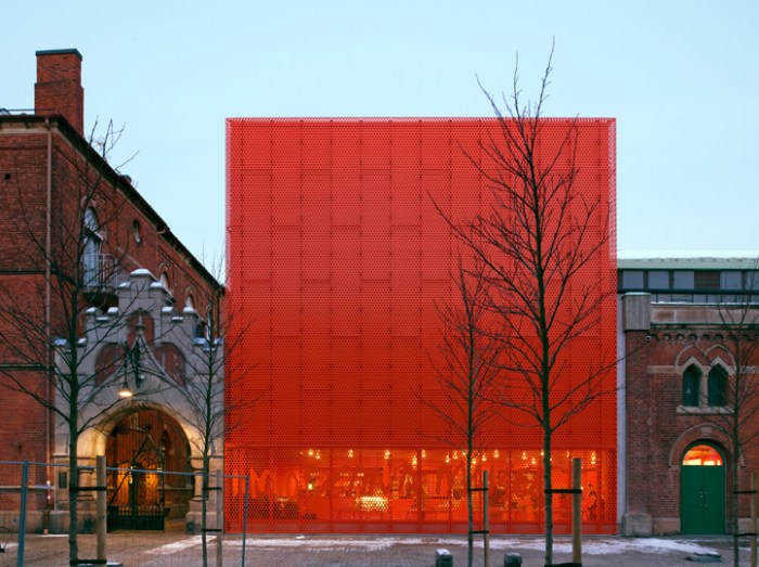
Stockholm art museum, modern architectureStockholm art museum, modern architectureModernaMuseet Malmo, stockholm art museum, architectureOne of the things that I truly enjoy, and gives me a little silly thrill, is seeing new architecture incorporated successfully with old. Coming across photos of the relatively new building for the art museum in Malmö, Sweden, Moderna Museet gave me said thrill.

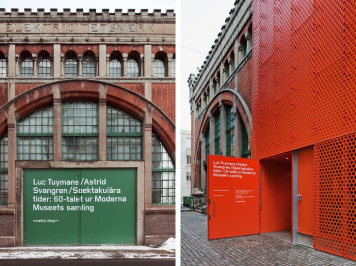
Designed by Tham & Videgård Arkitekter in collaboration with Henirk Nygren Design and Stockholm Design Lab, the two latter involved in the interior design as well as branding and signage, the bright orange-y red box looks fabulous next to the older, classic brick buildings that seem to be part of the museum as well.

The handwritten logo which works beautifully large across the windows at the base of the box in the same color, is adapted from Robert Rauschenberg’s handwriting and famous signature.

via Stockholm Design Lab

Nuria Mora: Street Art from Spain

Street Art Spain Graffiti Wall muralsStreet Art, Graffiti, Spain, Female Street ArtistClick images to enlarge

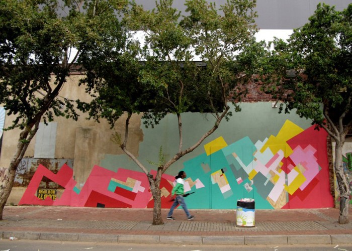
Nuria Mora is a street artist based in Madrid. Not that it should matter, but she is a woman and, as far as I’m concerned, it’s certainly refreshing to come across a female street artist—definitely in the minority.

Colorful and geometric, I imagine coming across any one of her wall murals would brighten one’s day. What I enjoy most about all of these is the contrast of the clean lines on the mostly old or run-down walls they appear on. It’s almost the opposite effect of graffiti way back when the tagging or murals would, many times, deface a newer wall or subway car.

There is plenty more to see on her site.

Typographied Objects II

TypographyType, Letters on objects, TypographyClick to enlarge.

After the first roundup of objects that utilize typography, I’ve come across several more items, so here is a second roundup of typographied objects:

Clockwise from top image:
Jaume Plensa sculpture; Kern ring set; Architecture/Art Tie; Typography Soap; Type Sneakers; Saporiti Alphabet Bookcase; Hello Skateboard; Akzidenz Printed Fabric; WD Collections (wallpaper in 3 bottom pics); Ampersand Tee; Typography Tableware; Diego Grandi Lullaby Plate; Type Clock; Scrabble Type Pillows; Keenan Keeley Alphabet Lamp

Rose Nolan: Typographic Art

Rose Nolan collabcubed Typography Art InstallationsTypographic Art InstallationsTypographic Art InstallationsClick to enlarge

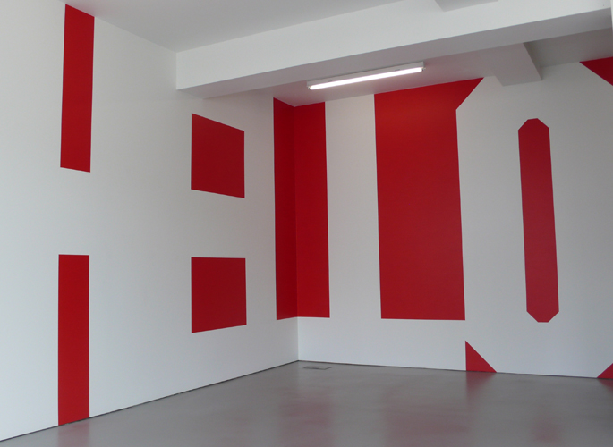
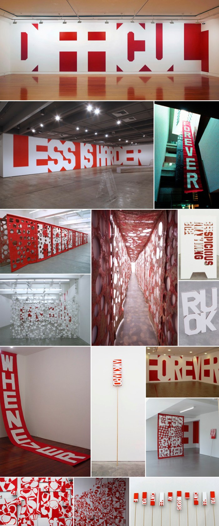
Australian artist Rose Nolan has been painting words onto walls, pennants, banners, and cardboard for 20 years. Her work is playful and oscillates between confident and self-deprecating, as well as bold and humble. Some seem to refer to herself and her reflections on what is art and what it is to be an artist.

Being a fan of type and especially large, bold type on a wall, this work is right up my alley. The red, Constructivist style only adds to its appeal, though I have to admit that the pennants and their humorous statements are also pretty great.

All photos courtesy the Anna Schwartz Gallery.

Camilo Rojas: Consumption

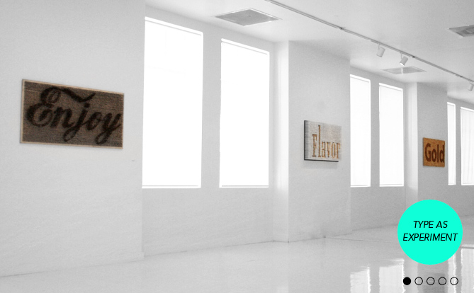
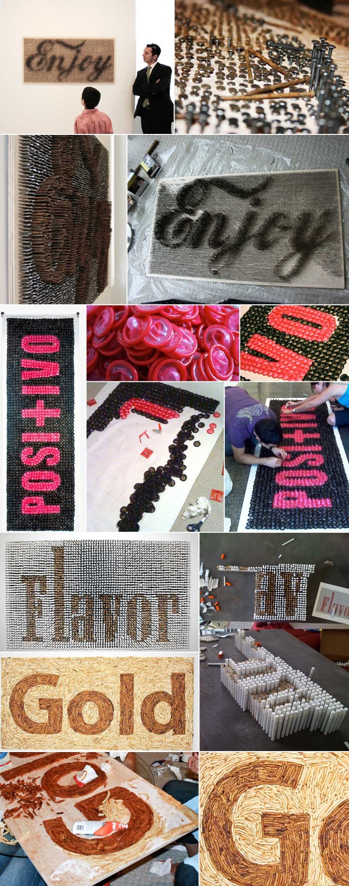
Camilo Rojas Type as Experiment CollabcubedTypography, Art made from cigarettes, fries, nailsClick to enlarge

Camilo Rojas and his Create Studio in Miami presented an installation of typographic messages using nontraditional methods in place of the more classic screen-print-on-paper style. Soda-rusted nails, condoms, cigarettes, and french fries were just some of the materials used to convey powerful statements, as well as raising awareness, about health issues such as obesity, lung cancer and STDs.

You can see the rest of them at his site.

via Quipsologies

Have a Nice Day: Jennis Li Cheng Tien

Digital Art WatercolorArt Digital Art WatercolorClick to enlarge

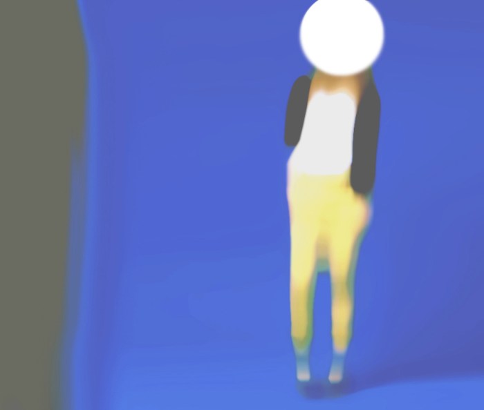
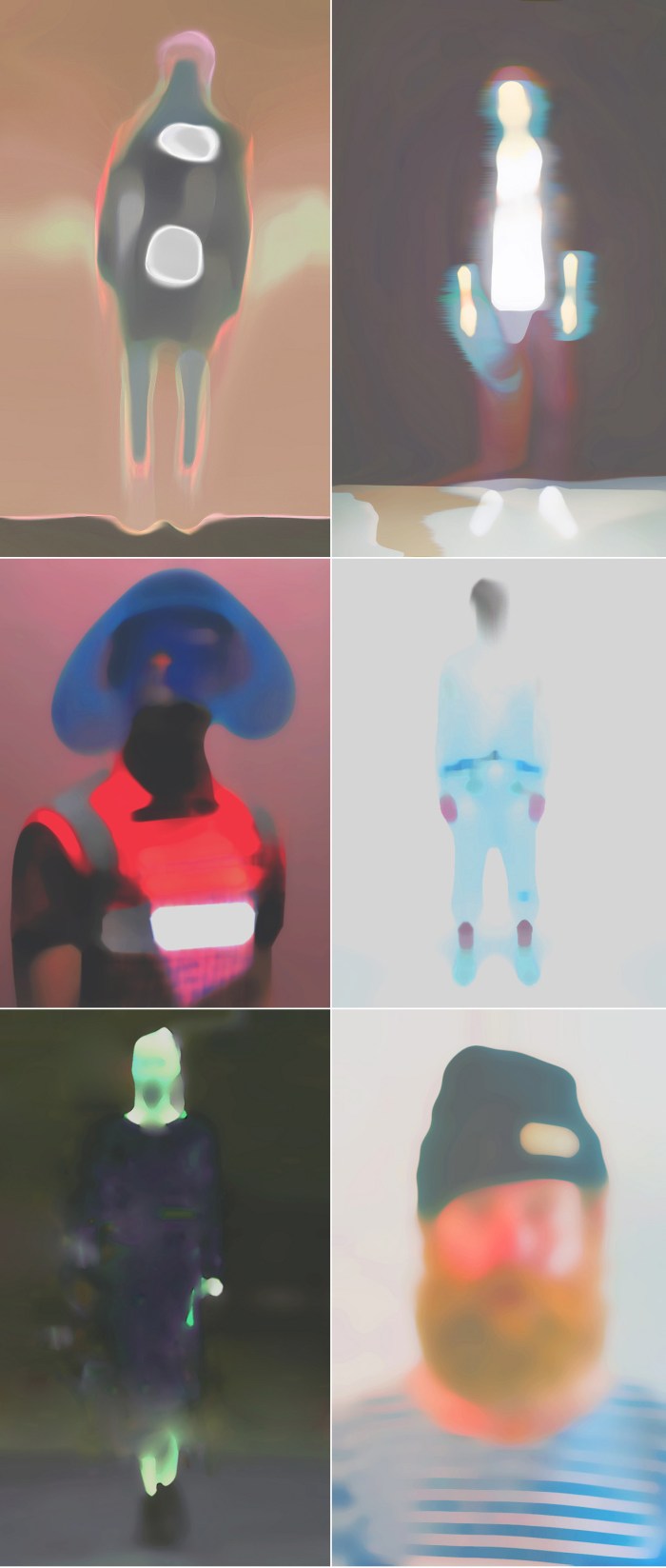
Berlin-based, Taiwanese artist Jennis Li Cheng Tien’s online personal project Have a Nice Day is a work in progress where she takes lost images from the internet and reprocesses them with digital filters distorting them to create somewhat eerie and ethereal images. A very interesting effect, I think.

You can see more of the Have a Nice Day series here, and more of Li Cheng Tien’s other artwork here.

via LanciaTrendVisions

Linotype: The Film

Linotype the FilmCalling all type lovers! I had the priviledge of hearing Doug Wilson, the director and producer of the upcoming documentary Linotype, speak at the BrandPerfect conference I attended a few days ago. He gave us a little history on the, now almost extinct, Linotype machine, as well as showed us the trailer and additional clips. Doug likes to put it this way: “The Linotype machine was basically the Twitter of the 1880s.”

From the site:
The Linotype completely transformed the communication of information similarly to how the internet is now changing communication again. Although these machines were revolutionary, technology began to supersede the Linotype and they were scrapped and melted-down by the thousands. Today, very few machines are still in existence.

Below is the trailer and you can follow screening locations and all other news on the film’s site, as well as help support the project by buying things in the shop. The film is slated for release by the end of 2011. Looks like a good one.

Black & White Graphic Posters

Graphic Design Black and White Posters Searching for specific things on Google images, time and time again I’m drawn to (and distracted from my search by) images that link back to baubauhaus.com, a website put together by two guys from Romania – Stefan Lucut and Andrei Don. Great name for a site and great content. These are just four posters from the Black and White section, but there’s so much more to see. It’s graphic designer heaven.

See it all here.

cartónLAB

cardboard exhibit design and industrial designcardboard exhibit design furniture designClick to enlarge

We have secretly been following (and admiring) the work of cartonLAB for a while now. This ongoing workshop, run by the team at Moho Architects in collaboration with Ability Graphic Design, (both in Spain) has apparently grown into a permanent subdivision of Moho’s studio. Creating everything from exhibit displays for trade shows and stores, to furniture, kids’ play objects, club dj stands, lamps and more, all out of cardboard; these guys impress. Each design somehow seems to top the last, both in beauty and complexity. In addition, many of their displays and stands are designed with multiple configuration options.

From the Moho website:
Cardboard is a material that has always been linked to artistic creativity and craftsmanship. The new design possibilities (digital cut, large print, cad, 3d modeling, etc) along with the latest patents in the production of cardboard (reboard, cardboard reinforced, flame retardant coatings, water repellent, etc) makes this material in a fantastic alternative at the time of generating new exhibition spaces, media and all types of custom cheap, lightweight and recyclable furniture. Working with contemporaneously cardboard creation process allows almost no intermediaries between the designer and the final piece through traditional interfaces (previous models) or digital.

cartonLAB’s constructions typically pack flat for easy transport, are relatively simple to assemble and, as we know, cardboard is not only economical but recyclable. The result: great, green design that won’t break the bank.

You can see more of cartonLAB’s work here, and more of Moho’s architecture work (including their beautiful entry for a dormitory building) here.

Architypeture: Part II

Typography in Architecture Lowther Children's CentreTypography in Architecture Multiple ExamplesClick to enlarge
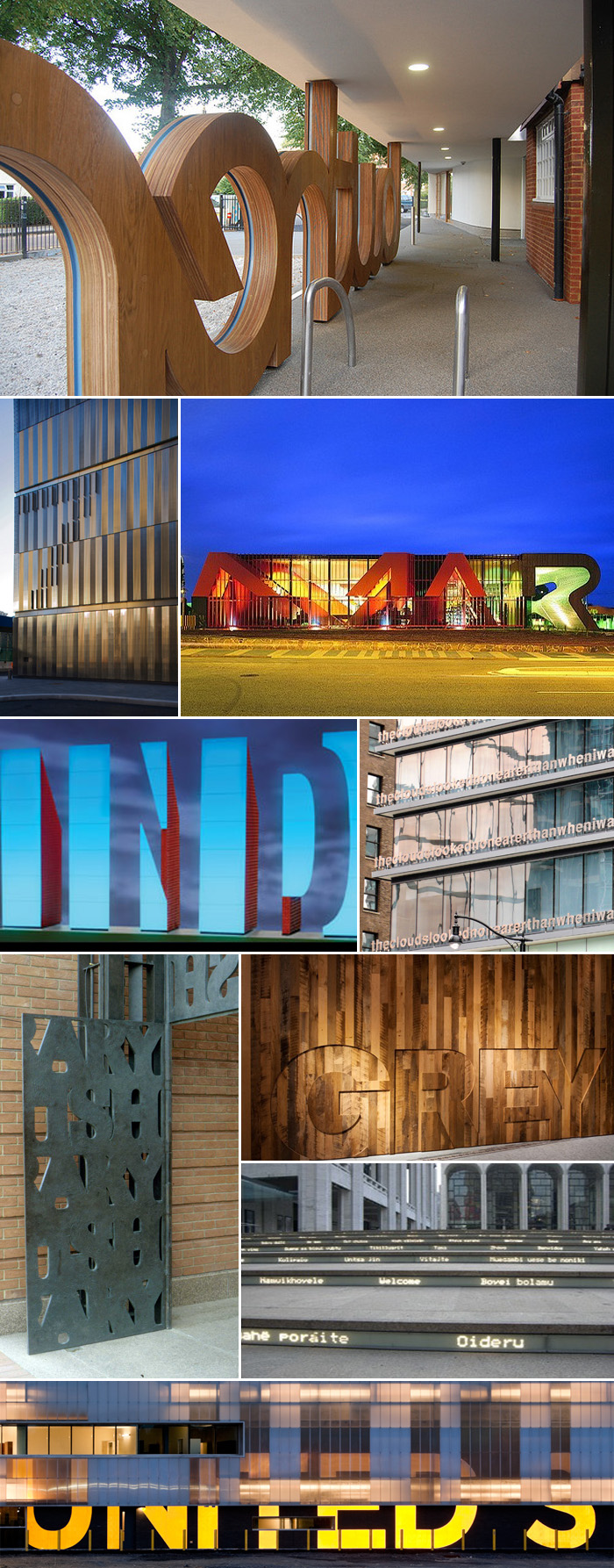
Row by row; left to right: Lowther Children’s Centre, London, Patel Taylor Architects. 7 World Trade Center, NYC, Michael Gericke, Pentagram. The Marion Cultural Centre by ARM + Phillips/Pilkington. Artwork for the Indianapolis Airport, Indiana, Joe C. Nicholson. Fairmont Pacific Rim Hotel, Vancouver, Canada, Liam Gillick; words say “Lying on top of a building, the clouds looked no nearer than when I was lying in the street.” British Library main gates, Cambridge, UK, Cardozo Kindersley Workshop. Grey Group, NYC, Paula Scher, Pentagram. Lincoln Center steps, “Welcome” in multiple languages, Diller Scofidio + Renfro. U.S.-Canada border crossing station at Massena, NY, Michael Bierut, Pentagram (has since been taken down.)

Typography in Architecture Pentagram Design

Click to enlarge
Row by row; left to right: New York Times Building Signage, NYC, Michael Bierut, Pentagram. Symphony Space, NYC, Paula Scher, Pentagram. 770 Broadway awning, Paula Scher, Pentagram. Harley Davidson Museum, Milwaukee, Wisconsin, Michael Bierut, Pentagram. Bloomberg Building, NYC, Paula Scher, Pentagram. Container Mall (proposed design) NYC, LOT-EK. APAP Open School, Korea, LOT-EK. Bohen Foundation, NYC, LOT-EK. Lignan Studio renovation, LOT-EK. PS1 Museum of Art, Queens, NY (not sure of designer.) Museum Tower, Dallas, Texas, Scott Johnson, Johnson Fain Architects, photo from williamedia’s photostream. Wales Millenium Centre, Cardiff, South Wales, Jonathan Adams, Capita Architecture, photo from iwouldstay’s photostream.

As promised, here is a second roundup of architecture and typography merged into one (see Part I). Pentagram has a large representation here, as does Lot-ek, possibly because many of their projects are in NYC and I am personally familiar with them, but it’s more likely because their websites happen to be chock-full of these beautiful projects. Lot-ek’s use of type and color on their projects feel a little like Freitag bags on steroids. I love it.