TULP: Webguerillas Bathrooms

interior design, fun bathrooms, markers in bathroom for graffiti writing, Tulp design, Munich, Webguerillasinterior design, fun bathrooms, markers in bathroom for graffiti writing, Tulp design, Munich, Webguerillasinterior design, fun bathrooms, toilet paper sky in bathroom, mirrors in bathroom, Tulp design, Munich, WebguerillasGerman brand architecture firm TULP created three fun restrooms for Webguerillas’ offices in Munich. The marker installation at top, invited staff and clients to mark up the room as they wished by using the pens (attached by magnets) to draw, graffiti, and decorate the walls. The second bathroom involved lots of toilet paper rolls and blue light, creating a paper sky and easy access to toilet paper replenishment. The third installation included an array of framed mirrors to change the sense of space and play on the idea of vanity.

Photos: Oliver Jung

via flor

Typographied Objects IV

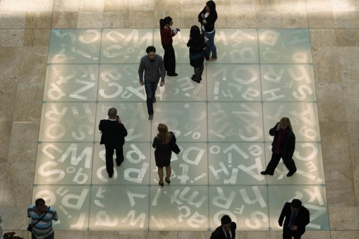
typography on mugs, numbers on mugs, typographic objects, bold numbers, fun itemsTypography on floor of Romanian National Library, Type Installation, Typography in ArchitectureTypography on objects from food to housewares and clothes. Letters, Type, Numbers, typographied objectsClick to enlarge

It’s been a while but here is the latest roundup of typography objects.

From left to right, starting at the top working down
Number Mugs from SuckUK; Floor of the Romanian National Library: Typographic Chessboard; Type Tote (front and back); Vitamin Packaging; Proposed Milk Carton Packaging; Sascha Grewe Letter Stools; Full House by J. Mayer H. for Bisazza SPA with dataprotection patterns; Handwritten Typeface by Lucas Neumann de Antonio; Edible Gelatin Type; Quotation Mark Plate; Typographic Sliding Puzzles; Bathroom Signage Student Project by Daniyil Onufrishyn; Alphatots Potatoes; TarGetBooks Shelf by Mebrure Oral; Dynamo Typocolate; Linus Dean Rugs; Typographic Dress; Urban Dinnerware; Love Your Fellow As Yourself T-shirt; Pablo Lehmann Bookcase; Ouch Quote Quips Bandages; and Anita Shelving by Ricard Mollon

See our previous posts Typographied Objects I, II, and III.

Tapewriter: Autobahn

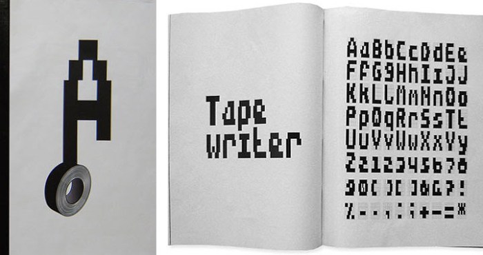
Autobahn design studio, Tapewriter, Duct Tape font, Typeface, Street Art typographyAutobahn design studio, Tapewriter, Duct Tape font, Typeface, Street Art typographyAutobahn design studio, Tapewriter, Duct Tape font, Typeface, Street Art typographyClick to enlarge

Dutch design studio Autobahn, founded by Maarten Dullemeijer and Rob Stolte, created the font Tapewriter while experimenting using duct tape as the writing material and outdoor metal fencing as their canvas. Each rectangle in the fence matched the width of the duct tape, creating a kind of bitmapped effect when words were taped out on the metal grid. From street art and free expression to font…interesting.

via behance

NY Design Week 2012

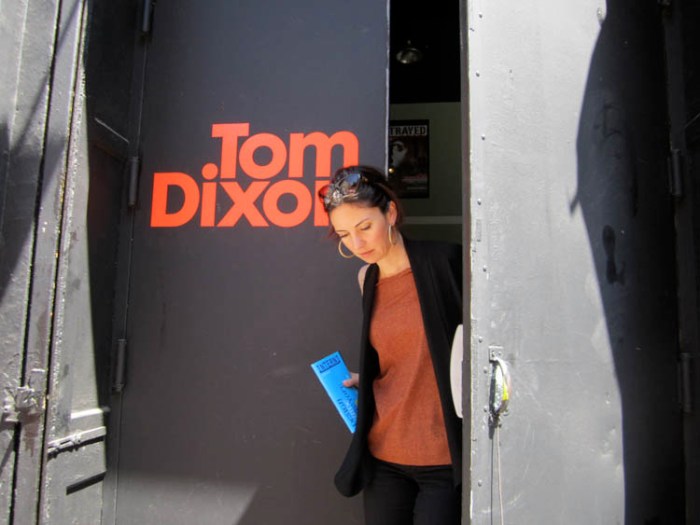
NY Design Week 2012, Noho District, Tom Dixon-Fab Pop Up London UndergroundNY Design Week 2012, Noho District, Tom Dixon-Fab Pop Up London UndergroundNY Design Week 2012, Tom Dixon, London Underground, Japanese Premium Beef, Balloon Factory beef balloons, Core77 Pop-up Gallery, Partners & Spade Children's ChairsClick to enlarge

Well, it looks like the ever-growing NY Design Week 2012 is off to a great start with exceptionally beautiful weather in store for the next three days. Aside from ICFF at the Jacob Javits Center, the event at the core of Design Week (and we – CollabCubed – will be there as part of the designboom mart, but more on that later) there are special design-related events going on all over the city. Too many to list here, but here are a few I ran across today in my travels through NoHo on my way to the East Village.

Tom Dixon along with Fab, Surface Magazine and Stumptown Coffee have teamed up and transformed the basement of the Bleecker Street Theater into a Pop-up shop and café: London Underground. Filled with lamps designed by Dixon, the space has a cool feel with interesting shadows cast upon the walls. My favorites? His new line of industrial looking ceramic lamps due out in September.

Two blocks north on Great Jones Street, Japanese Premium Beef (a unique butcher shop worth visiting anytime for its singular boutique-like quality) has a display of beef and sausage balloons created by Balloon Factory.

On the same block, The Future Perfect looked like they were setting up a special exhibit and across the street at Partners & Spade, Mondocane has an exhibit of historically relevant children’s chairs. Around the corner, Core77 was setting up their First Annual Core77 Open, a Pop-up exhibit featuring 5 designers from the 5 boroughs. The stacks and stacks of wooden flats(!) that they were loading into the shop look like they’ll make for an interesting installation.

More events include: Roll & Hill’s temporary showroom at 2 Cooper Square; Areaware at 22 Bond St.; and Hotel California at The Standard East Village.

You can see more events on the Noho Design District site, as well as Metropolis Magazine’s list, Core77, and WantedDesign for other events outside of Noho.

Enjoy!

All photos collabcubed except for bottom row of chairs courtesy of Mondocane and Partners & Spade.

Gregos: Masking the Streets of Paris

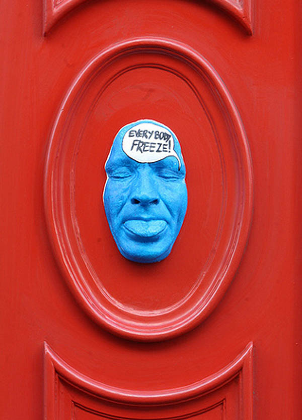
Street art in Paris, painted plaster self-portrait masks, Gregos, graffiti, collabcubedStreet art in Paris, painted plaster self-portrait masks, Gregos, graffiti, collabcubedStreet art in Paris, painted plaster self-portrait masks, Gregos, graffiti, collabcubedClick to enlarge

A couple of years ago, on a trip to Paris, we noticed many of these masks emerging from the walls around town. I came across a photo from that trip the other day and decided to google the artist. Gregos, as he is known, grew up in the suburbs of Paris and started graffiti painting in the late 80s. After stints in Athens, Greece and Boston, where he learned sculpting and painting, Gregos returned to Paris and street art, this time inventing his own 3D style combining all his newfound skills: sculpture, molding, and painting.

There are presently more than 400 faces, all cast from his own face — self-portraits that express his humor, thoughts, and most everything about Gregos.

You can see plenty more of these faces on his website and his flickr.

Laurent Perbos: Myths from the Banal

French contemporary sculpture made up of sports equipment such as bungee cords, Calydon,French contemporary sculpture made up of sports equipment such as bungee cords, Calydon,French contemporary sculpture using bungee cords and pvc piping, Laurent Perbos Click to enlarge

French artist Laurent Perbos belongs to the genre of artist that enjoys reappropriating the everyday and banal by converting it into art where it can be seen as playful, ironic and/or critical. He uses materials such as sports equipment, pencils, pvc piping, just to name a few. Many of his works reference mythological figures such as the sculpture at the top – made of bungee cords and javelins – titled Calydon, a wild boar from Greek mythology said to have been sent by the goddess Diane, that devastated the territory of Calydon. Below, Forest Tears, are trees and tree stumps made of pvc piping.

via documents d’artistes

Multipraktik: TapeArt

Street art from Slovenia, Murals made with colored tape, graphic designers, multipraktikStreet art from Slovenia, Murals made with colored tape, graphic designers, multipraktikStreet art from Slovenia, Murals made with colored tape, graphic designers, multipraktikClick to enlarge

The Slovenian, multi-disciplinary, design collective Multipraktik organized a series of street TapeArt actions – with different artists across Slovenia – as part of the new campaign for Orto, a cellphone carrier company. Aside from the resulting wonderful murals, it looks like these guys had a lot of fun. Take a look at one of the many stop-motion videos below.

via urban pride

Kay Rosen: Wordplay

Typographic Installations, Words, Type as art, Kay Rosen, play with wordsTypographic Installations, Words, Type as art, Kay Rosen, play with wordsTypographic Installations, Words, Type as art, Kay Rosen, play with wordsThese are fun. Texas-born artist Kay Rosen, who teaches at SAIC in Chicago, loves type. The shapes. “They are the architecture of text.” Her typographic art installations are playful and fun to figure out, but just to make it a little less challenging, I’ll list the titles from top to bottom here:

Blurred
Deep Beep
Wideep
Tent
Pendulum
MañanaMan
Overbite
Go Do Good

Many more on her website!

via IdN

Stuart Bird: Promise Land

Calling, Cell Phone film by Stuart Bird. Words Counter and Revolution spelled out Calling, Cell Phone film by Stuart Bird. Words Counter and Revolution spelled out, South African contemporary artStuart Bird. Words with Political meaning South African contemporary artClick to enlarge

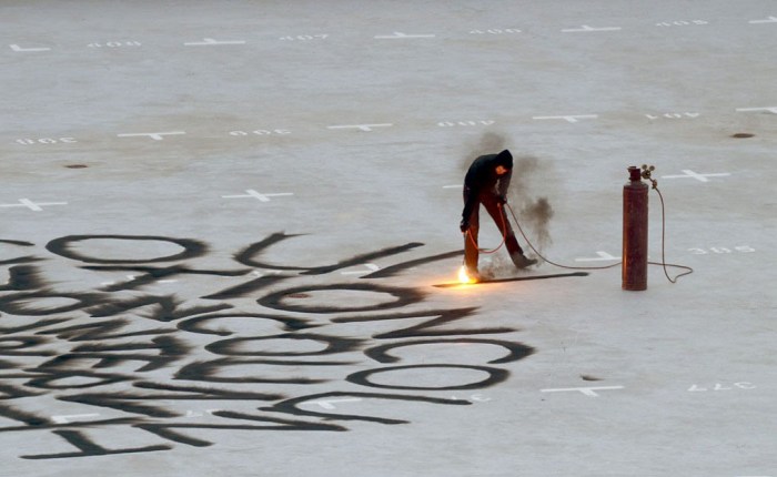
South African artist Stuart Bird creates sculptures, videos, and installations, often utilizing type, that speak to the socioeconomic situation of his present day country; South Africa’s potential for greatness existing side-by-side with empty government promises, hence the title of his recent solo exhibit: Promise Land. The show included the pieces shown here, the top three images being stills from Bird’s video Calling shot on a cellphone. The video documents the act of inscribing the words ‘Revolution’ and ‘Counter’ onto the roof of a building with an acetylene torch. From the artist:

It struck me, that the ideological lines between a counter-revolutionary and a revolutionary could be blurred and confusing. And I wondered about the recurring nature of revolutions, implied even in the alternative meaning of the word itself… The work ties into “Promise Land” in various ways, not least because socially and politically we are in the midst of a revolution, albeit a slowly unfolding one.

You can see more of Stuart Bird’s work at the Goodman Gallery’s website.

via Goodman Gallery and artthrob

Aldo Rojas: Social Conflicts

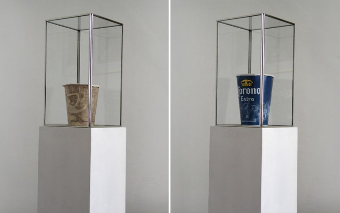
Homeless person's cup, Starbucks coffee cup, Mexican Contemporary art, collabcubedHomeless person's cup, change cups, Mexican Contemporary art, Aldo Rojas, collabcubedSocioeconomic art, popular culture, Mexican Contemporary art, Aldo Rojas, collabcubedClick to enlarge

I stumbled across Mexican artist Aldo Rojas’ work and really like the thinking behind it. Rojas is a conceptual artist who is interested in social conflicts and popular expression. His art deals with socioeconomic disparities. He likes to shake things up by bringing these quotidian examples of contrasts in economic levels from the streets to the interiors of art world institutions.

For his Vasos de Lismoneros (Panhandlers’ Cups) Rojas, along with Alfredo Wigueras, bought used cups from several panhandlers. They enjoyed the irony in these corporate brand cups starting as a tool for commercial consumption, subsequently converted to garbage, then rescued by the homeless panhandler and converted into a working tool once again, of a different sort, with the final twist in the artists buying these cups again and making them into ‘art’, exhibiting them in galleries, once again converting them into merchandise but in a completely different circle and social class.

Rojas’ other projects make similar statements and poke a bit of fun at the art world as well. His Mexico a Traves de sus Paletas (Mexico as seen through its Lollipops) is a collection of different style lollipops from different sections of Mexico City. Mobiliario Urbano Informal: Mingitorios Personales (Informal Urban Furniture: Personal Urinals) are a collection of bottled urine (from Evian water intake) in PET bottles, representing the bottles left around Mexico City by bus, truck and taxi drivers due to the lack of public toilets.

Lastly, Rojas’ Colecta de Conos (Cone Collection) depicts the lack of quality control in the cheap brand of cones typically dispensed to lower income families by ice cream cone carts in the parks of Mexico City, displaying them as a chromatic palette.

You can see more of Aldo Rojas’ work on his blog and in his Behance portfolio.

via Behance

Evol: Repeat Offender

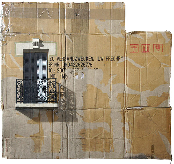
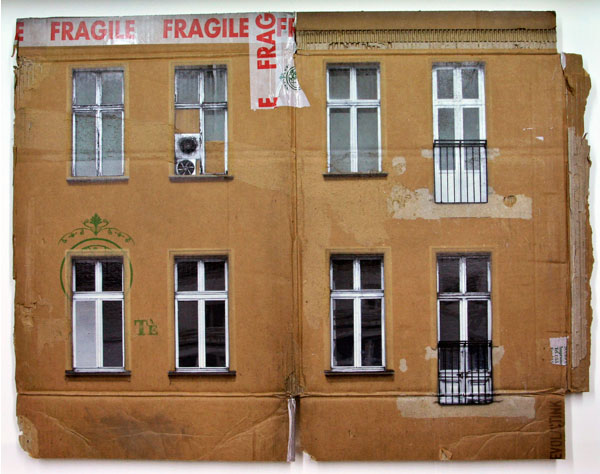
Cardboard paintings of buildings in Berlin, spray paint on cardboard, EVOL, Repeat Offender exhibit at Jonathan Levine GalleryCardboard paintings of buildings in Berlin, spray paint stenciled on cardboard, Evol, Repeat Offender exhibit at Jonathan Levine GalleryCardboard paintings of buildings in Berlin, spray paint stenciled on cardboard, Evol, Repeat Offender exhibit at Jonathan Levine GalleryBerlin-based artist Evol – known best for his street art interventions of scale models of abandoned and decaying buildings left on electrical boxes and cement blocks in cities around the world – currently has his first solo show in the United States at the Jonathan LeVine Gallery in Chelsea. Repeat Offender, as the exhibition is titled, is a collection of Evol’s recent work of multi-layered stencil paintings on used and flattened cardboard boxes, as well as other paintings on scrap metal. These works continue to convey general urban decay and, more specifically, the walls and façades of pre-gentrified East Berlin. Incredibly realistic (I thought they were photo-silkscreened), these spray-painted pieces work beautifully on their chosen canvases. The combination of the painted façades with the type, tape, and icons on the original boxes gives them a wonderful texture. Though they photograph well, seeing these in person, as with most art, adds another dimension.

Repeat Offender will be at the Jonathan LeVine Gallery through this Saturday, May 5th.

You can watch a video of Evol’s process here.

Photos courtesy Jonathan LeVine Gallery.

Roman Tyc: Semafory

Prague Street Art, Roman Tyc, Ztohoven, Traffic Light art, switched images of traffic lightsRoman Tyc, Ztohoven, Traffic Light art, switched images of traffic lights, Prague Street Art, Roman Tyc, Ztohoven, Traffic Light art, switched images of traffic lights, Prague Street Art, Roman Tyc, Ztohoven, Traffic Light art, switched images of traffic lights, Prague Street Art, Click to enlarge

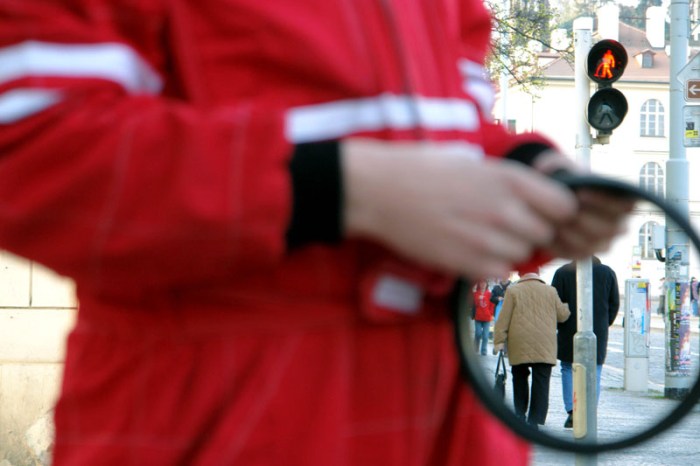
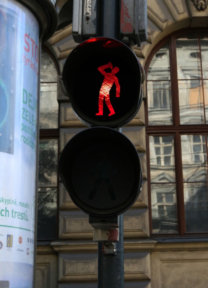
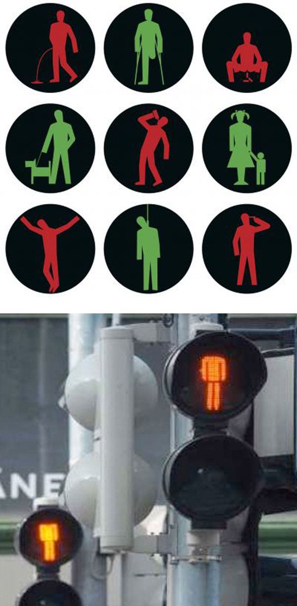
Czech artist Roman Tyc (née David Hons), member of the guerilla art group Ztohoven, replaced 48 traffic lights in Prague by amending the standard red and green figures to show them in situations such as drinking, urinating and being hanged, as well as more benign ones such as a man walking his dog. The act was embraced by the public as great fun (as well as awarded top prize at Austria’s Sidewalk Cinema Festival in Vienna that year) but, naturally, not so much by the authorities. Tyc had to pay for repairs in addition to a large fine. Tyc paid for the repairs but, refusing to pay the fine, was sentenced to 30 days in prison this past February. In protest, his supporters signed petitions and ‘decapitated’ – by blacking out the heads –  traffic light figures throughout the Czech Republic. Despite their efforts, Roman Tyc served the 30 days and was released in March.

Here’s a video of the installation:

via gestalten

A Building in the Hand…

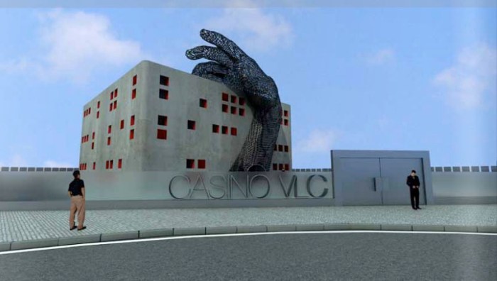
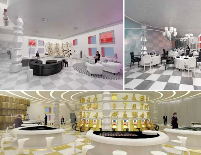
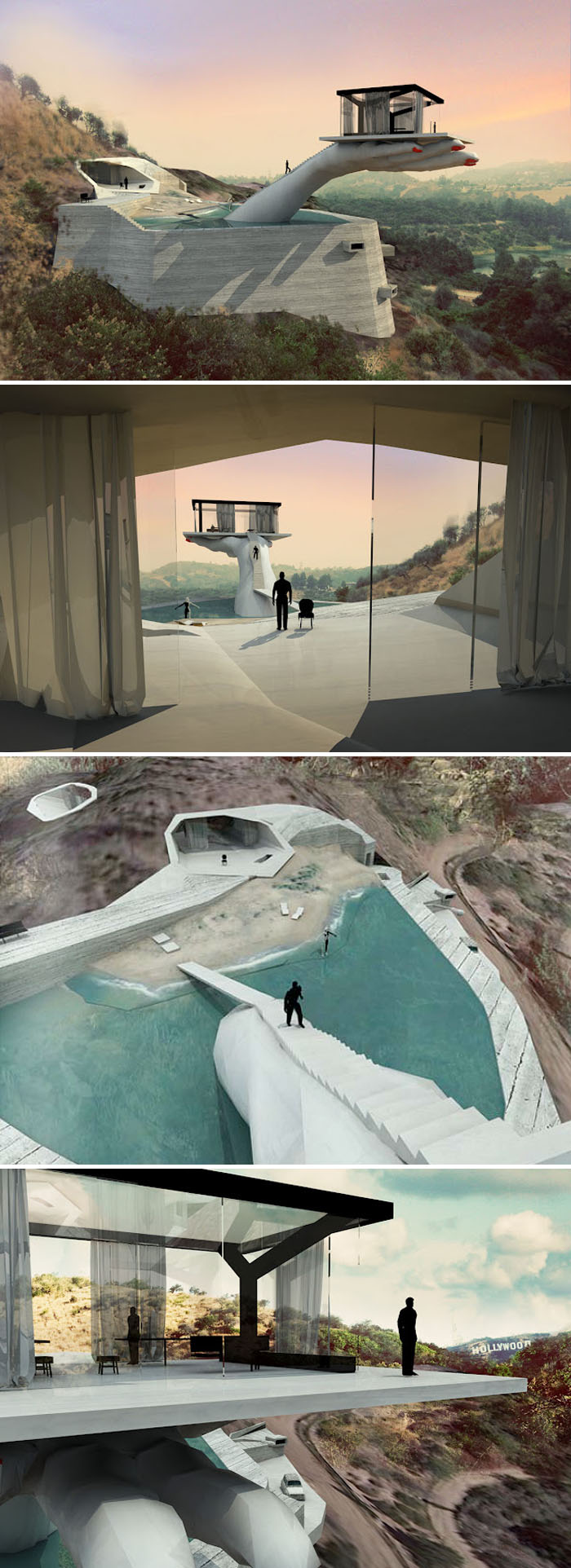
Casino Valencia, VLC, Student Project, Vicente Ortuno, Escuela de diseno Barreira, collabcubedCasino with large hand sculpture, Student Project, Vicente Ortuno, Escuela de diseno Barreira, collabcubedCasino Valencia, VLC, Student Project, Vicente Ortuno, Escuela de diseno BarreiraHand House by Andreas Angelidakis, Proposal, Case Study House, Los Angeles, Hollywood, collabcubedHand House by Andreas Angelidakis, Proposal, Case Study House, Los Angeles, Hollywood, collabcubedClick to enlarge

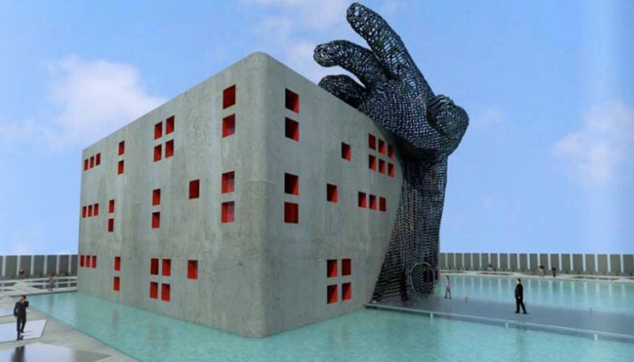
Awhile back I came across a student project for a redesign of the Casino VLC in Valencia Spain, by interior design student Vicente Ortuño at Escuela de diseño Barreira. The design features a large sculpture of a hand wrapping around the building as if grabbing it. Ortuño’s design is meant to break with the traditional Roman architecture approach to casino design. He opted for a surrealist vision, with a dreamlike quality in a place where people hope for dreams of winning and wealth to come true. The hand was specifically chosen for its presence in such game-playing phrases as “a good hand” or “sleight of hand” as well as for its strength, not to mention making a clear indicator as the main entrance.

Shortly after, I came across a case study for a house in Los Angeles by Greek architect Andreas Angelidakis who maintains an experimental practice in Athens which involves “building, designing and speculating the contemporary ecosystem of screens and landscapes. He usually operates at the intersection of systems: Art and Architecture, Virtual and Real, Building and Nature, Ruin and Construction.” Angelidakis’ design for the Hollywood Hand House has an involved story behind it. Basically, a concrete hand of a giant girl punches through a mountain off Wetona Drive from the direction of the Hollywood sign. After the anger subsides the hand comes out of a reservoir water basin and elegantly holds a glass box building on a serving tray, perched over the cliff like a billboard. The punched-out cave and glass house are connected via the reservoir which is converted to a swimming pool…it’s quite a fictionalized and surreal story which you can continue to read about on Angelidakis’ blog.

Obviously, they seemed like natural projects to group together…you know, with the giant hands and all. Both projects have a creepy quality, but then, I think that’s what each designer was going for.

Images courtesy of the architects.

via Di* and PINUP

Simone Decker: Chewing in Venice 1 + 2

Photography, Trompe l'oeil, oversized gum sculptures, Venice, Simone Decker, contemporary artPhotography, Trompe l'oeil, oversized gum sculptures, Venice, Simone Decker, contemporary artPhotographs, Chewing Gum, Bubble gum art, trompe l'oeil, Venice, Simone DeckerThese photos are a lot of fun. Luxembourger artist Simone Decker created them in 1999, but I just happened upon them for the first time now. Decker is interested in perspective shifts and often explores the way public space is arranged. Much of her work appropriates said space as in her photographic series shown above: Chewing in Venice 1 + 2. Using photographic trompe l’oeil devices, Decker includes the streets and squares of Venice as the backdrop for her oversized gum sculptures; a proposal for sculptural work, or at least that’s the way I understand it.

From an article translated on her website:
All of these works consist of photographs, mostly series of photographs, that propose sculptures or architectural elements for the public domain. They are documentations of real outside installations of these objects. But it is only the perspective of the camera that lends the works a visual presence and a dimension that puts them in the relationship to the urban or architectural environment desired by the artist. In Chewing in Venice, for example, the chewing-gum objects only become sculptures that fill squares and lanes by virtue of the fact that they are photographed right in front of the lens.

Those big bubbles remind me a bit of the RedBall Project. I think the realization of these sculptures would be a huge hit.

via chiquero

David Shillinglaw: Street and Studio Art

Street art in Capetown, UK, David Shillinglaw, Dodie Boy, illustration, graphic designStreet art in Capetown, UK, David Shillinglaw, Dodie Boy, illustration, graphic designStreet art in Capetown, UK, David Shillinglaw, Dodie Boy, illustration, graphic designClick to enlarge

London based artist David Shillinglaw’s (aka Dodie Boy) work is new to me, at least by name, but by the number of street art blogs that came up when googling, I have a feeling I may be in the minority. Either way, I really love it. Shillinglaw’s work moves between street and studio, usually working on multiple projects at once…no time for boredom! His bold, colorful, type-infused illustrations convey the ups and downs of life, often including humorous idioms and metaphors.
From the artist:
“I enjoy the way people use language to define a feeling or physical condition. We support what we think, feel, say, and mean, with often ridiculous idioms and metaphors; placing frogs in throats and fires in belly’s, in order to paint a picture of something invisible and abstract. I feed on these very human expressions. I find day-to-day, conversational poetry casts a warm light on an otherwise very calculated, systematic, clinical and scientific world. My work is about people. Human nature. Both the civilized and monstrous, the stupid and articulate.”

Here’s a nice interview with Shillinglaw, and you can see more of his work on his website and blog.

via dirtcheapmag

Nick Georgiou: Book & Newspaper Sculptures

Sculptures made from newspapers and books, inspired by death of print, Nick GeorgiouSculptures made from newspapers and books, inspired by death of print, Nick GeorgiouSculptures made from newspapers and books, inspired by death of print, Nick GeorgiouClick to enlarge

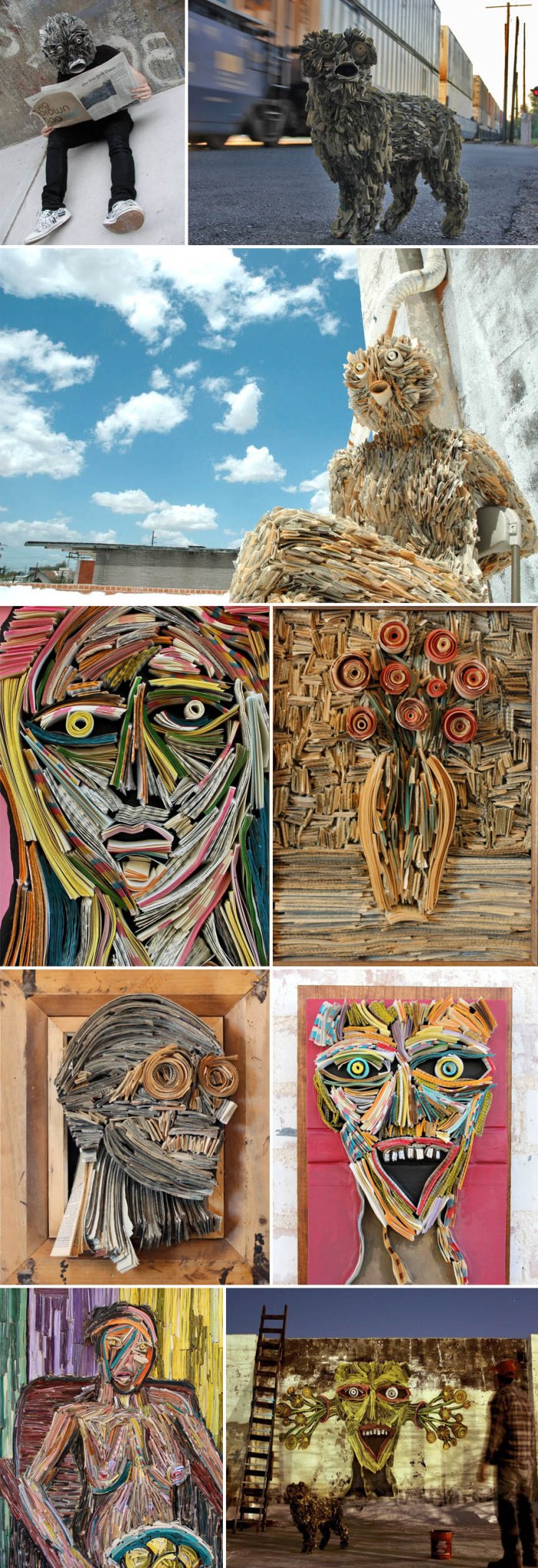
Reflecting on the shift away from print to digital in our current society, New York artist Nick Georgiou (presently residing in Arizona) creates sculptures, both two- and three-dimensional, by meticulously hand-stitching books and newsprint that he finds on the streets, and then integrates into the urban environment.

From Georgiou’s blog:
My art is inspired by the death of the printed word. Books and newspapers are becoming artifacts of the 21st century. As a society we’re shifting away from print consumption and heading straight towards full digital lives. My sculptures are products of their environment —both literally and figuratively. As often as I can, I use local newspapers to add authenticity, and the form the sculpture takes is a reflection of the personal connection I feel to that particular city. From a day-to-day standpoint, I’m heavily influenced by my surroundings. These days, I draw inspiration from America’s South West, and in particular Tucson, AZ–where I’ve lived and worked for almost four years. Going from NY to the desert is a pretty dramatic shift. Your concept of space expands when it’s not obstructed by buildings. You pay closer attention to nature because you’re always in it—and you do what you can to preserve it.
You can see much more of Nick’s work on his blog.

via citizens artist collective

Eric Mistretta: Mixed Media

Student work, mixed media, Affordable art fair, Family Business The Virgins Show, Eric MistrettaStudent work, mixed media, Affordable art fair, contemporary art, balloon, Eric MistrettaStudent work, mixed media, Affordable art fair, contemporary art, balloon, Eric MistrettaClick to enlarge

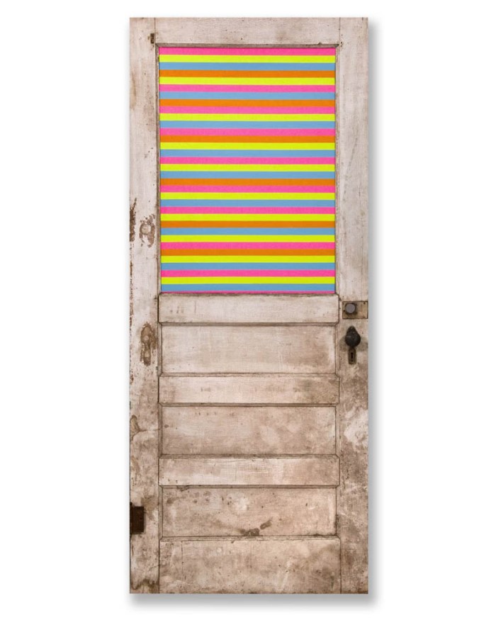
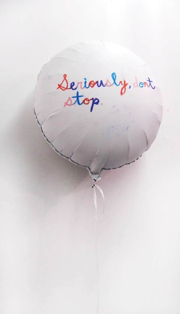
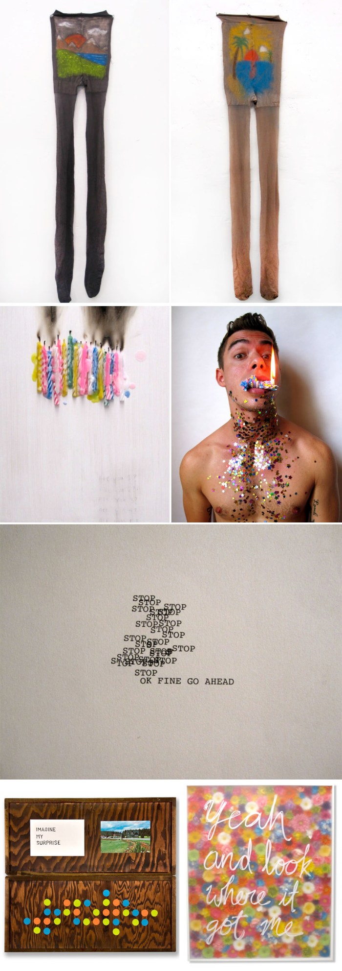
Mixed media New York artist and student Eric Mistretta seems to be making a splash. First, his quirky yet touching pieces that range from type on paper to type on balloons, taped doors to painted pantyhose and paintings/collages made with melted candles and smoke (just to name a few) appeared in the Virgins Show at the recently opened Family Business Gallery in Chelsea, a space opened through the collaborative forces of Maurizio Cattelan and New Museum director Massimiliano Gioni, and now he’ll be showing his work at the Affordable Art Fair starting Wednesday. These colorful, offbeat pieces that seem to use found materials, made me smile.
Born in Queens, NY, Mistretta is an MFA student at the School of Visual Arts, “makes a great bolognese” and keeps a food blog in a addition to his art blog.

via artlog

Matt McVeigh: Shopping Cart Sculptures

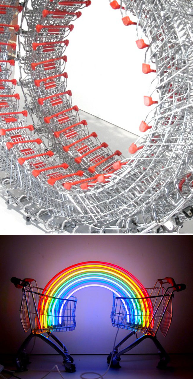
Shopping cart sculpture, Sculpture by the Sea cottesloe, Australia, cool contemporary sculptureShopping cart sculpture, Sculpture by the Sea cottesloe, Australia, cool contemporary sculptureShopping cart sculpture, Sculpture by the Sea cottesloe, Australia, cool contemporary sculptureThe multi-talented Matt McVeigh is an Australian set designer, painter, costume designer, puppet-maker, and sculptor. Most recently he has created a series of sculptures involving both life-size shopping carts and miniature ones. In these sculptures McVeigh explores consumerism and its resulting social issues by referencing the instability of our culture and the endless pursuit of more.

Last month in Cottesloe’s 8th annual Sculpture by the Sea, McVeigh had both an outdoor (top photo is The New Covenant) and indoor (bottom photo: Covenant Under Question?) sculpture exhibited.

You might also like last year’s submission, Ascension, as well as his kinetic piece Stentor.

via sculpture by the sea