Shakespeare Machine: Ben Rubin

Multimedia sculpture, Chandelier of text from Shakespeare Plays, Public Theater, NYC, Ben RubinMultimedia sculpture, Chandelier of text from Shakespeare Plays, Public Theater, NYC, Ben RubinMultimedia sculpture, Chandelier of text from Shakespeare Plays, Public Theater, NYC, Ben RubinClick to enlarge

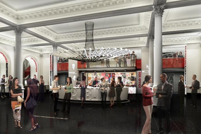
When I heard designer Paula Scher speak a couple of weeks ago at the Reasons to be Creative conference, she mentioned the current renovation at the Public Theater in NYC and the new graphics that she and her team at Pentagram are working on. She also mentioned a very interesting piece acting as a sort of centerpiece chandelier in the main lobby: a Shakespeare Machine designed by Ben Rubin (previously here and here.) The work is described in the Public Theater’s press release as follows:

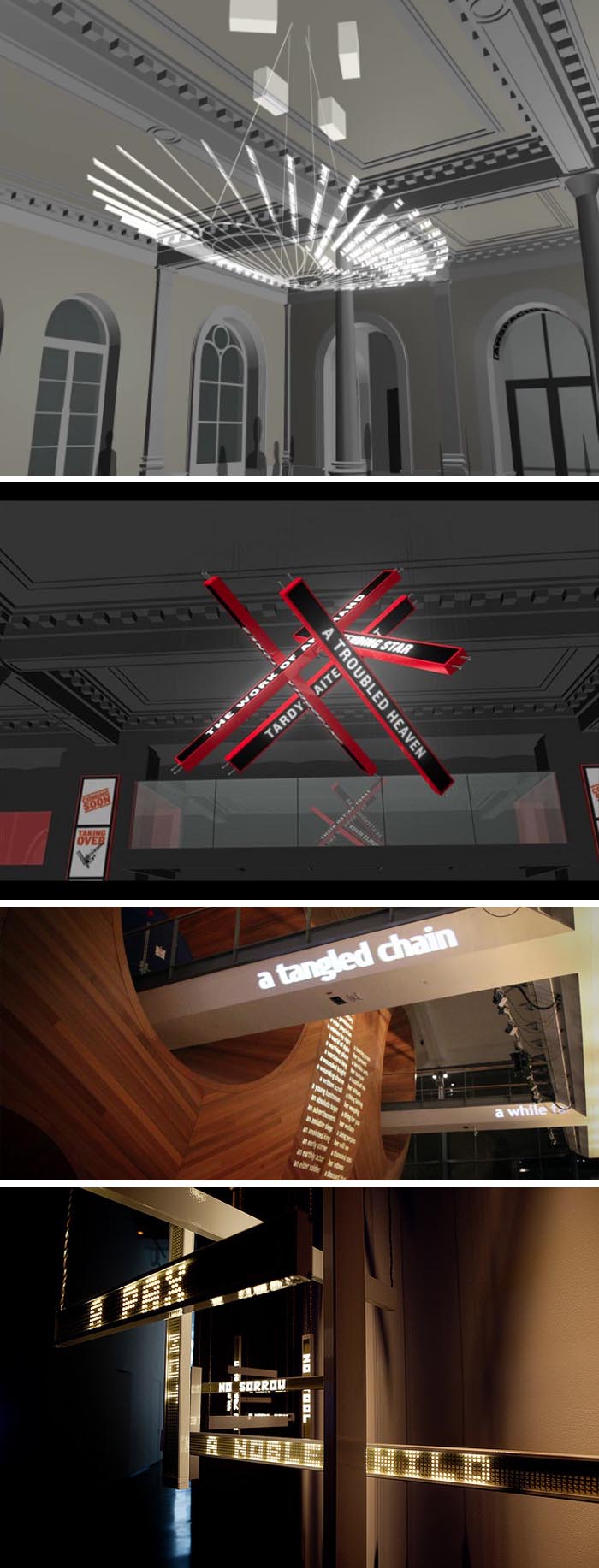
A large-scale multimedia sculpture, “Shakespeare Machine,” has been commissioned from Ben Rubin for The Public’s lobby. Suspended from the ceiling and serving as the lobby’s chandelier, the work features 37 display screens on which fragments of Shakespeare’s plays appear and dance, creating an unfolding kaleidoscope of language in motion. The installation is part of New York City’s Percent for Art initiative, which ensures that a portion of construction project budgets are dedicated to site-specific artworks.

Upon further research I came across several Shakespeare Machines that Rubin has worked on in the past few years, as a way of working out concepts and algorithms for the Public Theater sculpture. The top three images are from the latest, and presumably final, renderings for the actual piece due to debut this coming fall. The fourth image is a previous rendering from 2009, while the fifth image is from A Shakespeare Accelerator: Experiments in Kinetic Language, a piece that is currently being exhibited at the Experimental Media and Performing Arts Center (EMPAC) at RPI in Troy, NY through the end of July. The final image is an iteration from 2009 included in the group show Textual Landscapes: Real and Imagined at Bryce Wolkowitz Gallery.

The final piece that will hang in the Public Theater’s lobby will cycle continuously through the text of Shakespeare’s plays organized as a repeating series of compositions, recombining the small linguistic molecules to form new poetic visual combinations. The nature of the algorithms ensures that no composition will repeat.

I’m looking forward to checking this out. In the meantime, you can take a peek at the animated rendering here.
Images courtesy of Ben Rubin, EMAC, Bryce Wolkowitz, and The Public Theater.

Zach Lieberman: Interactive Artist

interactive art, computer graphics, human-computer interaction, very cool, art meets science and technologyinteractive art, computer graphics, human-computer interaction, very cool, art meets science and technologyinteractive art, computer graphics, human-computer interaction, very cool, art meets science and technologyinteractive art, computer graphics, human-computer interaction, very cool, art meets science and technologyClick to enlarge

Another of the amazing speakers at Reasons to be Creative last week was Brooklyn-based digital artist and programmer Zach Lieberman. He uses technology in a playful way breaking down the fragile boundary between the visible and invisible. His main goal is to surprise. Lieberman has collaborated on numerous impressive projects, many of which have rightfully won awards and been exhibited at, among other places, MoMA’s Talk to Me exhibit last year.

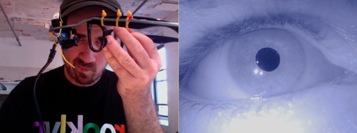
One of his impressive projects—in conjunction with the Graffiti Research Lab—is a project initially created to allow TEMPT1 — a pioneering artist in the 1980s and 90s California graffiti scene who has since been afflicted with ALS, a degenerative neuromuscular disorder leaving him completely paralyzed except for the use of his eyes and mind — to draw using an eyetracking system. Lieberman was able to keep the cost very low, and with incredible ingenuity created Eyewriter. See the video below to watch it in action and for more details. Truly incredible and so heartwarming.

Another interesting project Lieberman collaborated on with two typographers and a professional stunt driver is IQ font for Toyota. Tracking the car’s movements using custom software designed by Lieberman, they created a font which is unique and can be downloaded for free.

Other projects include voice activated graphics in Messa Di Voce, an audiovisual performance collaboration with Golan Levin, and a music video for BELL using FaceTracker code with fun effects happening on the singer’s face in real-time. (See second video below.)

Eltono: This Way in Warsaw

Social street art project in warsaw with French/Spanish artist Eltono, Otone, Vlepvnet, GPAScommunity street art project in warsaw with French/Spanish artist Eltono, Otone, Vlepvnet, GPASSocial street art project in warsaw with French/Spanish artist Eltono, Otone, Vlepvnet, GPASClick to enlarge

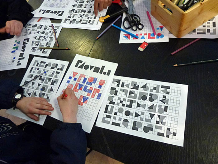
I love these kinds of projects. Originally French but living in Spain, street artist Eltono (‘the tone’) collaborated on a mural, last month, with kids from Mala Street in Warsaw as part of the project “This Way” implemented by the Vlepvnet Foundation and the GPAS. The kids involved in the project are ones who, because of their social environment, don’t have easy lives and spend much of their time on the street. With their help, a geometric abstract alphabet was created and words using those letters and selected by the kids were painted on a wall on Mala Street. From defining the letters to cutting stencils and spray-painting the words, the kids worked with Eltono every step of the way, taking pride in their art.

I wasn’t able to translate the wall but for those who want to give it a shot here is the alphabet and a Polish to English translator.
(Using the virtual keyboard and pressing the “Alt+Ctrl” key you will be able to use the Polish special characters.) If anyone figures it out, please share with the rest of us!

If you like this project, you might also enjoy Boa Mistura’s work.

via escrito en la pared

Typographied Objects IV

typography on mugs, numbers on mugs, typographic objects, bold numbers, fun itemsTypography on floor of Romanian National Library, Type Installation, Typography in ArchitectureTypography on objects from food to housewares and clothes. Letters, Type, Numbers, typographied objectsClick to enlarge

It’s been a while but here is the latest roundup of typography objects.

From left to right, starting at the top working down
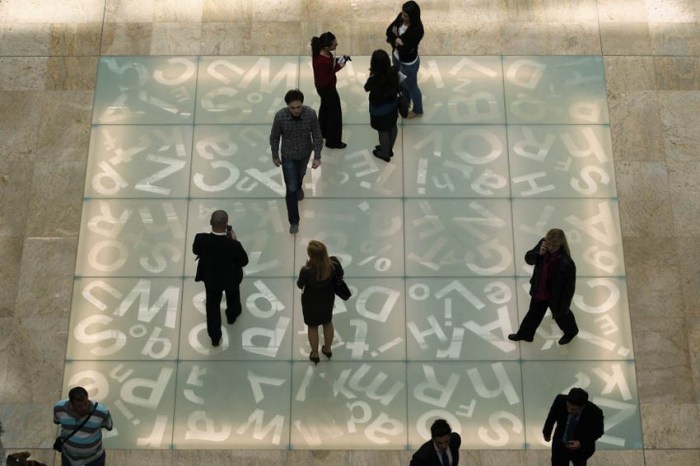
Number Mugs from SuckUK; Floor of the Romanian National Library: Typographic Chessboard; Type Tote (front and back); Vitamin Packaging; Proposed Milk Carton Packaging; Sascha Grewe Letter Stools; Full House by J. Mayer H. for Bisazza SPA with dataprotection patterns; Handwritten Typeface by Lucas Neumann de Antonio; Edible Gelatin Type; Quotation Mark Plate; Typographic Sliding Puzzles; Bathroom Signage Student Project by Daniyil Onufrishyn; Alphatots Potatoes; TarGetBooks Shelf by Mebrure Oral; Dynamo Typocolate; Linus Dean Rugs; Typographic Dress; Urban Dinnerware; Love Your Fellow As Yourself T-shirt; Pablo Lehmann Bookcase; Ouch Quote Quips Bandages; and Anita Shelving by Ricard Mollon

See our previous posts Typographied Objects I, II, and III.

Tapewriter: Autobahn

Autobahn design studio, Tapewriter, Duct Tape font, Typeface, Street Art typographyAutobahn design studio, Tapewriter, Duct Tape font, Typeface, Street Art typographyAutobahn design studio, Tapewriter, Duct Tape font, Typeface, Street Art typographyClick to enlarge

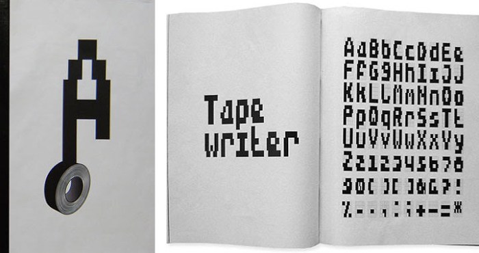
Dutch design studio Autobahn, founded by Maarten Dullemeijer and Rob Stolte, created the font Tapewriter while experimenting using duct tape as the writing material and outdoor metal fencing as their canvas. Each rectangle in the fence matched the width of the duct tape, creating a kind of bitmapped effect when words were taped out on the metal grid. From street art and free expression to font…interesting.

via behance

Yeah! More FarmGroup

Fun Type Installation made with drinking straws, in Bangkok mall, Yeah!, collabcubedFun Type Installation made with drinking straws, in Bangkok mall, Yeah!, collabcubedFun Type Installation made with drinking straws, in Bangkok mall, Yeah!, collabcubedClick to enlarge

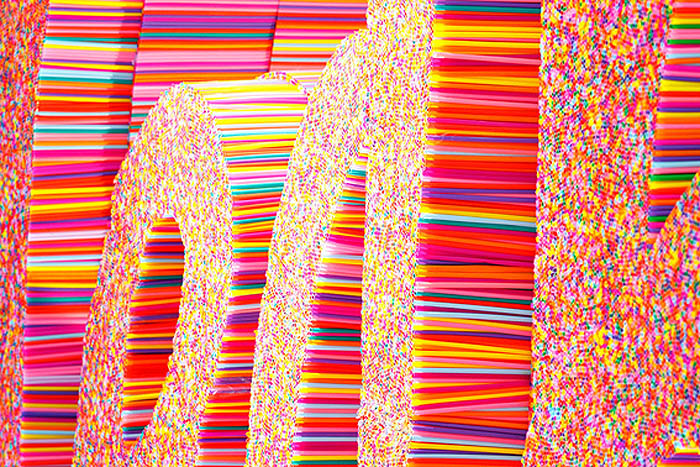
Bangkok-based multi-disciplinary design studio FarmGroup (previously here) created this fun Christmas installation at the Siam Center. Using thousands of colorful plastic drinking straws, the sculpted the word “Yeah!” along with several shapes of animals, stars, and other holiday motifs.

If you like this you might also like Sang Sik Hong’s Straw Sculptures and Scott Jarvie’s Clutch Project, also made with straws.

Brian Dettmer: Quotes Cut from Books

Book Sculptures, Cut books, Phrases cut out of books, typography, Brian Dettmer, Book artBook Sculptures, Cut books, Phrases cut out of books, typography, Brian Dettmer, Book artBook Sculptures, Cut books, Phrases cut out of books, typography, Brian Dettmer, Book artClick to enlarge

Originally from Chicago, artist Brian Dettmer, who creates innovative sculptures with books and other forms of antiquated media, currently resides in Atlanta.

As is the case with other artists working with books as their material of choice, Dettmer uses his art, in part, as a commentary on the waning physical form of the information age. The long-lasting book is being replaced by the intangible, digital file, and the world risks being left with nothing.

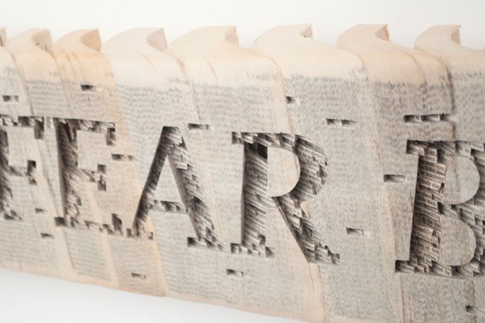
Dettmer works by cutting into the surface of books and dissecting through it. Working with knives, tweezers and surgical tools he carves one page at a time. Nothing within is relocated, just removed. Alternate histories and memories are revealed. In the case of the series of quotes above, Dettmer has cut into groups of paperbacks, sealed with acrylic, carving out the easily recognizable unfinished quotes.

You can see much more of Dettmer’s work here (definitely worth a look) and his Pecha Kucha talk from 2 years ago here.
via tribe magazine

Jean Daviot: Typographic Wordscapes

Typography landscapes, wordplay in grass, Lieu Lien, French art, Jean Daviot, type installationTypography landscapes, wordplay in grass, Memoire, French art, Jean Daviot, type installationTypography landscapes, wordplay in grass, Imagine, Memoire, French art, Jean Daviot, type installationClick to enlarge

French artist Jean Daviot works in a variety of mediums including painting, photography, video, and installation art. Throughout, he plays with aural and linguistic analogies. In his installations he is particularly interested in wordplay; in seeing words and type as shapes and then in essence dissecting them and seeing the words within the words. For example: MEmoiRE (memory), a word he uses in several installations, contains the letters M-O-I (self) inserted between the word MERE (Mother). He likes to take the words literally and then turn them upside down.

From the artist:
I’m particularly aware of those moments called entre chien et loup in French (twilight, when a wolf can’t be distinguished from a dog), those fleeting instants when day turns into night or vice versa and shapes are seen in a different light. All of my work is situated in this slippery moment, this passage in one direction or the other, that instant that suddenly reveals the face of things you thought were hidden and now suddenly can be seen, like the appearance of shapes through the intervention of an artwork that invites interpretation.

via documents dartistes and artpress

And That’s the Way it Is: Ben Rubin

Projected newsfeed onto University of Texas Facade, Ben Rubin, Cool art installation, Walter Cronkite Plaza, AustinProjected newsfeed onto University of Texas Facade, Ben Rubin, Cool art installation, Walter Cronkite Plaza, AustinProjected newsfeed onto University of Texas Facade, Ben Rubin, Cool art installation, Walter Cronkite Plaza, AustinClick to enlarge

A few weeks ago, The University of Texas dedicated one of their plazas to the legacy of Walter Cronkite. The newly named plaza was debuted along with media artist Ben Rubin’s (previously here) art installation titled And That’s The Way It Is; a digital interface that intertwines transcripts of Cronkite’s legendary broadcasts with contemporary journalism, projected in a beautifully choreographed manner (reminiscent of Jenny Holzer’s work) as compositions of moving text, onto the façade of the CMA building, overlooking the Walter Cronkite Plaza.

From austinist:
The profound differences between Cronkite’s world and ours are felt as the projection evolves, both in their content and manifestation within Rubin’s piece. For the Cronkite transcripts, Rubin slows the pace and allows the text to move slowly up and down the CMA with fully legible quotes. When projection segues to live news feeds, the text flies across the building, occasionally as just snippets of stories and other times with full news coverage. The words overlap and eventually become so dense that the overwhelming presence of media becomes the dominant character in Rubin’s piece. Rubin accurately portrays this amassing of information and reinforces the oversaturation of current journalism.

The permanent installation is on display nightly from dusk to midnight on the southern façade of the College of Communication A Building on the UT Austin Campus.

You can see the installation in action below:

Photos courtesy of the Ben Rubin and Paul Bardagjy.

via frame and austinist

Guildor: Write on the Water

Typography, Typographic installation in Milan, Amsterdam, Words floating on water, Guildor, Street artTypography, Typographic installation in Milan, Amsterdam, Words floating on water, Love, Guildor, Street artTypography, Typographic installation in Milan, Amsterdam, Words floating on water, Guildor, Street artClick to enlarge

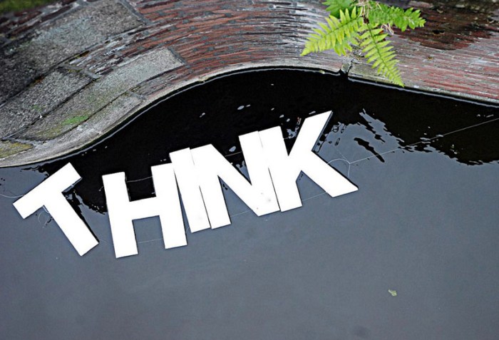
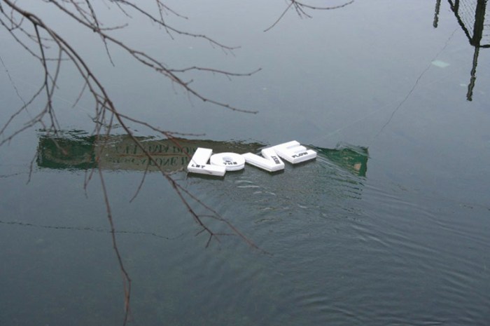
I can just imagine the smiles provoked by coming upon Milan-based street artist Guildor’s floating phrases. Write on the Water (love the punniness) is a series of installations created by the artist in several cities including Amsterdam, Milan, and Venice. Linking foam letters together to create words and statements such as “Clap First”, “Happiness Happens”, “Think Once and a Half”, “Pensa Spensierato (Think Carefree)”, and “Love; Let the Rest Flow” and floating them on water – from fountains to rivers and canals – is simply a happy and nice concept.

From the artist:
Writing on water is like writing down a thought in order to keep it secure even when it is shaken by the course of life, to distinguish the important things from those you should just let flow by.

If you like this you’d probably enjoy Nicole Dextras’ Ice Typography installations, too.

Top photo by Nicole Blommers; Once and HA photos by Andrea Bertolotti; all others by Thomas Pagani.

via flickr

Kay Rosen: Wordplay

Typographic Installations, Words, Type as art, Kay Rosen, play with wordsTypographic Installations, Words, Type as art, Kay Rosen, play with wordsTypographic Installations, Words, Type as art, Kay Rosen, play with wordsThese are fun. Texas-born artist Kay Rosen, who teaches at SAIC in Chicago, loves type. The shapes. “They are the architecture of text.” Her typographic art installations are playful and fun to figure out, but just to make it a little less challenging, I’ll list the titles from top to bottom here:

Blurred
Deep Beep
Wideep
Tent
Pendulum
MañanaMan
Overbite
Go Do Good

Many more on her website!

via IdN

Stuart Bird: Promise Land

Calling, Cell Phone film by Stuart Bird. Words Counter and Revolution spelled out Calling, Cell Phone film by Stuart Bird. Words Counter and Revolution spelled out, South African contemporary artStuart Bird. Words with Political meaning South African contemporary artClick to enlarge

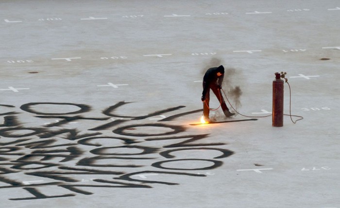
South African artist Stuart Bird creates sculptures, videos, and installations, often utilizing type, that speak to the socioeconomic situation of his present day country; South Africa’s potential for greatness existing side-by-side with empty government promises, hence the title of his recent solo exhibit: Promise Land. The show included the pieces shown here, the top three images being stills from Bird’s video Calling shot on a cellphone. The video documents the act of inscribing the words ‘Revolution’ and ‘Counter’ onto the roof of a building with an acetylene torch. From the artist:

It struck me, that the ideological lines between a counter-revolutionary and a revolutionary could be blurred and confusing. And I wondered about the recurring nature of revolutions, implied even in the alternative meaning of the word itself… The work ties into “Promise Land” in various ways, not least because socially and politically we are in the midst of a revolution, albeit a slowly unfolding one.

You can see more of Stuart Bird’s work at the Goodman Gallery’s website.

via Goodman Gallery and artthrob

Boa Mistura: Order is Intangible

Typographic installation, Boa Mistura, Louis Kahn Poem, cool type installation, collabcubedTypographic installation, Boa Mistura, Louis Kahn Poem, cool type installation, collabcubedTypographic installation, Boa Mistura, Louis Kahn Poem, cool type installation, collabcubedThe Spanish art collective Boa Mistura (previously here) composed of five self-proclaimed ‘graffiti rockers’ created this cool anamorphic typography installation for the interior design fair Interiorissimo Decoracción 2011. Inspired by the poem “Order is” by Louis I. Khan, the words “El Orden es Intangible” (Order is intangible) were painted on an abstract furniture composition that is only legible from one specific angle. This sort of thing always blows my mind.

David Shillinglaw: Street and Studio Art

Street art in Capetown, UK, David Shillinglaw, Dodie Boy, illustration, graphic designStreet art in Capetown, UK, David Shillinglaw, Dodie Boy, illustration, graphic designStreet art in Capetown, UK, David Shillinglaw, Dodie Boy, illustration, graphic designClick to enlarge

London based artist David Shillinglaw’s (aka Dodie Boy) work is new to me, at least by name, but by the number of street art blogs that came up when googling, I have a feeling I may be in the minority. Either way, I really love it. Shillinglaw’s work moves between street and studio, usually working on multiple projects at once…no time for boredom! His bold, colorful, type-infused illustrations convey the ups and downs of life, often including humorous idioms and metaphors.

From the artist:
“I enjoy the way people use language to define a feeling or physical condition. We support what we think, feel, say, and mean, with often ridiculous idioms and metaphors; placing frogs in throats and fires in belly’s, in order to paint a picture of something invisible and abstract. I feed on these very human expressions. I find day-to-day, conversational poetry casts a warm light on an otherwise very calculated, systematic, clinical and scientific world. My work is about people. Human nature. Both the civilized and monstrous, the stupid and articulate.”

Here’s a nice interview with Shillinglaw, and you can see more of his work on his website and blog.

via dirtcheapmag

Good Design Lasts

2804 Pencils to create signage, typography, signage design, office design, Spagnola and Associates2804 Pencils to create signage, typography, signage design, office design, Spagnola and Associates
Click to enlarge

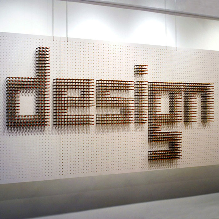
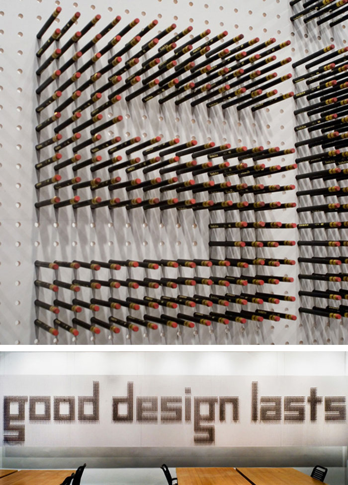
New York design office Spagnola & Associates faced the challenge of designing their new office space. They created a 20′ wide dimensional wall to stimulate ideas and complete the office. 2804 pencils were hammered into pre-drilled holes in the panels. The completed wall reads, in custom designed letters, “good design lasts”. The entire process is documented in the stop motion video above.

Bikeway Belém: P-06 Atelier

Bikeway Belém, Lisbon, Portugal, Typographic bike routes, wayfinding, symbols, collabcubedBikeway Belém, Lisbon, Portugal, Typographic bike routes, wayfinding, symbols, collabcubedBikeway Belém, Lisbon, Portugal, Typographic bike routes, wayfinding, symbols, collabcubedClick to enlarge

The way I see it, most everything is improved with a little typography. Bicycle paths included. The Bikeway Belém in Lisbon is a prime example. The 7,362-meter bike route along the river Tagus has bold white wayfinding text and symbols painted directly on the pavement which, apart from its practical purposes such as providing direction and measuring distances, is also fun and engaging. There are some ‘zuuuums’ and ‘vuuuums’ printed around as well as arrows and questionmarks that always look good. In addition, along one of the piers, there’s a verse by Portuguese poet Alberto Caeiro about the river Tagus. The project was a collaboration between the Lisbon-based communication and environmental graphics studio P-06 Atelier (previously here) and Global Landscape Architects.

As much as I love the Hudson River bike path, I think a project like this would only enhance it even more.

Photos courtesy P-06 Atelier and Decorating the Duck.

via segd

Charles Atlas: The Illusion of Democracy

Typography installation, light, projections, Bushwick, cool art installation in Brooklyn, collabcubedTypography installation, light, projections, Bushwick, cool art installation in Brooklyn, collabcubedTypography installation, light, projections, Bushwick, cool art installation in Brooklyn, collabcubedThis is an exhibit that we will definitely be checking out this week. I mean, numbers, projected on multiple screens in different variations, sizes and colors…totally our kind of thing! For their inaugural exhibition in the newly opened Bushwick gallery, Luhring Augustine is featuring works by video artist Charles Atlas. The exhibition is titled The Illusion of Democracy and includes three installations by Atlas never before exhibited in New York: Painting by Numbers (2011), Plato’s Alley (2008), and a new site-specific, large-scale video work 143652 (2012).

Originally from St. Louis, Missouri, Atlas has lived and worked in NYC since the ’70s and is considered a pioneering figure in film and video.

If you’re in NYC and thinking of visiting the Bushwick gallery, it’s important to note that it is only open Fridays through Sundays. The Illusion of Democracy will be on exhibit through May 20, 2012.

via artinfo via notcot