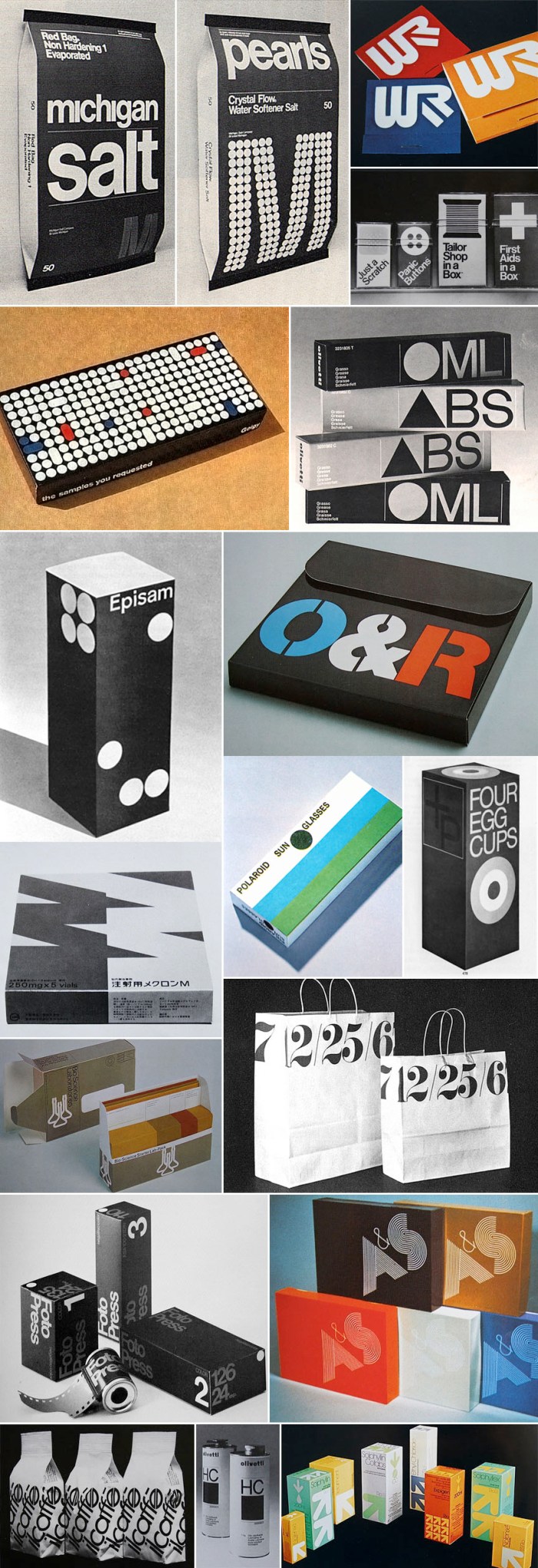
 Click to enlarge.
When I was in college, my library of choice on campus was the Fine Arts Library. I would lug my Calculus text books over there with full intention to study for my exam, but the temptation to peruse the newly discovered (for me) Graphis magazines and annuals was too huge to resist. So, you can imagine my excitement when, googling around for some typography-related material, I came across a beautiful flickr set of images from Graphis Packaging 3 and 4. It brought me right back to the Fine Arts Library and my not-so-great Calculus grade. SO much beautiful typography. I love it.
It’s interesting to note that Target introduced a new line of packaging within the last couple of years, Up & Up, that resembles the packaging in the bottom right image above, though not quite as nice.
You can see more images on crabstick’s flickr.
These are wonderful. Love the bag at the top.
Nice!
Also looks like the arrows of Burton’s logo, no?
🙂
Karen G.
Hi Karen!! Que tal?
Yes on the Burton logo.