Jen & Paul’s Souvenir City & Chelsea Bus Tours

Jen & Paul's Souvenir City & Chelsea Bus Tours, NYC, Humorous Art souvenirs, Art Bus, Performance art, Jen Catron and Paul OutlawJen & Paul's Souvenir City & Chelsea Bus Tours, NYC, Humorous Art souvenirs, Art Bus, Performance art, Jen Catron and Paul OutlawJen & Paul's Souvenir City & Chelsea Bus Tours, NYC, Humorous Art souvenirs, Art Bus, Performance art, Jen Catron and Paul Outlaw
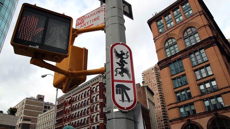
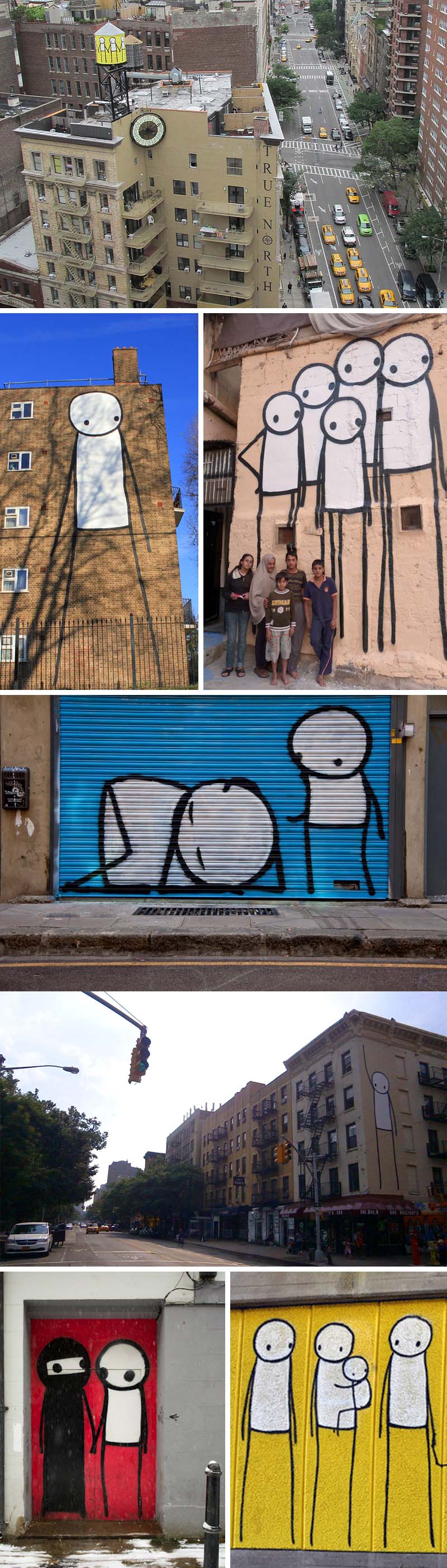
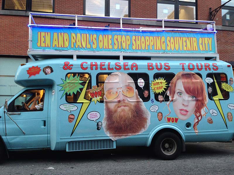
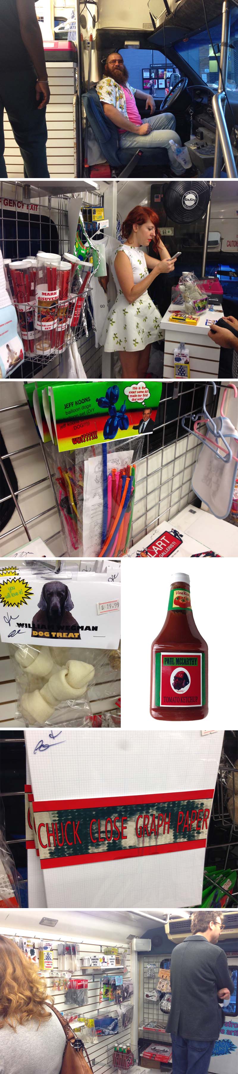
Strolling through the gallery openings in Chelsea the other evening I came upon Jen and Paul’s One Stop Shopping Souvenir City & Chelsea Bus Tours. Definitely hard to miss, the glitzed up light blue parked bus (on 26th Street the night I was there, but apparently more often located on 24th Street) beckons to passers-by, welcoming them in and offering an array of humorous art souvenirs for purchase. The mobile shop — created, designed, run, and driven by performance artists Jen Catron and Paul Outlaw — displays and sells an impressive selection of clever mock DIY-style art kits, games, and supplies that poke fun at the big-name contemporary artists whose work is often found within the galleries that surround it. Make your own Jeff Koons balloon animals with a set of branded balloons. A glasses and nose disguise is repositioned as a Cindy Sherman Disguise Kit. There’s Chuck Close Graph Paper, Paul McCarthy Ketchup bottles, Mini Damien Hirst Shark, William Wegman Dog Treats and much more. Definitely chuckle-inducing throughout. And if that weren’t enough, Jen and Paul offer free Chelsea tours led by the two of them as well as a few semi-celebrity guests such as Paddy Johnson and comedian Sean J Patrick with others to follow. Make sure to keep an eye out for the bus if you’re headed to Chelsea this fall, or sign up for a tour over here.

You can learn more about Jen and Paul in the video below:


Photos: collabcubed

21st Precinct: Street Art & Graffiti Art Show

21st Precinct NYC, Graffiti, Street art exhibit, Outlaw Arts, Alice Mizrachi, NYC art exhibit in an abandoned police station building21st Precinct NYC, Graffiti, Street art exhibit, Outlaw Arts, NYC art exhibit in an abandoned police station building21st Precinct NYC, Graffiti, Street art exhibit, Outlaw Arts, NYC art exhibit in an abandoned police station building21st-Precinct-NYC_Graffiti+Street-art-exhibit_Outlaw-Arts_collabcubedI stopped by the opening of Outlaw Arts’ graffiti and street art show 21st Precinct last Saturday evening. The 1863 NYPD building will be demolished in the coming months and a condominium will take its place, so, as has become recently popular in NYC and abroad, the four-story space was handed over to street artists who covered every wall, door, floor, ceiling, bathroom, and other nooks and crannies throughout with their art. The irony of graffiti in a police station was not lost on many of the artists who themed their work accordingly: there were excerpts from the Miranda Rights sprayed in beautiful type graffiti; there was a bathroom that looked like a murder scene with a blood-filled sink; a machine gun vending machine; Pacino’s Scarface above writing in white powder simulating cocaine on the floor, and much more. Each artist was apparently given a room or hallway or stairway to go to town on, and go to town they did. Some of my personal favorites included Rae-BK, Alice Mizrachi, Yok and Sheryo, Mr. Toll, and of course others who I was not able to identify, such as the bottom photo. (Update: it’s Erasmo.)

It’s interesting to see how street art is increasingly making its way indoors and with that so is the sense of a downtown gallery scene. There were even iPads displaying additional works in some of the rooms and business cards abound. And why not? Just as with any art, there are some truly exceptional artists among many of the more mundane, and I, for one, would be thrilled to have any one of a number of these artists’ works on my walls.

Many of the featured artists were wandering around the opening, blending in with everyone else, except for the rare case of red spandex pants that far from blended, but that seemed to be the point. If you missed the event last weekend, don’t despair, the 21st Precinct at 327 East 22nd St. will be open to the public again this coming weekend 8/23 and 8/24 from 1 to 6pm. If you can’t make it live, you can see many more (and better) photos here and here.

Photos: collabcubed

The Water Tank Project: Word Above the Street

The Water Tank Project, Word Above the Street, Mary Jordan, 100 water tanks in nyc wrapped in artists's works to raise environmental awareness. NYC. Art and awarenessThe Water Tank Project, Word Above the Street, Mary Jordan, 100 water tanks in nyc wrapped in artists's works to raise environmental awareness. NYC. Art and awarenessThe Water Tank Project, Word Above the Street, Mary Jordan, 100 water tanks in nyc wrapped in artists's works to raise environmental awareness. NYC. Art and awarenessThe Water Tank Project, Word Above the Street, Mary Jordan, 100 water tanks in nyc wrapped in artists's works to raise environmental awareness. NYC. Art and awarenessLook up New York! The Water Tank Project has started to roll out…or maybe “wrap around” would be more accurate. I first learned of Word Above the Street’s project roughly one year ago, but was happy to hear yesterday, via an interview on wnyc, that this is actually taking place right now. Filmmaker Mary Jordan, the creative and driving force behind the project, was working on a documentary in Ethiopia in 2007 when she fell gravely ill due to contaminated water. It was the women in the village she was in who nursed her back to health. In return, they asked that she let people know of the global water crisis when she returned to the U.S. Jordan founded Word Above the Street and set out to fulfill her promise through a citywide exhibit on the very icons that proudly contain our own fortunate and excellent water supply. Over 100 water tanks will be wrapped with art by acclaimed artists (such as John Baldessari, Jeff Koons, Maya Lin, Andy Goldsworthy), street artists (including Icy & Sot, Barry McGee, and Fab 5 Freddy), emerging artists, and even NYC public school students. The first one, by Laurie Simmons (top photo), went up two weeks ago on 29th Street near the High Line, and another one (I couldn’t find the artist, but third photo down) on West 25th Street.

Tanks in all five boroughs will be included and, in addition to the art above, action will be taken on the ground through educational programs, tours, and a symposium dedicated to global water issues. So, keep your head up and eyes peeled for the next 3 months if in NYC. Or, if not, you can always follow them on twitter or instagram for the latest updates. Water above all!

Photos & images courtesy of The Water Tank Project

Ryan McGinness: Signs

Ryan McGinness, Department of Transportation Public Art Project, DOT, street signs, street art, graphic design, fun art, nycRyan McGinness, Department of Transportation Public Art Project, DOT, street signs, street art, graphic design, fun art, nycRyan McGinness, Department of Transportation Public Art Project, DOT, street signs, street art, graphic design, fun art, nycI noticed a few of these in Nolita the other day and then again yesterday right around Astor Place. I wondered what they were about and have since learned that it’s a public art project titled Signs by artist/designer Ryan McGinness fabricated and installed by NYC Department of Transportation (DOT). Apparently there are fifty in all of these vinyl on aluminum signs and, so far, they seem to mostly be downtown. McGinness has sketches of all fifty on his website accompanied by brief, somewhat whimsical/enigmatic descriptions. I couldn’t find more information, such as how the DOT went along with this, but I’m a fan of anything that makes you stop on the busy streets of NYC and ponder. If you’re in the city, keep your eyes open for more of these. They’re scheduled to be up through August.

Top photo: Ryan McGinness; 2nd photo down: Animal; following three photos: DustyRebel.

Stik: Stick Figure Street Art

Stik, British street artist paint stick figure graffiti, cute, fun, water towersStik, British street artist paint stick figure graffiti, cute, fun, water towersStik, British street artist paint stick figure graffiti, cute, fun, water towersWhen it comes to street art, it doesn’t get much cuter than Stik. The British graffiti artist based in London paints mouthless and noseless stick figure characters on walls, doors, water towers, and more, that despite their minimalistic quality exude warmth and charm. Sometimes in groups holding hands (see the two water towers we’re acquainted with in the East Village and Bushwick), and other times alone, these not-so-little guys are usually painted in black and white against solid bright colored backgrounds. In addition to his unauthorized work, the somewhat private Stik, who has been homeless at times, works with many charitable and human rights organizations. See? That good heartedness shines through in his art. Stik’s work can be seen in Europe, NYC, and even the Middle East and Japan. We are fortunate to have two of his works right in our neighborhood.

You can see more of his work here and an interview below:

All images courtesy of Stik except bottom left: Geof Hargadon via Brooklyn Street Art, and bottom right: Paul Whitehouse via Huffington Post London.

Concrete Poetry: Karl Holmqvist

Concrete Poetry, Visual Poetry by Karl Holmqvist, West Village, Gavin Brown's Enterprise, murals, street art, typographic street artConcrete Poetry, Visual Poetry by Karl Holmqvist, West Village, Gavin Brown's Enterprise, murals, street art, typographic street artConcrete Poetry, Visual Poetry by Karl Holmqvist, West Village, Gavin Brown's Enterprise, murals, street art, typographic street artThe past few weeks I’ve spent quite a bit of time in the West Village and occasionally found myself on streets I hadn’t visited in a while. One of these was Leroy Street over by Washington where I came across three typographic murals, or, more accurately, concrete poetry, on the exterior of Gavin Brown’s Enterprise Gallery. It’s hard to explain the happy feeling playful or stylish or clever typography instills in me. That might be because it’s not really logical, it’s just an emotion. It goes as far back as my childhood when the IBM logo or the Design Research logo (and store in general) had a similar effect on me. Even the subway graffiti, not the black tags all over the interior of the cars that created a gloomy feel, but the occasional spectacular tag on the outside of a train car, large, colorful, and with dimension, would inspire me to run home and title my French homework “FRENCH” in block letters or bubble type, much to the dismay of my teacher who probably could have done without the header altogether but, at a minimum, I’m sure would have preferred it read “FRANCAIS”.

Anyway, back to the Concrete Poetry. Defined as “poetry in which the typographical arrangement of words is as important in conveying the intended effect as the conventional elements of the poem, such as meaning of words, rhythm, rhyme and so on,” another term for it is Visual Poetry. After a little research I discovered that these street pieces were created by Swedish artist Karl Holmqvist who is known for his text-based works, poetry, and readings. I don’t claim to know what these mean, but I enjoyed them and the surprise of turning a corner and seeing them there. Make of them what you will.

BoaMistura: Pensar/Sentir (Think/Feel)

Boa Mistura, University of Isthmus, Panama City, Typographic Mural with students, Think/Feel, Pensar/Sentir, anamorphosis, typography, street artBoa Mistura, University of Isthmus, Panama City, Typographic Mural with students, Think/Feel, Pensar/Sentir, anamorphosis, typography, street artBoa Mistura, University of Isthmus, Panama City, Typographic Mural with students, Think/Feel, Pensar/Sentir, anamorphosis, typography, street artA recent project at the University of Isthmus in Panama City by one of my favorite Spanish art collectives, Boa Mistura (previously), engaged the architecture and industrial design students. Invited to give a two-week workshop, the artists worked with the students to create a design using their signature anamorphic style which was then executed by the students. Seeing the university as a Ciudad del Saber (City of Knowledge) they created a type mural on the side of one of the campus buildings that reads pensar (think) from one angle, and sentir (feel) from another; two key elements in obtaining knowledge.

All images courtesy of BoaMistura

Shurong Diao: Hair Alphabet

Hair Alphabet by Shurong Diao, Type made with hair, Chinese calligraphy style, typographyHair Alphabet by Shurong Diao, Type made with hair, Chinese calligraphy style, typographyHair Alphabet by Shurong Diao, Type made with hair, Chinese calligraphy style, typographySchool of Visual Arts design student Shurong Diao decided to link Chinese calligraphy to the Roman alphabet by substituting black ink on rice paper with long black hair…and when I say “long” I mean crazy-long (photoshopped long?) hair. Every letter of the alphabet has been created and there are even a few words thrown in. Maybe not the most practical typeface, but kind of fun.

via étapes

Martijn Sandberg: Image Messages

type messages hidden in architecture by Martijn Sandberg, Typography, Architecture, Cooltype messages hidden in architecture by Martijn Sandberg, Typography, Architecture, Cooltype messages hidden in architecture by Martijn Sandberg, Typography, Architecture, CoolDutch visual artist Martijn Sandberg creates Image Messages in public spaces as well as in paintings and sculpture. He explores the tension between text and image, legibility and illegibility, public and private domain. In his site-specific public artworks throughout The Netherlands, Sandberg plays with the material bearing the image which in turn camouflages the message from certain angles, and exposes it from others. “Image is message is image.” Whether created using bricks on a building facade, tiles on a floor surface, concrete staircases, or a wooden fence, there’s a trickiness to all of Sandberg’s work that both challenges and amuses the viewer. And as if that weren’t enough, the messages themselves are often chuckle-worthy, such as in the third photo down in what looks to be brass strips: “U Heeft Tien Bewaarde Berichten” which translates as “You Have Ten Saved Messages.”

via filemag

Harvezt: Album Covers from the Other Side

Re-imagined Back sides of iconic album covers by Harvezt, Dark side of album covers, Abbey RoadRe-imagined Back sides of iconic album covers by Harvezt, Dark side of album covers, The StrokesRe-imagined Back sides of iconic album covers by Harvezt, Dark side of album covers, Kraftwerk, Nirvana, Springsteen, Pink Floyd, velvet UndergroundClick to enlarge

Flickr user Harvezt has cleverly ventured to the other side. The other side of iconic album covers, that is. Harvezt has created a gallery of album covers as seen from behind. From a British bobby directing Abbey Road traffic, to the other leg and cheek on the Strokes’ Is This It, on to Kraftwerk, Springsteen, Nirvana and more, the funny and well-executed idea often surprises, but even the less surprising cases readily evokes a smile. You can see the rest of the set here.

via @timothyogoodman

Motoko Ishii: Visual Music

Motoko Ishii, typography, music as typography, visual music, School of Visual Arts, Radio Head lyricsMotoko Ishii, typography, music as typography, visual music, School of Visual Arts, Radio Head lyricsMotoko Ishii, typography, music as typography, visual music, School of Visual Arts, Radio Head lyricsSVA design student Motoko Ishii used what looks like cassette tape or reel-to-reel audio tape to create a visual interpretation of Radiohead’s song Last Flowers. The project was done for Olga Mezhibovskaya’s typography class at the School of Visual Arts, and this particular assignment, titled Visual Music, invites students to select a piece of music of their choice and express it with the tools of typography. Nice assignment and beautifully executed, down to the serifs, by Motoko.

via graphis

The Big Egg Hunt NYC

#TheBigEggHuntNY, Faberge Eggs painted by over 200 artists and hidden around NYC, Spring 2014, public art#TheBigEggHuntNY, Faberge Eggs painted by over 200 artists and hidden around NYC, Spring 2014, public art#TheBigEggHuntNY, Faberge Eggs painted by over 200 artists and hidden around NYC, Spring 2014, public art#TheBigEggHuntNY, Faberge Eggs painted by over 200 artists and hidden around NYC, Spring 2014, public artReminiscent of the summer of 2000 when The Cow Parade hit the streets of NYC—we were huge fans, having set out on the mission to find all the cows and photograph ourselves with our favorites, pre-social media era, just for our own pleasure…imagine that!— this April the city has kicked off The Big Egg Hunt NY with close to 300 eggs “hidden” around town that Fabergé commissioned artists, designers, and architects to paint, or create their own, all in the name of charity. The participants are an impressive bunch, from artists such as Jeff Koons and Julian Schnabel, to architects Zaha Hadid and Morphosis, to graphic designer Debbie Millman, fashion designers including Cynthia Rowley and Diane Von Furstenberg, and, of course, street artists: Dain, Cost, Faust and plenty more. Unlike the cows at the beginning of the century, the eggs can be tracked via smartphone app that will notify a person if they’re near an egg and will place it on a map once it’s been discovered (and checked in) by ten people. It seems many of the street art eggs are located downtown, other eggs are exhibited in Grand Central, Rockefeller Center and Columbus Circle (there are a whole bunch more photos here.) But those are just a few eggsamples… there are lots more to find all across the boroughs, so get cracking! Well, you know what I mean. You have until April 17th. After that they’ll be exhibited at Rockefeller Center through the 25th and then auctioned off. Anyone can bid via the website and there are also more affordable mini versions available in the site’s shop.

Photos courtesy of The Big Egg Hunt NY & facebook page; danap07’s instagram; and complex.

via gothamist & nytimes

Hense: Murals and Paintings

Hense, spectacularly colorful street art, facades, murals, paintingsHense, spectacularly colorful street art, facades, murals, paintingsHense, spectacularly colorful street art, facades, murals, paintingsRecently, I ran across more of Hense’s (previously here) beautiful exterior murals. Originally recognized as a graffiti artist, Hense (aka Alex Brewer) moved into granted and commissioned public art, mostly in his native town of Atlanta but, more recently in other cities as well, from Detroit to Richmond, Chicago to Lima, Peru. These spectacularly colorful and cheerful abstract murals could brighten the gloomiest of neighborhoods or the most abandoned of buildings. I love them all. But, even if you don’t have a wall or building to cover, the good news is he paints canvases too. You can see more of Hense’s exteriors here and paintings over here.

r1: Yield

r1, Street art in South Africa, Johannesburg, Yield  r1, Street art in South Africa, Johannesburg, Yield  r1, Street art in South Africa, Johannesburg, Yield  South African street artist r1 sees the street as an open canvas and thus uses it accordingly, creating urban interventions and sculpture mostly using found materials, reappropriating them into the cityscape. His latest work is titled Yield, based on the commonly seen street sign. Starting by setting a street pole into the sidewalk, r1 continued with 100 yield signs, fitting them in a design on the wall behind it. Commissioned by the City of Johannesburg as part of its upgrade program, the intent being to encourage its citizens to engage more actively with the city’s life and creative activities. The significance of the yield sign is found in the word’s two meanings:  to “give way, concede” to others, as well as “to produce.” As r1 states:

“This tension between being productive and giving way exist in every city, and bustling Johannesburg is a good example of it.  This piece illustrates that these two seemingly opposite forces are in fact symbiotic; both embodied in the symbol of the yield sign.”

You can see a video of the installation below, and much more of r1’s interesting work here.

All photos courtesy of the artist.

Chanel Shopping Center: Paris Fashion Week

Chanel Shopping Center, Paris Fashion Week 2014, Karl Lagerfeld, Supermarket with all Chanel labeled food in grand Palais for displaying Chanel runway collectionChanel Shopping Center, Paris Fashion Week 2014, Karl Lagerfeld, Supermarket with all Chanel labeled food in grand Palais for displaying Chanel runway collectionChanel Shopping Center, Paris Fashion Week 2014, Karl Lagerfeld, Supermarket with all Chanel labeled food in grand Palais for displaying Chanel runway collectionFashion shows keep pushing the boundaries and blurring the lines between art, performance, design and fashion. Last week in Paris, Karl Lagerfeld and his Chanel team took their Fall 2014 runway show to a whole new level. Stepping into the Grand Palais, all attendees were welcomed by the over-the-top Chanel Shopping Center. An entire supermarket recreated with every item rebranded/repackaged and emblazoned with the highly recognizable interlocking C’s of the Chanel logo. From every food product you can imagine, to cleaning products, welcome mats, brooms, soap, garbage bags and much more. The models walked through the runway aisles clad in the new Fall line, all wearing sneakers (because you can wear a Chanel suit to pick up your groceries, but heels might be too much?) pushing grocery carts or carrying baskets. An impressive feat, which apart from the obvious wow-factor, was meant to be a commentary on the state of consumerism. You’ll be relieved to know that all of the items are being donated to charity. It is difficult to wrap one’s head around all the design, printing, and organization that clearly went into this event, in addition to the fashion line itself. It’s the ultimate mega pop-up shop/installation… it’ll be tough to top.

Here’s a video of the models strutting their wares:

Photos: Garance Doré; and Marcando Tendencia

via Garance Doré

Tobias Rehberger: Home & Away & Outside

Tobias Rehberger, Home and Away and Outside, optical illusion art installation, Schirn Kunsthalle FrankfurtTobias Rehberger, Home and Away and Outside, optical illusion art installation, Schirn Kunsthalle FrankfurtTobias Rehberger, Home and Away and Outside, optical illusion art installation, Schirn Kunsthalle FrankfurtGerman artist/designer/architect Tobias Rehberger (previously here) currently has a three-part exhibit titled Home and Away and Outside at the Shirn Kunsthalle Frankfurt. For the purposes of this post, I’m focusing only on the first part: a floor to ceiling installation with an optical illusion all-over effect combined with paintings and sculptures that create a dizzying state of sensory-overload. The dazzle camouflage graphics covering the surfaces are based on an optical technique employed mainly on ships in World War I making them difficult to pinpoint as targets. Once visitors make it through this first, trippy, part of the exhibition, they are greeted by a second, more tranquil section that contains applied and functional artworks including much of the sculpture that has set Rehberger apart since the 90s.

Home and Away and Outside is on view in Frankfurt through May 11, 2014.

via domus