Anemone: Oyler Wu Collaborative

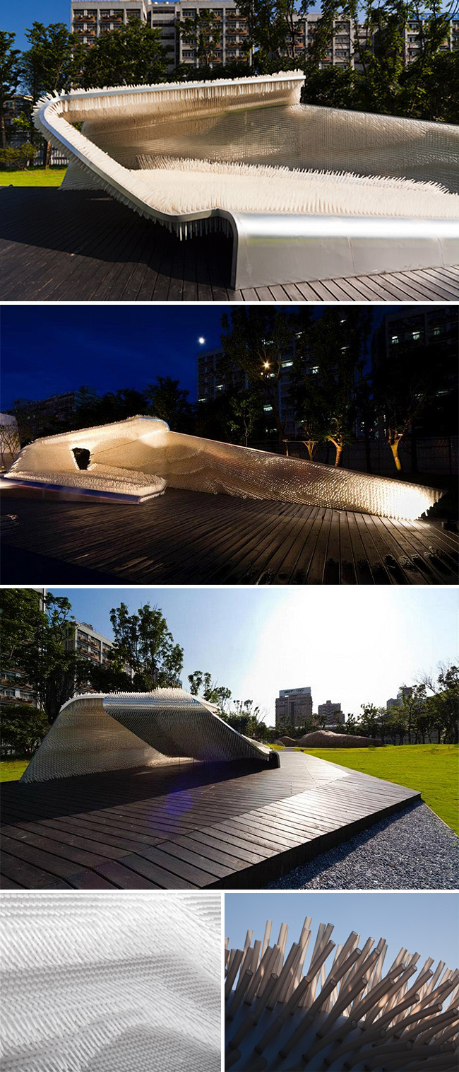
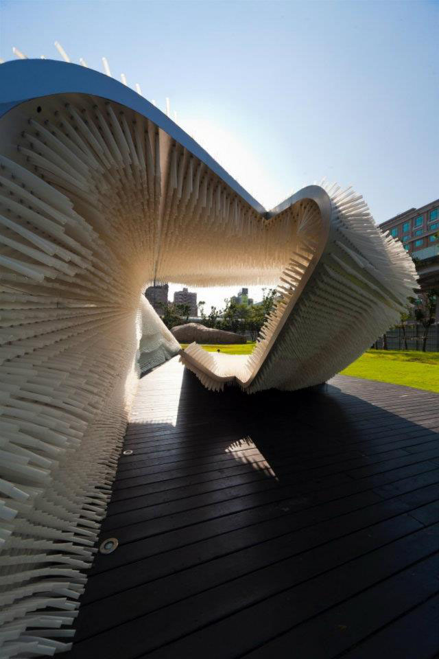
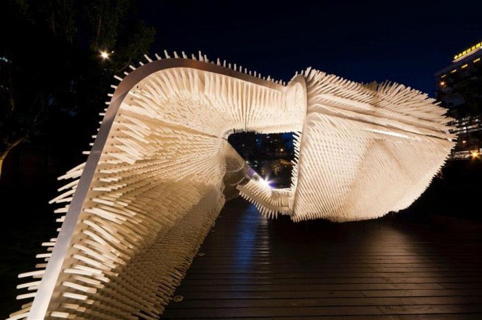
Architectural Installation, tactile, Taipei, Taiwan 2011, cool structure, interactiveArchitectural Installation, tactile, Taipei, Taiwan 2011, cool structure, interactiveArchitectural Installation, tactile, Taipei, Taiwan 2011, cool structure, interactiveAnemone is an art/architectural installation in Taipei, Taiwan designed by Oyler Wu Collaborative based in California. The concept behind Anemone was to create an installation that is not only appreciated for its aesthetic beauty but also allows for interaction through touch. Built using thousands of transparent flexible rods at different depths to add to the undulating feel of the structure, and give the look of bristling tentacles, the shape invites the viewer in and encourages them to feel the the walls as well as sit in the incorporated benches and bed-like elements. The cantilevered canopy adds elegance in addition to protection.

via inspir3d

Ross Racine: Fictional Aerial Views

Aerial Views of Fictional suburbs, freehand digital drawings, Ross Racine, maps, artAerial Views of Fictional suburbs, freehand digital drawings, Ross Racine, maps, artAerial Views of Fictional suburbs, freehand digital drawings, Ross Racine, maps, artAerial Views of Fictional suburbs, freehand digital drawings, Ross Racine, maps, artClick to enlarge

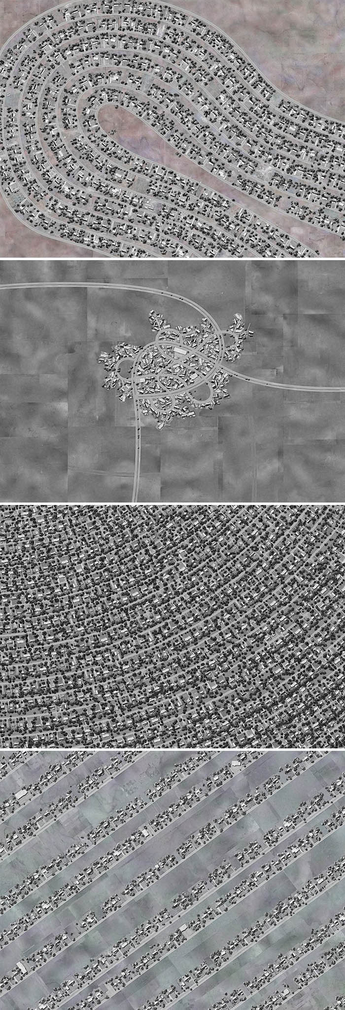
Originally from Montreal, but now living and working in New York, Ross Racine creates aerial views of fictional suburbs by drawing freehand directly on a computer. It’s hard to believe, but his works do not contain photographs or scanned material. Racine’s work is full of surprising opposites: handmade and digital, organic and mechanical, physical and virtual. The typically labyrinthine landscapes are super-sized in Racine’s versions, in some cases taking on a humorously monstrous quality, in contrast to the generic naming conventions such as Hummingbird Bend, Heavenly Heights, or Sunshine Acres; a playful way to critique and re-examine urban planning.

You can see more of Ross Racine’s aerial view drawings here and here.

Pod Exhibition Pavilion: Studio Nicoletti

Pod Exhibition Pavilion, 2011 architecture, Studio Nicoletti and Hijjas Kasturi, MalaysiaPod Exhibition Pavilion, 2011 architecture, Studio Nicoletti and Hijjas Kasturi, MalaysiaPod Exhibition Pavilion, 2011 architecture, Studio Nicoletti and Hijjas Kasturi, MalaysiaClick to enlarge

Slightly west of Kuala Lumpur in Malaysia, a large urban development is underway. The developer behind the project wanted the on-site offices and sales showroom to be an iconic structure that would reflect the architectural style of the upcoming development. Studio Nicoletti Associati in Rome in conjunction with Hijjas Kasturi Associates in Kuala Lumpur, came up with The Pod, inspired by water droplets in nature, the spherical structure is formed with a series of elliptical sections of varying width and height.

Inside, the pavilion is divided into two zones: one dedicated to the office space and the other contains the main showroom. Fabricated from tubular steel members the exterior skin is made of reflective aluminum panels causing its color to change depending on the sun or artificial lighting.

via The Archhive

Foster School of Business Art Installations

installation, Foster School of Business, Kristine Matthews, Karen Cheng, Type floor in elevatorTypographic wall installation, interactive, Kristine Matthews, Karen Cheng, University of Washingtoninstallation, Foster School of Business, Kristine Matthews, Karen Cheng, Type floor in elevatorBusiness Is..., Interactive art installation by Kristine Matthews, Karen Cheng, LED messages in wallClick to enlarge

Two interesting permanent typographic art installations were recently created for the Foster School of Business, part of the University of Washington in Seattle. The two installations are collaborations between designers Kristine Matthews and Karen Cheng, both on the faculty at the University’s School of Art.

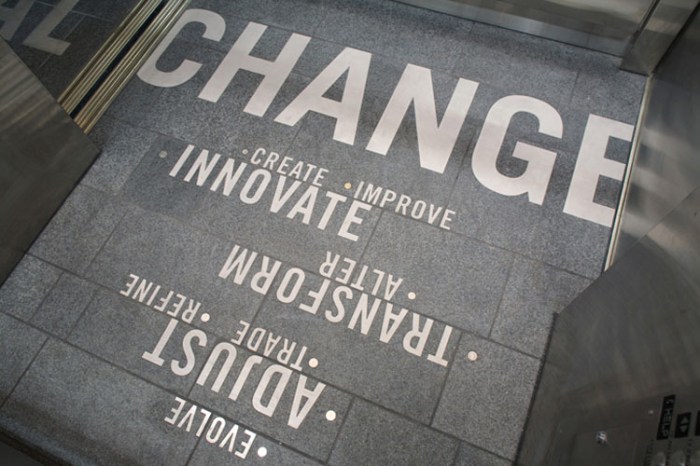
Change reflects on the dynamic relationship between business and change. The word “change” appears on the floor of each elevator, along with 18 synonyms (adapt, innovate, transform, etc.). The synonyms are each highlighted with actual loose change, international coins that hint at the diversity of the UW Foster Business School as well as the global nature of business.

As the elevator moves from floor to floor, the interior word “change” is modified by another word just outside the elevator, to both the front and back:
Floor 5: I Change/You Change
Floor 4: Lead Change/Manage Change
Floor 3: Expect Change/Embrace Change
Floor 2: Local Change/Global Change
Floor 1: Change Ideas/Change Lives
Floor 0: Change?/Change!

The second installation, Business Is..., asks how do you define ‘business’?

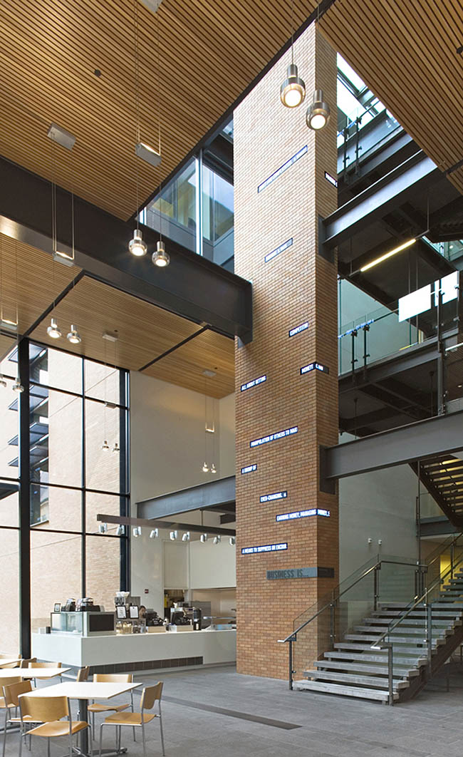
Viewers are asked to respond to the open-ended question “Business is…” on a companion website, www.FosterExchange.com. User responses appear on a series of LEDs that wrap around a four-story-high column. The monitors also display real-time stock market openings and closings, predictions, and even advice for students who meet and study in the atrium below.

Both installations are innovative, interactive, beautifully integrated, totally engaging and fun! I’d say complete successes through and through.

Here’s a video about the projects:

via sedg

SKIN: Pavilion of Knowledge

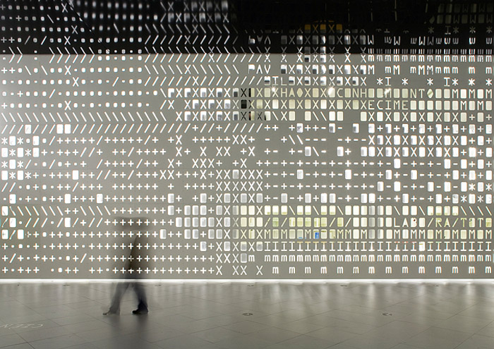
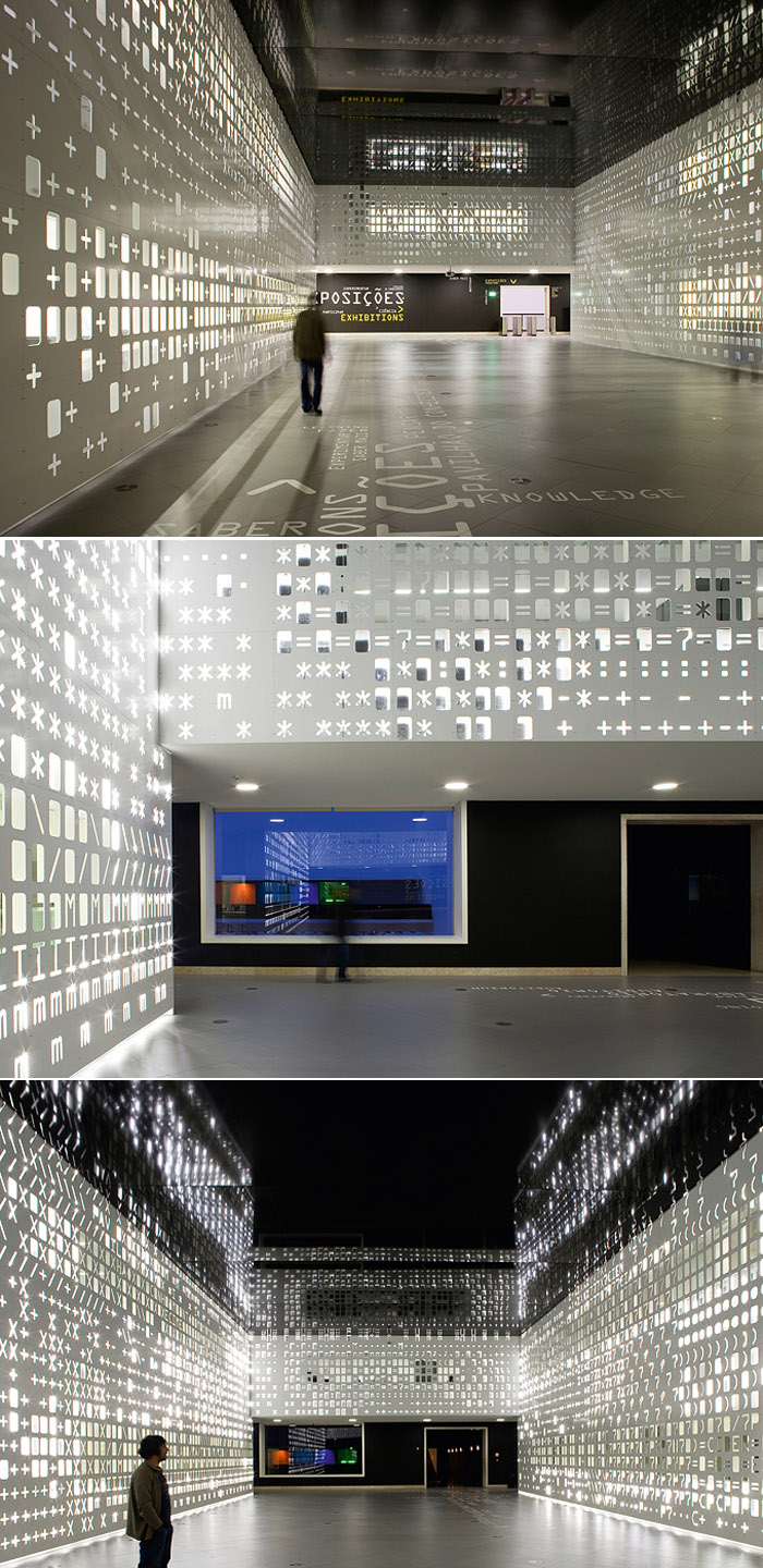
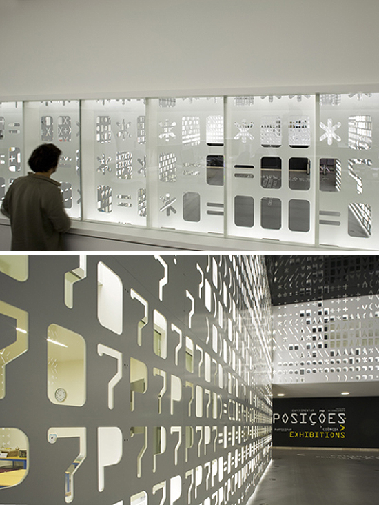
cool exhibit design, Installation in interactive science museum, Lisbon, P-06 Ateliercool exhibit design, Installation in interactive science museum, Lisbon, P-06 AtelierPavilion of Knowledge, enviornmental graphics, Lisbon, P-06 Atelier, typography, installationThe Pavilion of Knowledge in Lisbon is an interactive science and economy museum. The design firm P-06 Atelier, in collaboration with architect João Luís Carrilho da Graça, created a “skin” with a state of the art touch transforming the space into a playful and evocative landscape, employing a perfect mix of bold graphics, tactile patterns and typography.

The moveable walls have the American Standard Code for Information Interchange cut out of them as an analogy for the museum’s intention of sharing information. Through the different sized stencils, both noise and the white LED light are filtered differently at different points of SKIN.

I’d love to see this in person. Looks like a great effect.

via red dot design

Roskilde Festival Plywood Dome

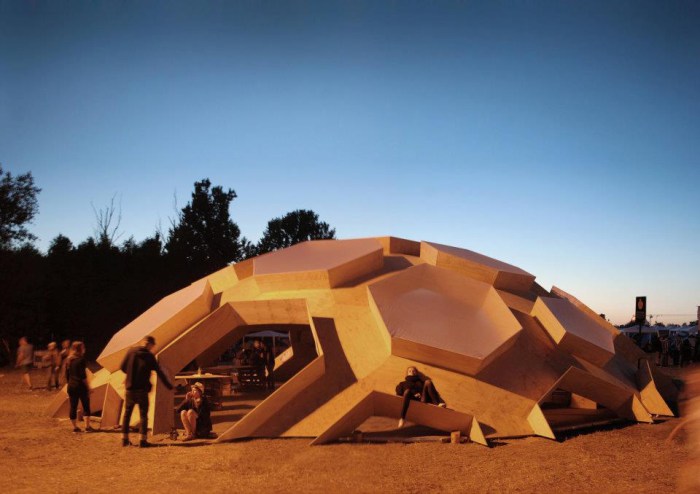
plywood dome, cool architecture, hexagonal structure, henrik almegaard, Festival structureplywood dome, cool architecture, hexagonal structure, Festival structure, Danish designplywood dome, cool architecture, hexagonal structure, Festival structure, Danish designInside and out this wooden dome, designed by Danish architect Kristoffer Tejlgaard and engineer Henrik Almegaard, looks great. Made up of 240 plywood hexagons, this geodesic dome was created for the 2011 Roskilde Festival in Denmark and disassembles into sections.

The futuristic shape, as well as those skylights that jut out and add texture, give the structure a very cool look.

You can watch a video of its construction here.

via intoform

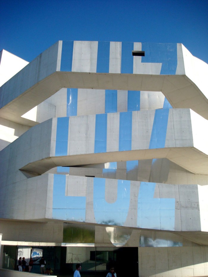
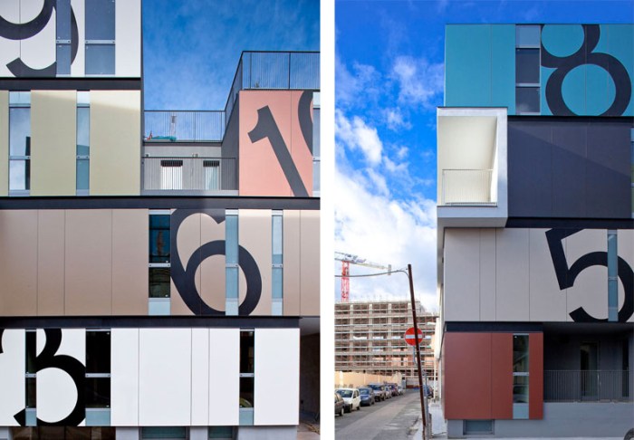
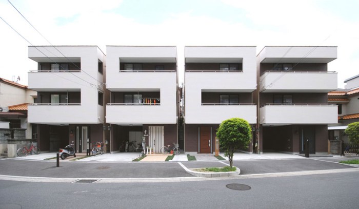
Architypeture III

Typography in Architecture, Type, Environmental graphics, Luz exhibit, Architecture with typography, signageTypography in Architecture, Type, Environmental graphics, typotecture, Architecture with typography, signageTypography in Architecture, Type, Environmental graphics, typotecture, Architecture with typography, signage, Clavel Arquitectos, Mitsumoto Matsunami, C+CO4, architects,Click to enlarge
From top to bottom and left to right:
Museo Ibere Camargo, Porto Alegre, Brazil; Condominio P in Cagliari, Italy by C+CO4 Studio; Objekt 10, Zavrtinica Business Center in Croatia interiors by Typotecture, exteriors by Brigada / Damjan Geber (architect), Srđana Alač (designer)(x4 photos); Rocklea Road Warehouses, Jackson Clement Burrows Architects; Cafés Salzillo, Coffee & Literature Week, Mucia, Spain, Clavel Arquitectos (x3 photos); Vigaceros Headquarters, Murcia, Spain, Clavel Arquitectos.

Architecture and typography combined, Buildings with typography, Signage, Sculptural typography, Architypeture, typotectureArchitecture and typography combined, Buildings with typography, Signage, Sculptural typography, Architypeture, typotecture

Click to enlarge
The Number House in Osaka, Japan, Mitsutomo Matsunami Architects; Education Executive Agency Tax Office in Groningen, UNstudio photo by Ron Tilleman; Museum of Modern Art, Santos, Brazil, Metro Arquitetos Associados + Paulo Mendes da Rocha; Pokobar, Zagreb, Croatia, Typotecture (x3 photos); Restaurante LAH!, Madrid, Spain, Ilmio Design; QV Car Park, Melbourne, Australia, Latitude Group; Chips Residential Development, New Islington, Manchester, Alsop Architects.

Here we bring you our third installment of Architypeture: the beautiful combination of architecture and typography. These projects come from Brazil, Spain, Croatia, and the Netherlands, as well as representation from Japan, Australia, and the UK. Click on the credits to link to more images or information, usually on the architect’s site.

If you missed our previous Architypeture posts, Architypeture I is here, and Architypeture II is here.

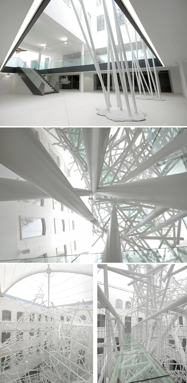
Chaos at Zellig: Philip Watts Sculpture

cool installation, 5-story sculpture, Custard Factory, England, collabcubedcool installation, 5-story sculpture, Custard Factory, England, collabcubedcool installation, 5-story sculpture, Custard Factory, England, collabcubedClick to enlarge

This really caught my eye. In the center atrium of Zellig — a building designed to provide space for young creative enterprises and galleries as part of the Custard Factory redevelopment in Birmingham, England — is a unique five-story-high sculpture designed by Philip Watts Design titled Chaos. Though at first glance the piece does give the appearance of a chaotic mass, in actuality it is a functional art installation designed to connect the courtyard at three levels. Made with 2000 meters of steel tubing and containing three glass bridges, it must be quite spectacular to find oneself intertwined in the sculpture.

via knstrct via notcot

Devon Boathouse: Elliott + Associates

Oklahoma City Riverfront, boathouse, Elliott + Associates, contemporary architectureOklahoma City Riverfront, boathouse, Elliott + Associates, contemporary architectureOklahoma City Riverfront, boathouse, Elliott + Associates, contemporary architectureOklahoma City Riverfront, boathouse, Elliott + Associates, contemporary architectureClick to enlarge

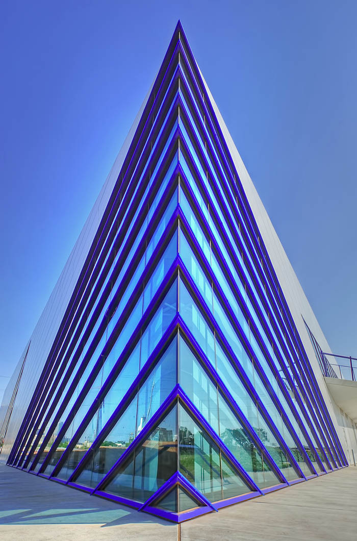
I must confess that I don’t know anything about Oklahoma City, but it seems there is a very nice riverfront district that has been undergoing redevelopment over the past several years with three boathouses and a high-performance center in the Regatta District alone. All architecturally interesting, the newest of these boathouses is the Devon Boathouse completed in 2011. Home to the Oklahoma City University Rowing and Canoe/Kayak teams as well as the headquarters for the OKC National High Performance Center, the Devon Boathouse, designed by Rand Elliott of Elliott + Associates Architects, makes for a striking image against the downtown skyline. Its sharp corner creates the impression of a “prow” breaking against the river’s edge.

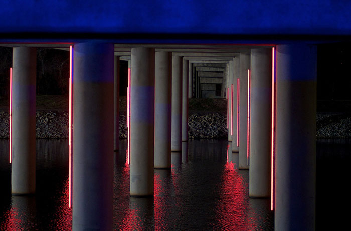
Expansive windows make for soaring spaces, created by glass and polycarbonate walls, which are flooded with natural light and views. Blue LED lights light up the boathouse at night, adding another dimension to the already dramatic building.

In its 33,000 sq. feet, the boathouse includes reception, event spaces, catering facilities, high performance fitness center, propulsion rowing tank, endless pool, high altitude training room, weight room and locker rooms as well as boat storage and repair area.

Photos courtesy of the Elliott + Associates, Michael Stano, Ryan Fogle, Timberlake Construction, Allied Arts, and Boathouse District

via Michael Stano’s flickr

The Insinuated Furniture Project

The insinuated furniture project, Ludens, Urban Prosthetics, Mexico City, street artThe insinuated furniture project, Ivan Hernandez-Quintela, Urban Prosthetics, street artLudens,Ivan Hernandez-Quintela, Urban Prosthetics, street art, Mexico cityThe insinuated furniture project, Ivan Hernandez-Quintela, Urban Prosthetics, street artThis concept made me smile. The Insinuated Furniture Project is the creation of Mexican artist/architect Ivan Hernandez-Quintela who started a design collective called Ludens. Hernandez-Quintela considers his designs spatial gags and enjoys invading Mexico City with his ‘Urban Prosthetics’. All his projects are about how people share space and how the objects that surround us affect the way we share it. He believes that each of us has the power to impact a city, one gesture at a time and that could have a contagious effect creating larger impacts from these small gestures. On his Insinuated Furniture Project, Hernandez-Quintela has this to say:

When one live in a city where urban furniture is not a priority, one finds that its inhabitants get creative and improvise by using different constructive surfaces as furniture. Insinuated furniture project is an attempt to call attention to these potential surfaces by drawing silhouettes of recognizable furniture over them.

Insinuated Furniture is a task for people and/or designers to go around the city with masking tape and draw silhouettes on these surfaces. Not to necessarily add objects to the city, but to recognize how existing objects are used, or misused. To help visualize the potential of the city.

via tarp

Spa House: Metropolis Design

Guest house and entertainment center, spa, pool, contemporary architecture, Cape TownGuest house and entertainment center, spa, pool, contemporary architecture, Cape TownGuest house and entertainment center, cool underwater room, contemporary architectureClick to enlarge

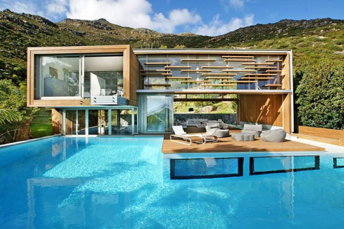
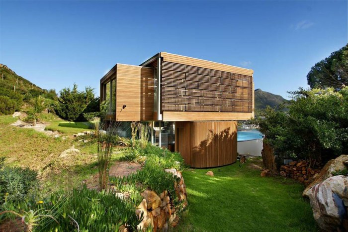
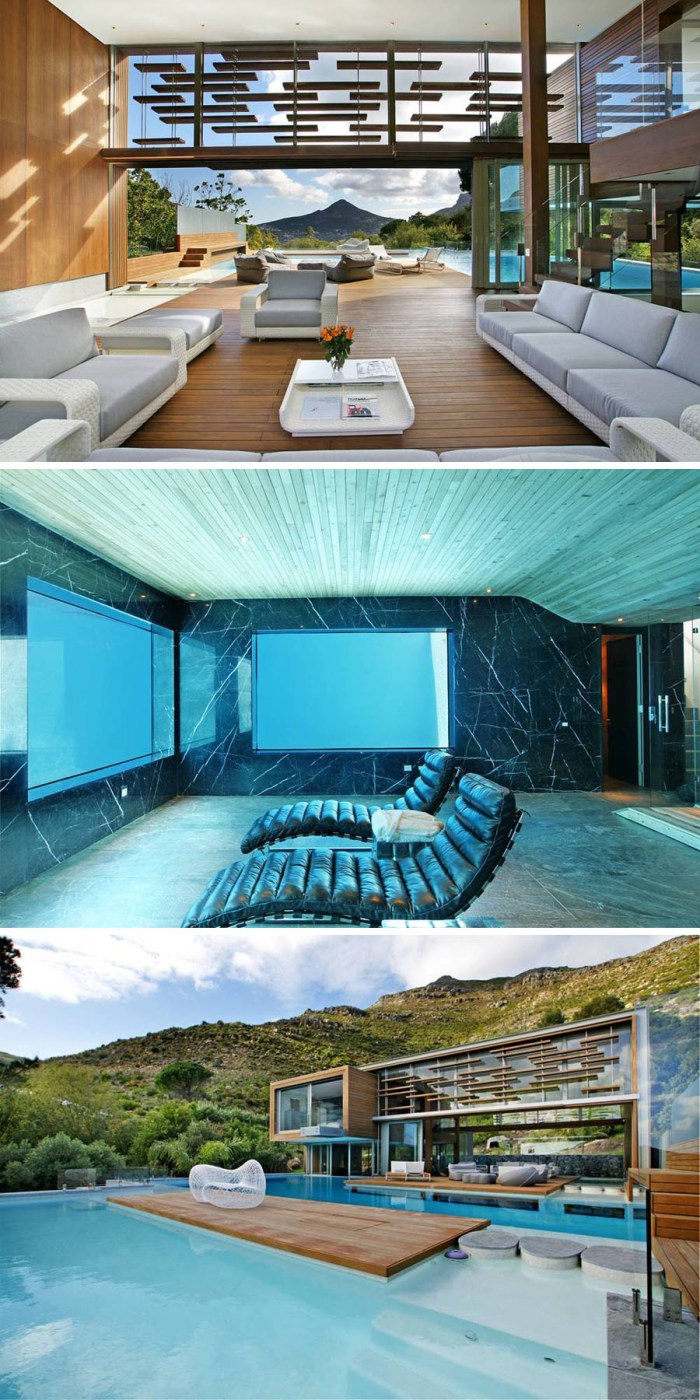
The Spa House designed by Metropolis Design in Cape Town, South Africa, is set on the mountainside on the urban edge of Hout Bay overlooking the bay and harbour, and integrated with the beautiful landscape that surrounds it.

The house functions as the guest house and entertainment facility of a larger house – separated by a hill but connected by footpaths – incorporating swimming pools, spa, and guest accommodations. Let the record show that I, for one, would not mind being a guest. I especially like the room with the underwater views, though I’m sure I would spend much more time on the sunny deck.

The house is quite dramatic, with its separate sculptural forms dynamically combined into one superstructure made of steel construction and clad in afromosia shiplap boards on timber studwork.

via world skyscaper

AIIM P&D Building: SKM-S2F Architects

Timber design, Australia, Innovation Campus, SKM-S2F Architects, University WollongongTimber design, Australia, Innovation Campus, SKM-S2F Architects, University WollongongTimber design, Australia, Innovation Campus, SKM-S2F Architects, University WollongongClick to enlarge

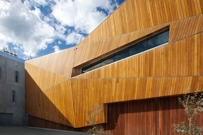
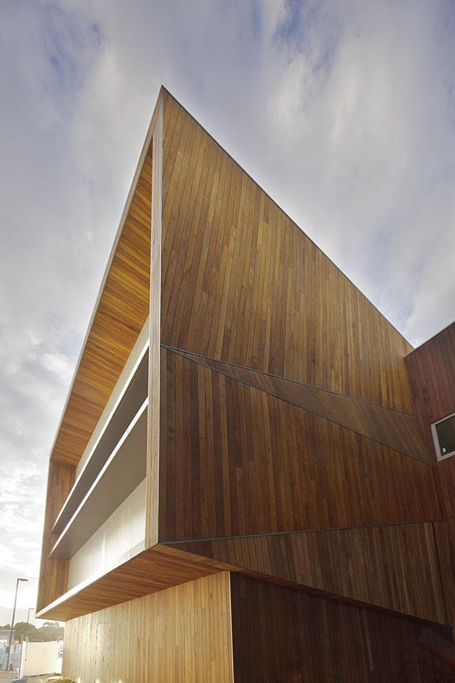
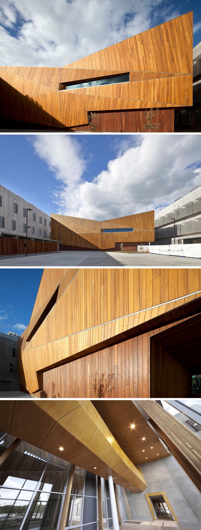
The beautiful timber design of the University of Wollongong Australian Institute for Innovative Materials (AIIM) Processing and Devices (P&D) Building (now you understand the need for initials) is the work of SKM-S2F Architects with construction by Baulderstone. Located in North Wollongong, Australia (between Sydney and Canberra), the AIIM building links two state-of-the-art research buildings and houses the University’s Electron Microscopy Center. In addition to being aesthetically pleasing the timber design is also functional in that the electron microscopes that it houses are very sensitive to their operating environment. In order to avoid electromagnetic interference, the structural elements had to be non-ferrous, being the reason that a timber structure was chosen for the design. And what a great design it is!

Pacific Teak wood was used on the top half of the building while Spotted Gum was used on the bottom. The intention is for the building to weather and grey by Summer 2012.

Photos: John Gollings

via woodform architectural

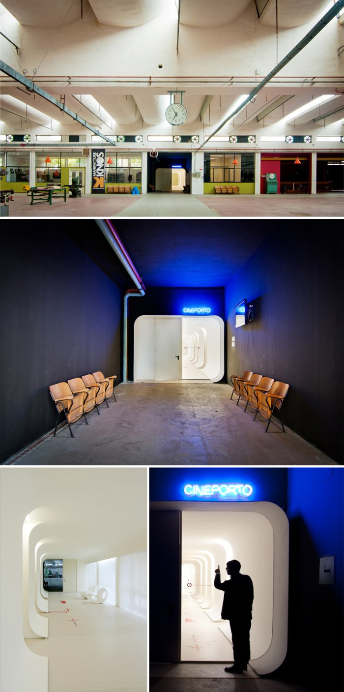
Cineporto in Lecce: Metamor Architects

Film Center in Lecce, Italy, designed by Metamor Architects, contemporary architectureFilm Center in Lecce, Italy, designed by Metamor Architects, mod architectureFilm Center in Lecce, Italy, designed by Metamor Architetti, mod architectureClick to enlarge

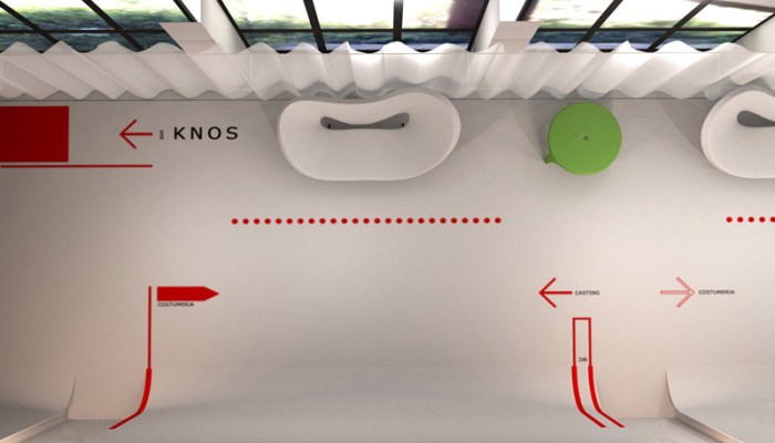
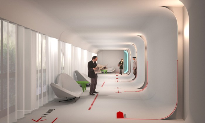
Cineporto in Lecce, Italy is a film center/studio that offers high-definition film screenings, includes production offices and casting studios, and is free to those working on films in the area. Originally an industrial building, Metamor Architects, based in Lecce, were brought in to transform the building and connect the three different areas to meet the requirements of a film facility. Metamor created a main entrance area named Knos to have a welcoming quality and connects to the Cineporto via mod corridors with walls that curve at the floor and ceiling and are beautifully lit. Add to that some fun typography and arrows on the floor, as well as neon signs on the walls, and the industrial melds seamlessly with the contemporary. Nice.

Photos courtesy the architects and g_g75’s flickr.

via europaconcorsi

Arthouse at the Jones Center

Arts Center, Austin Texas, LTL Architects, Texas Society of Architects AIA AwardArts Center, Austin Texas, LTL Architects, cultural design, collabcubedArts Center, Austin Texas, LTL Architects, Texas Society of Architects AIA AwardArts Center, Austin Texas, LTL Architects, Texas Society of Architects AIA AwardClick to enlarge

I am consistently drawn, unknowingly, to the work of LTL Architects. The Arthouse at the Jones Center in Austin, Texas is no exception. Looking around for interesting art, I came across the Arthouse’s website and spotted their recent renovation with its protruding, aqua-tinted, translucent glass rectangles that add color and texture to the white façade through to the interior. Illuminated by LED lights at night, the glass units especially animate the street view after dark. An expansion of the existing contemporary art space, and keeping with many of the original architectural qualities of this 160-year-old building (the first 3-story brick building in Austin, that once housed a theater and later a department store) LTL (Lewis.Tsurumaki.Lewis) Architects implemented a series of integrated tactical additions, creating a “visual dialogue between the art and the surrounding urban environment.” The original Queen Theater’s murals are exposed, as well as the wooden ceiling and steel trusses. Historical and contemporary features are cleverly intertwined throughout. The grand central staircase, made of wood, is dramatically suspended 35 feet down from the ceiling. In addition, a beautiful wood roof deck with laminated light boxes provides a movie screen and panoramic views of downtown Austin.

Looks like a lovely space.

All photos ©Michael Moran Studio

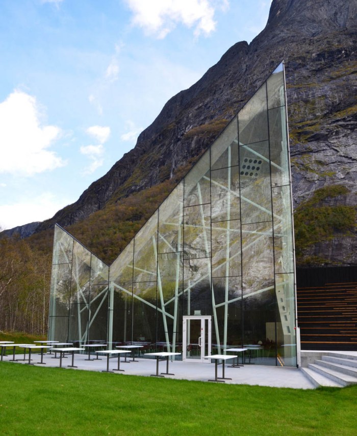
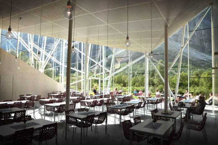
Trollwall Restaurant: RRA in Norway

Restaurant design, contemporary architecture, Reiulf Ramstad, Norway, glass facadeRestaurant design, contemporary architecture, Reiulf Ramstad, Norway, glass facadeRestaurant design, contemporary architecture, Reiulf Ramstad, Norway, glass facadeClick to enlarge

How spectacular would it be to sit in this restaurant?! The recently completed Trollwall Restaurant and Service Center in Trollveggen, Møre og Romsdal, Norway was designed by Oslo-based architects Reiulf Ramstad Arkitekter (RRA). Sitting at the foot of one of Norway’s natural attractions, The Troll Wall, this new building has a dramatically sloped roof that mimics its surroundings with eye-catching glass façade to reflect the impressive natural landscape. A stunning accent to an already breathtaking backdrop. In addition to the restaurant, the building houses a gift shop and a theater.

via Open Buildings

Pharmacophore: Architectural Placebo

modern dance, inflatable sculpture, storefront for art and architecture, HAt, Silas Reinermodern dance, inflatable sculpture, storefront for art and architecture, HAt, Silas Reinermodern dance, inflatable sculpture, storefront for art and architecture, HAt, Silas ReinerClick to enlarge

Last night, the three of us strolled over to the Storefront for Art and Architecture here on Kenmare Street in NYC, to catch the last 20 minutes of the sold-out dance performance Pharmacophore: Architectural Placebo from the street. Storefront’s fun cut-out façade, which opens the small sliver of a space to the sidewalk, allowed us to enjoy the rather unique dance performance. A collaboration between designers Seth Harrison and Ariane Lourie Harrison of Harrison Atelier (HAt) and choreographer Silas Riener. The third installment in HAt’s Pharmacophore series, the performance, along with the installation, explore the cultural and philosophical economy that surrounds medicine technology and the human prospect in the 21st century.

From the creators:
The installation at Storefront, incorporating set and costumes, evokes a hybrid pharmaceutical-cultural landscape: both a medical waiting room with inflatable “plants” and a radiological suite in which the audience sits apposed to translucent glass. The installation consists of 24 eight-foot, laminated glass and stainless steel structures, arrayed along the back wall of the gallery. Contoured seats are dotted with inflatable forms that, when unfurled, become spatializations of pharmacophores. The inflatable set pieces are used as costumes and props, and audience members use them as cushions.

Truthfully, we did not see enough of the dance performance to justify an opinion, but what we did see, we liked. The Merce Cunningham dancers pranced, tumbled and gracefully walked with their fun inflatable tubular costumes that match the props and seat cushions in the beautifully glowing blue setting. We loved everything about the installation: the appropriately sterile pharmaceutical feeling evoked by the lighting and plastic inflatables; the clear Muji raincoats that acted as lab coats and were worn by staff; the seats with their mod-waiting-room feel; but most of all, the way it all worked so well together and successfully integrated with the space. And if that wasn’t enough, Baryshnikov was in the small audience!

Pharmacophore: Architectural Placebo will be performed twice a night through this Wednesday, November 30th. Tickets are free, but reservations necessary. And then there’s always the street view, too, if you want to use the stroll-by approach. The installation, sans performance, will continue on view through December 3rd.

For those who can’t attend, below is a short video of the previous performances in the Pharmacophore series:
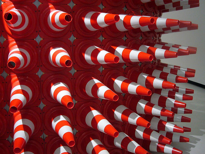
Traffic Cone Art & Design

Traffic Cone Art, Teddy Cruz, Rome, MaxxiTeddy Cruz, Paprika, Dennis Oppenheim, Burning Man, Tomer Diamant, traffic conesClick to enlarge

In the past month I’ve come across a few works made of traffic cones, so I decided to explore more and see what else is out there. Here are some of my favorites; from installations and sculptures to traffic cone inspired graphic design.

From top to bottom and left to right:
Estudio Teddy Cruz’s installation Cultural Traffic at Fondazione Maxxi (top 2 pics); Dennis Oppenheim’s sculpture Safety ConesRescue Bubble by Tomer Diamant at the Royal Botanical Gardens; Crocodile by Allee Willis; 2005 Burning Man installation; Hedgehog, a temporary performance pavilion to raise money for young homeless made of 300 traffic cones on a steel frame by EFGH (x3 photos); Bottom 6 images are part of the World Summit and Congress of Architecture at the Design Expo in Taipei by Paprika, brochure included.

Architects of Air: Luminaria

Mirazozo, Miracoco, Light installation, inflatable structuresMirazozo, Miracoco, Light installation, inflatable structuresLuminaria, Light installation, inflatable structuresClick to enlarge

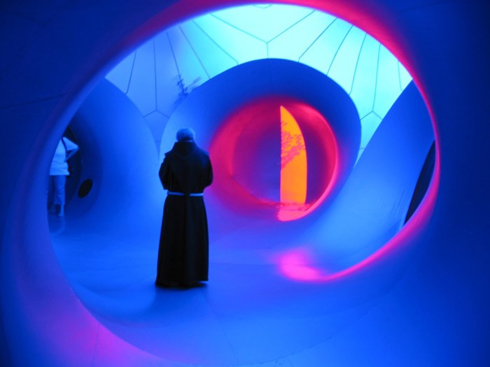
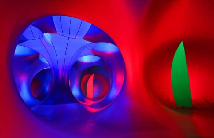
The British company Architects of Air is based in Nottingham UK in a 4000 sq ft former textile workshop. There, since 1992, they spend 6 months out of the year creating luminariums and the other 6 months touring to several countries exhibiting them. “What is a luminarium?” you may be asking yourself right about now. Luminaria are monumental inflatable structures that contain a maze of winding tunnels and soaring domes displaying the beauty of light and color. There are six different designs each made up of about 20 elements zipped together on site to occupy a 1000 sq. meter area. The most recent design is Miracoco which was launched this past summer, 2011, but there were 4 other models that toured this summer as well.

They all look spectacular to me. Architects of Air have mounted these  structures at 500 exhibits in 37 countries. Though I see on their timeline that they’ve had installations in New York in the 1990s, being that I missed those I vote for a summer 2012 NYC installation. Or maybe as part of next year’s Bring to Light Festival.
You can see many more photos on their site and on flickr.