Adriano Zumbo Pâtissier

Zumbo Patisserie, Retail Design, Sydney, Fun Bakery design, The Star, Luchetti Krelle Design, collabcubedZumbo Patisserie, Retail Design, Sydney, Fun Bakery design, The Star, Luchetti Krelle Design, collabcubedZumbo Patisserie, Retail Design, Sydney, Fun Bakery design, The Star, Luchetti Krelle Design, collabcubedClick to enlarge

This is a fun design for a bakery! Adriano Zumbo, who has four locations in Australia, creates desserts that are unique in concept and execution, and so it would seem that designers Luchetti Krelle (Stuart Krelle and Rachel Luchetti) set out to design a space unique in concept and execution as well for Zumbo’s latest location at the Star Casino in Pyrmont. Full of humor from the windmill boots in the window to the dessert conveyer belt and the “In Case of Emergency Break Glass” cases of French Macarons, the space is sure to lure in any passersby.

Photos by Murray Fredericks and Adriano Zumbo’s website.

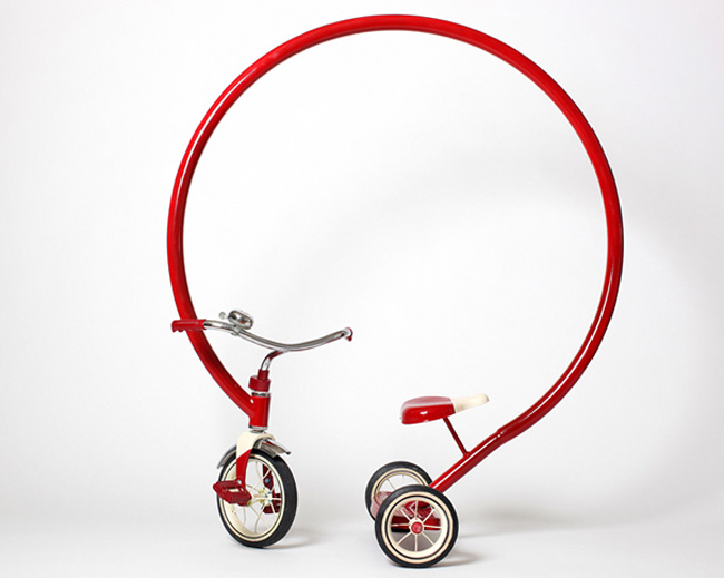
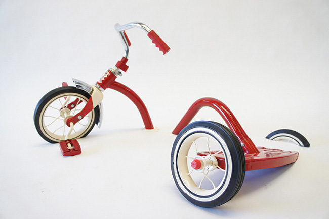
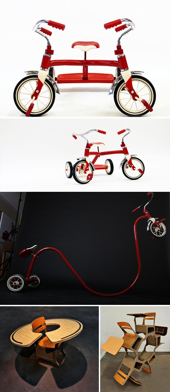
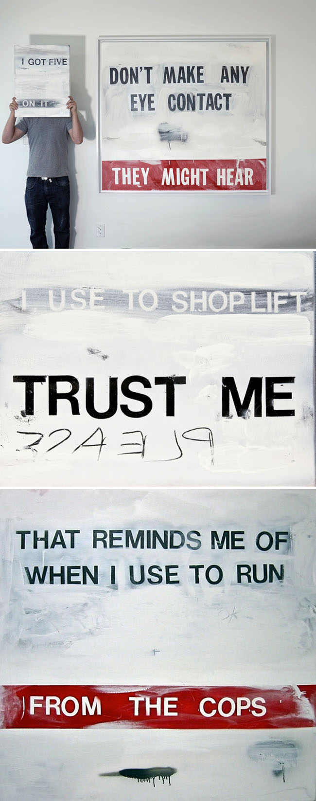
Sergio Garcia: Tricycles Reinvented

fun sculptures of tricycles, distorted tricycles, Sergio Garcia, Scope Miami, collabcubedfun sculptures of tricycles, distorted tricycles, Sergio Garcia, Scope Miami, collabcubedfun sculptures of tricycles, distorted tricycles, and desks, fun art, collabcubedhumorous signs, billboards, edgy text, Sergio Garcia, Scope Miami, collabcubedClick to enlarge

It’s difficult not to smile when looking at Sergio Garcia’s work. His delightfully fun tricycle sculptures play with the viewer’s structural expectations while at the same time stimulating childhood memories. According to Garcia, “Sometimes it’s good to step back and laugh and not take everything so serious.” That lighthearted mentality is evident not only in his sculptures, but in their titles, as well as in his Billboard series (bottom three photos.) Some of the tricycle sculpture titles are: “Its not always easy to tell whats real and whats fabricated” and “And then there were two” (the top photo and third one down, respectively.)

Fun work all the way around.

If you like these, you might also enjoy Dario Escobar’s work and Tulio Pinto’s.

via irreversible

Rat Race Park Project: Yuken Teruya

Rat playground concept for NYC subway system, Rats, NYC, Yuken Teruya, collabcubedRat playground concept for NYC subway system, Rats, NYC, Yuken Teruya, collabcubedClick to enlarge

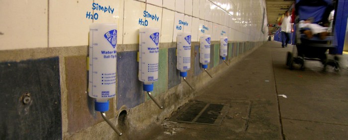
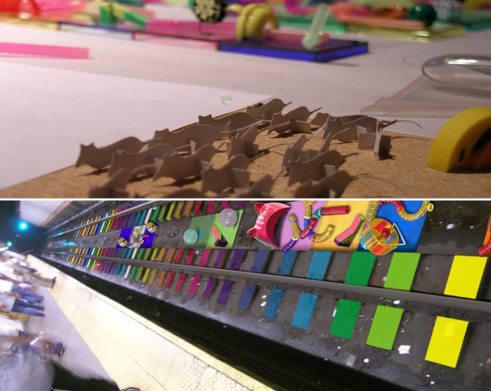
There aren’t many things that gross me out more than rats. Seeing them around town occasionally, especially in the subway, is one of the few downers about living in NYC. Artist Yuken Teruya (previously here) has a crazy concept of turning the subway platforms and tracks in New York into a Rat Race Park. His Rat Race Park Project envisions similar play equipment to that sold in pet stores for hamsters and gerbils but, instead, placed on the subway tracks. There would be special lighting equipment with the tracks painted in bright colors similar to those often seen in playgrounds, and, of course, water bottles along the base of the platform for a quick pick-me-up and refresher for the active rodents working up a sweat. Teruya’s goal behind this plan? “…to reconsider the underground life of rats at the subway station and to thus share a feeling of larger community in New York City.” Umm…I think my community is large enough, thank you.

Base Design: They’ve Got it Covered

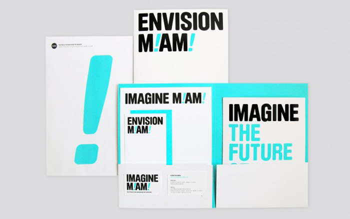
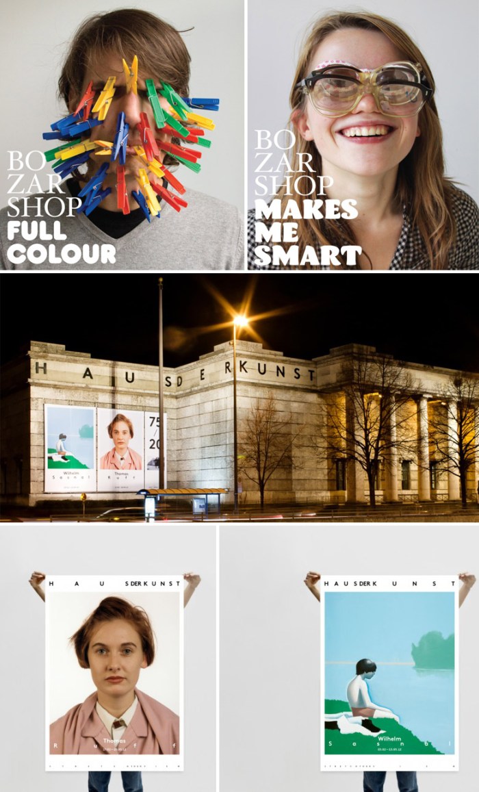
Branding, Graphic Design, Miami Art Musem Logo, Clever logos, Base DesignBranding, Graphic Design, Miami Art Musem Logo, Clever logos, Base DesignBranding, Graphic Design, Museum Logos, Clever logos, Haus der Kunst, Base DesignClick to enlarge

A couple of nights ago I had the pleasure of hearing Thierry Brunfaut and Dimitri Jeurissen, partners at the amazing design firm Base, speak at an AIGA event about their firm’s history, the present, as well as offer 10 pieces of advice for designers and business owners. Originally only in Brussels, Base has now expanded with offices in Barcelona, Madrid, New York and Santiago and more on the way.

I wasn’t familiar with these guys, though it turns out I did know some of their older projects such as branding for MoMAQNS, The Stand, and Kiki de Montparnasse, but that’s just the tip of the iceberg. Everything they do, and they really DO do everything, is smart, fun, playful, with a strong initial concept that gets driven home from beginning to end in each project. Above are only three examples of branding: M!AM! (The Miami Art Museum), Bozar, Center of Fine Arts in Brussels, and Haus der Kunst, a logo that shows elasticity and flexibility typographically by never being exactly the same in two images; that wraps around the building itself in uneven letterspacing, and that, when animated, the letters slide around horizontally. Incredibly original. And if their talent weren’t enough, they all seem to be having tons of fun. I’m sure everyone in the audience was ready to sign up.

You should definitely take a look at their website for so much more of Base’s work. The site has a very fun—if a little ADD—quality that seems to perfectly represent the studio’s personality. And below are two of a series of humorous videos they created titled Perspectives. The difference between the Spanish-speaking interviewee and English one made me smile.

Cartoon-like Handbags: Jump from Paper

fun handbags and messenger bags that look 2-dimensional, cartoon-like, collabcubedfun handbags and messenger bags that look 2-dimensional, cartoon-like, collabcubedfun handbags and messenger bags that look 2-dimensional, cartoon-like, collabcubedThese bags are ridiculously fun. Designers Chay Su and Rika Lin from Taipei asked themselves “How amazing it would be if a two-dimensional hand-drawn illustration could come to life as a real bag?!” And from there Jump from Paper came to be. Pretty amazing. Though the bags look flat, apparently they are quite roomy. These bags will definitely turn a head or two on the street.

via swissmiss

Andreas Johansson: Collage Pop-Up Books

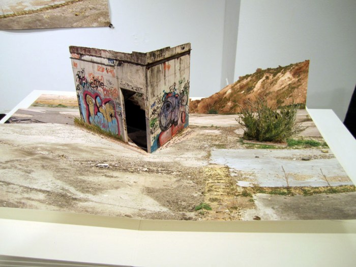
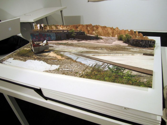
Pop-Up Books, Photo collage, desolate landscapes, skateboard industrial landscapes, VoltaNYPop-Up Books, Photo collage, desolate landscapes, skateboard industrial landscapes, VoltaNYPop-Up Books, Photo collage, desolate landscapes, skateboard industrial landscapes, VoltaNYClick to enlarge

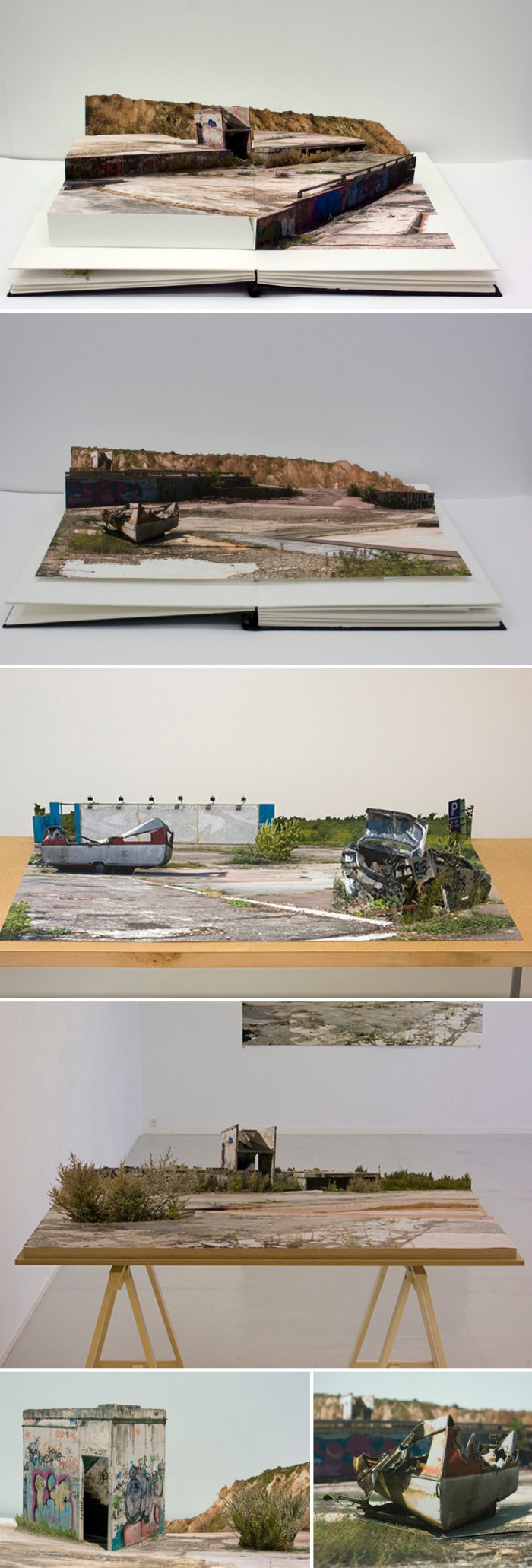
I came upon these impressive photo collage pop-up books at the Volta art show here in NYC last Friday. Swedish artist Andreas Johansson has been drawn to industrial and desolate areas ever since his youth as a skateboarder in Vaxjo. Working in collage, cutting apart photographs and then building up new environments of the abandoned industrial kind has been something Johansson has done for a while. In his solo exhibit titled From Where the Sun Now Stands, he has taken these ‘sets’ and created a series of oversized pop-up books with 6 pages each, showing different perspectives of the same vacant lot. Turning these large pages and seeing these pages come to life was an interesting departure from the pop-up books (that I loved) of my youth. You can see the pages being flipped at the bottom of this page here.

Photos courtesy Galleri Flach, VoltaNY, and collabcubed

CollabCubed at 1

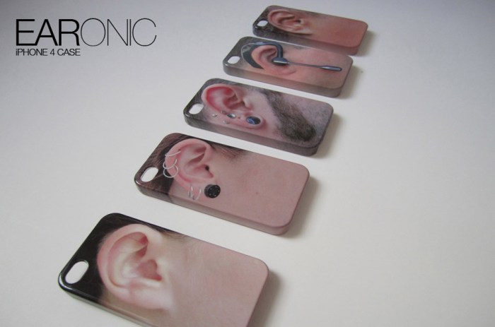
Last week marked our one year anniversary as a blog and, though not an especially remarkable feat in this sea of blogs, it seems like a good time to say of few words and acknowledge some people. It’s been a fun year for us and surprising how this blog, as well as a few related side projects, have been major topics of conversation between the three of us even at a semi-long distance. We’ve had fun trying to come up with somewhat unique content and it’s been really satisfying, and sometimes a little thrilling, to have many of the blogs and sites that we admire pick up some of our posts. Notcot and Rugenius (aka Jean and Justine) over at notcot.org have picked up many of our submissions and have been instrumental in giving us exposure. You can see our collabcubed posts on their pages here. Christopher Jobson at the amazing Colossal has had many kind words for us and been very supportive, as well as picking up several of our posts during the year and kindly linking back to us…this is where the little thrills came in. Same goes for the wonderful thisisnthappiness. And a big thanks to holycool and the always generous swissmiss for being the first ones to post our EARonic phone cases causing them to go viral with buyers cropping up all over the globe and eventually leading to a deal with Fred and Friends who will be distributing a variation on Daniela’s initial concept starting next month but, have no fear, we continue to sell our own EARonic models at our shop.

We’ve got other exciting projects in the works for this year, starting with being selected to exhibit our EARonics and some other designs at the Designboom Mart at the ICFF 2012 in New York this May, which has us super excited, but we’ll talk more about that later.

In the meantime we’ve added a bunch of photos and links to our facebook page – we’ll be adding more in the next few days – making it easier to look at some older posts, so maybe you’d like to ‘like us’ there if you haven’t already, and of course there’s also twitter, or subscribe to our RSS feed or emails.

Below are a few of our most popular posts this past year (in case you missed them the first time around); click on the photo to go to the post. Most importantly, thanks to all of you for following our blog and making it fun for us to keep posting.

Sang Sik Hong Plastic Straw Sculptures

Nicole Dextras Ice Typography

The Portrait Building by ARM Architects

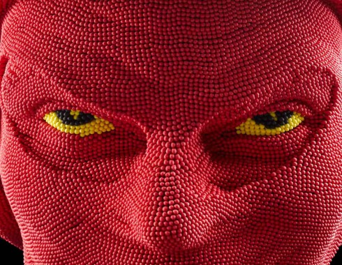
Matchheads by David Mach

Blackfield by Zadok Ben David

The Transfinite: Ryoji Ikeda

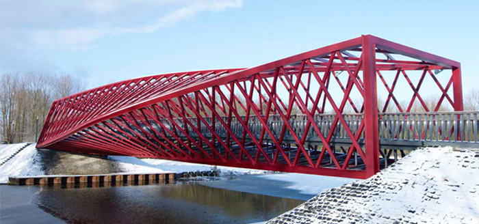
The Twist Bridge

Ana Soler: Causa-Efecto

EARonic iPhone Cases by Daniela Gilsanz

Dario Escobar: Sports Recontextualized

baseball bats in art, guatemalen art, fun art installation, sports gear, collabcubedbicycle tires in art, guatemalen art, fun art installation, sports gear, collabcubedsports gear, guatemalen contemporary art, art installations, kamel mennour, collabcubedClick to enlarge

Guatemalen artist Dario Escobar is known for his sculptural installations which explore the recontextualization of objects, particularly sports-related ones. From chopped bats to rooms filled with serpentile bicycle tires, or hanging sculptures of worn soccer balls to reconfigured skateboards, Escobar’s work takes the ordinary object and metamorphosizes their form and meaning.

Photos courtesy the artist and Galerie Kamel Mennour

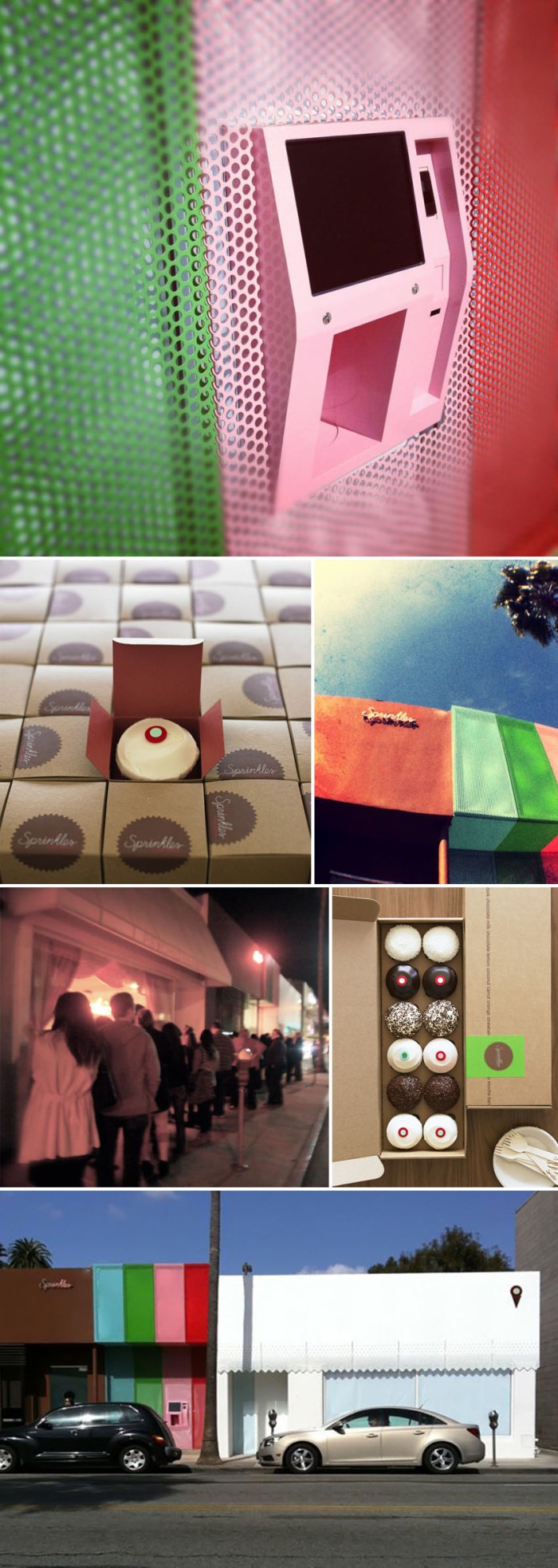
Sprinkles 24-Hour Cupcake ATM

cool vending machine, 24-hour cupcake atm, Sprinkles cupcakes, food, dessert, collabcubedcool vending machine, 24-hour cupcake atm, Sprinkles cupcakes, food, dessert, collabcubedcool vending machine, 24-hour cupcake atm, Sprinkles cupcakes, food, dessert, collabcubedClick to enlarge

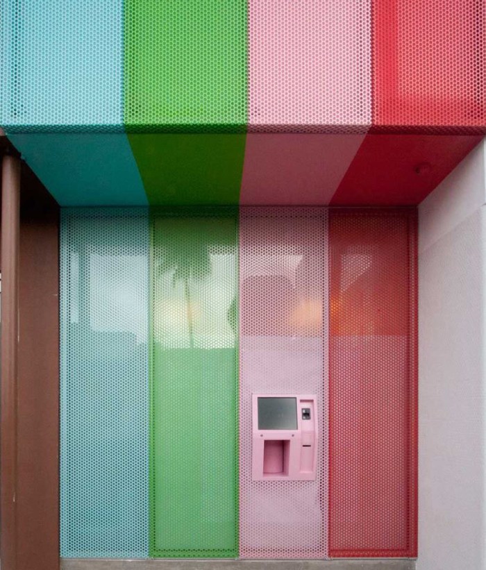
Not being much of a dessert person myself, I can’t really imagine a 4am craving for a cupcake, but I guess it’s reassuring for some of you to know that now there is a 24-hour cupcake ATM to assuage such a desire. The Beverly Hills bakery Sprinkles has recently installed the cupcake vending machine as part of their storefront and judging from a photo posted to their facebook page, the late-night lines are insane. We’ll have to ask our LA correspondent, Moni, to check this out for us.

UPDATE: Apparently there will be three of these ‘cupcake automats’ opening in NYC within the next year, the first one opening this summer on the Upper West Side. (Thanks, Breger!)

You can watch the video below to see it in action:

You might also like these other unique vending machines here.

Photos: Sprinkles facebook, we heart, and Sprinkles

via @mrfidalgo

Pprofessors: Red People Art-Constructor

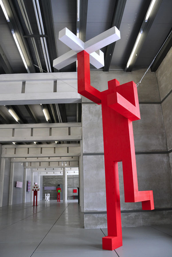
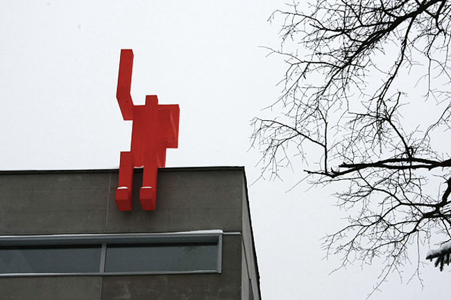
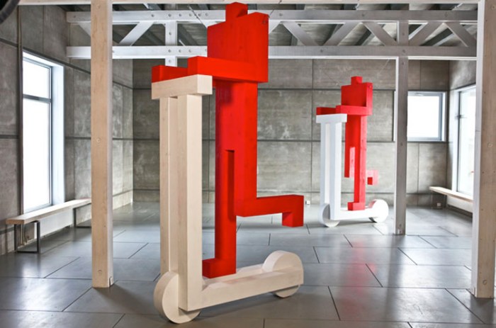
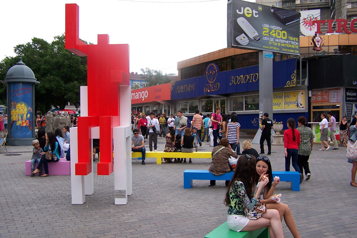
Russian Contemporary Art, Red Men Statues, cool, viral, fun installation, Gridchinhall,Russian Contemporary Art, Red Men Statues, cool, viral, fun installation, design, collabcubedRussian Contemporary Art, Red Men Statues, cool, viral, fun installation, design, collabcubedRussian Contemporary Art, Red Men Statues, cool, viral, fun installation, design, collabcubedViral Red People, Moscow, Russia, Pprofessors, art installation, sculpture, collabcubedClick to enlarge

Yes, there’s been a bit of a Russian theme this week after perusing many a Russian gallery site into the wee hours the other night, but this is the last of it for now, and it’s a fun one, at least I think so.

The Red People project, created by Andrey Lublinskiy and Maria Zaborovskaya of the Pprofessors art group, is a modular system used to assemble an anthropomorphous character, sometimes large, other times small, out of 13 wooden blocks. Working in practically any context and integrated therein, these Red Men have become a sort of viral phenomenon around Moscow and its environs. So much so, that they have become stars of comics and political debates, and are slowly making their way across the world.

With inspiration from, and a nod to, cult artists such as Malevich, Rodchenko, Bruskin, Giacometti, Haring and Gormley, the Pprofessors have made these red contemporary icons pop up in the most unexpected of places, including sitting by a park fountain, scootering around the streets of Moscow, or sitting in the middle of a shopping center. After their exhibit in 2010 at the Gridchinhall Gallery, a few of the men have become permanent fixtures on the grounds, with one sitting atop the gallery’s building entrance.

The Pprofessors also created a toy-like kit of the Red People, where each child (or adult) can manipulate the elements of the composition using the basic red blocks included in the kit.

All in all, a very fun project that I could see taking off in NYC.

via artguide

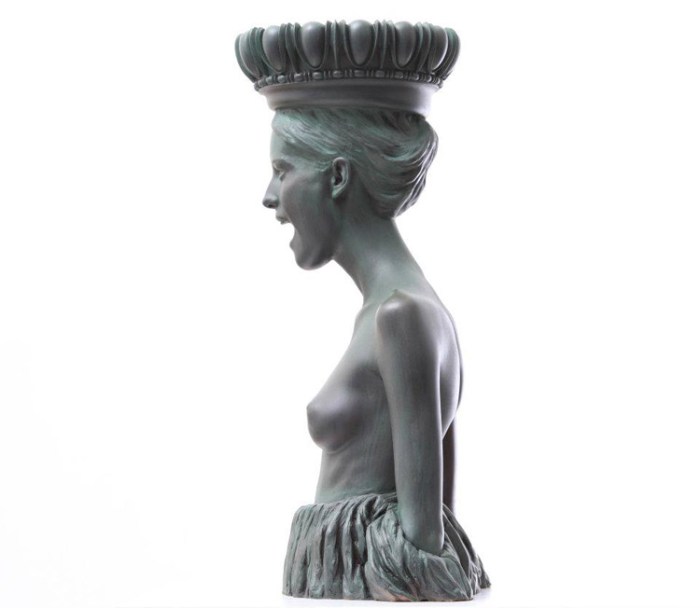
Alexey Morosov: Antologia

Russian Contemporary art, modernized classic sculpture, Bronze statue, Caryatid, MorozovRussian Contemporary art, modernized classic sculpture, Bronze statue, Caryatid, MorozovRussian Contemporary art, modernized classic sculpture, Bronze statues, Sepia sketches, Hellenic figures on scooters, Morozov, Praetoria, collabcubedClick to enlarge
Russian artist Alexey Morosov creates sculptures, paintings and drawings combining the influence of famous masterpieces by sculptors of Ancient Greece and Rome with the contemporary cultural experience of modern man. His recent solo exhibition at the Russian Museum in St. Petersburg was titled Antologia and included over 48 of Morosov’s works. From the museum’s press release:

The heroes that are marked by inspired beauty and imposing harmony seem to be protecting themselves from the threat of invisible aggressive force in the most part of presented works. The high skill of execution, natural combination of tradition and innovation, canonical and spontaneous helps Aleksey Morozov to discover the new possibilities of plastic language of the Antique Art and to emphasize the eternal significance of its humanistic ideals.

The contrast of these Hellenic nymphs on their super-rugged segways cracks me up. You can see more of Morosov’s work on his website.

via The Russian Museum

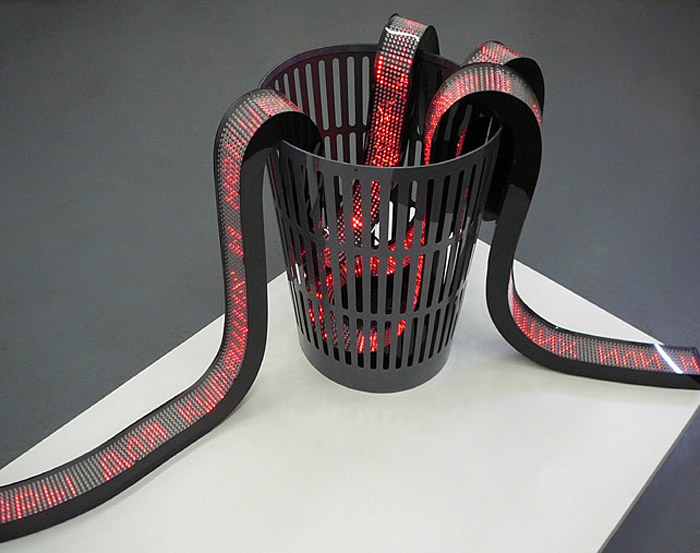
Aristarkh Chernyshev: New Media Sculptures

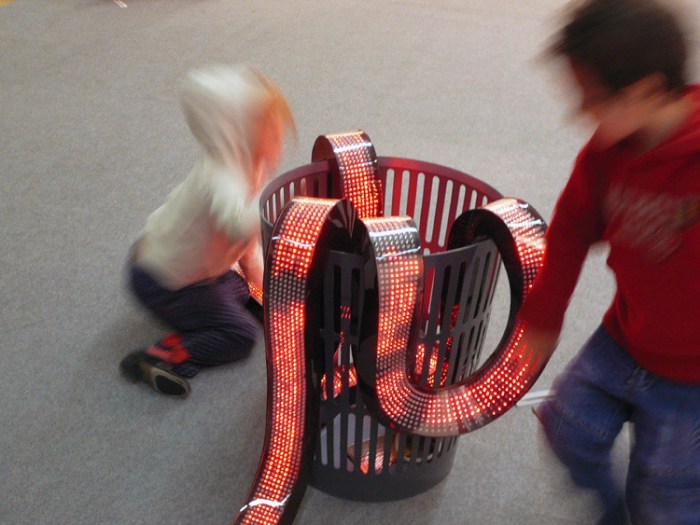
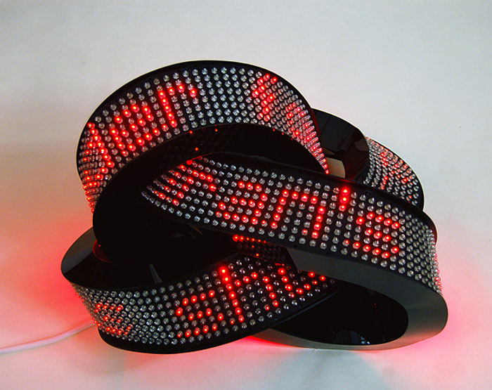
New Media Sculptures, interactive art and installations, Contemporary Russian Art, LEDs, collabcubedNew Media Sculptures, interactive art and installations, Contemporary Russian Art, LEDs, collabcubedNew Media Sculptures, interactive art and installations, Contemporary Russian Art, LEDs, collabcubedNew Media Sculptures, interactive art and installations, Contemporary Russian Art, LEDs, collabcubedClick to enlarge

Moscow-based contemporary new media artist Aristarkh Chernyshev creates sculptures that integrate today’s technology while commenting on our obsession with it in a humorous fashion. His LED sculptures play with the idea of information overload, in some instances grabbing real-time news feeds from the internet, winding them around the LED lightboard strips through the trash as in his work Urgently! (top two photos), or winding around endlessly in a knot as in Knode (third from top), as well as taking poetic texts and breaking them apart then reuniting them as stock exchange rates in Lyric Economy (second from bottom).

In addition to his LED sculptures, Chernyshev has collaborated with other artists on some fun and interesting interactive pieces. With Alexei Shulgin —the co-founder of their art collective/gallery/creative electronics production company Electroboutique — they created the eyeglasses piece titled The Way I See It! as well as the wowPod, an oversized distorted iPod.

There’s lots more interesting work that can be seen on the XL Gallery’s site and the Electroboutique site.

Here’s The Way I See It! in action…with a very catchy poppy tune that I, unfortunately, don’t know what it is.

via XL Gallery

Serkan Özkaya: David

Double Manifesto Series, Storefront for Art and Architecture, David on low-boy trailerDouble Manifesto Series, Storefront for Art and Architecture, David on low-boy trailerIf you’re in New York City tomorrow (March 6th) you may notice a double-size golden statue of David being hauled around town from 11am through the early afternoon on a lowboy trailer. This would be the work of Turkish conceptual artist Serkan Özkaya, whose golden replica of Michelangelo’s David was initially created for the Istanbul Biennial in 2005. Özkaya’s work typically deals with the concepts of appropriation and reproduction. Apparently, the sculpture collapsed shortly after its installation, then was restored and two replicas were cast. One remains in Turkey and the other was acquired by 21c Museum in Louisville, Kentucky.

So, tomorrow the museum, in collaboration with the Storefront for Art and Architecture, will tour the David around town arriving at the Storefront Gallery on Kenmare Street in the early afternoon where it will be parked outside on display until 9pm. The gallery will be running a Manifesto Series titled Double, which will include a live staging of manifestos on the topic of doubling, replicating or copying, by a panel of artists, architects, critics and historians.

You can follow David (inspired by Michelangelo) on twitter @storefrontnyc #doubledavid to keep up with its whereabouts or visit the gallery’s website for details on the event.

Boa Mistura: Beauty and Pride in a Favela

typography, street art, graffiti, Brazilian Favela, Brasilandia, Pride, color, collabcubedtypography, street art, graffiti, Brazilian Favela, Brasilandia, Sweetness, color, collabcubedtypography, street art, graffiti, Brazilian Favela, Brasilandia, Pride, Beauty, Sweetness,color, collabcubedClick to enlarge

I love everything about this amazing project by the appropriately named Spanish art collective Boa Mistura (good mix): the typography, the color, the participative nature, and most of all the huge heart behind it.

Made up of artists Arkoh, Derko, Pahg, Purone, and Rdick who have developed their work in different fields, Boa Mistura represents a mixture of perspectives combined to create something better. Recently they have started a series of projects in the favelas (slums) of Brazil, starting with Vila Brasilândia near São Paulo where, directly involving the inhabitants, they painted the streets and alleyways with murals using anamorphic typography with pride-inducing words such as, well, ‘pride’ (orgulho), ‘beauty’ (beleza), ‘sweetness’ (doçura), ‘firmness’ (firmeza), and ‘love’ (amor).

As you can see, the result is fantastically joyful. Bravo!

via juxtapoz

Ana Soler: Causa-Efecto

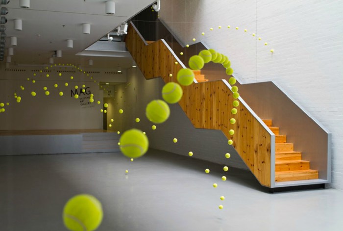
art installation, tennis balls, fun, contemporary art in spain, cool installation, collabcubedart installation, tennis balls, fun, contemporary art in spain, cool installation, collabcubedart installation, tennis balls, fun, contemporary art in spain, cool installation, collabcubedClick to enlarge
Spanish artist Ana Soler has a knack for taking the everyday object and creating spectacular installations. Her most recent, Causa-Efecto (Cause and Effect) involved 2000 tennis balls giving the illusion of bouncing all over the various rooms and levels of the Mustang Art Gallery in Alicante this past fall. The multiple trajectories that these balls take have you looking in all directions. A bit like a three-dimensional airline route map.

Very fun and cool!

Photos courtesy of the artist.

via mag

The Wynwood Walls: Street Art in Miami

Graffiti, Street art, Deitch, Goldman, Miami, artists paint murals on walls in Miami FloridaGraffiti, Street art, Deitch, Goldman, Miami, artists paint murals on walls in Miami FloridaGraffiti, Street art, Jeffrey Deitch, Tony Goldman, artists paint murals on walls in Miami FloridaClick to enlarge

Well, this certainly puts the Houston graffiti wall to shame! The Wynwood Walls is a community revitalization concept conceived by Tony Goldman in 2009 as a way to transform the warehouse district of Wynwood, Miami into a center where people could gravitate and explore, thereby developing the area’s pedestrian potential. I should have picked up on something with so many street artists featuring projects in Miami on their sites.

Initially opened in 2010 with the Wynwood Doors, the project has since expanded to the Wynwood Walls and Outside the Walls. Street artists from all over the world have gone to Miami to participate and it has become a sort of “Museum of the Streets,” as coined by Jeffrey Deitch, one of the original co-curators.

Here Comes the Neighborhood is a series of short episodes on the project as a whole, as well as interviews with individual artists. If you like the trailer below you can head on over to their site to see much more.

via the delightful Karen aka Kaia!