Etelvina: The Bag-storing Chicken and more

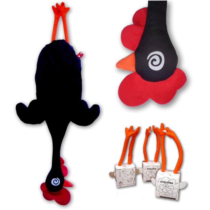
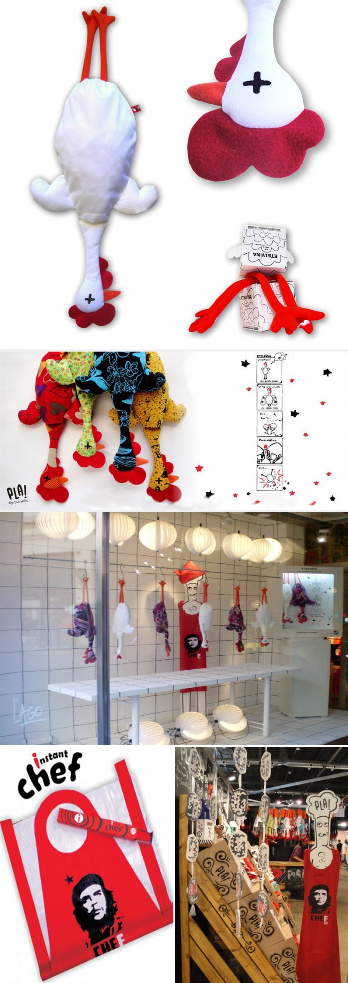
kitchen, bag-storer, apron, che, chicken, plastic bags, Pla, cookingkitchen, bag-storer, apron, che, chicken, plastic bags, Pla, cookingPLA, corrupt policeman piggy bank, humorous design, collabcubedIt’s not exactly a Thanksgiving post, but it does involve the kitchen, poultry and cooking. Last year Em brought back one of these Pla! Etelvina plastic bag-storing chickens from Buenos Aires that we have hanging in our kitchen, and though plastic bags are out, somehow we still accumulate enough to see our Etelvina plump up as we gradually stuff her, and trim down as we use the bags for garbage. Along with the chicken came CheF, (much to a cousin’s horror) the politically incorrect apron that’s ridiculous enough to make us laugh, and that I am donning today as I cook our Thanksgiving dinner.

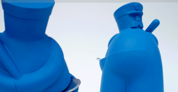
If you’re into these kinds of quirky, and we think, fun objects then you might want to check out the rest of the Argentinean company’s items: there’s a cotton ball dispensing bunny and a corrupt policeman piggy bank that takes coins in his side pocket while looking the other way.

In the meantime, have a nice holiday!
Traffic Cone Art & Design

Traffic Cone Art, Teddy Cruz, Rome, MaxxiTeddy Cruz, Paprika, Dennis Oppenheim, Burning Man, Tomer Diamant, traffic conesClick to enlarge

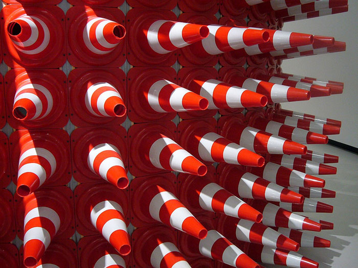
In the past month I’ve come across a few works made of traffic cones, so I decided to explore more and see what else is out there. Here are some of my favorites; from installations and sculptures to traffic cone inspired graphic design.

From top to bottom and left to right:
Estudio Teddy Cruz’s installation Cultural Traffic at Fondazione Maxxi (top 2 pics); Dennis Oppenheim’s sculpture Safety ConesRescue Bubble by Tomer Diamant at the Royal Botanical Gardens; Crocodile by Allee Willis; 2005 Burning Man installation; Hedgehog, a temporary performance pavilion to raise money for young homeless made of 300 traffic cones on a steel frame by EFGH (x3 photos); Bottom 6 images are part of the World Summit and Congress of Architecture at the Design Expo in Taipei by Paprika, brochure included.

Zero Collection by DoroDesign

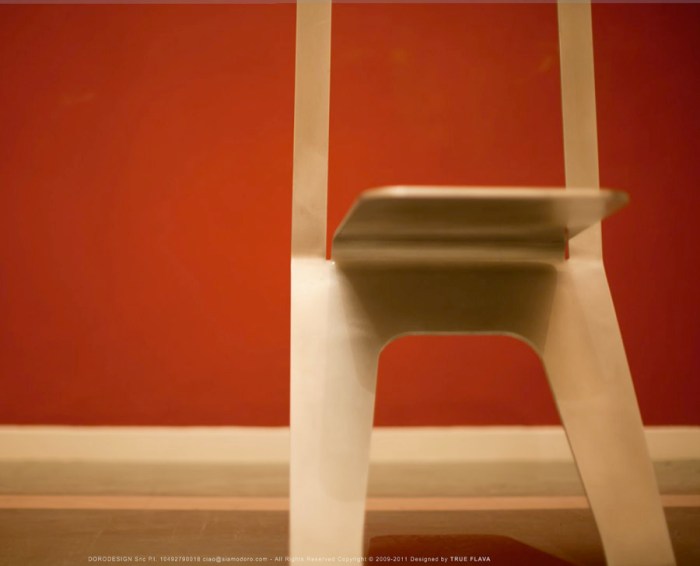
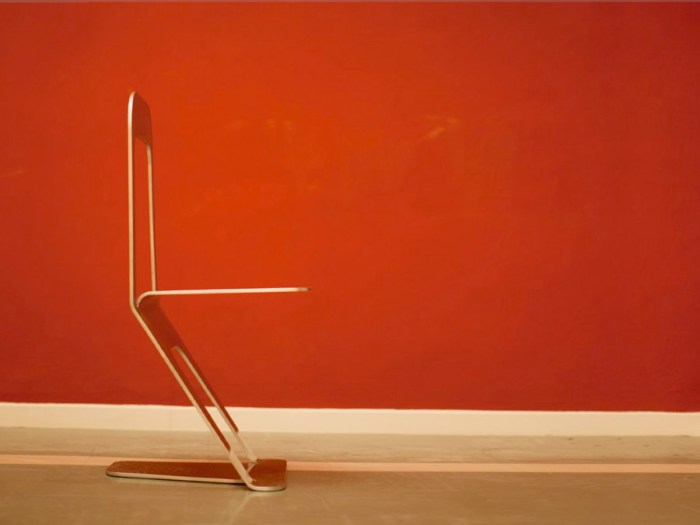
contemporary italian furniture design, zero collection, chair, collabcubedcontemporary italian furniture design, zero collection, chair, collabcubedcontemporary italian furniture design, zero collection, chair, coat rackClick to enlarge

DoroDesign, an Italian design firm founded by Dario Olivero and Stefano Ollino, aims to work with creative minds from a variety of cultures and backgrounds and make their visions reality in all design mediums from graphic to interior. Their Zero Collection represents the essence of the firm:

Zero Collection is the essence of the DORODESIGN lifestyle. Designed entirely around the Aluminum linear and clean material able to transform into tangible shapes the soul of the studio.Precise cuts, lines that suddenly find themselves`s soft, simple but full of vital energy, the Collection reflects the fusion between the sophisticated and urban, luxury and metropolitan.

With just three cuts and two folds on a sheet of aluminum, the Zero Chair is a beautiful example of simple and minimalist design. The chaise longue and coat rack follow the same cut-out simplicity with beautiful lines. The product photos aren’t too shabby, either.

via behance

Maggie’s Centre Nottingham: CZWG

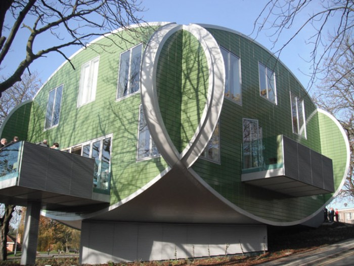
Maggie's Nottingham, CZWG, Paul Smith, Architecture, collabcubedMaggie's Nottingham, CZWG, Paul Smith, Architecture, collabcubedMaggie's Nottingham, CZWG, Paul Smith, Architecture, collabcubedClick to enlarge

The new Maggie’s Cancer Caring Center in Nottingham, England, was designed by Piers Gough, Partner CZWG Architects with interiors by Paul Smith. Comprised of four interlocking ovals and elevated above the ground to give a floating sensation, the distinctive building is clad in green glazed ceramic tile.

The building is situated on a sloping wooded area, not typical of hospitals, near the main entrance to Nottingham City Hospital. The balconies extend out from the kitchen and sitting room providing pretty and peaceful views of the surrounding landscape. The Paul Smith interiors are colorful, open, and bright, from the blue and green tiled bathrooms to the upholstery on the chairs. An uplifting atmosphere for sure.

Photos: Martine Hamilton Knight; Ercol’s flickr and Living Projects

via e-architect

Typography in Providence

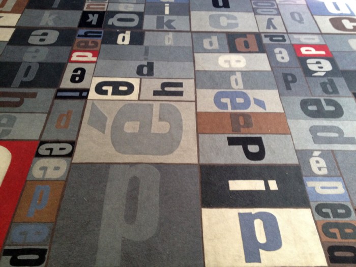
typography, type, rug, Brown University, Pembroke Hall, collabcubedtypography, type, rug, Brown University, Pembroke Hall, collabcubedtypography, type, Brown University, RISD, Rhode Island School Design, collabcubedClick to enlarge

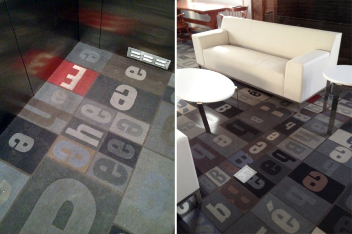
Providence, Rhode Island holds a special place in our hearts being that two out of the three of us are currently living there the majority of the year. Not surprisingly, the importance placed in design on both campuses where Em and Dan attend, is evident from Brown’s new Granoff Arts Center designed by Diller Scofidio + Renfro, to the RISD Museum of Art designed by Jose Rafael Moneo. What are nice as well, are the little surprise design elements you suddenly come upon on both of these adjacent schools. Typography, one of our favorites for example, is nicely incorporated and used decoratively on both campuses. Strolling around on a recent visit we spotted some of these. I wasn’t able to find information on all of the designs, but have included what I did obtain.

From top to bottom:
Typography carpet in Pembroke Hall, Brown;  Decorative type panels on the sides of the bleacher seating area and behind the librarian desk at Rhode Island School of Design (RISD) Library, designed by Office dA; Portfolio Café at RISD; Sciences Library floor numbers at Brown, designed by Warner Burns Toan & Lunde Architects.
All photos by Emma/Collabcubed except two grand hall shots of RISD Library courtesy Office dA.

Diane Landry: Knight of Infinite Resignation

water bottle art, light, motion, installation, cool, Landry, Knight of Infinite Resignationwater bottle art, light, motion, installation, cool, Landry, Diane Landry lives and works in Quebec. Many of her works call attention to the threat on the earth’s clean water supply. In her sound and automation installation Knight of the Infinite Resignation, the 237 bottles used are filled with sand making the bottles dried-up and sterile, at the same time acting as hour glasses. There are allusions to the 12 hours in a day and 12 months in the year, as well as windmills and stars.

From the artist’s site:
The short-sightedness of human management of natural resources is made pitifully obvious by the work’s evocation of cosmic time, in comparison with which the human lifespan and even the existence of the species seem simply irrelevant. And there is something terrifying about this assemblage, which is so cold and serene, so unperturbed by the viewer’s presence.

via asiapacific

Nooka Concept Watch

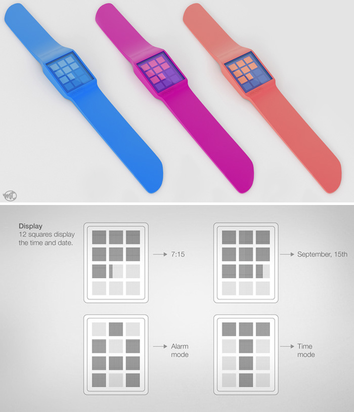
watch design, nooka, magnetic, pixels, mario troisewatch design, nooka, magnetic, pixels, mario troisecool watch design, nooka, magnetic, pixels, mario troiseIt’s been a while since we’ve posted about a watch but, being the watch lovers that we are, it was great to have  one pop up in our inbox. This concept design for a Nooka watch by Brazilian designer Mario Troise seems like it would fit in perfectly with the collection. The minimalist design includes a magnetic band and 12 boxes on the face made up of pixels offering up yet another way to read time.

Micheline Branding by Anagrama

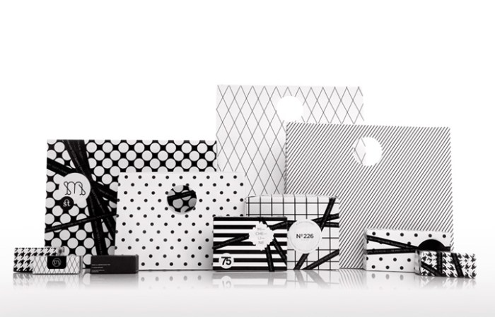
interior design, branding, print shop, Mexico, typographyinterior design, branding, print shop, Mexico, typography, packaginginterior design, branding, print shop, Mexico, typographyMexican design firm Anagrama, specializing in identity and brand consulting, rebranded the boutique print shop Micheline, from their logo and packaging to the interior of their shop. In order to express uniqueness, elegance and modernity and keep the flavor of the mid 70s when Micheline was founded, Anagrama played up the 1975 year typographically in the decor as well as through the furniture and lighting selections. The color palette was kept neutral to contrast with the bright colors of the card catalogues and papers. Nicely done!

via retail design blog

Yuya Ushida: Sofa_XXXX and Stool

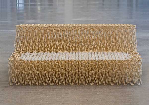
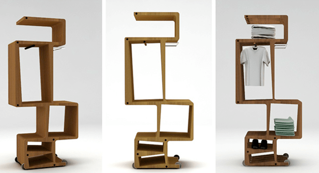
chopsticks, creative furniture, cool sofa, repurposed, chair designchopsticks, creative furniture, cool sofa, repurposed, chair designAs a design student in the Netherlands, Yuya Ushida created the original Sofa_XXXX out of 8,000 recycled bamboo sticks (think chopsticks) for his graduation project in 2010. The expandable and contractible chair/sofa has since been produced using components that are injection-moulded from recycled plastic bottles and available in black or white. This version, available through Royal Ahrend is called XXXX_Sofa. Ushida has also come out with a stool version that only uses 600 parts and comes in a kit, not surprisingly named XXXX_Stool.

I don’t know, but even putting a mere 600 parts together seems like a bit of a challenge…

via the chair blog

IXXI: Photo Walls

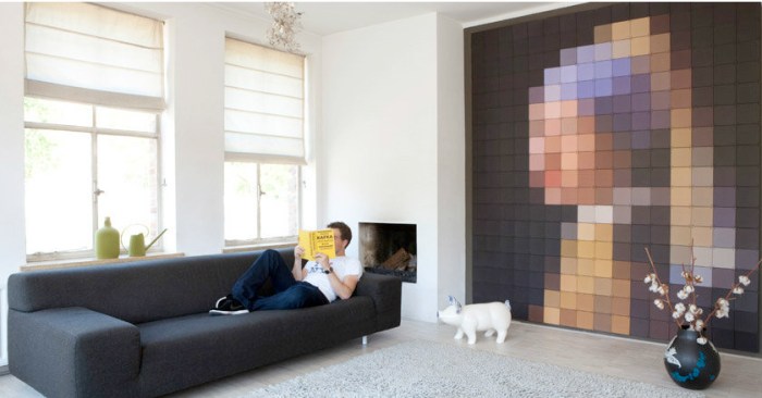
pixelated wall images, photo wall, modular photo system, ixxipixelated wall images, photo wall, modular photo system, ixxiDeveloped by Dutch designers Eric Sloot, Paulien Berendsen and
Roel Vaessen, ixxi is a modular wall-hanging system made up of square photo cards connected by plastic x’s and i’s. It allows you to make your own photo enlargements, photo collages, pixelated images, or any other creative ideas you can come up with. Oh, the possibilities!

See more on the ixxi site.

via bb

De Tafelwip: Marleen Jansen

Dutch product design, table, seesaw, DDW, fun furnitureDutch product design, table, seesaw, DDW, fun furnitureThere’s a reason you don’t see many see-saws in playgrounds anymore; it could be safety issues or maybe just a complete loss of faith in see-saw partnerships. After all, there’s a lot of trust involved on the see-saw. One person gets off unexpectedly and the other one can go flying…or more accurately, crashing.

Dutch designer Marleen Jansen clearly still has faith in the see-saw and the unspoken contract that is entered when both parties mount one. De tafelwip, a project developed after her dissertation entitled ‘Being Forced Voluntarily’ (Ongedwongen moeten) on the subject of table manners, prevents people from walking away from the table during dinner. The see-saw seating forces the two people to stay at the table because, as she points out: “If one leaves the table, the other diner ends up on the floor! Definitely not a charming thing to do!”

Emily Post would be proud.

via ddw

Scott Jarvie: The Clutch Project

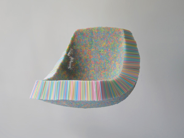
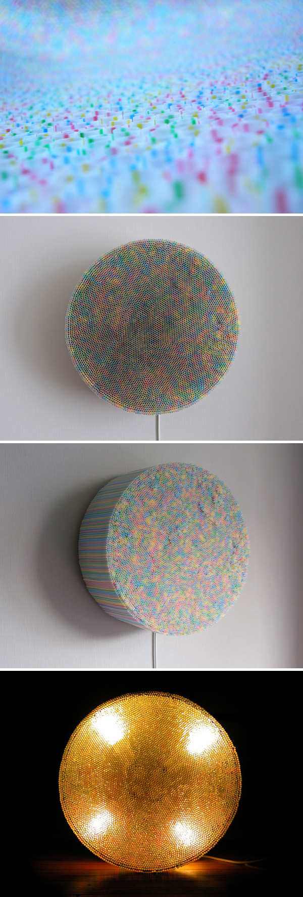
straws, drinking straws, chair, research piece, Noise Festivalstraws, drinking straws, chair, research piece, lamp, cool designI happened upon Scottish designer Scott Jarvie’s website and his Clutch Project. The Clutch Chair is an experimental research project made from 10,000 drinking straws. In the Clutch Lamp, the straws are grouped together and transformed into a spot light. The inner surface of the straws reflect the light in a jewel-like manner creating a unique effect.

Instantly reminded me of one of my favorite artists, Tara Donovan’s Haze installation: thousands of clear drinking straws stacked on a wall creating an effect that doesn’t even look like the straws that it’s made up of.

You can see more of Scott Jarvie’s interesting work here.

Typographied Objects III

typography objects, letterforms, type on sheets, type on clothes, type jewelry, collabcubedtypography objects, letterforms, type on sheets, type on clothes, type jewelry, collabcubedClick to enlarge

Our latest roundup of objects with type. See our previous posts Typographied Objects and Typographied Objects II for more.

From left to right, top to bottom:
Typeshelf by Thirtyfive Creative Works; Punctuation Journals; Lucky Letters Umbrella; Letter Lamp; Eivor Ord Duvet cover and pillow cases; READ book shelf; Ampersand Jewelry; Caleido Digit Radiator; Profiltek Vetro Shower Door; Blah Blah Throw; Alphabet Stockings; Welcome Letter Concept Chair; Even Little Number Plates; Calvin Klein Briefs; Number Placemats; Numbers Runner

Matthew Parker: Event Installations

event installation, paper airplanes, EMP, Seattle, Boeing, partyevent installation, paper airplanes, EMP, Seattle, Boeing, partyevent installation, coffee filters, store window decor, Seattle, displayClick to enlarge

Matthew Parker Events is a boutique design studio from Seattle, WA that produces custom event decor, paper art, and prop styling. Most recently, Parker’s design for the Design*Sponge Book Tour backdrop has been popping up on various design blogs, but he’s got other interesting work as well, that ranges from window displays to event installations to a custom wedding altar.

Using common elements such as paper and  cardboard in combination with influences that include typography, tessellation origami, pop art and the future, Matthew Parker creates original handmade decor.

Top two photos: Paper airplane installation at the EMP for an Artsfund event. Photos by Jena Lacomis Garcia.
Other photos: Coffee filter sculpture/installation in collaboration with Sam Trout. Photos by Kip Beelman.

Liam Gillick: Type, Color & Light …Trifecta!

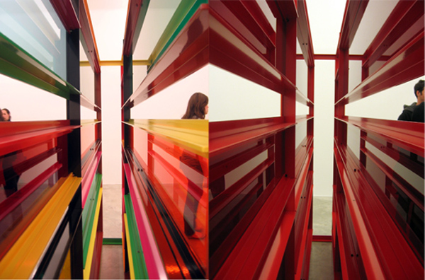
color art installation, contemporary art, typographycolor art installation, contemporary art, typographyYes siree, three of my favorite elements all combined by one artist: Liam Gillick. The British artist is based both in London and New York. He has published a number of texts that function in parallel to his artwork, and the artwork itself often incorporates typography. In addition to Gillick‘s installations, he has collaborated with architects on the façades and interiors of many buildings including the Fairmont Pacific Rim Hotel in Vancouver, Canada (see our Architypeture II post) and the Marsham Street Home Office in London.

Gillick’s installations are at once minimalist, conceptual and ironic. They are often seen as abstract representations of the various social projects that he participates in. Definitely would love to see one of these in person.

via artnet

Barbara Licha: Wire Figures

Wire figures, Australian artist, Licha, contemporary sculptureWire figures, Australian artist, Licha, contemporary sculptureClick to enlarge

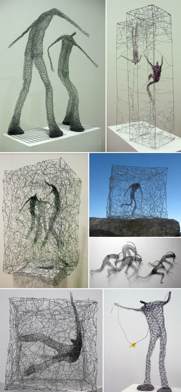
Polish artist Barbara Licha, based in Australia, is interested in the complexity of the human condition and explores parallels between actual people and the ones in her imagination. I particularly like her wire figure sculptures with their gestures in their tangled worlds or boxes. In her work, Licha tries to convey what she sees inside people: their wishes, dreams and desires.

You can see more of Licha’s work here and here.

via Brenda May Gallery