Owen Shop NYC: Tacklebox

New highend store in meatpacking with 25000 paperbag installation, Owen, Tacklebox, Juliana SohnNew cool highend store in meatpacking with 25000 paperbag installation, Owen, Tacklebox, Juliana SohnNew cool highend store in meatpacking with 25000 paperbag installation, Owen, Tacklebox, cool store designClick to enlarge

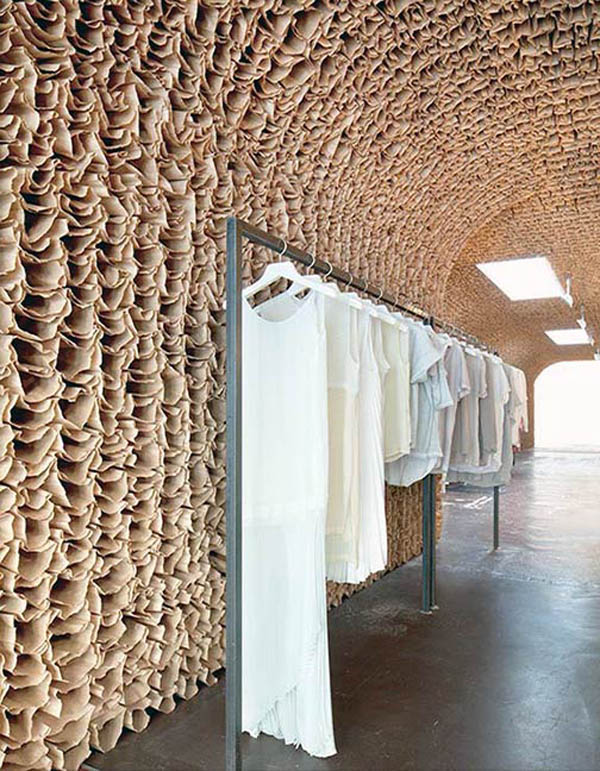
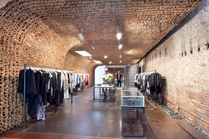
Once again architecture firm Tacklebox uses unique materials in their retail store design (see previous post on Aesop’s kiosk here), this time for the new high end OWEN shop in New York City’s Meatpacking District. A continuous surface hand-built out of 25,000 brown paper bags, arches from floor to ceiling creating a honeycomb effect within the industrial brick and concrete 1,800 square foot space that previously housed a meat storage facility. This project is the first in a series of signature stores for OWEN and serves as a preview of stores to come.

Very cool.

Photos courtesy of Tacklebox by Juliana Sohn.

via NY Times

Typographied Objects IV

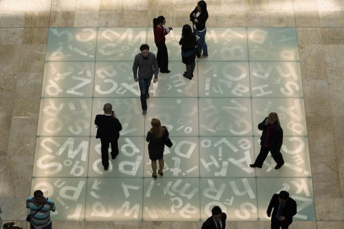
typography on mugs, numbers on mugs, typographic objects, bold numbers, fun itemsTypography on floor of Romanian National Library, Type Installation, Typography in ArchitectureTypography on objects from food to housewares and clothes. Letters, Type, Numbers, typographied objectsClick to enlarge

It’s been a while but here is the latest roundup of typography objects.

From left to right, starting at the top working down
Number Mugs from SuckUK; Floor of the Romanian National Library: Typographic Chessboard; Type Tote (front and back); Vitamin Packaging; Proposed Milk Carton Packaging; Sascha Grewe Letter Stools; Full House by J. Mayer H. for Bisazza SPA with dataprotection patterns; Handwritten Typeface by Lucas Neumann de Antonio; Edible Gelatin Type; Quotation Mark Plate; Typographic Sliding Puzzles; Bathroom Signage Student Project by Daniyil Onufrishyn; Alphatots Potatoes; TarGetBooks Shelf by Mebrure Oral; Dynamo Typocolate; Linus Dean Rugs; Typographic Dress; Urban Dinnerware; Love Your Fellow As Yourself T-shirt; Pablo Lehmann Bookcase; Ouch Quote Quips Bandages; and Anita Shelving by Ricard Mollon

See our previous posts Typographied Objects I, II, and III.

Cristina de Middel: The Afronauts

spanish contemporary photography of Zambian space program, Africa, Edward Makuka, Surreal photographs, African historyspanish contemporary photography of Zambian space program, Africa, Edward Makuka, Surreal photographs, African historyspanish contemporary photography of Zambian space program, Africa, Edward Makuka, Surreal photographs, African historyClick to enlarge

When I first came across Spanish photographer Cristina de Middels ongoing Afronauts Project last month, I loved the photos but was not aware of the story behind them which make them all the more interesting.

From the photographer:
In 1964, still living the dream of their recently gained independence, Zambia started a space program that would put the first African person on the moon catching up the USA and the Soviet Union in the space race.
Only a few optimists supported the project by Edward Makuka, the school teacher in charge of presenting the ambitious program and getting its necessary funding. But the financial aid never came, as the United Nations declined their support, and one of the astronauts, a 16 year old girl, got pregnant and had to quit. That is how the heroic initiative turned into an exotic episode of the African history, surrounded by wars, violence, droughts and hunger.
“Afronauts” is based on the documentation of an impossible dream that only lives in the pictures. I start from a real fact that took place 50 years ago and rebuild the documents adapting them to my personal imagery.

It was hard to select just one of De Middel’s photography projects to post here; they are all wonderful. If you have a few minutes you might want to check out Pop Totem, Messenger, and Centauro…or go crazy and look at everything on her site.

via treintaycuatro and colors

Tapewriter: Autobahn

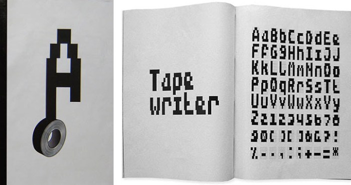
Autobahn design studio, Tapewriter, Duct Tape font, Typeface, Street Art typographyAutobahn design studio, Tapewriter, Duct Tape font, Typeface, Street Art typographyAutobahn design studio, Tapewriter, Duct Tape font, Typeface, Street Art typographyClick to enlarge

Dutch design studio Autobahn, founded by Maarten Dullemeijer and Rob Stolte, created the font Tapewriter while experimenting using duct tape as the writing material and outdoor metal fencing as their canvas. Each rectangle in the fence matched the width of the duct tape, creating a kind of bitmapped effect when words were taped out on the metal grid. From street art and free expression to font…interesting.

via behance

Henrik Vibskov: Book Launch Performance

Henrik Vibskov, performance art, cool installations, graphic stage sets, avant garde fashion designHenrik Vibskov, performance art, cool installations, graphic stage sets, avant garde fashion designHenrik Vibskov, performance art, cool installations, graphic stage sets, avant garde fashion shows, avant garde art installations, wacky, fun, car washClick to enlarge

Danish fashion designer Henrik Vibskov is not your ordinary fashion designer. His fashion designs could be described as avant garde, but they are only the tip of the iceberg. He is a multifaceted artist, stage designer and musician who has a unique, sort of wacky, offbeat style. Seeing one of his fashion shows must be a real treat. More of a performance art piece than a classic runway show.

This month a book of his work is due out titled, not surprisingly, Henrik Vibskov. For the Berlin book launch, Vibskov designed and choreographed an interesting performance with a graphic backdrop and two actors covered in the same pattern, performing odd tasks, such as sweeping into a dustpan, in very slow motion. Also not to be missed are his collaborations with Andreas Emenius, including The Fringe Projects and The Circular Series.

You can watch a video of the book launch performance below.

And here is one of the installations from The Fringe Projects pictured above, titled Car Wash in action:

via gestalten

Tivoli Park Sculpture: Rok Grdisa

Sculpture, information pavilion, folded metal bars at different angles, archway, dynamicSculpture, information pavilion, folded metal bars at different angles, archway, dynamicSculpture, information pavilion, folded metal bars at different angles, archway, dynamicClick to enlarge

Originally designed for, and a second place winner of, the Trimo Urban Crash competition, this dynamic urban sculpture designed by architect Rok Grdisa has now become a permanent installation in Tivoli Park in Ljubljana, Slovenia. Acting as an information pavilion, this red structure made up of 6 differently folded bright red metal panels, has a sort of blooming effect that is very appealing. The interior panels include lighting, which makes for lovely nighttime illumination.

Photos by Peter Mihelic

via design diffusion and plusmood

Jonathan Delafield Cook: Charcoal Drawings

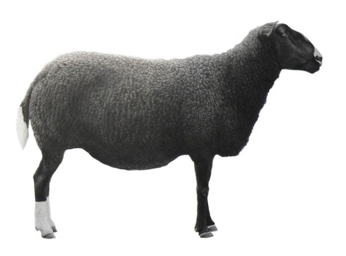
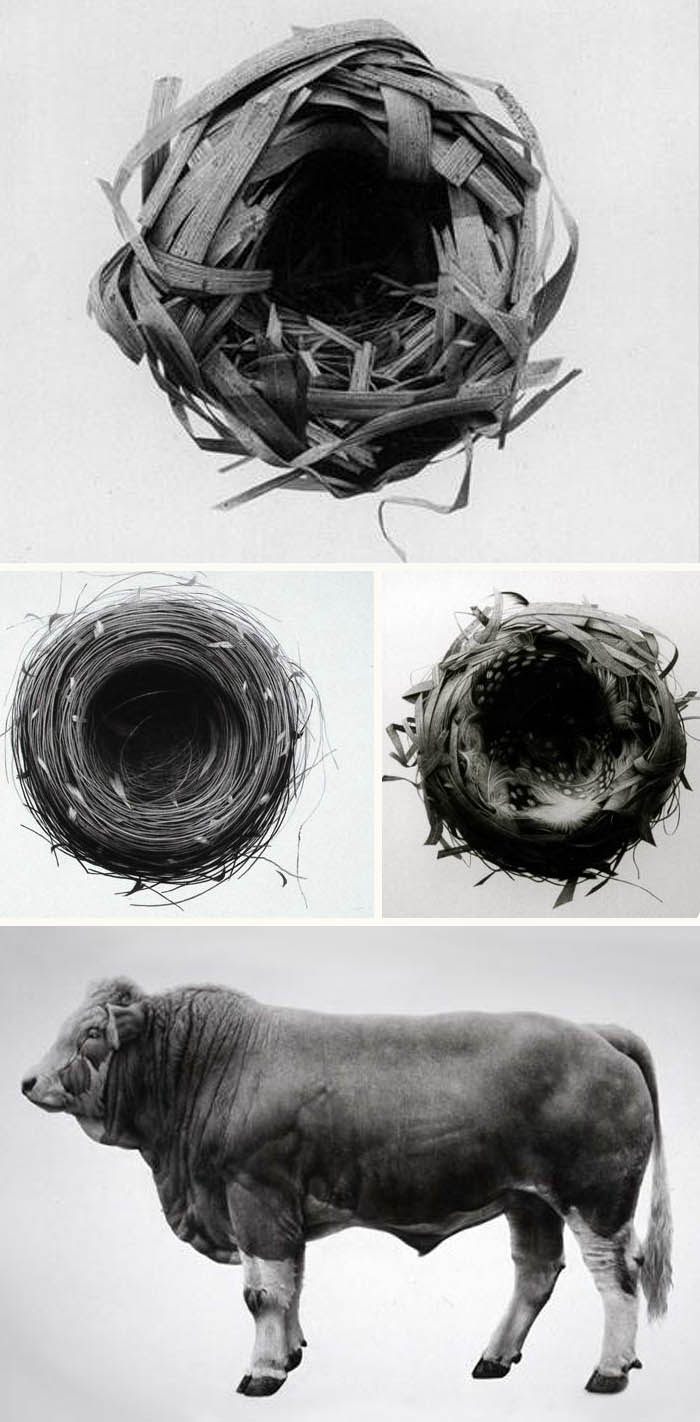
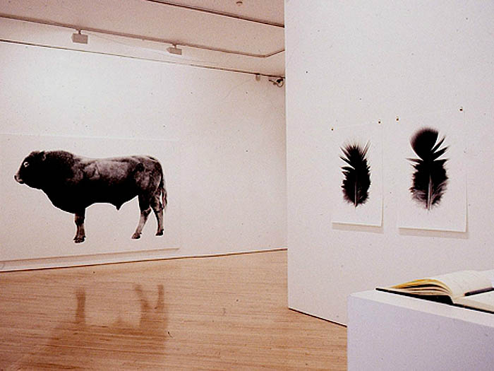
Amazing charcoal drawings of nests and animals that almost look like photographsAmazing charcoal drawings of nests and animals that almost look like photographsAmazing charcoal drawings of nests and animals that almost look like photographsClick to enlarge

Yes. Drawings. London artist Jonathan Delafield Cook gets his inspiration for his remarkable hyper-realistic charcoal drawings on paper and canvas from nature. His attention to detail makes these works look almost photographic. He plays with scale by enlarging his subject matter, whether it be birds’ nests or bulls. Pretty amazing and beautiful, to boot.

Thanks, Breger.

Designboom Mart 2012 Designs

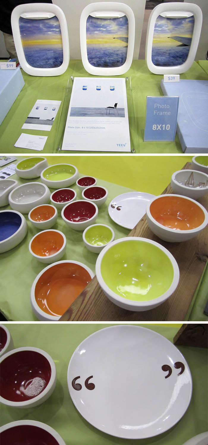
designboom mart 2012 at ICFF products/designs, frames, stools, bowls, bagsdesignboom mart 2012 at ICFF products/designs, Teevstyle airplane window frames, stools, Bold and Lovely porcelain bowlsAfter two days at the designboom mart 2012 at ICFF, things are going really well at our table with lots of nice feedback, but we’ve also had the pleasure of being surrounded by so many interesting, clever, and beautifully designed products. Here are some of our immediate neighbors whose designs we’ve been admiring.

Above top, Seoul-based design studio TEEV has designed these very clever picture frames in the style of an airplane window. No, the window shade does not come down, despite many a person’s attempt at pulling, but even without that possibly-in-the-future fun feature, these frames put a smile on most everyone’s face.

Right below the photo frames, Nancy Froehlich’s Bold & Lovely chunky porcelain bowls with bright and colorful glazed interiors, are simply beautiful. Contemporary and fresh in their design, we’re still trying to decide which one of these bowls from Oregon we’re going to purchase for ourselves. Nancy also has a line of plates with quote marks on them that have been quite popular at the show.

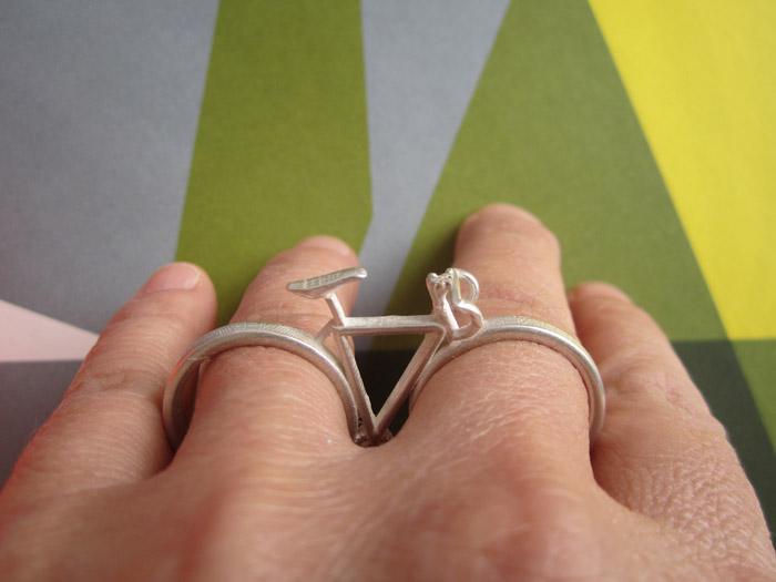
recycled bottle caps into shoulder bags, squashed basketball fruitbowls, R. Mutt toilet stickers, Marcel DuchampA couple of tables over, Colombian design studio Proyecto Tres y Medio have brought along their Tápate messenger bags made of recycled plastic bottle caps that have been sewn together and lined to make a series of very unique bags.

UK-based Alex Garnett has an interesting collection of work that includes ceramic fruit bowls in the shape of squashed basketballs and, Daniela’s favorite (though she got there two minutes after the last one at the mart was sold): Conceptual Crap –“R. Mutt” stickers to transform your toilet into a Duchampian/DADA work of art. Brilliant!

Beautiful woodwork, Dadelion stool and magazine rack, amazing packaging for beautiful ring designsMoissue from Taiwan has some spectacular woodwork. Their Dandelion stool — which doubles as a magazine rack — is beautifully crafted and would make a great sculpture on its own let alone a dual-purpose piece of furniture. Their wood and metal rings are lovely, but what really blew us away is their incredibly innovative packaging; a wooden cylinder that screws shut with the ring inside. Without a doubt the best jewelry packaging I’ve ever seen.

There are  plenty more creative products at the designboom mart and we’ll also be sharing some designs from ICFF 2012 as well in the coming days.
NY Design Week 2012

NY Design Week 2012, Noho District, Tom Dixon-Fab Pop Up London UndergroundNY Design Week 2012, Noho District, Tom Dixon-Fab Pop Up London UndergroundNY Design Week 2012, Tom Dixon, London Underground, Japanese Premium Beef, Balloon Factory beef balloons, Core77 Pop-up Gallery, Partners & Spade Children's ChairsClick to enlarge

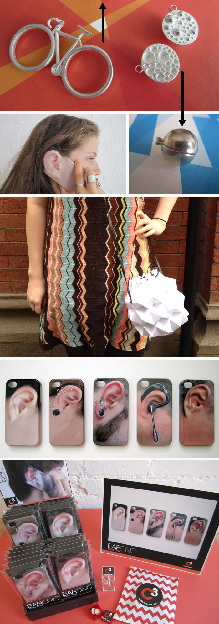
Well, it looks like the ever-growing NY Design Week 2012 is off to a great start with exceptionally beautiful weather in store for the next three days. Aside from ICFF at the Jacob Javits Center, the event at the core of Design Week (and we – CollabCubed – will be there as part of the designboom mart, but more on that later) there are special design-related events going on all over the city. Too many to list here, but here are a few I ran across today in my travels through NoHo on my way to the East Village.

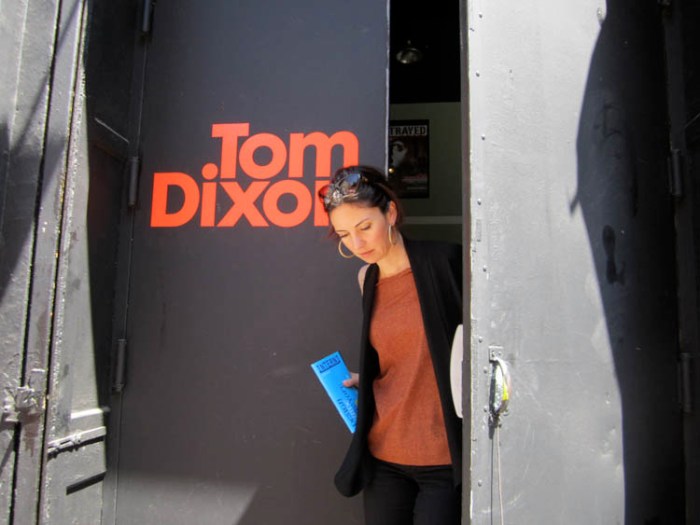
Tom Dixon along with Fab, Surface Magazine and Stumptown Coffee have teamed up and transformed the basement of the Bleecker Street Theater into a Pop-up shop and café: London Underground. Filled with lamps designed by Dixon, the space has a cool feel with interesting shadows cast upon the walls. My favorites? His new line of industrial looking ceramic lamps due out in September.

Two blocks north on Great Jones Street, Japanese Premium Beef (a unique butcher shop worth visiting anytime for its singular boutique-like quality) has a display of beef and sausage balloons created by Balloon Factory.

On the same block, The Future Perfect looked like they were setting up a special exhibit and across the street at Partners & Spade, Mondocane has an exhibit of historically relevant children’s chairs. Around the corner, Core77 was setting up their First Annual Core77 Open, a Pop-up exhibit featuring 5 designers from the 5 boroughs. The stacks and stacks of wooden flats(!) that they were loading into the shop look like they’ll make for an interesting installation.

More events include: Roll & Hill’s temporary showroom at 2 Cooper Square; Areaware at 22 Bond St.; and Hotel California at The Standard East Village.

You can see more events on the Noho Design District site, as well as Metropolis Magazine’s list, Core77, and WantedDesign for other events outside of Noho.

Enjoy!

All photos collabcubed except for bottom row of chairs courtesy of Mondocane and Partners & Spade.

Yeah! More FarmGroup

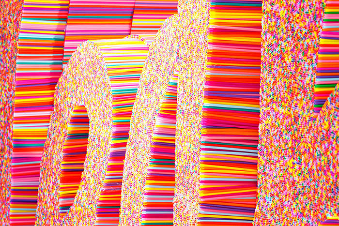
Fun Type Installation made with drinking straws, in Bangkok mall, Yeah!, collabcubedFun Type Installation made with drinking straws, in Bangkok mall, Yeah!, collabcubedFun Type Installation made with drinking straws, in Bangkok mall, Yeah!, collabcubedClick to enlarge

Bangkok-based multi-disciplinary design studio FarmGroup (previously here) created this fun Christmas installation at the Siam Center. Using thousands of colorful plastic drinking straws, the sculpted the word “Yeah!” along with several shapes of animals, stars, and other holiday motifs.

If you like this you might also like Sang Sik Hong’s Straw Sculptures and Scott Jarvie’s Clutch Project, also made with straws.

Kukje Art Gallery: SO-IL Architects

Solid-Objectives – Idenburg Liu, SO – IL Architects, Cool chainlink facade, Kukje Art Gallery, Seoul, KoreaSolid-Objectives – Idenburg Liu, SO – IL Architects, Cool chainlink facade, Kukje Art Gallery, Seoul, KoreaSolid-Objectives – Idenburg Liu, SO – IL Architects, Cool chainlink facade, Kukje Art Gallery, Seoul, KoreaClick to enlarge

For their recently completed project in the northern part of Seoul, partners Florian Idenburg and Jing Liu of the Brooklyn-based Solid Objectives – Idenburg Liu (SO–IL) architecture studio, diffused the front of their structure for the Kukje Art Gallery with a chainmail veil. As part of their master plan for the gallery’s new “art campus”, SO–IL designed a clear-span art space in the shape of a box to house large contemporary installations. They maintained the pure geometry of the space by pushing the circulation out to the edge of the building. They felt that the white cube was too rigid within the historic environs, so, by enveloping the structure in a steel mesh, they blurred the edges and softened the appearance as a whole, in addition to creating a very cool-looking building.

Working with FrontInc. Engineers, and fabricators in China, to design and manufacture the armor-style mesh, SO–IL oversaw mock-up tests in Southern China for the proper elasticity and geometry before having it transported to the gallery site in Seoul.

The result, needless to say, is very striking.

Photos by Iwan Baan; FrontInc; SO–IL and SO–IL’s facebook.

via afasia and domus

Gregos: Masking the Streets of Paris

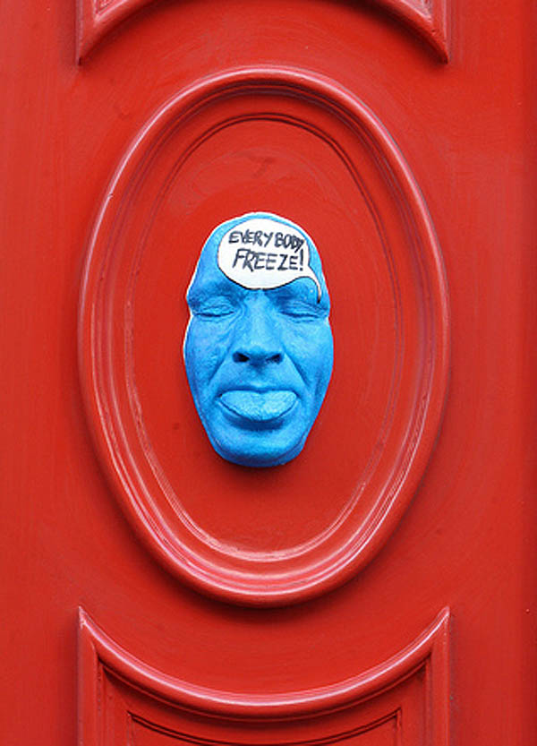
Street art in Paris, painted plaster self-portrait masks, Gregos, graffiti, collabcubedStreet art in Paris, painted plaster self-portrait masks, Gregos, graffiti, collabcubedStreet art in Paris, painted plaster self-portrait masks, Gregos, graffiti, collabcubedClick to enlarge

A couple of years ago, on a trip to Paris, we noticed many of these masks emerging from the walls around town. I came across a photo from that trip the other day and decided to google the artist. Gregos, as he is known, grew up in the suburbs of Paris and started graffiti painting in the late 80s. After stints in Athens, Greece and Boston, where he learned sculpting and painting, Gregos returned to Paris and street art, this time inventing his own 3D style combining all his newfound skills: sculpture, molding, and painting.

There are presently more than 400 faces, all cast from his own face — self-portraits that express his humor, thoughts, and most everything about Gregos.

You can see plenty more of these faces on his website and his flickr.

Tomás Saraceno: Cloud City at the Met

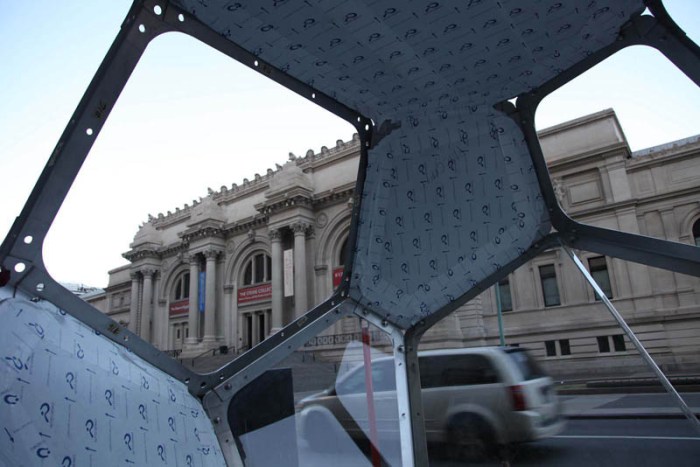
Met Roof Garden installation, Cloud City, Tomas Saraceno, cool installation, contemporary art, collabcubedMet Roof Garden installation, Cloud City, Tomas Saraceno, cool installation, contemporary art, collabcubedMet Roof Garden installation, Cloud City, Tomas Saraceno, cool installation, contemporary art, collabcubedCool installation on roof of the Metropolitan Museum 2012, Tomas Saraceno, Argentine ArtistClick to enlarge

It may not have been the best day to inaugurate Argentine artist Tomás Saraceno’s new installation, Cloud City (his largest in a 10-year-old series Cloud Cities/Air Port City), on the roof of the Metropolitan Museum due to the heavy downpours of rain, but it was the previously determined date. I was looking forward to checking out the installation in person, having been aware of Saraceno’s habitable constructions (previously here) for a while now, but will wait for a sunnier day.

The sculptural/architectural piece atop the Met is made up of interconnected metal and acrylic modules with both reflective and transparent panels. Visitors are able to enter the structure for up to twenty minutes by obtaining a timed-entry ticket. If the regular views from the roof garden weren’t already beautiful enough, I would imagine that both, the views from the additional 20-foot high interior, as well as off of the mirrored panels on its exterior, are even more spectacular, as evident in Saraceno’s photos.

Definitely worth a visit, though there are likely to be long lines to enter, especially on weekends. Luckily, Cloud City will be on the roof of the Met through November 4, 2012, at which point it will travel to Green Box Arts Festival in Colorado where it will be placed in the middle of the forest.

Check out The Met’s site for details.

Photos courtesy of the artist and The Met.

via The Metropolitan Museum and NY Times

Realities United: 2 X 5 (Brothers)

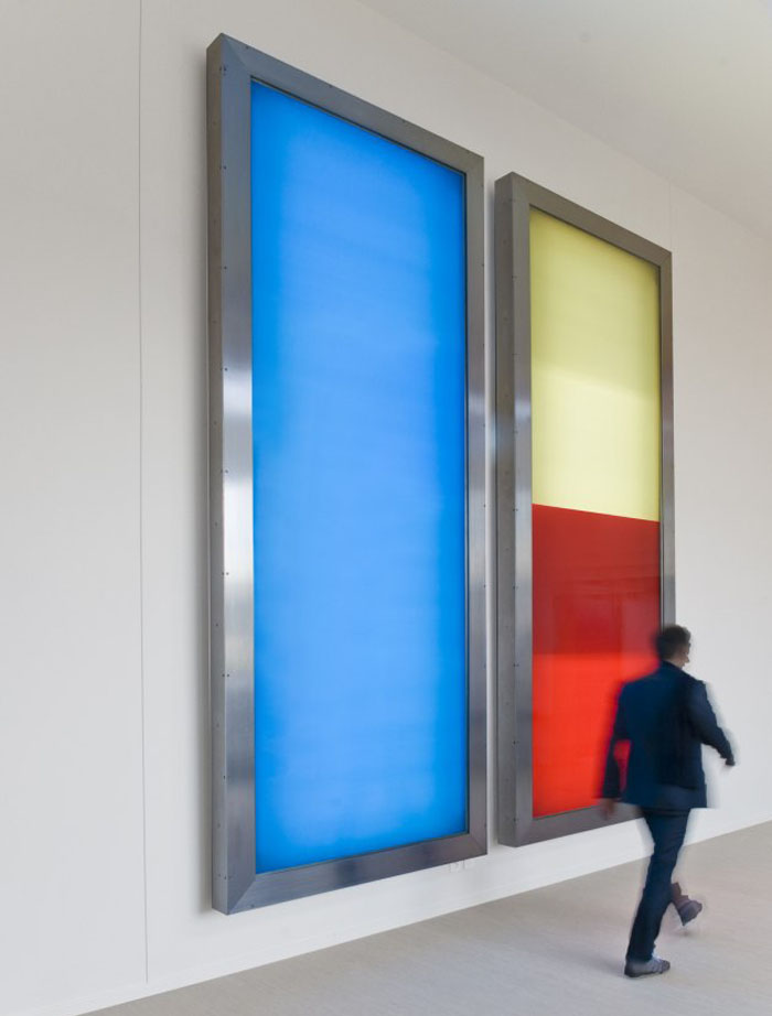
Kinetic Light Installation at Granoff Center at Brown University by Realities UnitedKinetic Light Installation at Granoff Center at Brown University by Realities UnitedKinetic Light Installation at Granoff Center at Brown University by Realities UnitedClick to enlarge

It’s true that we have a soft spot for all things Brown, with Em being up there almost 9 months of the year, but we’ve also been fans of the year-old Granoff Center on campus, designed by DillerScofidio+Renfro, since its opening. And now, I came across the permanent kinetic light installation titled 2×5 (Brothers) by, ironically enough, the two brothers at Berlin-based firm Realities United, which hangs at the entrance of the building as of last month. This colorful installation just adds an extra ‘like’ to all of the above; a little Rothko meets Albers meets Turrell rolled into one that has been beautifully integrated with the window panes and doors of the main ingress.

2×5 is a time-based work with two identical casings containing poster scrollers with full-surface monochromatic colored prints on stretched fabric illuminated from behind.

At the beginning of the academic year, the machines tend to both show the same color equally intensely backlit, and the changes are usually fundamental, i.e., from one color entirely to another. In the course of the year, the probability increases that the two machines will show behavior independent of each other. Then the spatial experience is shaped by up to four different colors of differing intensities at once. With two to four changes per day the frequency of the change is so low that visitors initially experience the installation mostly as static in the respective configuration.

You can see more of Realities United’s work, such as the very cool Bix/Kunsthaus Graz and the more recent mirror installation Transreflex, at their website.

Brian Dettmer: Quotes Cut from Books

Book Sculptures, Cut books, Phrases cut out of books, typography, Brian Dettmer, Book artBook Sculptures, Cut books, Phrases cut out of books, typography, Brian Dettmer, Book artBook Sculptures, Cut books, Phrases cut out of books, typography, Brian Dettmer, Book artClick to enlarge

Originally from Chicago, artist Brian Dettmer, who creates innovative sculptures with books and other forms of antiquated media, currently resides in Atlanta.

As is the case with other artists working with books as their material of choice, Dettmer uses his art, in part, as a commentary on the waning physical form of the information age. The long-lasting book is being replaced by the intangible, digital file, and the world risks being left with nothing.

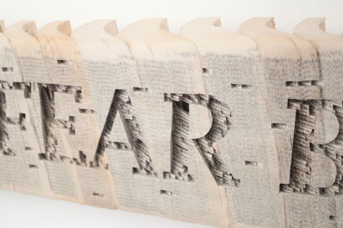
Dettmer works by cutting into the surface of books and dissecting through it. Working with knives, tweezers and surgical tools he carves one page at a time. Nothing within is relocated, just removed. Alternate histories and memories are revealed. In the case of the series of quotes above, Dettmer has cut into groups of paperbacks, sealed with acrylic, carving out the easily recognizable unfinished quotes.

You can see much more of Dettmer’s work here (definitely worth a look) and his Pecha Kucha talk from 2 years ago here.

via tribe magazine

Jean Daviot: Typographic Wordscapes

Typography landscapes, wordplay in grass, Lieu Lien, French art, Jean Daviot, type installationTypography landscapes, wordplay in grass, Memoire, French art, Jean Daviot, type installationTypography landscapes, wordplay in grass, Imagine, Memoire, French art, Jean Daviot, type installationClick to enlarge

French artist Jean Daviot works in a variety of mediums including painting, photography, video, and installation art. Throughout, he plays with aural and linguistic analogies. In his installations he is particularly interested in wordplay; in seeing words and type as shapes and then in essence dissecting them and seeing the words within the words. For example: MEmoiRE (memory), a word he uses in several installations, contains the letters M-O-I (self) inserted between the word MERE (Mother). He likes to take the words literally and then turn them upside down.

From the artist:
I’m particularly aware of those moments called entre chien et loup in French (twilight, when a wolf can’t be distinguished from a dog), those fleeting instants when day turns into night or vice versa and shapes are seen in a different light. All of my work is situated in this slippery moment, this passage in one direction or the other, that instant that suddenly reveals the face of things you thought were hidden and now suddenly can be seen, like the appearance of shapes through the intervention of an artwork that invites interpretation.

via documents dartistes and artpress

Laurent Perbos: Myths from the Banal

French contemporary sculpture made up of sports equipment such as bungee cords, Calydon,French contemporary sculpture made up of sports equipment such as bungee cords, Calydon,French contemporary sculpture using bungee cords and pvc piping, Laurent Perbos Click to enlarge
French artist Laurent Perbos belongs to the genre of artist that enjoys reappropriating the everyday and banal by converting it into art where it can be seen as playful, ironic and/or critical. He uses materials such as sports equipment, pencils, pvc piping, just to name a few. Many of his works reference mythological figures such as the sculpture at the top – made of bungee cords and javelins – titled Calydon, a wild boar from Greek mythology said to have been sent by the goddess Diane, that devastated the territory of Calydon. Below, Forest Tears, are trees and tree stumps made of pvc piping.

via documents d’artistes