 Click images to enlarge
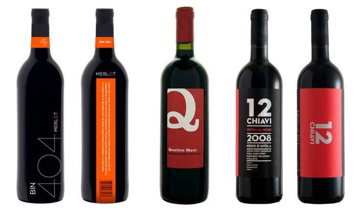
I know it’s not wise, but I am definitely prone to choosing a wine based on its label rather than its vintage, mostly due to ignorance on the subject of fine wine, but also because as a graphic designer I am apt to go for the nicely designed label. And within the nicely designed label category, I am most likely to be lured by a nicely designed, typography-driven label.
Here is a small selection of mostly typographic wine labels that caught my eye on Lovely Package, Graphic Exchange, and, of course, FreshDirect.
Please credit the designers.