Gregos: Masking the Streets of Paris

Street art in Paris, painted plaster self-portrait masks, Gregos, graffiti, collabcubedStreet art in Paris, painted plaster self-portrait masks, Gregos, graffiti, collabcubedStreet art in Paris, painted plaster self-portrait masks, Gregos, graffiti, collabcubedClick to enlarge

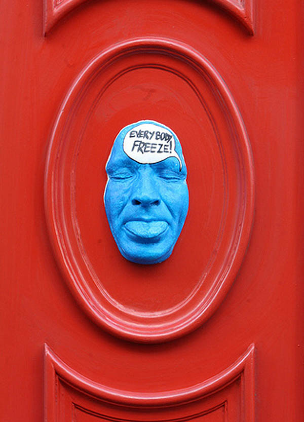
A couple of years ago, on a trip to Paris, we noticed many of these masks emerging from the walls around town. I came across a photo from that trip the other day and decided to google the artist. Gregos, as he is known, grew up in the suburbs of Paris and started graffiti painting in the late 80s. After stints in Athens, Greece and Boston, where he learned sculpting and painting, Gregos returned to Paris and street art, this time inventing his own 3D style combining all his newfound skills: sculpture, molding, and painting.

There are presently more than 400 faces, all cast from his own face — self-portraits that express his humor, thoughts, and most everything about Gregos.

You can see plenty more of these faces on his website and his flickr.

Jean Daviot: Typographic Wordscapes

Typography landscapes, wordplay in grass, Lieu Lien, French art, Jean Daviot, type installationTypography landscapes, wordplay in grass, Memoire, French art, Jean Daviot, type installationTypography landscapes, wordplay in grass, Imagine, Memoire, French art, Jean Daviot, type installationClick to enlarge

French artist Jean Daviot works in a variety of mediums including painting, photography, video, and installation art. Throughout, he plays with aural and linguistic analogies. In his installations he is particularly interested in wordplay; in seeing words and type as shapes and then in essence dissecting them and seeing the words within the words. For example: MEmoiRE (memory), a word he uses in several installations, contains the letters M-O-I (self) inserted between the word MERE (Mother). He likes to take the words literally and then turn them upside down.

From the artist:
I’m particularly aware of those moments called entre chien et loup in French (twilight, when a wolf can’t be distinguished from a dog), those fleeting instants when day turns into night or vice versa and shapes are seen in a different light. All of my work is situated in this slippery moment, this passage in one direction or the other, that instant that suddenly reveals the face of things you thought were hidden and now suddenly can be seen, like the appearance of shapes through the intervention of an artwork that invites interpretation.

via documents dartistes and artpress

And That’s the Way it Is: Ben Rubin

Projected newsfeed onto University of Texas Facade, Ben Rubin, Cool art installation, Walter Cronkite Plaza, AustinProjected newsfeed onto University of Texas Facade, Ben Rubin, Cool art installation, Walter Cronkite Plaza, AustinProjected newsfeed onto University of Texas Facade, Ben Rubin, Cool art installation, Walter Cronkite Plaza, AustinClick to enlarge

A few weeks ago, The University of Texas dedicated one of their plazas to the legacy of Walter Cronkite. The newly named plaza was debuted along with media artist Ben Rubin’s (previously here) art installation titled And That’s The Way It Is; a digital interface that intertwines transcripts of Cronkite’s legendary broadcasts with contemporary journalism, projected in a beautifully choreographed manner (reminiscent of Jenny Holzer’s work) as compositions of moving text, onto the façade of the CMA building, overlooking the Walter Cronkite Plaza.

From austinist:
The profound differences between Cronkite’s world and ours are felt as the projection evolves, both in their content and manifestation within Rubin’s piece. For the Cronkite transcripts, Rubin slows the pace and allows the text to move slowly up and down the CMA with fully legible quotes. When projection segues to live news feeds, the text flies across the building, occasionally as just snippets of stories and other times with full news coverage. The words overlap and eventually become so dense that the overwhelming presence of media becomes the dominant character in Rubin’s piece. Rubin accurately portrays this amassing of information and reinforces the oversaturation of current journalism.

The permanent installation is on display nightly from dusk to midnight on the southern façade of the College of Communication A Building on the UT Austin Campus.

You can see the installation in action below:

Photos courtesy of the Ben Rubin and Paul Bardagjy.

via frame and austinist

Guildor: Write on the Water

Typography, Typographic installation in Milan, Amsterdam, Words floating on water, Guildor, Street artTypography, Typographic installation in Milan, Amsterdam, Words floating on water, Love, Guildor, Street artTypography, Typographic installation in Milan, Amsterdam, Words floating on water, Guildor, Street artClick to enlarge

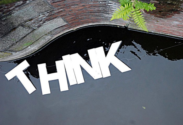
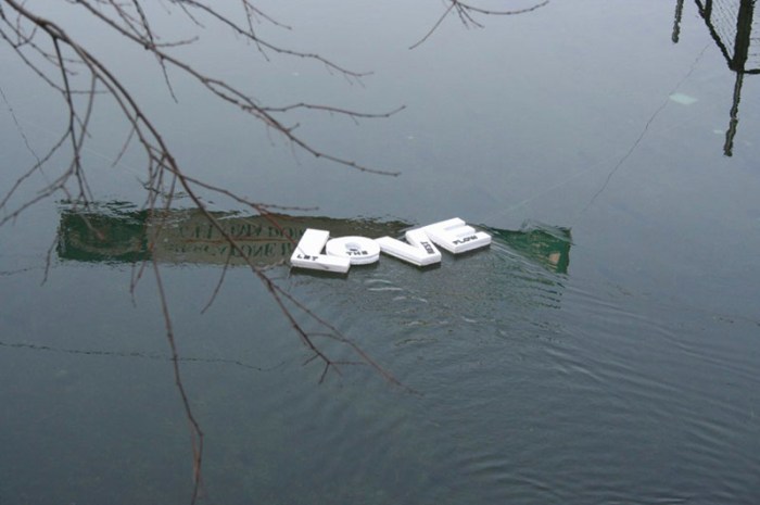
I can just imagine the smiles provoked by coming upon Milan-based street artist Guildor’s floating phrases. Write on the Water (love the punniness) is a series of installations created by the artist in several cities including Amsterdam, Milan, and Venice. Linking foam letters together to create words and statements such as “Clap First”, “Happiness Happens”, “Think Once and a Half”, “Pensa Spensierato (Think Carefree)”, and “Love; Let the Rest Flow” and floating them on water – from fountains to rivers and canals – is simply a happy and nice concept.

From the artist:
Writing on water is like writing down a thought in order to keep it secure even when it is shaken by the course of life, to distinguish the important things from those you should just let flow by.

If you like this you’d probably enjoy Nicole Dextras’ Ice Typography installations, too.

Top photo by Nicole Blommers; Once and HA photos by Andrea Bertolotti; all others by Thomas Pagani.

via flickr

Multipraktik: TapeArt

Street art from Slovenia, Murals made with colored tape, graphic designers, multipraktikStreet art from Slovenia, Murals made with colored tape, graphic designers, multipraktikStreet art from Slovenia, Murals made with colored tape, graphic designers, multipraktikClick to enlarge

The Slovenian, multi-disciplinary, design collective Multipraktik organized a series of street TapeArt actions – with different artists across Slovenia – as part of the new campaign for Orto, a cellphone carrier company. Aside from the resulting wonderful murals, it looks like these guys had a lot of fun. Take a look at one of the many stop-motion videos below.

via urban pride

Evol: Repeat Offender

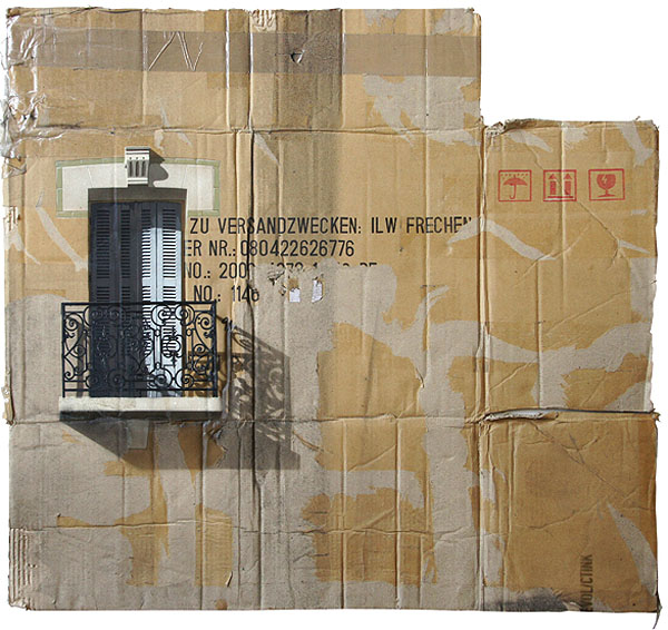
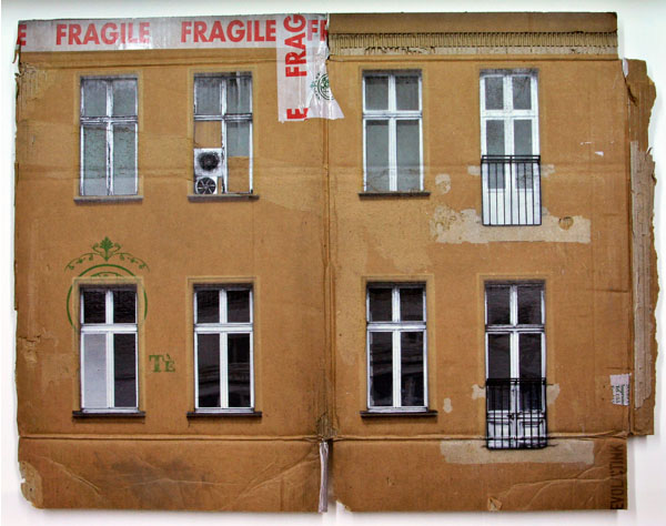
Cardboard paintings of buildings in Berlin, spray paint on cardboard, EVOL, Repeat Offender exhibit at Jonathan Levine GalleryCardboard paintings of buildings in Berlin, spray paint stenciled on cardboard, Evol, Repeat Offender exhibit at Jonathan Levine GalleryCardboard paintings of buildings in Berlin, spray paint stenciled on cardboard, Evol, Repeat Offender exhibit at Jonathan Levine GalleryBerlin-based artist Evol – known best for his street art interventions of scale models of abandoned and decaying buildings left on electrical boxes and cement blocks in cities around the world – currently has his first solo show in the United States at the Jonathan LeVine Gallery in Chelsea. Repeat Offender, as the exhibition is titled, is a collection of Evol’s recent work of multi-layered stencil paintings on used and flattened cardboard boxes, as well as other paintings on scrap metal. These works continue to convey general urban decay and, more specifically, the walls and façades of pre-gentrified East Berlin. Incredibly realistic (I thought they were photo-silkscreened), these spray-painted pieces work beautifully on their chosen canvases. The combination of the painted façades with the type, tape, and icons on the original boxes gives them a wonderful texture. Though they photograph well, seeing these in person, as with most art, adds another dimension.

Repeat Offender will be at the Jonathan LeVine Gallery through this Saturday, May 5th.

You can watch a video of Evol’s process here.

Photos courtesy Jonathan LeVine Gallery.

Henrique Oliveira: Labyrinthine Installations

Amazing bursting labyrinthine wood installations, Brazilian contemporary art installations by Henrique OliveiraAmazing bursting labyrinthine wood installations, Brazilian contemporary art installations by Henrique OliveiraAmazing bursting labyrinthine wood installations, Brazilian contemporary art installations by Henrique OliveiraClick to enlarge

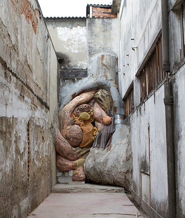
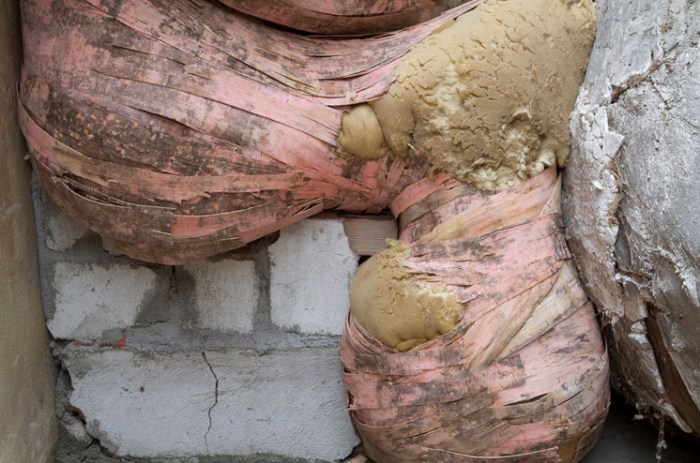
Brazilian artist Henrique Oliveira, based in São Paulo, started as a traditional painter, but after some time he started experimenting with scraps of wood found in his father’s woodworking shop as well as on the streets. In many ways his installations are seen as his own unique style of painting. With these splintered  scraps of wood as his pictorial material, Oliveira evolved from a painter and sculptor to simply an artist.

His large-scale, labyrinth-like installations burst through walls and façades in a sculptural, painterly, and collagey way. Inside, these works resemble the interiors of caves and, in some ways, the inside of the human body as entered through a vaginal-like entrance. The gigantic and jammed quality of these ‘paintings’ sprawl out of exhibition spaces and buildings in a beastial and amazing manner.

Oliveira’s most recent exhibit just closed yesterday at the Offenes Kulturhaus in Linz, Austria, but coming up in July he will be having another show in Galeria Millan in São Paulo.

via ok-centrum

Roman Tyc: Semafory

Prague Street Art, Roman Tyc, Ztohoven, Traffic Light art, switched images of traffic lightsRoman Tyc, Ztohoven, Traffic Light art, switched images of traffic lights, Prague Street Art, Roman Tyc, Ztohoven, Traffic Light art, switched images of traffic lights, Prague Street Art, Roman Tyc, Ztohoven, Traffic Light art, switched images of traffic lights, Prague Street Art, Click to enlarge

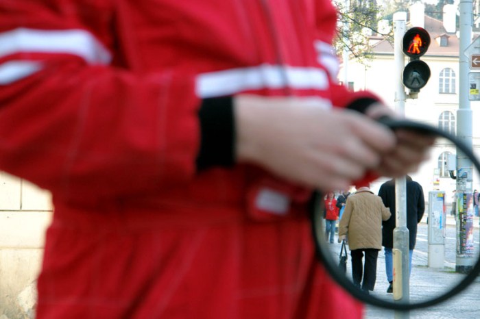
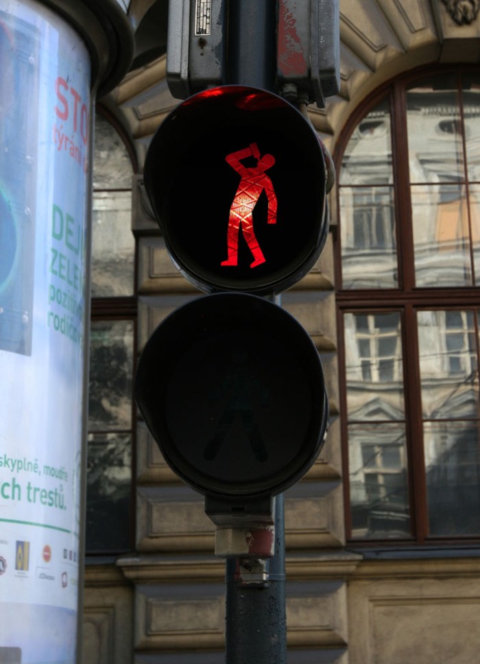
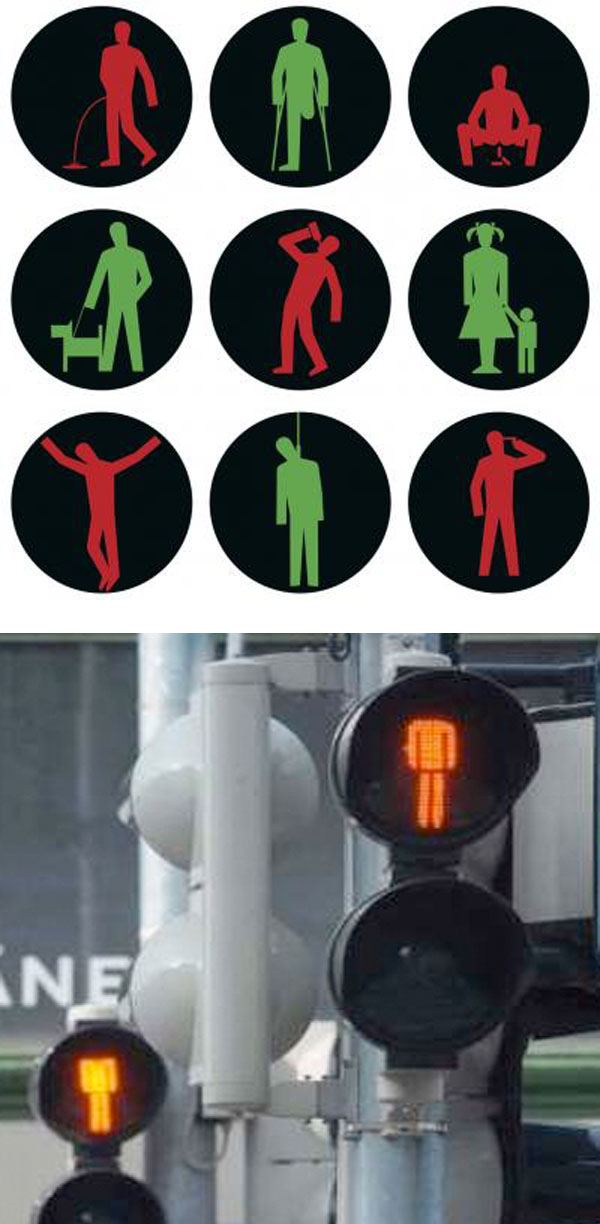
Czech artist Roman Tyc (née David Hons), member of the guerilla art group Ztohoven, replaced 48 traffic lights in Prague by amending the standard red and green figures to show them in situations such as drinking, urinating and being hanged, as well as more benign ones such as a man walking his dog. The act was embraced by the public as great fun (as well as awarded top prize at Austria’s Sidewalk Cinema Festival in Vienna that year) but, naturally, not so much by the authorities. Tyc had to pay for repairs in addition to a large fine. Tyc paid for the repairs but, refusing to pay the fine, was sentenced to 30 days in prison this past February. In protest, his supporters signed petitions and ‘decapitated’ – by blacking out the heads –  traffic light figures throughout the Czech Republic. Despite their efforts, Roman Tyc served the 30 days and was released in March.

Here’s a video of the installation:

via gestalten

Simone Decker: Chewing in Venice 1 + 2

Photography, Trompe l'oeil, oversized gum sculptures, Venice, Simone Decker, contemporary artPhotography, Trompe l'oeil, oversized gum sculptures, Venice, Simone Decker, contemporary artPhotographs, Chewing Gum, Bubble gum art, trompe l'oeil, Venice, Simone DeckerThese photos are a lot of fun. Luxembourger artist Simone Decker created them in 1999, but I just happened upon them for the first time now. Decker is interested in perspective shifts and often explores the way public space is arranged. Much of her work appropriates said space as in her photographic series shown above: Chewing in Venice 1 + 2. Using photographic trompe l’oeil devices, Decker includes the streets and squares of Venice as the backdrop for her oversized gum sculptures; a proposal for sculptural work, or at least that’s the way I understand it.

From an article translated on her website:
All of these works consist of photographs, mostly series of photographs, that propose sculptures or architectural elements for the public domain. They are documentations of real outside installations of these objects. But it is only the perspective of the camera that lends the works a visual presence and a dimension that puts them in the relationship to the urban or architectural environment desired by the artist. In Chewing in Venice, for example, the chewing-gum objects only become sculptures that fill squares and lanes by virtue of the fact that they are photographed right in front of the lens.

Those big bubbles remind me a bit of the RedBall Project. I think the realization of these sculptures would be a huge hit.

via chiquero

David Shillinglaw: Street and Studio Art

Street art in Capetown, UK, David Shillinglaw, Dodie Boy, illustration, graphic designStreet art in Capetown, UK, David Shillinglaw, Dodie Boy, illustration, graphic designStreet art in Capetown, UK, David Shillinglaw, Dodie Boy, illustration, graphic designClick to enlarge

London based artist David Shillinglaw’s (aka Dodie Boy) work is new to me, at least by name, but by the number of street art blogs that came up when googling, I have a feeling I may be in the minority. Either way, I really love it. Shillinglaw’s work moves between street and studio, usually working on multiple projects at once…no time for boredom! His bold, colorful, type-infused illustrations convey the ups and downs of life, often including humorous idioms and metaphors.

From the artist:
“I enjoy the way people use language to define a feeling or physical condition. We support what we think, feel, say, and mean, with often ridiculous idioms and metaphors; placing frogs in throats and fires in belly’s, in order to paint a picture of something invisible and abstract. I feed on these very human expressions. I find day-to-day, conversational poetry casts a warm light on an otherwise very calculated, systematic, clinical and scientific world. My work is about people. Human nature. Both the civilized and monstrous, the stupid and articulate.”

Here’s a nice interview with Shillinglaw, and you can see more of his work on his website and blog.

via dirtcheapmag

Nick Georgiou: Book & Newspaper Sculptures

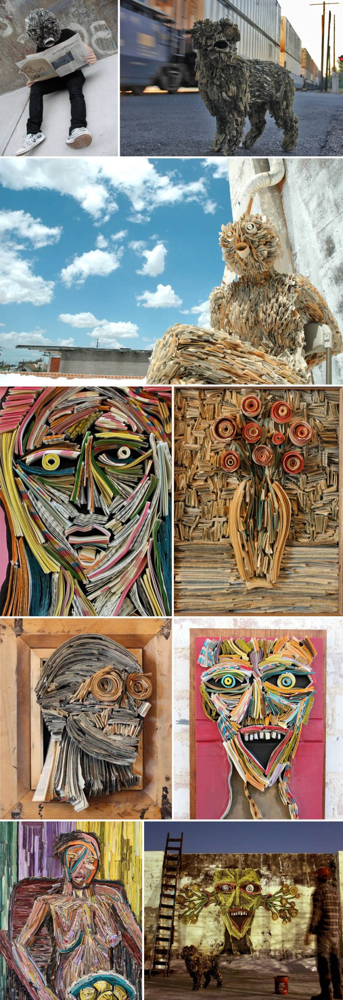
Sculptures made from newspapers and books, inspired by death of print, Nick GeorgiouSculptures made from newspapers and books, inspired by death of print, Nick GeorgiouSculptures made from newspapers and books, inspired by death of print, Nick GeorgiouClick to enlarge

Reflecting on the shift away from print to digital in our current society, New York artist Nick Georgiou (presently residing in Arizona) creates sculptures, both two- and three-dimensional, by meticulously hand-stitching books and newsprint that he finds on the streets, and then integrates into the urban environment.

From Georgiou’s blog:
My art is inspired by the death of the printed word. Books and newspapers are becoming artifacts of the 21st century. As a society we’re shifting away from print consumption and heading straight towards full digital lives. My sculptures are products of their environment —both literally and figuratively. As often as I can, I use local newspapers to add authenticity, and the form the sculpture takes is a reflection of the personal connection I feel to that particular city. From a day-to-day standpoint, I’m heavily influenced by my surroundings. These days, I draw inspiration from America’s South West, and in particular Tucson, AZ–where I’ve lived and worked for almost four years. Going from NY to the desert is a pretty dramatic shift. Your concept of space expands when it’s not obstructed by buildings. You pay closer attention to nature because you’re always in it—and you do what you can to preserve it.

You can see much more of Nick’s work on his blog.

via citizens artist collective

Javier Siquier: Graffiti Removal

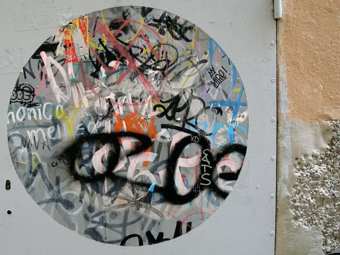
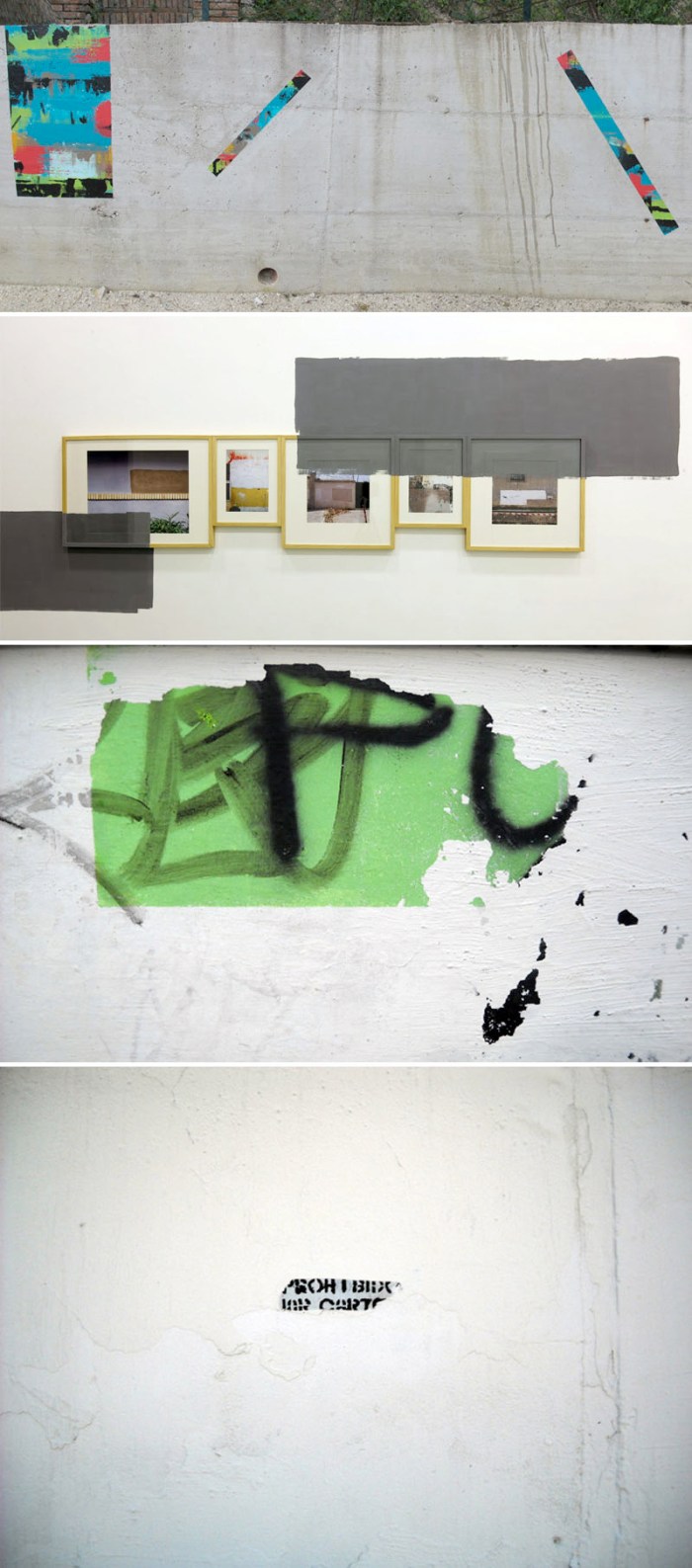
Javier Siquier, Spanish Street Art, Graffiti, Graffiti removal, OA, collabcubedJavier Siquier, Spanish Street Art, Graffiti, Graffiti removal, OA, collabcubedJavier Siquier, Spanish Street Art, Graffiti, Graffiti removal, OA, collabcubedSpanish graphic designer, illustrator and street artist Javier Siquier seems intrigued by reversal. Recently, he created a series of work on the streets titled Graffiti Removal where he whites out graffiti, leaving blocks of (mostly) white paint, as if redacting the words from the streets.

In the works above, which I really like, he neatly whites out the surrounding area exposing just enough graffiti, making it neat and graphic. Almost like a patterned appliqué. Love it! Conversely, in his exhibit presently up at the SC Gallery in Bilbao, Siquier frames photos of his Graffiti Removal works and paints the gallery walls to overlap the frames. A nice effect.

via vandal hostel via escrito en la pared

No Longer Empty: “This Side of Paradise”

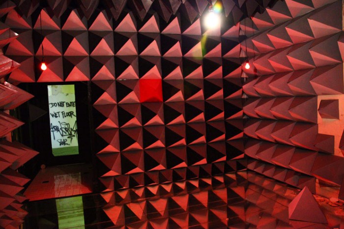
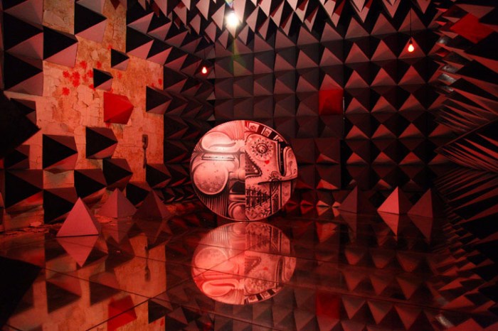
Bronx Senior Citizens Home revitalized with street artist's site-specific works, No Longer Empty, Andrew Freedman HomeBronx Senior Citizens Home revitalized with street artist's site-specific works, No Longer Empty, Andrew Freedman HomeBronx Senior Citizens Home revitalized with street artist's site-specific works, No Longer Empty, Andrew Freedman Home, Crash, How and Nosm, Daze, Cheryl Pope, Adam Parker SmithClick to enlarge

The contemporary public art organization No Longer Empty, is revitalizing the Andrew Freedman Home — a block-long mansion along the Grand Concourse in the Bronx, originally built as a welfare hotel for the retiring wealthy who had fallen on hard times beginning in the 1920s and lasting into the 80s, when it was taken over by the non-profit Mid Bronx Senior Citizens Council — by inviting 32 artists to create site-specific works.

Many of the artists included are well known graffiti artists such as Crash, Daze, and How & Nosm who have each taken one of the rooms and are bringing them to life. There is a bit of irony in the choice to invite street artists to revitalize the grand mansion when its decline coincided with the rise of Bronx graffiti in the 70s and 80s, but there are also parallels which the curator points out: “…the role of the artist rising from the ashes of the burned-out neighborhoods then and an art show in the decay of this home now.”

The exhibit, titled This Side of Paradise, begins the evening of April 4th through June 5th, and will open the gates of the Andrew Freedman Home to the public.

Photos by Jaime Rojo. Top to bottom: How & Nosm Reflections; Crash Connections; Daze; Adam Parker Smith, I Lost All My Money In The Great Depression And All I Got Was This Room; Scherezaede Garcia; Cheryl Pope, Then and There

via Brooklyn Street Art

Bikeway Belém: P-06 Atelier

Bikeway Belém, Lisbon, Portugal, Typographic bike routes, wayfinding, symbols, collabcubedBikeway Belém, Lisbon, Portugal, Typographic bike routes, wayfinding, symbols, collabcubedBikeway Belém, Lisbon, Portugal, Typographic bike routes, wayfinding, symbols, collabcubedClick to enlarge

The way I see it, most everything is improved with a little typography. Bicycle paths included. The Bikeway Belém in Lisbon is a prime example. The 7,362-meter bike route along the river Tagus has bold white wayfinding text and symbols painted directly on the pavement which, apart from its practical purposes such as providing direction and measuring distances, is also fun and engaging. There are some ‘zuuuums’ and ‘vuuuums’ printed around as well as arrows and questionmarks that always look good. In addition, along one of the piers, there’s a verse by Portuguese poet Alberto Caeiro about the river Tagus. The project was a collaboration between the Lisbon-based communication and environmental graphics studio P-06 Atelier (previously here) and Global Landscape Architects.

As much as I love the Hudson River bike path, I think a project like this would only enhance it even more.

Photos courtesy P-06 Atelier and Decorating the Duck.

via segd

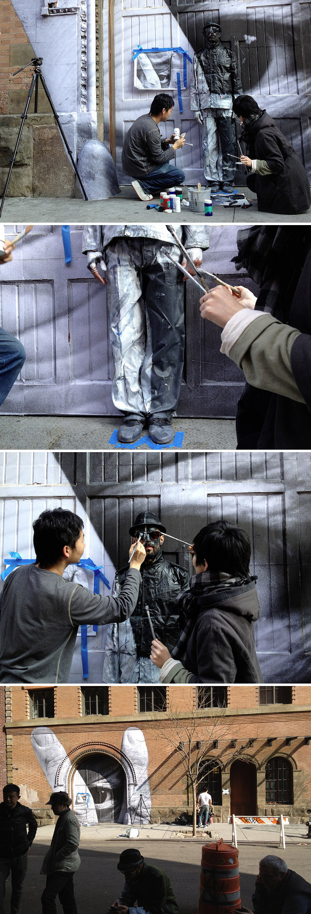
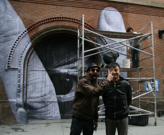
JR and Liu Bolin Collaboration in Nolita

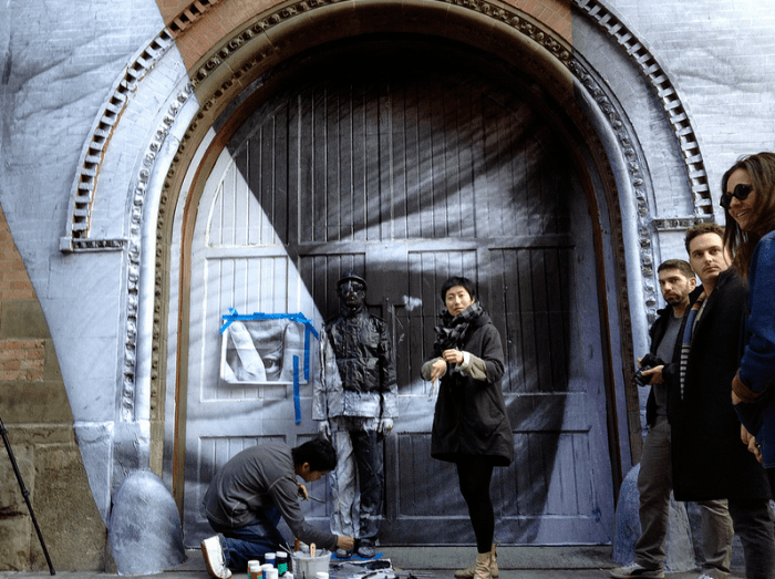
NYC Street Art, JR, Liu Bolin, collaboration, graffiti, awesome art, collabcubedNYC Street Art, JR, Liu Bolin, collaboration, graffiti, awesome art, collabcubedNYC Street Art, JR, Liu Bolin, collaboration, graffiti, awesome art, collabcubedJR and Liu Bolin collaborating in Nolita, Elizabeth and Spring, March 18, 2012French street artist JR (previously here) and Chinese artist Liu Bolin (previously here) have collaborated in Nolita, NYC, on a great looking work. NewYorkStreetArt has documented the ‘making of’ Liu Bolin’s part on her flickr here. Love it.

I’m going to take a guess that this has something to do with the opening of Liu Bolin’s exhibit Lost in Art at Eli Klein Fine Art in Soho today, which will be up through May 11th, 2012. Happy Spring!

UPDATE: JR’s mural is a photo of Liu Bolin. You can see the first stage of JR’s wheatpasting over at Arrested Motion.

All photos NewYorkStreetArt’s flickr except bottom photo from Arrested Motion.  

Occupy Chairs by Sebastian Errazuriz

Occupy Wall Street Chairs, OWS, the 99 Percent, 99%, the 1%, Occupy Chairs, furniture design, contemporary artOccupy Wall Street Chairs, OWS, the 99 Percent, 99%, the 1%, Occupy Chairs, furniture design, contemporary artOccupy Wall Street Chairs, OWS, the 99 Percent, 99%, the 1%, Occupy Chairs, furniture design, contemporary artClick to enlarge

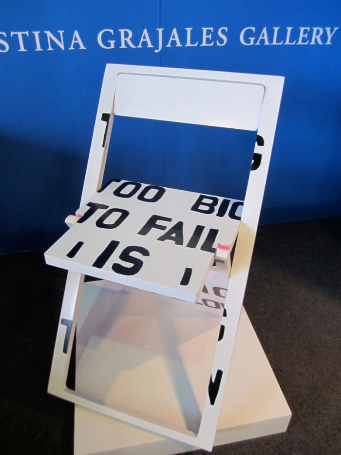
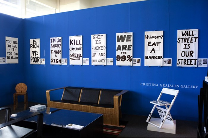
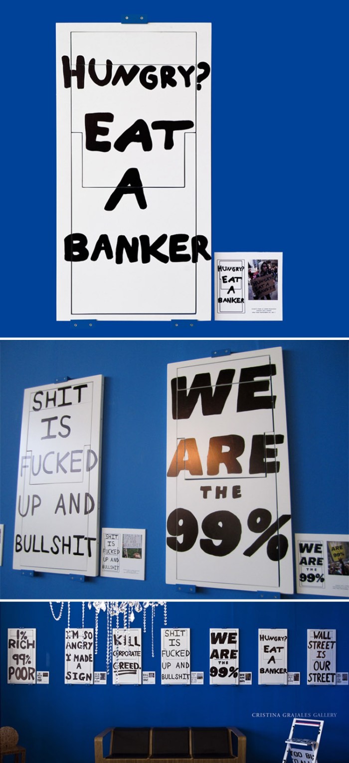
Chilean-born, New York-based artist and designer Sebastian Errazuriz definitely has a provocative sense of humor with his heart and brain in the right place. Smack in the middle of one of the aisles at Pier 92 of the Armory Show this past weekend, in a prime rest/lounge area, were his Occupy Chairs. Targeting the art-collecting 1%, Errazuriz invited them to purchase these white folding chairs painted with the Occupy Wall Street movement’s slogans, to raise money in support of the 99% as well as integrating the messages of the larger group into the homes of the smaller one. In essence, transporting the movement’s placards into private lives of those they are protesting. Political statement, general awareness, and a fundraiser all rolled into one. Genius if they actually sold at $2,500 a piece!

There are eight Occupy Chair designs with 10 of each slogan all available through the Cristina Grajales Gallery.

Second and bottom photos courtesy of the artist and Cristina Grajales Gallery; all the rest by collabcubed

CollabCubed at 1

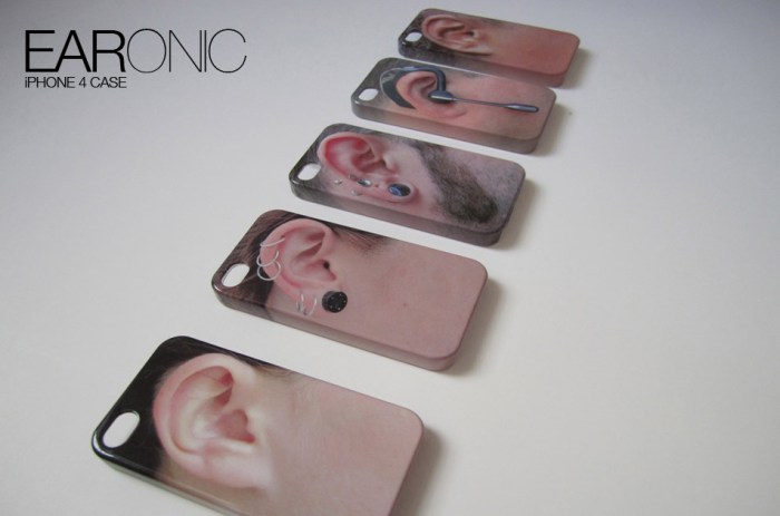
Last week marked our one year anniversary as a blog and, though not an especially remarkable feat in this sea of blogs, it seems like a good time to say of few words and acknowledge some people. It’s been a fun year for us and surprising how this blog, as well as a few related side projects, have been major topics of conversation between the three of us even at a semi-long distance. We’ve had fun trying to come up with somewhat unique content and it’s been really satisfying, and sometimes a little thrilling, to have many of the blogs and sites that we admire pick up some of our posts. Notcot and Rugenius (aka Jean and Justine) over at notcot.org have picked up many of our submissions and have been instrumental in giving us exposure. You can see our collabcubed posts on their pages here. Christopher Jobson at the amazing Colossal has had many kind words for us and been very supportive, as well as picking up several of our posts during the year and kindly linking back to us…this is where the little thrills came in. Same goes for the wonderful thisisnthappiness. And a big thanks to holycool and the always generous swissmiss for being the first ones to post our EARonic phone cases causing them to go viral with buyers cropping up all over the globe and eventually leading to a deal with Fred and Friends who will be distributing a variation on Daniela’s initial concept starting next month but, have no fear, we continue to sell our own EARonic models at our shop.

We’ve got other exciting projects in the works for this year, starting with being selected to exhibit our EARonics and some other designs at the Designboom Mart at the ICFF 2012 in New York this May, which has us super excited, but we’ll talk more about that later.

In the meantime we’ve added a bunch of photos and links to our facebook page – we’ll be adding more in the next few days – making it easier to look at some older posts, so maybe you’d like to ‘like us’ there if you haven’t already, and of course there’s also twitter, or subscribe to our RSS feed or emails.

Below are a few of our most popular posts this past year (in case you missed them the first time around); click on the photo to go to the post. Most importantly, thanks to all of you for following our blog and making it fun for us to keep posting.

Sang Sik Hong Plastic Straw Sculptures

Nicole Dextras Ice Typography
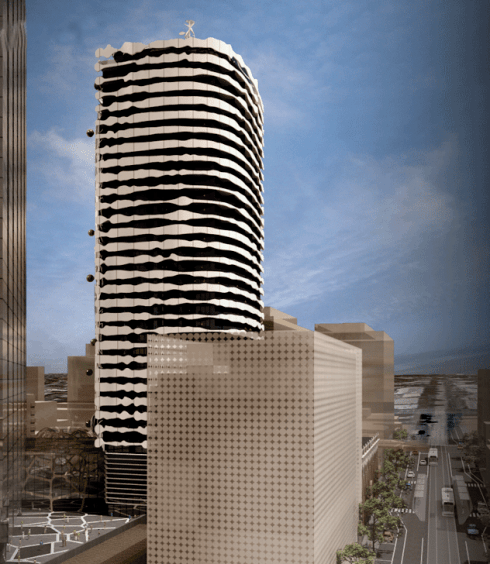
The Portrait Building by ARM Architects
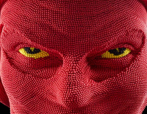
Matchheads by David Mach

Blackfield by Zadok Ben David

The Transfinite: Ryoji Ikeda
The Twist Bridge

Ana Soler: Causa-Efecto
EARonic iPhone Cases by Daniela Gilsanz