Baltimore Love Project: Michael Owen

Love Mural by Michael Owen, Baltimore Love Project, fosters community, and good will. Street artLove Mural by Michael Owen, Baltimore Love Project, fosters community, and good will. Street artLove Mural by Michael Owen, Baltimore Love Project, fosters community, and good will. Street artClick to enlarge

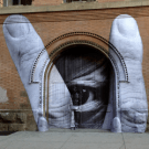
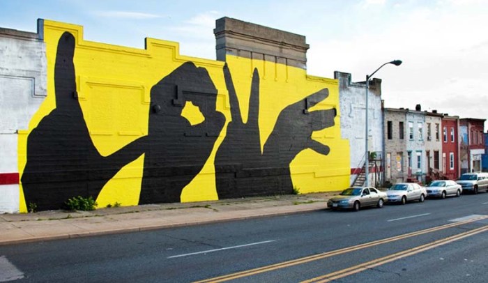
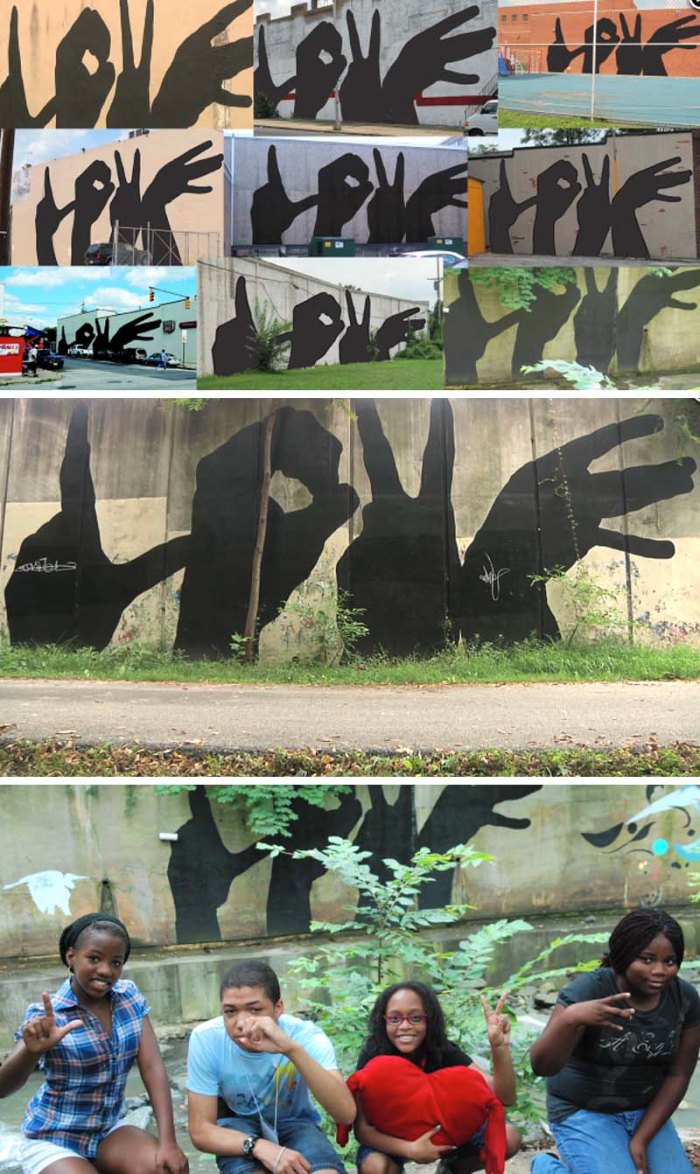
Seems fitting to post about a love mural on Valentine’s Day, no? The Baltimore Love Project began a few years ago when local artist Michael Owen developed a design of four hands spelling out the word love. Since then the image has been painted on several walls with a total of 20 scheduled across Baltimore City; the idea being a way of expressing love and connecting people and communities all around the urban center. The community seems to have lovingly embraced the project with an impressive level of enthusiasm including a couple taking their wedding photos in front of one of the murals.

You can see a time lapse video of one of the murals in progress below, and there’s a 5-minute documentary on the project over here.

via think.bigchief via notcot

Buchstaben Museum: Museum of Letters

Berlin Museum on Typography, signage, letters. Type museum, Museum of Letters, Buchstaben Museum,Berlin Museum on Typography, signage, letters. Type museum, Museum of Letters, Buchstaben Museum,Berlin Museum on Typography, signage, letters. Type museum, Museum of Letters, Buchstaben Museum,Click to enlarge

Well this is something I’ll definitely check out when I make it over to Berlin. Buchstaben Museum (Museum of Letters) is devoted to preserving and documenting letterforms. It is nestled away in the back of a mall and houses a beautiful collection of found type, which the owners have rescued from around the world. The sizes of type vary, and the conditions of each piece too. All the letterforms are piled up over several rooms, some rooms are color coordinated. Neon letters that are still in working order are presented in all their glory. Sounds like a graphic designer’s dream museum!

Photos: Buchstaben Museum; frankrolf’s flickr; and olex.

via berlin design guide

Ed Young: Irreverent Edginess

Contemporary South African Art, Ed Young, Provocative art, Edgy art, My Gallerist Made Me Do itContemporary South African Art, Ed Young, Provocative art, Edgy art, My Gallerist Made Me Do itContemporary South African Art, Ed Young, Provocative art, Edgy art, My Gallerist Made Me Do it, Desmond tutuClick to enlarge

South African conceptual artist Ed Young enjoys challenging the art world and its methodologies working in various mediums ranging from sculpture and painted type murals to videos and more. And his work does not go unnoticed. Last year at the Jo’burg Art Fair, Young created an exact-to-scale silicone replica of his naked self at two-thirds his actual size, titled My Gallerist Made Me Do It, fascinating most of the 8,500 attendees of the fair. His piece titled Arch (short for Archbishop Desmond Tutu) swings from a working chandelier in the conference room of the IDASA headquarters, and apparently brought huge smiles to the Archbishop himself upon setting eyes on it.

Young’s murals are equally provocative in their bold type. Unknowingly, we ourselves came across one of Young’s murals a few years back in Miami…that’s Em in the bottom right photo!

Young doesn’t say a heck of a lot about his work when interviewed as you can see in the video below.

via SMAC

La Chaleur de L’amour & la Beauté des Paroles

Cool light installation by Jad k. Melki, mattress, lights, springs and wires shaped as typeCool light installation by Jad k. Melki, mattress, lights, springs and wires shaped as typeCool light installation by Jad k. Melki, mattress, lights, springs and wires shaped as typeClick to enlarge

This installation caught my eye. La Chaleur de L’amour & la Beauté des Paroles (The warmth of love & the beauty of words) was created by Jad Melki, assistant professor of journalism and media studies at the American University of Beirut as well as visiting Faculty at Johns Hopkins University in Washington, DC. Melki’s piece represents presence in absence. Using an exposed mattress and warmly lighting it to make it glow, Melki converted its inner springs into words and sentences extracted from letters written by his mother when she was in Sierra Leon in 1974 to his father at the American Univeristy of Beirut. His father read the letters nightly, finding warmth and comfort in them and, in turn, feeling his wife’s presence in her absence. Nice.

Photos by Micheline Nahra

via anonymousd

Styn Flipper: Sam van Doorn

Pinball machine turned design/drawing tool; Styn Flipper by Sam Van DoornPinball machine turned design/drawing tool; Styn Flipper by Sam Van DoornPinball machine turned design/drawing tool; Styn Flipper by Sam Van DoornClick to enlarge

For his senior project, Dutch designer and typographer Sam van Doorn designed Styn. a deconstructed pinball machine reconstructed as a design tool. The idea behind the installation is that by creating new tools one is able to break free from standards in design. By playing the machine the balls create an unpredictable pattern, and the better the player the better the print. Somehow, the grid used relates to the signs of the alphabet, tying it into typography but, in all honesty, I couldn’t figure out what that means exactly. In any case, the concept is pretty unique and fun.

via etapes

7-Eleven Rebrand: BVD

7-Eleven, 7Eleven, Rebrand of 7-eleven in Sweden by BVD, logos, corporate identity rebranding7-Eleven, 7Eleven, Rebrand of 7-eleven in Sweden by BVD, logos, corporate identity rebranding7-Eleven, 7Eleven, Rebrand of 7-eleven in Sweden by BVD, logos, corporate identity rebrandingClick to enlarge

There’s been a recent resurgence of 7-Eleven shops around NYC, much to my dismay. In fact, I’ve always associated the chain with the suburbs and find it surprising, and a little depressing, that they should be cropping up all around town. But maybe, just maybe, it would be a little less painful if they were to implement the new identity BVD created for their Swedish market; foregoing the retro look for a clean and modern one.

via visuelle

Ghost of a Dream: Luck & Lust

ghost of a dream, collages made of lottery tickets and romanc novel covers, cool art, art installationsghost of a dream, collages made of lottery tickets and romanc novel covers, cool art, art installationsghost of a dream, collages made of lottery tickets and romanc novel covers, cool art, art installationsClick to enlarge

A couple of our favorite works at the What Do I Owe You? exhibit that we saw a few weeks back were by the artist duo Adam Eckstrom and Lauren Was that go by the name of Ghost of a Dream. Ghost of a Dream create sculpture, collages, and installations typically using discarded materials popular culture; mostly discarded lottery tickets and romance novel covers, though much of their other works involve handwritten type and positive and negative areas created by it. But, getting back the the lottery tickets: it’s interesting to see the juxtaposition between the luxurious items they depict and the discarded elements used in hopes of reaching those lofty goals, whether it be wealth via lottery tickets or the dream of love via romance novels. These collages and installations are intricately detailed creating impressive patterns that look more like Oriental rugs than thousands of scratch-off game cards. The artists state, “The “scratchers” are collected from gas stations, grocery stores, bars, and streets around the world. The scratch tickets represent real dreams that usually disappear just as quickly as they came.”

Update: Just came across this interesting interview with these two over here.

Glenn Ligon: Neon

Neon art, Neon Type, by Glen Lidon at Luhring AugustineNeon art, Neon Type, by Glen Lidon at Luhring AugustineNeon art, Neon Type, by Glen Lidon at Luhring AugustineClick to enlarge

Being a type and neon enthusiast, you can imagine my delight upon entering the Luhring Augustine Gallery in Chelsea last month and discovering Glenn Ligon’s Neon exhibit. Bronx-born Ligon still lives and works in NYC. His works explore themes such as race, sexuality, and language. He uses evocative text including quotes from historically relevant material that at times is culturally charged.

Neon will be on exhibit at Luhring Augustine through January 19th, 2013.

From the C3 Archives: Part II

catwoman-as-saint_igor-scalisi-palminteri_agiografie_collabcubedAnaSoler_collabcubedjean-francios-fourtou_tombee-du-ciel_lille-fantastique-2012_collabcubed

red_people_scooters_pprofessors_collabcubedLiu_Wei_collabcubedjr-liu-bolin_nolita_nyc_nystreetart_collabcubed

Kukje-Art-Gallery_collabcubedthe_twist_bridge_west-8-architects_collabcubedsaddam-hussain_stephen_ives_mrdictatorhead_collabcubed-e1324268209235

roman_tyc_semafory_collabcubedjuergenmayerh_berlinische-galerie_collabcubedkuggen_the-cog_wingacc8ardh-architects_collabcubed

p06-atelier_belem-bikeway_collabcubedcracking-art-group_milan-duomo_regeneration2_collabcubedSnarkitecture_MiamiBowl_collabcubed

Here are some more of our popular posts from 2012. Superhero Saints; Ana
Soler’s suspended bouncing balls; the House that Fell from the Sky; the Red People in Russia; Liu Wei’s amazing Cityscapes made from schoolbooks: Liu Bolin’s fun collaboration with JR; So-il’s Kukje Gallery; the amazing Twist Bridge; the Mr. Dictator Heads; Roman Tyc’s replacement traffic lights; J. Mayer H.’s cool number installation Rapport; Kuggen the colorful cog; a typographic bike path; Giant snails take over the roof of a Milan cathedral; and Snarkitecture’s Memorial Bowling.

Click on the photos to be taken to their corresponding post.

From the C3 Archives

key_frames_Groupe_LAPS_collabcubedSlinky_Springs_Tobias_Rehberger_collabcubedRubbertree

MiddleKingdomPorcelainCleaningBottlestrampoline-bridge-paris_azc_2_collabcubedStags_Piccinini_small

Barcode_Garcia-FraileCupnoodles_Museum_Yokohama_collabcubedboa-mistura_brasilandia_typography_street-art_collabcubed

TrafficConeArtandDesignKunsthofpassage_Germany_collabcubedCaitlind-Brown_Cloud_collabcubed

Tiger-and-Turtle-magic-mountain-landmarke-thomas-mayer4-collabcubedsergio-garcia_mad-tricycle_collabcubedcmyplay_by_av_studio_collabcubed

HighTrestleBridge_collabcubedMolecule_PurifiedTap_collabcubedUntitled-1-2586

We’re taking a few days off to enjoy the holidays. In the meantime here are some of our favorites from the archives. Click on an image above to be taken to its post, or feel free to scroll through by category using the pull-down tab in the right margin, or randomly if you prefer. You can always like us on facebook, follow on twitter, or if email is your thing, you can subscribe at the bottom of the site.

Happy Holidays!

cartonLAB: Typographied Cardboard

Typographic cardboard polaroid photo frames for fun wedding and birthday party photo shoots, cartonLab, cardboard stands with typeTypographic cardboard polaroid photo frames for fun wedding and birthday party photo shoots, cartonLab, cardboard stands with typeTypographic cardboard polaroid photo frames for fun wedding and birthday party photo shoots, cartonLab, cardboard stands with type

Click to enlarge

Our friends over at cartonLAB (previously here and here) are working nonstop expanding their offerings with all sorts of fun products and stands made out of cardboard. And lately, much to our delight, they’ve gone a little type crazy. From their personalized Photocall Polaroid-like photo frames for weddings and parties to their impressive range of creative event stands with the type cut out or printed right on, cartonLAB has added another dimension to their work. And if that weren’t enough, they’ve also come up with a smart proposal for recycling large boxes (think Ikea furniture boxes) by printing the patterns to some of their creations on the cardboard for personal execution called Mas que Cajas (More than Boxes). Very clever.

All photos courtesy CartonLab

Architypeture IV

Typography in Architecture, Casa do Conto in Porto by PedraLiquida Architects, Architypeture, Letters on ceilingTypography in Architecture, Library by manfredinicoletti Architects, Architypeture, Letters on facadeTypography in Architecture, Library by manfredinicoletti Architects, Architypeture, Letters on Architecture, environmental design, signage, Pentagram, Ann Hamilton, Clavel Arquitectos, manfredinicoletti, grelewicz, trafiq, 81Font

Click to enlarge

Our 4th installment of Architypeture (the fusion of architecture and typography.) If you haven’t seen our other Architypeture posts you can see them here: I, II, III.

From top to bottom, left to right: Casa do Conto Arts Residency in Porto, Portugal, by PedraLiquida Architects; University Library in Udine, Italy by Manfredi Nicoletti; Seattle Central Library by Ann Hamilton and OMA (x2); One Shelley Street Offices, Sydney by Clive Wilkinson Architects; Marks & Spencer, Stratford, UK by Pentagram; San Cristobal Residential Building, Murcia, Spain by Clavel Arquitectos, photos by David Frutos (x3); Public Library in Ludoz, Poland by Maciek Grelewicz (x2); Casa do Conto Arts Residency, Porto, Portugal by Pedra Liquida Architects; Social Housing Conil de la Frontera in Cadiz, Spain by Mediomundo Arquitects; Trafiq Club/Restaurant in Budapest, Hungary by 81Font with Kiss Miklos (bottom 3).

David Meyer: Imposed Order

Imposed Order by David Meyer, installation with concentric circles of letters and words made from piles of flour spelling out Chance or Design, typography installationImposed Order by David Meyer, installation with concentric circles of letters and words made from piles of flour spelling out Chance or Design, typography installationImposed Order by David Meyer, installation with concentric circles of letters and words made from piles of flour spelling out Chance or Design

Click to enlarge

Delaware-based sculptor David Meyer’s work ranges from installations to simple objects that compel the viewer to take a second look. His installation Imposed Order is composed of three words “Chance Or Design” repeated continuously in concentric circles. The type is created on site, sifting flour into piles to form each letter. The scale and physicality of the piles of text are designed to create an illusion of permanence.

You can see much more of Meyer’s work on his website.

via ISC

Timothy Goodman: Writing on the Walls

Illustration, Graphic Design, Writing on the walls at the Ace Hotel, FlexFit, Fun Decor, typographyIllustration, Graphic Design, Writing on the walls at the Ace Hotel, FlexFit, Fun Decor, typographyIllustration, Graphic Design, Writing on the walls at the Ace Hotel, FlexFit, Fun Decor, typography

Click to enlarge

New York based Timothy Goodman is a designer, illustrator, art director and teacher. For the Ace Hotel in NYC, Goodman hand drew 99 picture frames creating a dense wall of ‘discovery’ about NYC for the common tourist staying in the room. Each frame contains a different fact/love/thing/tidbit/or place that the artist likes in the city. At roughly 120 feet, the art was drawn imprecisly to capture the spontaneity of the city, using markers and opaque black paint.

Just this past August, Goodman, in a similar style, created a wall mural for FlexFit Headwear at the Magic S.L.A.T.E. trade show in Las Vegas which he drew in real-time during the first day of the show. He came up with the idea of hand-lettering Tupac Shakur lyrics to Keep Ya Head Up on 500 sq. ft. of wall space, going round and round for about 9 hours. Apart from the great illustrated type, I’m amazed at how perfectly aligned he keeps it all. You can see a video of the FlexFit installation below:

Luckey Climber at Columbus Commons

Climbing structure, Indoor Children's Playground, Columbus, Ohio, Tom Luckey, Luckey Climber, Fun Playground DesignClimbing structure, Indoor Children's Playground, Columbus, Ohio, Tom Luckey, Luckey Climber, Fun Playground DesignClimbing structure, Indoor Children's Playground, Columbus, Ohio, Tom Luckey, Luckey Climber, Fun Playground Design

Click to enlarge

Here’s a fun-, if a bit precarious-looking structure for kids. Designed by the recently deceased Thomas Walker Luckey, an artist, sculptor and architect renowned for his one-of-a-kind climbing sculptures, this particular 35-foot “Luckey Climber” is found in Columbus, Indiana at the Columbus Commons. The indoor playground was completed in 2011 and judging from the reviews on Trip Advisor is (not surprisingly) a big hit with kids. The floating C’s alone had me sold instantly.

Photos: Susan Fleck Photography and Columbus Indiana Visitors Bureau.

Exit Sign Art

Sculpture and installations that use Exit signs, Exit Signs as ArtSculpture and installations that use Exit signs, Exit Signs as ArtSculpture and installations that use Exit signs, Exit Signs as Art

Exit sign art, installations and sculpture made with exit signs, Ingo MaurerClick to enlarge

About a year and a half ago, Daniela and I popped into the Charles Bank Gallery on the Bowery and were welcomed by Allen Grubesic’s modified Exit sign reading “EXCITING”. We both found the sculpture very clever. Since that day, when perusing gallery and artists’ websites online, I’ve run into many other sculptures and installations that repurpose old exit signs or are simply influenced by them. Also, when Emma interned at a gallery the summer before last, one of the tasks assigned to her was to research inexpensive exit signs for one of their artists who was planning to use them in his work. That’s when I realized there was some sort of trend here. I started bookmarking these works as I came across them and though there are some that I’ve lost in the shuffle, this is a roundup of most of them.

From top to bottom and left to right: Nicholas Consuegra, Untitled; Allen Grubesic, Exciting; Bobbybabe, Exit; Kelly Mark, Exist;  Rafael Lozano-Hemmer, Reference Flow; Cecile Colle & Ralf Nuhn, Exit Wall; Dana Depew, Exit Strategy; Ingo Maurer, Exit (and bottom); Foreign Flash, Exit Installation; Ji Lee, Exit, Word as Image; Marke Johnson, No Exit; Lowe+Partners, Axe Ad Campaign; Philip Cheater, First Emergency Fire Exit

And here’s Rafael Lozano-Hemmer’s Reference Flow in action:

Tempting Typography: Studio Airport

Window Typography workshop in the Netherlands during Graphic Design Festival 2012Window Typography workshop in the Netherlands during Graphic Design Festival 2012Window Typography workshop in the Netherlands during Graphic Design Festival 2012

Click to enlarge

Here’s a nice event that took place during the Graphic Design Festival in Breda, Netherlands. Design firm Studio AIRPORT held a three-day-long workshop called Tempting Typography based on window-typography.

Every participant worked with a shop on St.Annastraat to create a typographic window display/signage to the satisfaction of the retailer and with the idea of staying on the shop’s window for an extended period of time. The end result was a beautiful street with lovely handwritten window typography.

Photos: Studio Airport and Olga Mishyna

via studio airport

Persona: Type Work Desk

Typographic furniture, Desk with typography legs by Liviu Availoiei, cool furniture design, Typographic objectTypographic furniture, Desk with typography legs by Liviu Availoiei, cool furniture design, Typographic objectTypographic furniture, Desk with typography legs by Liviu Availoiei, cool furniture design, Typographic object

Click to enlarge

Listen up all you type lovers! How does a desk with your favorite letters of the alphabet, or maybe your initials, as its legs grab you? Romanian graphic designer Liviu Avasiloiei, now living in Washington D.C., has a design in the works making it a reality. So smart and clever! Even the lamp has been integrated into the design. I think Ikea needs to get in touch with Avasiloiei ASAP…

via behance