From the CollabCubed Archives

We’re taking a little summer blogging break this month. To keep you entertained, we’ve put together easy access links to some of our more popular posts in the past months but, of course, feel free to peruse instead by category using the drop-down menu in the right sidebar, or click on the ‘random post’ icon also in the sidebar. There’s always our facebook page, as well, with links to all of our posts. And for those of you in NYC, please check out our recently launched site Culture on the Cheap offering daily suggestions of free and cheap events in New York City.

Enjoy and we’ll be back in a few weeks!

jay-shells_jason-shelowitz_rap-quotes_street-signs_street-art_collabcubed

trafiq-budapest-typography-architecture_collabcubedFarmacia-Lordelo_collabcubedUnidisplay_Carsten-Nicolai_collabcubedMirador-del-Palmeral_collabcubedPenique-Productions_collabcubedFarshad_Mehdizadeh_Dayereh-Snack-Bar_collabcubedOlson_Gensler_collabcubedAnn_Hamilton_the-event-of-a-thread_collabcubedinfinity_bridge_Speirs-and-Major_collabcubedPendulumChoir_collabcubedStairway-Cinema_Oh.No.Sumo_Auckland_Australia_collabcubedAlex-Schweder_PerformanceArchitecture_collabcubedClearing-Installation_collabcubedAram-Bartholl_DVD-dead-drop_Museum-of-Moving-Image_2_collabcubedClip-Bag_Bristol_collabcubedREgeneration_CrackingArtGroup_collabcubedgeorge-orwell-birthday-party_surveillance-cams-party-hats_collabcubed

Paprika: Memory Gaps

Cool Interactive installation Trous des Memoires/Memory Gaps by Paprika in Montreal for Aires Libres, Aire Banque NationaleCool Interactive installation Trous des Memoires/Memory Gaps by Paprika in Montreal for Aires Libres, Aire Banque NationaleCool Interactive installation Trous des Memoires/Memory Gaps by Paprika in Montreal for Aires Libres, Aire Banque NationaleClick to enlarge

Montreal-based graphic design and strategic marketing firm Paprika (previously here) never disappoints. Checking in to their site for a boost of inspiration I came across their currently exhibited art installation for Aires Libres—an artistic event on St. Catherine Street in Montreal. Trous de mémoire (Memory Gaps) invites visitors to take a walk down memory lane, but there are tricks and humorous discoveries to be made, indicating that what is forgotten is not always lost. By day or by night, pedestrians can slip between the panels and uncover their secrets from up close or from a distance, deciphering them from all angles and even climb through them.

For those of us not near Montreal, the experience is nicely captured in the videos below, the second one being a timelapse version of the installation process (with a lovely song by Black Water.)

Memory Gaps (Trous de mémoire) is on view through September 2, 2013.

3PTPOP: Victor-John Villanueva

3PTPOP, Victor Pump, Victor-John Villanueva, Perler Bead pop art accessories3PTPOP, Victor Pump, Victor-John Villanueva, Perler Bead pop art accessories3PTPOP, Victor Pump, Victor-John Villanueva, Perler Bead pop art accessoriesClick to enlarge

I’ve mentioned our personal appreciation/fascination for perler bead fashion accessories before and 3PTPop‘s range of portrait neckware is no exception. New York City based graphic designer Victor-John Villanueva (aka Victor Pump) is inspired by pop culture and the figures that shape it. With his label Three Point Pop he merges art and fashion. The collection features  pop culture icons and immortalizes their images in fusible beads and resin. From Andy Warhol & Anna Wintour to Pharell Williams and even Bill Cunningham, Villanueva is able to render their faces in an unmistakeable way. Even the business cards are made using the fused beads. You can purchase these works as necklaces or as framed works here and you can follow the latest designs on his blog here.

Food Typography: Danielle Evans

Food Typography, Type made with food, Danielle Evans project for Target's Food for thought campaignFood Typography, Type made with food, Danielle Evans project for Target's Food for thought campaignFood Typography, Type made with food, Danielle Evans project for Target's Food for thought campaignClick to enlarge

Midwestern designer Danielle Evans of Marmalade Bleue combines savoir-faire with natural materials such as tea, spices, flour or coffee, to create an amazing typographic series titled Food Typography. In collaboration with Target for their Food for Thought social media campaign announcing the opening of their Canadian stores, Evans created designs of phrases in both French and English using a myriad of food groups. Evans enjoys the organic quality to the process and quickly sees the bezier curves in the powder-y substances as well as the ephemeral and imperfect aspects of the medium. You can hear and see more about the project in the video below.

via swissmiss

Hollie Chastain: Book Cover Collage

Hollie Chastain, Book Cover Collages, Contemporary collage on old book covers, The Hole Summer Reading exhibitHollie Chastain, Book Cover Collages, Contemporary collage on old book covers, The Hole Summer Reading exhibitHollie Chastain, Book Cover Collages, Contemporary collage on old book covers, The Hole Summer Reading exhibitClick to enlarge

We stopped by the hole here in NYC over the weekend to see their Summer Reading group show—an exhibit that combines a reading room atmosphere interspersed with book-related art—and became enamored with Hollie Chastain’s book cover collages. The Tennessee-based artist has worked in multiple mediums but collage stole her heart at an early age. Chastain uses found materials including old book covers, and lets the scribbles, labels, and aging quality dictate the direction of the piece. These charming and detailed works combine the archival with colorful geometric shapes and patterns, making them antique-y and contemporary at the same time. Lovely. Lucky for me, and anyone else who enjoys these as much, Chastain has an etsy shop where she sells some original works and limited edition prints.

Ian Strange: Suburban

Suburban Interventions by Ian Strange (Kid Zoom), Street art on suburban homes, cool art interventions in suburbiaSuburban Interventions by Ian Strange (Kid Zoom), Street art on suburban homes, cool art interventions in suburbiaSuburban Interventions by Ian Strange (Kid Zoom), Street art on suburban homes, cool art interventions in suburbiaClick to enlarge

New York based Australian artist Ian Strange (aka Kid Zoom) has created a multifaceted photography, installation, and film project titled Suburban.

“… Since 2011 Strange worked with a film crew and volunteers in Ohio, Detroit, Alabama, New Jersey, New York and New Hampshire to create, photograph and film seven site specific interventions incorporating suburban homes. The recording of these interventions through film and photographic documentation forms the basis of this new body of work.”

SUBURBAN will premier in a solo exhibition at the National Gallery of Victoria, Australia on July 26, 2013.

Photos & video courtesy of the artist.

via junkculture & designboom

40 Days of Dating: Walsh & Goodman

Jessica Walsh and Timothy Goodman, 40 Days of Dating, Typography, Experiment, Fun, Cute, Dating, FriendshipJessica Walsh and Timothy Goodman, 40 Days of Dating, Typography, Experiment, Fun, Cute, Dating, FriendshipJessica Walsh and Timothy Goodman, 40 Days of Dating, Typography, Experiment, Fun, Cute, Dating, FriendshipClick to enlarge

Part graphic-designer-online-reality-show, part experiment, part sociological/psychological art project, part super-clever-promo-piece, or whatever else you’d like to call it, Jessica Walsh (of Sagmeister & Walsh) and Timothy Goodman’s (previously here) 40 Days of Dating has Daniela and me completely hooked. Launched a few days ago (today is Day 5, so there’s not much catching up involved) the two good friends have opposite relationship problems—one an incurable romantic, the other has commitment issues—and are growing tired of the NYC dating life. Both single, they decided to embark on an adventure/experiment wherein they date each other exclusively (complying to a list of rules) for 40 days, answering a daily questionnaire that is revealed on the website, day by day. In addition, they enlisted an impressive slew of designers from their professional and personal circles to contribute daily typographic designs, beautifully illustrating the themes of the day.

It doesn’t hurt that both Walsh and Goodman are incredibly cute, talented, and appealing (plus we’re longtime fans) making the project that much more compelling, but there’s no doubt that under all it’s designy-ness and fun, 40 Days of Dating is a voyeuristic fest, complete with some cringe-inducing moments. Nonetheless, we’ve been totally drawn in, finding ourselves in daily discussions and speculating on what direction things will take. We’ve even piqued Em’s curiosity, so I’m sure she’ll be following soon.

They’ve also made a series of related videos that you can see here, and the behind-the-scenes one is below.

via coolhunting

Vanessa Vanselow: Originality vs Authenticity

Vanessa Vanselow Australian Graphic Design, Installation on originality vs authenticityVanessa Vanselow Australian Graphic Design, Installation on originality vs authenticityVanessa Vanselow Australian Graphic Design, Installation on originality vs authenticityVanessa Vanselow Australian Graphic Design, Installation on originality vs authenticityClick to enlarge

Recent graduate, Melbourne-based graphic designer Vanessa Vanselow created a installation to visualize her thesis on Originality vs Authenticity. It’s probably best to quote Vanessa directly on her thesis statement and explanation:

Redefining the term ‘originality’ into the more relevant term ‘authenticity’ is essential in the growth and development of the design community. Authenticity entails taking ideas and using them in a way that is unique and different. It is more about the way you are influenced by what is around you, and the way you apply your ideas to your work. It relates to how you are inspired, what elements affect you personally and how you translate this into a solution.
In creating a visual outcome, I have focused on the concept of an authentic experience that is ever changing by creating an imprint made by each viewer onto a structure, whilst projecting images and colours onto it that relate to them on a personal level. This therefore becomes a genuine and authentic experience, influenced solely by the viewer that evolves and changes through time. The ever-changing nature captures an ephemeral imprint of each user, tailoring the experience to become authentic and personal to each individual.

Here’s the stop motion animation that documents the installation in use and illustrates Vanselow’s thesis quite well.

via IdN

Chu Doma: Colorful Multilayer Sculpture

Chu Doma, Julian Pablo Manizelli, argentinean street artist, colorful, multilayer, sculpture, illustrationChu Doma, Julian Pablo Manizelli, argentinean street artist, colorful, multilayer, sculpture, illustrationChu Doma, Julian Pablo Manizelli, argentinean street artist, colorful, multilayer, sculpture, illustrationClick to enlarge

Argentinean street artist Chu Doma (previously here) — aka Julian Pablo Manizelli — has taken his very appealing 2-dimensional drawing style and transformed it into wonderful 3-D multilayer sculptures that are beautifully crafted. They almost look like puzzles (maybe they are?). I love everything about them: the playfulness, the bright-yet-muted color palettes; and even though I haven’t seen them in person, I’m pretty sure I’d enjoy their feel.

You can see much more of Chu Doma’s sculptures, toys, and, of course, street art on his flickr.

via graffitimundo

Street Stone: Léo Caillard & Alexi Persani

classic stone statues dressed in contemporary hip clothing, leo caillard photographer, Alexis Persani retoucherclassic stone statues dressed in contemporary hip clothing, leo caillard photographer, Alexis Persani retoucherclassic stone statues dressed in contemporary hip clothing, leo caillard photographer, Alexis Persani retoucherClick to enlarge

I’ve seen modern-day people dress up as classical statues both on Las Ramblas in Barcelona and, occasionally, here in NYC, but I’ve never seen classical statues dress up as modern-day people. French photographer Léo Caillard came up with the humorous concept. He didn’t actually dress these stone sculptures but instead had retoucher Alexis Persani masterly ‘enrobe’ them using photoshop, converting them into the most unassuming hipsters…well, maybe a little stiffer. How no one has come up with this concept before (talk about perfect models!) for a clothing company catalog (I can just see Victoria’s Secret’s Fall catalog now…) is a mystery to me. Very clever, Léo.

You can see the “making of” in the video below. Those are some mad skills (cue daughters’ eyerolls and cringing here.)

via radiolab

Olson Office: Gensler

Cool Typographic Environmental Graphics and signage by Gensler for Olson, Minneapolis Cool Typographic Environmental Graphics and signage by Gensler for Olson, Minneapolis Cool Typographic Environmental Graphics and signage by Gensler for Olson, Minneapolis Click to enlarge

Rapidly expanding Olson, the largest advertising agency in Minneapolis, enlisted Gensler to design their 125,000 sq. ft. offices within Minneapolis’s historic Ford Center building, while maintaining the industrial character of the space. All elements were considered: from work flow to brand rooms to client-focused food and beverage service system. However, it is the treatment of the environmental graphics that I am focusing on here. They support and further the architectural concept, becoming an essential part of the design. Innovative use of super graphics enliven the building’s public spaces, yet continue to respect the building’s original character. The type treatment is bold, fun, and super creative, with giant floor numbers made out of colored string and nails, as just one example. The firm’s name is boldly and amorphously displayed on the ceiling of the top four floors creating an optical illusion, clearly read from the street looking up. The staircases and bathrooms continue with large painted signage and even the wall graphics and colorful furniture scream bold, assertive, and fun.

Photos by Pete Sieger

via segd

UBC Buchanan Courtyard: Public Design

UBC Buchanan Courtyard Renewal by Public Design in Vancouver, British Columbia. Cool seating and plaza area, with type circles in fountain emulating logo.UBC Buchanan Courtyard Renewal by Public Design in Vancouver, British Columbia. Cool seating and plaza area, with type circles in fountain emulating logo.UBC Buchanan Courtyard Renewal by Public Design in Vancouver, British Columbia. Cool seating and plaza area, with type circles in fountain emulating logo.Click to enlarge

The University of British Columbia (UBC) invited Vancouver-based architecture and design firm Public together with landscape architects Phillips Farevaag Smallenberg to revitalize the courtyards between the existing Buchanan buildings, home to the Faculty of the Arts. Their solution: two dynamic spaces; one for contemplation and relaxation and the other for gathering and performances. At its center is a striking and twisty concrete pavilion, a sculpture in itself, which rests in a reflecting pool that contains typeset quotations in radiating rings mimicking the logo for The Arts whose identity was also designed by Public. In addition to being a visually pleasing place to spend time, by including the new reflecting pool the designers solved a chronic storm water management problem that plagued the space.

Photos courtesy of Public. Second photo by Stephan Pasche for Fast+Epp

Rockaway Beach Signage: Pentagram

NYC Beaches - Signage   Location:  Rockaway Beach    Graphics:  Pentagram DesignNYC Beaches - Signage   Location:  Rockaway Beach    Graphics:  Pentagram DesignNYC Beaches - Signage   Location:  Rockaway Beach    Graphics:  Pentagram Design, Rockaway by Garrison ArchitectsClick to enlarge

A couple of weeks ago I went out to Rockaway Beach for the first time since last fall/winter when the post-Sandy ravaged beach looked like it would never quite bounce back with its boardwalk blown to bits, its playgrounds’ asphalt erupting like lava from a volcano, and the large parking lot near 105th St. practically invisible under the mounds of sand that had made its way two blocks in from the shore. But bounce back it has—though not quite 100%—clearly through an amazing amount of effort, work, and expense by countless numbers of people and organizations.

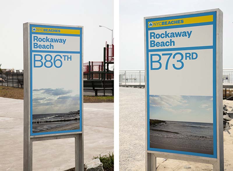
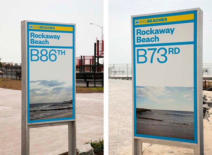
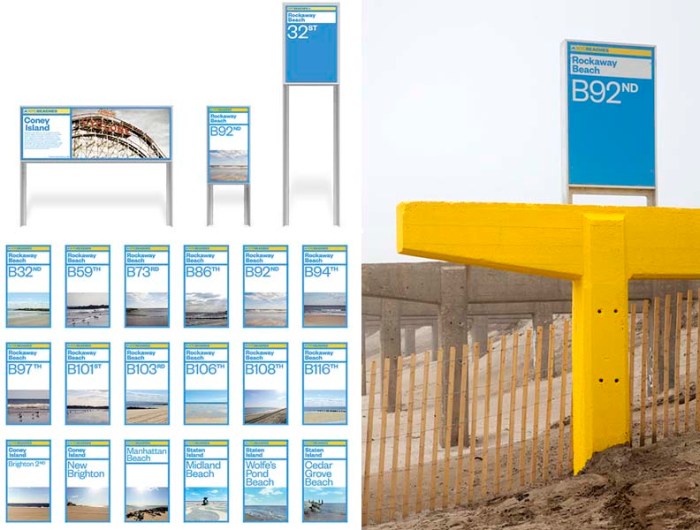
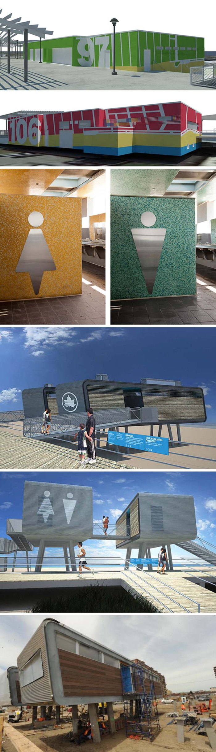
The boardwalk is still MIA but right away I noticed new, crisp signage clearly marking each beach name and street, as well as temporary concrete islands (designed by Sage and Coombe Architects) emblazoned with colorful supergraphics also displaying the corresponding beach numbers. Not surprisingly, I have since found out, perusing the Pentagram website, that the environmental graphics are the handy work of Paula Scher and her team of designers. Scher previously developed the identity and signage standards for the New York City Department of Parks and Recreation, which manages and maintains the city’s beaches, and the beach graphics are an extension of that program, utilizing the logo but changing the fonts and colors.

In addition, the graphics have been applied to the mod ‘pods’ designed by Garrison Architects that contain the lifeguard and comfort stations . These look a little more futuristic and slick in the renderings than in reality, but in truth, they weren’t completely finished when I was there.

Impressive work all around, from clean-up, to graphics and architecture. By July 4th weekend it should all be in full-swing again, with many concession stands opening then. New Yorkers are a pretty invincible bunch.

Photos and renderings courtesy of Pentagram & Garrison Architects.

Ctrl-Alt-Del: Yossi Wallner

Yossi Wallner, Tel Aviv Street art, Control Alt Delete keys, Escape keys placed on random exterior walls Yossi Wallner, Tel Aviv Street art, Control Alt Delete keys, Escape keys placed on random exterior wallsYossi Wallner, Tel Aviv Street art, Control Alt Delete keys, Escape keys placed on random exterior wallsClick to enlarge

What if the keyboards that we use incessantly all day would work in reality? If you could escape something by a push of a button? Delete anything by a flick of a finger? Or format your surroundings to your liking? These are the questions that Israeli designer Yossi Wallner is posing with his recent street art project around Tel Aviv. He has placed these function keys in random locations surely piquing the curiosity of those who come across them. I’ve never seen a ‘Sleep’ or ‘Wake’ key (must be a pc thing) but those make for interesting messages too. You can see more images of the project on his flickr page.

NYC Culture on the Cheap

Culture on the Cheap, NYC, Free and Cheap things to do in NYC, New Site, AnnouncementIf you’re here looking for our regular NYC Culture on the Cheap post, we have exciting news for you. Starting today, Culture on the Cheap will be its own separate site offering links to free and cheap things to do in NYC in art, music, design, film, theater, dance, food, architecture, talks, tours, and general fun. It won’t focus specifically on weekends anymore, though most activities may still be weekend-centric. So go take a look! You can sort by Event Date, Price, Genre, or even a specific date on the calendar.

If you like what you see, please share it with you friends and lovers! Sisters and brothers! Like our page on facebook or follow us on twitter.

It’s just up today, so please bear with us if any glitches should arise.

Paulius Nosokas: SPAMspace

SpamSpace by Paulius Nosokas, lines of spam converted to graph-like images and installations.SpamSpace by Paulius Nosokas, extracted lines of spam converted to graph-like images and installations.SpamSpace by Paulius Nosokas, extracted lines of spam converted to graph-like images and installations.Click to enlarge

Currently Berlin-based, Lithuanian-born artist Paulius Nosokas has a touching and inspiring childhood story, braving it independently from an early age and coming to the US at the age of 18 where he worked in, and learned on the job, graphic design and screen design. He combines these skills in his art being a firm believer that behind every good work of fine art is good design.

In his series of works titled SPAMspace, Nosokas collected 3-year’s worth of actual spam subject heads that appeared in his 5 email inboxes. He took a small fraction of them and designed them into stripes of color, dividing them into 7 sets — one for each day of the week — placing each line on its side, taking on a graph-like appearance. Together, they tell a story of the power of the written word to seduce, and become a clear representation of the internet and its invasion of privacy. Nosokas chose sexual spam, but could have just as easily  chosen non-sexual lines. SPAMspace is designed to fit in the space at hand, traveling up and across walls. I’d like to see this as a wallpaper selection. Maybe in the pastel tones of pink and blue. Maybe even in a baby’s room! Just kidding…

You might want to check out the rest of Paulius Nosokas’s work that ranges from light drawing to beautifully animated geometric shapes.

All photos courtesy of the artist.

Clemens Behr: Sculptural Street Art

Clemens Behr, German street art, 3d street art, sculptural street art and graffiti art. Cool art.Clemens Behr, German street art, 3d street art, sculptural street art and graffiti art. Cool art.Clemens Behr, German street art, 3d street art, sculptural street art and graffiti art. Cool art.Click to enlarge

German street artist Clemens Behr “scours cities and sites for spots to build installations” much in the way other street artists look for walls to spray on. Behr’s origami-like structures are made with simple recycled materials, converted into geometric forms. Though some of his work is in the form of murals, most of Behr’s interventions are 3D sculptural objects, in many cases mural-like, emanating from walls or corners. It’s always fun to see artists push a genre in a different direction.

You can see more of Clemens Behr’s installations on his site and his blog.

via idn

Somos Luz: Boamistura

Boamistura, Panama City, Somos Luz, We are Light, Street Art, CommunityBoamistura, Panama City, Somos Luz, We are Light, Street Art, CommunityBoamistura, Panama City, Somos Luz, We are Light, Street Art, CommunityClick to enlarge

The folks of Boamistura (previously here & here) were at it again, doing what they do so well: fostering pride and community in impoverished neighborhoods with their street art interventions. Their latest participatory urban art project Somos Luz (We are Light) took place this past March in Panama City. Invited by the Panama Art Biennial and as part of their own Crossroads project, Boamistura enlisted the help of the inhabitants of the Begonia I building in El Chorrillo to paint the phrase “Somos Luz” on the façade of their building. Each apartment (50 total) was responsible for painting their own home including corridors and stairways. The concept was based on a color grid that, when seen from up close, looks like abstract shapes but, from a distance, spells out their proud bright message. It’s win-win all around. The building got a much needed coat of paint (see ‘before’ in third photo down from top.) The community, down to the young children, were included in the project. And a sense of well-deserved pride was instilled in all who live in the Begonia I building. Nice work as usual Boamistura!